Ad creative is the single biggest lever in Meta advertising performance. Targeting can get your ad in front of the right person, and budget determines how often it shows up, but creative is what actually does the work. It stops the scroll, earns the click, and carries the message that turns a stranger into a customer.
Most marketers know this in theory. The harder problem is knowing which creative approaches actually convert, and more importantly, how to replicate them consistently without burning through budget on guesswork.
The Meta feed is a crowded place. Users are moving fast, attention is scarce, and the bar for stopping someone mid-scroll is higher than ever. The creatives that win are not necessarily the most polished or the most expensive. They are the ones built around proven psychological structures that match where the buyer is in their journey.
This article breaks down eight of those structures. For each one, you will find a clear explanation of what the format looks like in practice, why it works psychologically, and how to build it into your own campaigns. Whether you are a solo media buyer or managing accounts for multiple clients, these strategies give you a repeatable framework for producing ads that actually convert.
You will also see how platforms like AdStellar can help you generate, test, and surface top-performing creatives without needing a full creative team behind you. The goal is to move from one-off ad creation to a systematic process that compounds over time.
Let's get into it.
1. The Before-and-After Creative
The Challenge It Solves
One of the hardest things to do in a paid ad is communicate benefit quickly. You have a fraction of a second to make someone understand what your product does and why they should care. Abstract claims like "transforms your results" do not land the way a concrete visual contrast does. The before-and-after format solves this by showing the outcome rather than describing it.
The Strategy Explained
The transformation narrative is one of the oldest and most consistently effective structures in direct response advertising. Psychologically, contrast draws attention and makes benefit tangible in a way that copy alone rarely achieves. When someone sees a clear visual shift from problem state to desired outcome, they immediately understand the value proposition without having to work for it.
This format works in both static image and video. In static, a split-panel layout with a left side showing the "before" state and a right side showing the "after" is the most common execution. In video, the before state opens the creative and the reveal becomes the payoff that keeps viewers watching.
The copy should reinforce the contrast rather than explain it. A headline like "This is what 30 days looks like" or "Before we got involved" lets the visual do the heavy lifting while the words add emotional context.
Implementation Steps
1. Identify the most visually dramatic transformation your product delivers. If the change is not visible, find a proxy metric or outcome that can be shown rather than told.
2. Shoot or source both states with consistent framing so the comparison is clean and credible. Inconsistent lighting or angles can undermine trust.
3. Write a headline that teases the transformation without giving it away entirely. Curiosity pulls viewers into the full creative.
4. Add a CTA that connects the transformation to the viewer's own situation: "See your results" or "Start your transformation" rather than generic "Shop now" language.
Pro Tips
The most effective before-and-after creatives lead with the "after" in the thumbnail or first frame, then reveal the "before" to create a contrast effect. This inverts the expected order and creates a moment of surprise that increases watch time in video formats. Test both sequencing approaches to see which resonates with your specific audience.
2. The Social Proof Stack
The Challenge It Solves
A single testimonial is easy to dismiss. One five-star review could be from a friend, a family member, or simply an outlier experience. The challenge is creating a sense of overwhelming consensus that makes skepticism feel unreasonable. That is what the social proof stack is designed to do.
The Strategy Explained
Robert Cialdini's foundational work on persuasion, documented in his book Influence, established social proof as one of the most powerful drivers of human decision-making. People look to others when they are uncertain, and the more signals of consensus you can layer into a single creative, the more compelling that proof becomes.
Instead of one testimonial, the proof stack combines multiple signals simultaneously: a star rating with a review count, a quote from a real customer, a press logo or media mention, and a user count or milestone figure. Each element adds a layer, and the cumulative effect is far stronger than any single proof point on its own.
Visually, the stack works best when it feels curated rather than cluttered. Use a clean layout with clear hierarchy so each proof element registers individually before the viewer takes in the whole picture.
Implementation Steps
1. Audit all your existing proof assets: reviews, ratings, press mentions, customer counts, awards, and media logos. Collect everything before designing.
2. Prioritize proof types by credibility. Third-party press logos and verified review platform ratings tend to carry more weight than anonymous quotes.
3. Design the stack with visual hierarchy. Lead with your strongest proof signal, then layer supporting elements below it. Do not treat all proof as equal.
4. Create two or three variations of the stack using different proof combinations. Rotate them in your campaigns to avoid creative fatigue while keeping the format consistent.
Pro Tips
Specificity dramatically increases the credibility of testimonials within the stack. "It saved me three hours a week" is far more convincing than "I love this product." When curating quotes for your stack, prioritize ones that name a specific outcome, timeframe, or result. Vague praise blends into the background; specific claims stick.
3. The UGC-Style Hook Creative
The Challenge It Solves
Polished, obviously branded ads trigger a mental filter in most social media users. People have developed a strong instinct for recognizing ads, and the moment that recognition kicks in, resistance goes up. Native-style content sidesteps this by blending into the organic feed environment, giving your message a chance to land before the viewer's guard is raised.
The Strategy Explained
UGC-style creatives mimic the look and feel of content someone might post organically: slightly imperfect framing, natural lighting, direct-to-camera delivery, and minimal production polish. This aesthetic reduces the psychological resistance many users have toward obvious advertisements and creates a sense of authenticity that branded content often struggles to achieve.
The first three seconds are everything in this format. A strong hook is not just a good opening line; it is a pattern interrupt that makes the viewer feel like they stumbled onto something worth watching. Questions, bold statements, and relatable confessions all work well as hooks. "I spent two years trying to fix this before I found something that actually worked" is more compelling than any product feature claim.
The good news is that producing this type of content no longer requires sourcing real creators. AdStellar's AI Ad Creative feature generates UGC-style video content using AI avatars directly from your product URL, giving you authentic-looking creatives without coordinating with influencers or running creator briefs.
Implementation Steps
1. Write three to five hook variations that open with a relatable problem, a surprising claim, or a direct question. Test each one as a separate creative.
2. Keep the visual style intentionally raw. Avoid heavy motion graphics, branded lower thirds, or anything that signals high production value. Authenticity is the point.
3. Write captions that complement the raw aesthetic. Short, punchy lines that mirror how people actually write in social posts work better than polished marketing copy.
4. Use AdStellar's chat-based editing to refine the script and delivery without starting from scratch each time.
Pro Tips
Hooks that reference a specific audience segment outperform generic openers. "If you run Facebook ads for e-commerce brands" immediately signals relevance to the right viewer and encourages them to self-select into the message. The more specific your hook, the more qualified your click-throughs tend to be.
4. The Problem-Agitation-Solution Ad
The Challenge It Solves
Most ads jump straight to the solution without earning the emotional investment needed to make that solution feel meaningful. If a viewer does not feel the pain of the problem, they have no reason to care about the fix. The PAS framework solves this by building emotional momentum before making any product claim.
The Strategy Explained
The Problem-Agitation-Solution framework is a well-established copywriting structure widely attributed to direct response pioneer Dan Kennedy. Its power lies in sequencing. You open by naming a problem the viewer already feels, then deepen the emotional resonance by exploring why that problem is genuinely frustrating or costly, and only then introduce your product as the logical resolution.
In ad creative, this plays out visually and in copy simultaneously. The opening frame or headline surfaces the problem. The middle section of the creative adds context that makes the problem feel more urgent. The final section delivers the solution with a clear, benefit-led CTA.
For video, this maps naturally to a three-act structure. For static images, a bold problem-focused headline paired with agitation copy and a solution-oriented subheadline can compress the same arc into a single frame.
Implementation Steps
1. Write out the problem in the exact language your customer uses. Not marketing language. The words they use when venting to a colleague or searching for a solution at midnight.
2. Identify the secondary consequences of the problem. What does it cost them in time, money, or frustration? The agitation layer should make the problem feel bigger, not just repeat it.
3. Frame your product as the resolution to the specific pain you have surfaced. The solution should feel inevitable given the problem you have built up.
4. Close with a CTA that connects directly to relief: "Stop losing money to underperforming ads" is more compelling than "Learn more."
Pro Tips
The agitation section is where most marketers pull back because it feels uncomfortable to dwell on negative emotions. Resist that instinct. The more vividly you articulate the frustration, the more powerfully the solution lands. Just make sure the agitation is empathetic rather than alarmist. You are acknowledging their experience, not exploiting it.
5. The Direct Offer Creative
The Challenge It Solves
Storytelling formats are powerful, but they are not always the right tool. When someone is already aware of your product, already in a buying mindset, or being retargeted after a previous visit, they do not need to be warmed up. They need a clear, compelling reason to act right now. The direct offer creative is built for exactly that moment.
The Strategy Explained
Direct response advertising has decades of documented history showing that clear, specific offers outperform vague brand messaging in lower-funnel contexts. When a buyer is ready to convert, friction is the enemy. Anything that makes the offer harder to understand or evaluate delays the decision.
The direct offer format strips away narrative and leads with the value: a price, a discount, a bundle, a deadline, or a guarantee. Every design element serves the offer. The headline states it. The visual reinforces it. The CTA captures it. There is no ambiguity about what is being offered or why the viewer should act.
Urgency signals like countdown timers, limited quantity language, or expiration dates can increase action rates in this format, but they need to be genuine. Manufactured urgency erodes trust quickly, especially with audiences who have seen the same "48-hour sale" running for three weeks.
Implementation Steps
1. Lead with the offer in the headline. Do not bury the discount or deadline in the body copy. The value proposition should be the first thing the viewer reads.
2. Design for immediate comprehension. Someone scrolling at speed should understand your offer within one second of seeing the creative. If it requires reading, it is too complex.
3. Pair the visual with a headline-copy combination that reinforces the offer from two angles. The headline states the offer; the copy handles the "why now" element.
4. Reserve this format for retargeting campaigns and warm audiences. Cold traffic typically needs more context before an offer is compelling.
Pro Tips
Guarantee language can function as a powerful urgency substitute that does not feel manufactured. "Risk-free for 30 days" or "Full refund if it does not work" removes the friction of uncertainty without requiring a fake deadline. For products where the purchase barrier is risk rather than price, guarantees often outperform discount-led offers.
6. The Competitor Comparison Creative
The Challenge It Solves
Buyers in an active consideration phase are comparing options. They are looking at your product alongside alternatives, and if you do not help frame that comparison, they will do it themselves, often without the full picture. The comparison creative enters that conversation proactively and positions your product as the obvious upgrade.
The Strategy Explained
Comparison advertising is a legal and widely used format in many markets, governed in the US by FTC guidelines that require claims to be truthful and substantiated. When executed well, it does something most ad formats cannot: it acknowledges the competitive landscape and wins within it rather than pretending alternatives do not exist.
The most effective comparison creatives focus on specific, meaningful differentiators rather than generic superiority claims. A feature table format works well for product comparisons where specific capabilities matter. Side-by-side visual layouts work for outcome-based comparisons where the result speaks for itself.
You do not always need to name a competitor directly. "Vs. traditional agencies" or "Vs. doing it manually" frames a comparison without requiring you to call out a specific brand, which can reduce legal complexity while still delivering the positioning benefit.
Implementation Steps
1. Identify the two or three differentiators where your product genuinely wins. Focus only on areas where the advantage is clear and defensible. Do not overreach.
2. Choose your comparison framing. Direct competitor naming, category comparison, or "old way vs. new way" are all valid approaches depending on your market position.
3. Design the visual to make your product the clear winner at a glance. Checkmarks, highlighted rows, and bold contrast between columns guide the viewer's eye to your advantage.
4. Substantiate any specific claims you make. If you say you are faster, cheaper, or more effective, be prepared to back that up. Unsubstantiated comparative claims carry regulatory risk.
Pro Tips
The "old way vs. new way" framing is particularly effective because it positions your product as progress rather than just a competitor. It also avoids naming specific brands, which simplifies legal review and broadens the relevance of the ad to anyone still using outdated methods, regardless of which specific tool they are using.
7. The Educational Value-First Creative
The Challenge It Solves
Cold traffic audiences do not know you, do not trust you, and have no reason to click your ad. Leading with a sales message in that context is often the least effective approach. The educational creative solves the cold traffic problem by leading with genuine value, building trust before making any ask, and letting the quality of the insight do the selling.
The Strategy Explained
Content marketing and value-first advertising are well-established strategies built on a simple premise: if you help someone solve a problem, they are far more likely to trust you with their business. In the context of Meta ads, this translates to creatives that open with a useful tip, a surprising insight, or a practical framework that the viewer can use immediately.
Carousel formats are particularly well-suited to this approach. Each card can deliver one piece of a micro-lesson, with the final card bridging from the educational content to a product-led CTA. The transition feels natural because the viewer has already experienced your expertise firsthand.
Single-image formats can also work by leading with a bold insight in the headline and using the body copy to deliver the substance, with the CTA offering more depth through a lead magnet, guide, or free trial.
For cold traffic, the educational creative builds the awareness and trust needed before a conversion ask. For warm audiences, it reinforces expertise and keeps your brand top of mind during longer consideration cycles.
Implementation Steps
1. Identify a specific, actionable insight that your target audience would find immediately useful. The more specific and counterintuitive, the more attention it will earn.
2. For carousel formats, map out a five to seven card structure: hook card, two to three insight cards, one summary card, and one CTA card. Each card should stand alone while building on the previous one.
3. Write a CTA that connects the educational content to your product naturally. "We built a tool that handles all of this automatically" is a smoother transition than a hard sell.
4. Target cold audiences with educational creatives and use the engagement data to build warm retargeting audiences for more direct offer formats.
Pro Tips
The best educational creatives teach something the viewer did not know they did not know. Validating what people already believe builds rapport but does not drive action. Revealing a blind spot or a counterintuitive truth creates a genuine "aha" moment that makes your brand memorable and positions you as a source worth following.
8. The Bulk Variation Testing Strategy
The Challenge It Solves
Running one creative at a time and waiting for results is one of the most expensive habits in paid advertising. By the time you have enough data to make a decision, you have spent budget on a sample size too small to be reliable, and you are still only one creative deeper into your learning. The bulk variation approach replaces sequential testing with simultaneous testing, compressing the time it takes to find winners.
The Strategy Explained
Meta's own guidance on creative testing emphasizes the value of running multiple variations to give the algorithm enough signal to optimize effectively. The more creative diversity you introduce, the faster the system learns what resonates with your audience and the more efficiently it allocates spend toward top performers.
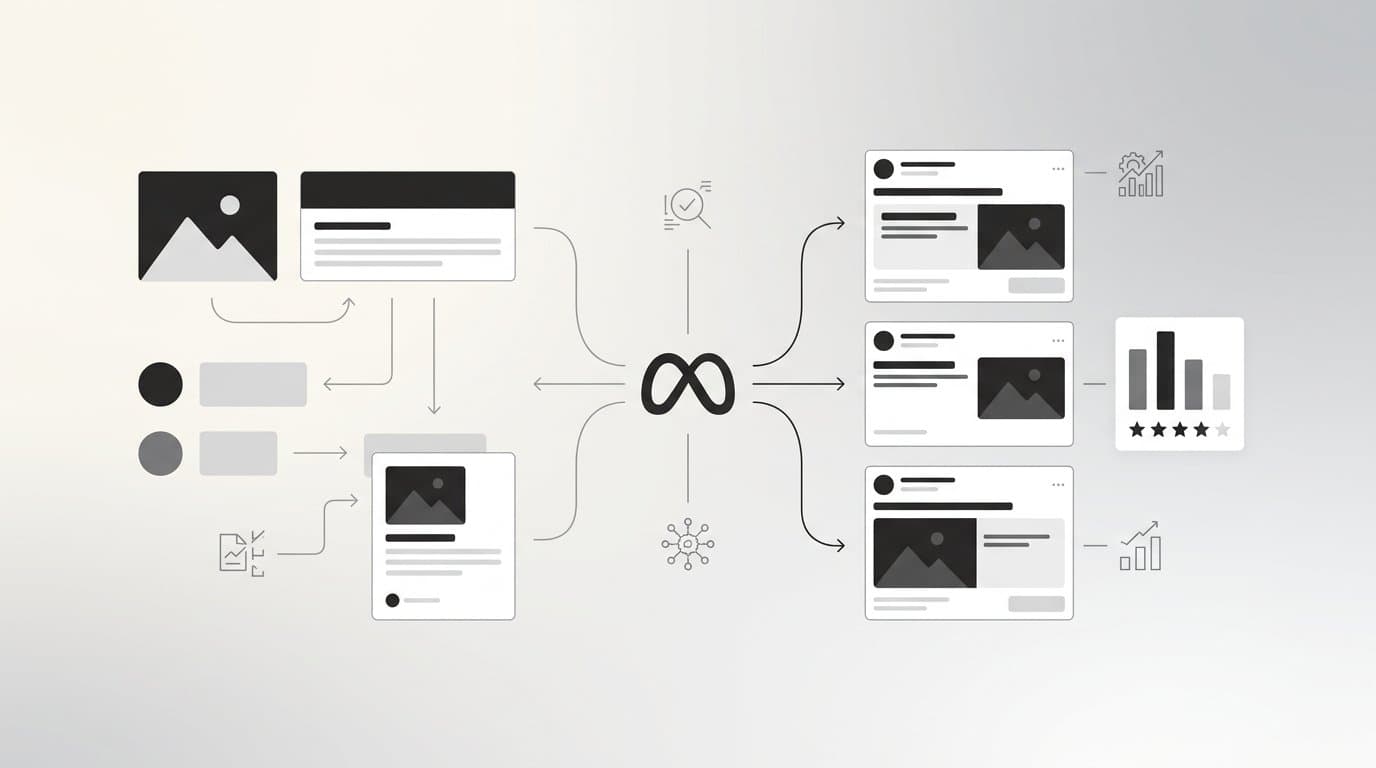
The bulk variation strategy is built around a testing matrix. Instead of creating one ad, you create a structured set of variations by mixing different creative assets, headlines, and copy combinations. Each combination becomes its own ad, giving you a broad testing surface without requiring a proportional increase in creative effort.
This is where AdStellar's Bulk Ad Launch feature changes the equation entirely. You can create hundreds of ad variations in minutes by mixing multiple creatives, headlines, audiences, and copy at both the ad set and ad level. AdStellar generates every combination and launches them to Meta in clicks, not hours. What used to take a team of media buyers an entire day can be done before your morning coffee is finished.
Once the variations are live, AdStellar's AI Insights feature takes over. Leaderboards rank your creatives, headlines, copy, audiences, and landing pages by real metrics like ROAS, CPA, and CTR. You set your target goals and the AI scores everything against your benchmarks, so you can instantly spot winners and reuse them in your next campaign through the Winners Hub.
Implementation Steps
1. Define your testing matrix before you create anything. Decide which variables you are testing: creative format, headline angle, copy length, or audience segment. Keep the matrix manageable so results are interpretable.
2. Create your creative assets using AdStellar's AI Ad Creative tools. Generate image ads, video ads, and UGC-style content from your product URL, or clone competitor ad structures from the Meta Ad Library as a starting point.
3. Use the Bulk Ad Launch feature to mix and launch all combinations simultaneously. Let the campaigns run long enough to accumulate statistically meaningful data before drawing conclusions.
4. Review the AI Insights leaderboards to identify which creative elements are driving performance. Look for patterns across winners, not just individual top performers.
Pro Tips
When analyzing bulk test results, resist the temptation to pause everything except the single top performer. Keeping two or three strong variations running simultaneously protects you against creative fatigue and gives the algorithm continued signal diversity. Use the Winners Hub to track your best performers over time and build a library of proven elements you can remix into future campaigns.
Your Implementation Roadmap
Eight creative strategies is a lot to absorb at once, so let's make this practical. You do not need to implement all of them simultaneously. The smarter approach is to match the format to your current funnel stage and build from there.
If you are running cold traffic campaigns, start with the educational value-first creative or the UGC-style hook. These formats are built for audiences who do not know you yet. Once you have generated awareness and engagement, layer in the PAS format and the before-and-after creative to move people toward consideration.
For retargeting and warm audiences, the direct offer creative and the social proof stack are your highest-leverage tools. These formats work best when the viewer already has some familiarity with your product and needs a final push to convert.
The competitor comparison and bulk variation testing strategies work at every funnel stage, but they require a bit more setup. Build them in once you have a baseline of creative performance data to work from.
The most important shift is moving from ad-by-ad creation to a systematic process. Create a testing cadence, use performance data to identify what is working, and double down on the formats and elements that consistently drive results. Stop rebuilding from scratch every time a campaign ends.
AdStellar is built to support exactly this kind of systematic approach. From generating scroll-stopping image and video creatives with AI, to launching hundreds of variations through Bulk Ad Launch, to surfacing your winners through AI Insights and the Winners Hub, it handles the full creative-to-conversion workflow in one place. No designers, no video editors, no guesswork.
Start Free Trial With AdStellar and be among the first to launch and scale your ad campaigns faster with a platform that automatically builds and tests winning ads based on real performance data.