Getting your Facebook post image size right is one of those foundational details that separates polished, high-performing content from posts that look off, get cropped awkwardly, or lose impact before anyone reads the copy. It sounds like a technical checkbox, but the dimensions you choose directly affect how your creative renders across feeds, Stories, Reels, and mobile versus desktop.
Facebook supports multiple image formats and placements, each with its own recommended dimensions, aspect ratios, and file requirements. Using the wrong size does not just look unprofessional. It can reduce your ad delivery, hurt your click-through rate, and waste budget on creative that never had a chance to perform.
This guide covers eight practical strategies for getting Facebook image sizes right, from understanding core specs for each placement to building a scalable system for producing correctly sized creatives at volume. Whether you are a solo marketer managing your own account or a media buyer running campaigns across multiple clients, these strategies give you a clear framework for choosing the right dimensions, designing within safe zones, and testing image formats efficiently.
By the end, your visuals will always look intentional and be set up to perform at their best.
1. Start With the Universal Recommended Size: 1200 x 628 Pixels
The Challenge It Solves
When you are creating a Facebook post with a link preview, or running a standard link click campaign, the image that appears in the preview box needs to render correctly across both desktop and mobile. Without a clear starting point, many marketers either use whatever image they have on hand or guess at dimensions, resulting in awkward cropping or blurry visuals.
The Strategy Explained
The 1200 x 628 pixel dimension is the baseline recommended size for Facebook feed posts and link previews. It corresponds to a 1.91:1 aspect ratio, which is the standard for horizontal feed placements. Designing to this spec ensures your image fills the preview area cleanly without automatic cropping or distortion.
This is your default starting point for any campaign where the primary placement is the Facebook news feed and the goal is driving traffic to an external URL. It renders correctly on desktop and scales appropriately on mobile, making it the most universally safe choice for link-based content.
Implementation Steps
1. Set your canvas to exactly 1200 x 628 pixels in your design tool before you start building the creative.
2. Keep your primary visual and any text elements centered, with important content staying well within the inner 80% of the frame to avoid edge cropping on smaller screens.
3. Export as JPG or PNG and confirm the file size stays under 30 MB, which is Meta's maximum for image uploads.
Pro Tips
Even when using this standard size, preview your creative in Meta's Ads Manager before publishing. Different browsers and devices can render link preview images slightly differently, so a quick preview check catches issues before your budget starts running.
2. Use Square Images (1080 x 1080) for Maximum Feed Versatility
The Challenge It Solves
One of the most common creative production headaches is building separate assets for Facebook and Instagram. When you design in a format that only works for one platform, you create extra work and inconsistency across your campaigns. You also miss the opportunity to take up more visual space in mobile feeds, where attention is the most competitive.
The Strategy Explained
Square images at 1080 x 1080 pixels, with a 1:1 aspect ratio, are the most versatile format in the Meta ecosystem. They render cleanly in the Facebook news feed, work natively on Instagram feed posts, and take up significantly more vertical real estate on mobile screens compared to the standard 1.91:1 horizontal format.
On a mobile device, a square image occupies more of the screen than a landscape image, which means more thumb-stopping surface area before a user scrolls past. For paid campaigns, this makes 1:1 the smartest default format when you want a single creative to perform well across multiple placements without resizing.
Implementation Steps
1. Design your primary campaign creatives at 1080 x 1080 pixels as the default canvas size.
2. Ensure your main subject and any key messaging sit in the center of the frame, since some placements may crop slightly at the edges.
3. Upload the same 1:1 asset to both Facebook and Instagram ad sets to streamline your production workflow and maintain visual consistency across platforms.
Pro Tips
Square format is particularly effective for product-focused creatives where you want the product to fill the frame. Avoid placing important text or visuals in the corners, as some mobile interfaces can clip the outer edges of the image slightly depending on the device.
3. Design for Vertical Placements With 4:5 and 9:16 Ratios
The Challenge It Solves
Most Facebook content is consumed on mobile devices, yet many marketers still default to horizontal or square formats out of habit. Vertical images are designed for the way people actually hold their phones, and they occupy significantly more screen real estate in mobile feeds. Ignoring vertical formats means leaving visible space on the table in one of the most valuable placements available.
The Strategy Explained
Two vertical ratios matter most for Facebook advertising. The 4:5 ratio, at 1080 x 1350 pixels, is the tallest image format allowed in the standard Facebook news feed. It gives you maximum feed coverage without pushing into Stories territory. The 9:16 ratio, at 1080 x 1920 pixels, is the full-screen format for Stories and Reels placements.
These formats demand a different approach to composition. Vertical images work best when the subject fills the frame top to bottom, with the focal point in the upper-center area where it is visible before any UI overlays appear at the bottom of the screen.
Implementation Steps
1. Create a 1080 x 1350 pixel canvas for feed-optimized vertical images and a 1080 x 1920 pixel canvas for Stories and Reels.
2. Place your primary subject and key messaging in the upper two-thirds of the frame, keeping the bottom portion clear of critical content to account for UI overlays.
3. Review both formats in Meta Ads Manager using the placement preview tool to confirm nothing important is cropped or hidden before launching.
Pro Tips
Vertical creatives require intentional photography or design from the start. Trying to crop a horizontal image into a 4:5 ratio after the fact usually results in a composition that looks forced. Build vertical assets as originals, not as afterthoughts.
4. Keep Text Within the 20 Percent Rule to Protect Delivery
The Challenge It Solves
A common instinct when designing ad images is to load them with text, headlines, offers, and callouts directly on the visual. The logic makes sense: you want to communicate your message clearly. But Facebook has historically factored text density in images into its ad quality scoring, and images with heavy text overlays can see reduced delivery or higher costs.
The Strategy Explained
Meta originally enforced a strict rule that penalized images where more than 20% of the surface area contained text. While that hard cap has since been relaxed, Meta still evaluates image quality and text density as part of its ad quality scoring system. Images with minimal text tend to perform better in delivery auctions and often look more native to the feed environment.
The smarter approach is to let your ad copy and headline fields carry the primary message, while the image focuses on visual impact: a strong product shot, a compelling scene, or a bold single-line hook at most. This keeps the creative clean and the delivery healthy.
Implementation Steps
1. Audit your current ad images and identify how much of the surface area is covered by text overlays, logos, or graphic callouts.
2. Move supporting copy, offers, and CTAs into the ad's headline, primary text, and description fields rather than embedding them in the image itself.
3. If text must appear in the image, limit it to a single short phrase or headline and use high-contrast typography that reads clearly at small sizes.
Pro Tips
Test a version of your creative with no text overlay against a version with minimal text. In many cases, the cleaner image drives stronger engagement because it looks less like an ad and more like organic content, which tends to earn more trust in the feed.
5. Optimize File Format and Compression Without Losing Quality
The Challenge It Solves
Exporting your creative at the wrong settings is one of the most common and avoidable ways to undermine an otherwise strong image. Over-compressed files look blurry or pixelated in the feed, which immediately signals low quality to viewers and can affect your ad relevance score. On the other end, unnecessarily large files slow down upload times and create workflow friction.
The Strategy Explained
Meta recommends JPG and PNG as the primary file formats for Facebook image ads. JPG is the better choice for photographs and complex visuals with gradients, as it compresses efficiently while maintaining visual quality at the right settings. PNG is preferable for graphics, logos, and images with transparent backgrounds or hard edges, since it preserves sharpness without the compression artifacts that can appear in JPG at lower quality settings.
The maximum file size for images on Meta is 30 MB, but you should aim well below that ceiling. A well-optimized image for Facebook advertising typically lands between 500 KB and 2 MB, which is large enough to look sharp at full resolution but small enough to load quickly across mobile connections.
Implementation Steps
1. Use JPG for photographic ad creatives and export at a quality setting of 80 to 90%, which balances file size and visual clarity effectively.
2. Use PNG for graphics-heavy images, logos, or any creative with transparent elements where edge sharpness matters.
3. After exporting, preview the image at full size to check for compression artifacts before uploading to Ads Manager.
Pro Tips
Tools like Squoosh or ImageOptim can help you fine-tune compression settings and compare quality levels side by side before finalizing your export. A few seconds of quality checking before upload can save you from running a campaign with visibly degraded creative.
6. Design With Safe Zones to Prevent UI Cropping
The Challenge It Solves
Facebook overlays a significant amount of interface elements directly on top of your ad creative. Profile photos, page names, reaction buttons, share icons, and "Sponsored" labels all sit on top of the image in the feed. If you place key visuals, product shots, or CTAs too close to the edges or bottom of your image, they will be partially or fully hidden by these UI elements, and your viewer will never see them.
The Strategy Explained
Safe zones are the areas of your image where it is reliable to place important content, knowing that Facebook's UI will not cover it. The general principle is to keep critical elements away from the bottom 15 to 20% of the image, where reaction and share buttons appear in the feed, and away from the top left corner, where the page profile icon and name are displayed.
This is especially important on mobile, where the UI overlays are proportionally larger relative to the image size. Designing with safe zones as a built-in constraint rather than an afterthought ensures your product, face, or headline is always visible to the viewer.
Implementation Steps
1. Add a safe zone overlay to your design templates in your preferred tool, marking the bottom 20% and top-left corner as restricted areas for critical content.
2. Place your primary subject, product, or visual hook in the center and upper portion of the frame where it will always be unobstructed.
3. Use Meta's ad preview tool in Ads Manager to review how the image renders in the actual feed environment before launching.
Pro Tips
Safe zones matter even more for video thumbnails and the first frame of video ads. If your video starts with important text or a product in the lower portion of the frame, it may be hidden before the viewer even decides to watch. Apply the same safe zone rules to your video creative from the first frame.
7. Create Multiple Aspect Ratio Versions for Advantage+ Placements
The Challenge It Solves
When you run campaigns using Meta's Advantage+ placements, the algorithm serves your creative across a wide range of surfaces: the news feed, Stories, Reels, the right column, Marketplace, and more. Each placement has different dimensions and aspect ratio requirements. If you only provide one image size, Meta will crop or letterbox your creative to fit other placements, often with results that look unintentional or visually broken.
The Strategy Explained
Providing multiple aspect ratio versions of your creative gives Meta's algorithm the flexibility to serve the best-fitting asset to each placement. The three core ratios to cover are 1.91:1 (1200 x 628) for horizontal feed and link placements, 1:1 (1080 x 1080) for square feed placements across Facebook and Instagram, and 4:5 (1080 x 1350) for vertical feed placements optimized for mobile.
When Meta has access to all three versions, it can match the right creative to each placement rather than forcing a single asset into every context. This improves both the visual quality of your ads and the algorithm's ability to optimize delivery efficiently.
Implementation Steps
1. After finalizing your primary creative concept, export three versions: 1200 x 628 for horizontal, 1080 x 1080 for square, and 1080 x 1350 for vertical.
2. Upload all three versions when building your campaign in Ads Manager, using the "Add media" options to assign each ratio to its corresponding placement group.
3. Review each version in the placement preview to confirm that the composition works well in each format and no critical elements are cropped.
Pro Tips
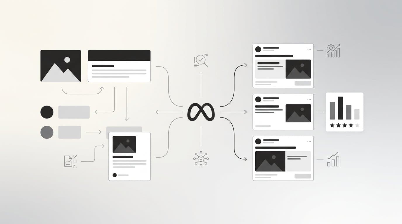
Do not simply crop the same image to fit each ratio. Recompose each version so the subject is well-framed for that specific format. A horizontal image cropped to square often loses the subject or creates awkward empty space. Treat each ratio as its own creative decision. Tools like AdStellar can generate and size creatives for multiple placements automatically, removing the manual resizing step from your workflow entirely.
8. Test Image Sizes as a Variable in Your Creative Experiments
The Challenge It Solves
Most creative testing focuses on the obvious variables: the image concept, the headline, the offer, or the color palette. Aspect ratio and image dimensions are rarely treated as a standalone test variable, even though they directly affect how much screen space your ad occupies, how it fits the native context of each placement, and ultimately how it performs. Ignoring format as a variable means leaving meaningful optimization insight on the table.
The Strategy Explained
Aspect ratio affects performance independently of creative content. A square version of an ad can outperform an identical horizontal version simply because it takes up more space in a mobile feed and creates more visual presence. Vertical formats can drive stronger thumb-stop rates in Stories because they feel native to the full-screen environment. The only way to know which format works best for your specific audience and offer is to test it directly.
Structure size-focused experiments by holding the creative concept constant and varying only the aspect ratio. This isolates the format as the variable and gives you clean data on which dimensions drive the best CTR, thumb-stop rate, or CPA for your campaigns.
Implementation Steps
1. Choose one proven creative concept and export it in at least two aspect ratios: 1:1 and 1.91:1 as a starting point, or 1:1 and 4:5 for mobile-focused campaigns.
2. Set up a split test in Meta Ads Manager with identical targeting, budget, and copy across both versions, changing only the image format.
3. Run the test for enough time and spend to reach statistical significance, then review performance by format using metrics like CTR, CPA, and ROAS before scaling the winner.
Pro Tips
Use AdStellar's AI Insights leaderboards to track creative performance across formats in one place. When your image size tests are generating results, you need a system that ranks every variation by real metrics like ROAS and CPA, not just impressions. Having that data organized automatically makes it far easier to identify your format winners and feed them into your next campaign through the Winners Hub.
Putting It All Together
Getting Facebook post image sizes right is not a one-time task. It is an ongoing part of your creative production workflow, and the compounding benefit of doing it consistently is significant. Every correctly sized creative is one less point of friction between your ad and the person you are trying to reach.
Start with the fundamentals: 1200 x 628 for link posts, 1080 x 1080 for feed versatility, and vertical formats for mobile-first placements. Layer in safe zone awareness, smart file compression, and minimal text overlays to make sure every creative renders cleanly across devices and placements.
Then build a system. When you are running paid campaigns at any real volume, manually resizing every asset becomes a bottleneck that slows your testing velocity and limits how fast you can iterate. The strategies in this guide give you the framework, but the execution needs to be scalable.
That is exactly where AdStellar fits in. AdStellar generates image ads, video ads, and UGC-style creatives already sized for the placements you are targeting, then launches them directly to Meta. The AI Campaign Builder tests every combination and surfaces the winners so you know which size and format is actually driving results, not just which one looks good in preview. AI Insights leaderboards rank every creative, headline, and audience by real metrics like ROAS, CPA, and CTR, so you always know what to scale and what to cut.
The goal is to stop guessing and start scaling. Nail your image specs, test systematically, and let your performance data tell you what to standardize. When your creative production keeps up with your testing velocity, that is when results compound.
Ready to transform your advertising strategy? Start Free Trial With AdStellar and be among the first to launch and scale your ad campaigns faster with an intelligent platform that automatically builds and tests winning ads based on real performance data.