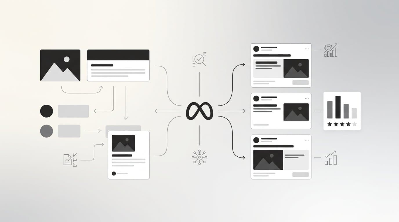
Carousel ads are one of the most versatile formats in Meta's advertising toolkit. Unlike a single static image or video, a carousel lets you tell a story across multiple cards, showcase an entire product lineup, walk someone through a process, or address different objections within a single ad unit. That flexibility is exactly why the format performs so well when used with intention.
The problem is that most carousel ads are built without a clear strategy. Marketers stack a few product images, write generic captions, and hope the format does the heavy lifting. It does not.
The format gives you the canvas. Your strategy determines whether someone swipes all the way through or scrolls past after the first card.
This guide covers 10 carousel ad best practices that actually move the needle. Each one addresses a specific mistake or missed opportunity that shows up repeatedly in underperforming carousel campaigns. Whether you are running direct-to-consumer product ads, lead generation campaigns, or retargeting sequences, these practices apply across the board.
1. Lead With Your Strongest Card
The Challenge It Solves
The first card is the only one guaranteed to be seen. Every other card has to be earned. If that first frame does not stop the scroll and create enough curiosity or desire to make someone swipe, the rest of your carousel simply does not exist for that viewer.
The Strategy Explained
Most advertisers lead with their logo, a brand introduction, or a generic product shot. These are low-stakes choices that waste the highest-leverage real estate in the entire ad unit. Your first card should lead with your most compelling visual asset, your strongest offer, or your sharpest hook.
Think about what would make your target customer stop mid-scroll. Often it is a bold result, a striking product shot, a provocative question, or a visual that immediately signals relevance to their specific situation. Brand identity can be woven into the design without it being the headline feature.
Implementation Steps
1. Audit your existing creative library and identify the assets that have historically generated the strongest click-through or engagement rates in single-image formats. These are strong candidates for card one.
2. Write a headline for card one that creates an open loop or a clear value statement. Something that makes a viewer want to see what comes next, rather than summarizing everything upfront.
3. Test two or three different first-card approaches before committing to a single version. The first card is worth isolating as a testing variable on its own.
Pro Tips
Note that Meta's ad system includes an automatic card optimization feature that can reorder cards to show the best-performing one first. If you want to control narrative sequence, disable this feature in Ads Manager. If you are running a product showcase without a strict story order, letting the algorithm lead with the top performer can work in your favor.
2. Build a Narrative Arc Across Cards
The Challenge It Solves
A carousel without a narrative is just a gallery. Galleries are easy to ignore. When there is no logical progression pulling a viewer from one card to the next, they have no reason to keep swiping. You end up with a format that could have told a compelling story but instead delivered a disconnected collection of images.
The Strategy Explained
Three narrative structures tend to work particularly well in carousel format. The first is problem-agitate-solution, where early cards name the problem and make it feel real, middle cards deepen the tension, and later cards present your product or service as the answer. The second is feature reveal, where each card introduces one specific feature or benefit in sequence, building a cumulative case for your offer. The third is social proof progression, where you move from a bold claim to evidence, testimonials, results, and finally a call to action.
The key is mapping your card order to where a buyer is in their decision process. Someone who does not know your brand needs a different opening than someone who has already visited your product page.
Implementation Steps
1. Choose one of the three narrative structures based on your campaign objective and audience temperature. Cold audiences typically respond better to problem-solution framing. Warm audiences can handle a more direct feature or offer sequence.
2. Outline your card content before designing anything. Write out what each card communicates and confirm the sequence creates forward momentum.
3. Read your card headlines in order as if they were sentences in a paragraph. If they do not flow logically, reorder or rewrite before moving to design.
Pro Tips
The transition between cards is invisible to the viewer but felt as momentum or friction. Each card should make the next one feel necessary. If a card feels complete on its own, it may be breaking the arc rather than building it.
3. Match Each Card to a Specific Audience Pain Point
The Challenge It Solves
A single ad image has to do everything at once. It has to resonate with every concern your audience might have in a single frame. Carousel format removes that constraint entirely. You have multiple cards, which means you can speak to multiple objections without cramming everything into one cluttered message.
The Strategy Explained
Before building your carousel, list the top three to five concerns or hesitations your target customer has before purchasing or converting. These might include price concerns, questions about quality, doubts about fit or compatibility, uncertainty about results, or lack of trust in the brand. Assign each card to one specific pain point and address it directly.
This approach works especially well for considered purchases where buyers need to clear multiple mental hurdles before they commit. A well-structured carousel can function like a condensed sales conversation, moving someone through their objections in a single swipe session rather than requiring multiple touchpoints.
Implementation Steps
1. Interview customers or review support conversations to identify the objections that come up most frequently before a purchase decision is made. Use their actual language, not marketing language.
2. Rank those objections by how commonly they appear and how much they impact conversion. Address the highest-impact ones first in your card sequence.
3. Write each card headline and visual brief around one objection only. Resist the urge to address two concerns on a single card. Specificity is what makes this approach work.
Pro Tips
This structure pairs naturally with retargeting campaigns. When you know a viewer has already seen your product but has not converted, a carousel that systematically addresses the most common reasons people hesitate can be significantly more effective than simply showing them the same product image again.
4. Keep Visual Consistency Without Being Repetitive
The Challenge It Solves
Carousels that look identical across every card feel lazy and give viewers no reason to keep swiping. Carousels that look completely different across cards feel disjointed and erode trust. Finding the balance between cohesion and variety is one of the most common creative challenges in carousel production.
The Strategy Explained
The solution is to establish a clear distinction between brand constants and card variables. Brand constants are the elements that stay the same across every card: your color palette, typography, logo placement, and overall visual style. These create the sense that all the cards belong together and come from the same brand.
Card variables are the elements that change from card to card: the primary image or video, the layout arrangement, the focal point, and the specific visual treatment of each card's content. Varying these elements keeps the experience visually engaging without breaking the sense of brand cohesion.
Implementation Steps
1. Define your brand constants before designing any individual cards. Create a simple one-page reference that specifies the exact colors, fonts, and logo placement rules for your carousel format.
2. For each card, change at least one major visual element from the card before it. This could be the background image, the layout orientation, the product angle, or the type of content shown (lifestyle vs. product close-up vs. text-forward).
3. View all your cards side by side before launching. They should feel like a family without being clones of each other.
Pro Tips
A useful test is to shuffle your cards into a random order and see if the carousel still looks like it comes from the same brand. If it does, your brand constants are strong. If it falls apart, you may be relying too heavily on sequence to create cohesion rather than building it into the design itself.
5. Write Card Headlines That Build on Each Other
The Challenge It Solves
Most carousel headlines are written as standalone statements with no connection to the cards before or after them. The result is a series of isolated messages rather than a conversation. Viewers who swipe through feel no pull from one card to the next because the headlines do not create any forward momentum.
The Strategy Explained
Progressive headline writing treats your card sequence like chapters in a short story. Each headline should either resolve something from the previous card or create a new question that the next card will answer. Three techniques work particularly well for this.
Open loops leave a question unanswered at the end of a card, compelling the viewer to swipe to find the resolution. Numbered sequences signal that there is more to come, making each card feel like part of a larger reveal. Benefit laddering starts with a surface-level benefit and progressively deepens toward the more meaningful or emotional outcome, pulling viewers toward the payoff at the end of the sequence.
Implementation Steps
1. Write all your card headlines in a single document before designing anything. Read them in sequence and identify any points where the thread breaks or the momentum stalls.
2. For each headline, ask whether it makes the next card feel necessary. If a headline feels like a complete thought with no open thread, add a forward-pulling element or restructure the sequence.
3. Keep headlines within the approximately 45-character limit that Meta displays before truncation on most placements. Every word counts at that length, so cut aggressively.
Pro Tips
Read your headlines aloud in sequence. If they sound like a natural progression of thought, you are on the right track. If they sound like five separate ads that happen to be in the same unit, rewrite until the thread is clear.
6. Use the Last Card as a Dedicated CTA Card
The Challenge It Solves
The final card is the most underused real estate in carousel advertising. Most advertisers treat it like any other card in the sequence, giving it a product image and a generic headline. This wastes the moment when a viewer is most engaged and most primed to take action after having swiped through your entire story.
The Strategy Explained
A dedicated CTA card does three things. It closes the narrative loop by connecting back to the promise made in card one. It reinforces the offer with clarity, whether that is a discount, a free trial, a specific product, or a next step. And it gives the viewer a single, unambiguous action to take.
The design of a CTA card should be visually distinct from the rest of the carousel while still fitting within your brand constants. This signals to the viewer that they have reached a decision point. A high-contrast button treatment, a clear action phrase, and minimal competing visual elements all contribute to a more effective final card.
Implementation Steps
1. Write your CTA card headline as a direct continuation of the narrative, not as a generic instruction. "Ready to fix this?" or "Here is what to do next" performs differently than "Shop Now" because it acknowledges the journey the viewer just took.
2. Include the specific offer or next step on the card itself, not just in the button. If there is a discount, show it. If there is a free trial, state it. Clarity at the decision moment reduces friction.
3. Link this card to the most relevant destination for conversion, whether that is a product page, a landing page, or a lead form. The link destination should feel like the natural continuation of the card's message.
Pro Tips
If you are running a carousel where Meta's automatic card optimization is enabled, your CTA card may not always appear last for every viewer. In that case, design your CTA card to also work as a standalone entry point, not just as a sequence closer.
7. Link Each Card to a Relevant Destination
The Challenge It Solves
Sending every card in a carousel to the same homepage URL wastes the specificity that the format enables. If card three highlights a specific product and card five highlights a different one, both linking to a generic homepage forces the viewer to do additional work to find what they were just shown. That friction costs conversions.
The Strategy Explained
Meta's carousel format allows each card to have its own unique destination URL. For product carousels, this is a significant advantage. Each card can link directly to the product page for the item it features, removing the navigation step between interest and purchase intent.
That said, card-specific URLs are not always the right choice. For narrative carousels where the story only makes sense as a complete sequence, a single destination that picks up where the story left off often makes more sense than fragmenting the journey across multiple landing pages. The rule is that the link destination should feel like the natural next step from the card that triggered the click.
Implementation Steps
1. For product showcase carousels, assign each card its own product page URL. Confirm that each landing page matches the specific product, color, or variant shown in the card.
2. For narrative or storytelling carousels, use a single destination that is built to receive traffic from the full carousel experience. This might be a dedicated landing page that mirrors the carousel's message rather than a generic homepage.
3. Before launching, click through every card URL in preview mode to confirm each destination loads correctly and matches the card's content.
Pro Tips
Use UTM parameters on each card's URL to track which cards are driving clicks and conversions in your analytics platform. This gives you a layer of attribution data beyond what Meta Ads Manager provides natively, and it is especially useful for understanding which products or messages are resonating most in a multi-product carousel.
8. Test Card Count, Order, and Creative Variations Systematically
The Challenge It Solves
Carousel testing is more complex than single-image testing because there are more variables in play. Card count, card order, creative style, headline approach, and link destinations can all affect performance. Testing without a clear structure leads to inconclusive results and wasted budget because you cannot isolate what actually drove the difference.
The Strategy Explained
The most productive carousel testing approach isolates one variable at a time across structured experiments. Start with card count if you are unsure whether a five-card or eight-card sequence performs better for your audience. Then test card order once you have a baseline count. Creative style variations, such as lifestyle imagery versus product-only visuals, are worth testing after you have established a working structure.
Audience overlap is the most common problem in carousel testing. Running multiple carousel variations to the same audience simultaneously means viewers may see both versions, contaminating your results. Use Meta's A/B testing tool or separate ad sets with exclusions to keep test audiences clean.
Generating multiple carousel variations at scale used to mean significant design and production time. AdStellar's Bulk Ad Launch feature lets you create hundreds of ad variations by mixing different creatives, headlines, and audiences across card combinations, then launch them to Meta in minutes rather than hours. That kind of volume makes systematic carousel testing practical rather than theoretical.
Implementation Steps
1. Define the single variable you are testing before building any creative. Write down your hypothesis: "We believe a six-card carousel will outperform a three-card carousel because our audience needs more context before converting."
2. Build both versions with all other elements held constant. The only difference between the two ad sets should be the variable you are testing.
3. Set a minimum spend threshold before drawing conclusions. Pulling data too early from carousel tests leads to decisions based on statistical noise rather than real signal.
Pro Tips
Track swipe-through behavior alongside click data when evaluating carousel test results. A version that drives fewer clicks but significantly more swipe-throughs may be building stronger brand familiarity even if it does not win on direct conversion metrics. Context matters for how you interpret the results.
9. Optimize for Mobile Viewing First
The Challenge It Solves
The majority of Meta ad impressions happen on mobile devices, and carousel ads behave differently on mobile than on desktop. Text that looks perfectly placed in Ads Manager's desktop preview can get cut off on a phone screen. Visual elements that appear centered on a larger display can shift awkwardly on a smaller one. Designing without accounting for mobile first means your creative may look broken for most of the people who see it.
The Strategy Explained
The recommended image size for carousel cards is 1080x1080 pixels at a 1:1 ratio. This square format works consistently across both mobile and desktop placements. The more important consideration is the safe zone: the area of the card that remains visible and unobstructed by UI elements like the card headline, the swipe indicator, and the CTA button.
Keep your most important visual content and any text overlays within the central portion of the card, away from the bottom edge where the headline and link appear. Avoid placing key information in the corners, which can be clipped on certain device sizes or placements.
Implementation Steps
1. Design all carousel cards at 1080x1080px and preview every card using Meta's mobile preview option in Ads Manager before publishing. Do not rely solely on the desktop preview.
2. Keep any text overlays on the card itself minimal and positioned in the upper two-thirds of the frame. The lower portion will be partially obscured by the headline and link text on most mobile placements.
3. If you are using video cards within your carousel, keep them short. Feed placements favor shorter clips, and mobile viewers are less likely to watch a long video within a carousel context than they would be in a dedicated video ad unit.
Pro Tips
Test your carousel on multiple physical devices if possible, not just in preview mode. What looks clean in Ads Manager can still behave unexpectedly on older phone models or different operating system versions. A quick device check before launch catches formatting issues that previews sometimes miss.
10. Analyze Per-Card Performance, Not Just Campaign Totals
The Challenge It Solves
Aggregate campaign metrics hide what is actually happening inside your carousel. A strong overall click-through rate can mask a weak card that is causing viewers to drop off before reaching your CTA. A mediocre campaign total might contain one exceptional card that is carrying the rest. Without per-card data, you are optimizing blind.
The Strategy Explained
Meta Ads Manager provides per-card performance data through its breakdown reporting. You can access card-level click data, which shows how many clicks each individual card received, along with impressions per card in some reporting views. This data tells you which cards are generating interest and which ones are losing viewers.
The metrics worth prioritizing at the card level are card-level CTR, which shows how compelling each card is relative to how many people saw it, swipe-through patterns, which reveal where viewers are dropping off in the sequence, and card-specific conversion data when card-level URLs are in use.
Tools like AdStellar's AI Insights feature take this further by ranking your creatives, headlines, and audiences against real metrics like ROAS, CPA, and CTR, scored against your specific benchmarks. Instead of manually pulling breakdown reports and building your own comparison logic, you get a leaderboard view that makes it immediately clear which creative elements are working and which need to be replaced.
Implementation Steps
1. In Meta Ads Manager, navigate to your carousel campaign and use the Breakdown menu to view performance by carousel card. Review this data at least once after a campaign has been running long enough to accumulate meaningful impressions.
2. Identify any cards with significantly lower CTR than the rest of the sequence. These are your drop-off points. Decide whether to replace the creative, rewrite the headline, reorder the card, or remove it entirely.
3. Use per-card data to inform your next creative iteration. If card two consistently outperforms card one, consider testing a version where card two leads the sequence.
Pro Tips
Do not wait until a campaign ends to review per-card data. Checking it mid-flight allows you to make adjustments while the campaign is still spending, rather than applying the learnings only to the next round. Early optimization based on card-level signals can meaningfully improve the remaining campaign performance.
Putting It All Together
Carousel ads reward intentionality. Every card, every headline, every link destination is a decision that either moves a potential customer closer to converting or gives them a reason to keep scrolling.
The ten practices in this guide cover the full lifecycle of a carousel ad, from how you structure the first card to how you analyze per-card data after launch. You do not need to implement all ten at once. Start with the areas where your current carousels are weakest.
If your first card is not stopping the scroll, that is the priority. If your headlines feel disconnected, work on narrative continuity before anything else. If you have never looked at per-card metrics, start there before changing any creative.
The most common mistake is treating carousel optimization as a one-time production task rather than an ongoing iteration process. The advertisers who get the most out of this format are the ones who treat each campaign as a source of data for the next one.
Platforms like AdStellar make it easier to act on these practices at scale. You can generate multiple carousel creative variations with AI, including image ads, video ads, and UGC-style content, launch them directly to Meta, and use the AI Insights leaderboard to see which cards and combinations are actually driving results. The Winners Hub keeps your top-performing creatives, headlines, and audiences in one place so you can pull them into your next campaign without starting from scratch. No designers needed, no manual spreadsheet tracking.
The format is powerful. The practices make it profitable. Start Free Trial With AdStellar and be among the first to launch and scale your carousel campaigns faster with an intelligent platform that automatically builds, tests, and surfaces winning ads based on real performance data.