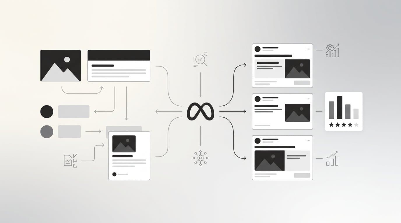
Carousel ads give advertisers something most formats cannot: multiple chances to tell a story, showcase products, and earn a click within a single placement. On Meta platforms, you can stack up to ten cards, each with its own image or video, headline, and link. That flexibility is powerful, but it also means there are more ways to get it wrong.
A poorly structured carousel loses people at card one. A well-built carousel pulls them deeper, builds desire, and converts. The difference usually comes down to intentional design choices, not production budget.
This guide covers ten carousel ad design tips built for performance marketers who want to move beyond basic templates and start building carousels that actually work. Whether you are running direct-to-consumer product ads, lead generation campaigns, or brand awareness plays, these strategies apply. Each tip focuses on a distinct element of carousel design, from visual flow and card sequencing to copy structure and testing. No fluff, no overlap. Just actionable guidance you can apply to your next campaign.
If you want to skip the manual design process entirely, tools like AdStellar let you generate carousel-ready creatives with AI, test every variation, and surface the winners automatically. But first, let us get into the fundamentals.
1. Lead With Your Strongest Card
The Challenge It Solves
Most carousel ads fail before they even get started. Card one is your first impression in a feed already packed with content competing for attention. If that first card does not stop the scroll, none of the other cards matter. The problem is that many advertisers treat card one like any other card in the sequence rather than the hook that determines whether anyone sees the rest.
The Strategy Explained
Think of card one as your ad's headline. It needs to earn the swipe. That means leading with your most visually striking creative, your boldest claim, or your most immediately relevant message. Ask yourself: if someone only saw this one card, would they understand why they should care? If the answer is no, you have not found your strongest card yet.
Strong first cards typically feature a single clear focal point, a high-contrast visual, and a message that speaks directly to a desire or problem your audience has right now. Avoid cluttered layouts, generic lifestyle imagery, or introductory text that just names your brand. Get to the point immediately.
Implementation Steps
1. Gather all the creative assets you plan to use across the carousel and rank them by visual impact and message clarity.
2. Identify the one card that communicates your core value proposition most directly and position it at card one.
3. Review the first card in isolation, without the context of the other cards, and confirm it works as a standalone hook.
4. Run a simple A/B test with two different first cards to validate your assumption with real audience data before committing to scale.
Pro Tips
Resist the temptation to use card one as a brand introduction. Viewers do not need to see your logo first. They need a reason to keep swiping. Save brand reinforcement for card two or three, once you have already earned their attention. Your strongest card is defined by your audience's response, not your personal preference, so let performance data make the final call.
2. Build Visual Continuity Across Cards
The Challenge It Solves
When each card in a carousel looks like it came from a different campaign, the result feels disjointed and unprofessional. Viewers pick up on visual inconsistency immediately, even if they cannot articulate why. That friction erodes trust, and eroded trust kills conversions. Many advertisers assemble carousels by pulling assets from different shoots or templates without considering how they flow together.
The Strategy Explained
Visual continuity means your carousel feels like one cohesive piece of communication, not a collection of individual ads stitched together. That requires consistent use of brand colors, typography, layout structure, and photography style across every card. When someone swipes from card two to card three, the transition should feel natural.
One effective technique is the panoramic or connected carousel approach, where the image bleeds across card edges to form a larger visual when viewed in sequence. This approach is particularly effective on Instagram, where the swipe mechanic makes the connected image feel almost interactive. It also gives viewers a clear reason to keep swiping because they want to see the full picture.
Implementation Steps
1. Define a visual system for your carousel before building any cards: choose a primary color palette, one or two typefaces, and a consistent layout grid.
2. Use the same photography style or illustration approach across all cards. Mixing studio product shots with lifestyle photography, for example, creates visual tension that works against you.
3. If using the panoramic technique, design the full-width image first, then crop individual cards from it, ensuring each card still works as a standalone visual.
4. Do a final review by quickly swiping through all cards to check whether the sequence feels smooth and intentional.
Pro Tips
Visual continuity does not mean every card looks identical. Variety within a consistent system is the goal. You can change the focal element on each card while keeping the color palette, font choice, and layout structure consistent. That balance between consistency and variety is what makes a carousel feel both professional and engaging throughout the full sequence.
3. Write Card-Level Headlines That Build Momentum
The Challenge It Solves
Copy is often an afterthought in carousel design. Advertisers spend hours on visuals and then write generic headlines that repeat the same message across every card. The result is a carousel that stalls. If card three says roughly the same thing as card one, there is no reason to keep swiping. Repetitive copy kills momentum and signals to the viewer that nothing new is coming.
The Strategy Explained
Each card headline should do two things simultaneously: stand on its own as a clear, compelling message, and advance the narrative from the previous card. Think of it like chapters in a short story. Card one introduces the hook. Card two develops the idea. Card three adds proof or detail. Card four moves toward resolution. The progression should feel intentional, not accidental.
A useful framework is the problem-agitation-solution structure applied across cards. Card one names the problem. Cards two and three agitate it by showing consequences or missed opportunities. Cards four and five introduce your solution. The final card closes with a clear CTA. This structure gives each headline a specific job and prevents the repetition trap.
Implementation Steps
1. Write out all your card headlines in a single document before designing anything, so you can see the full narrative arc.
2. Read the headlines in sequence and ask whether each one adds new information or advances the story. If two headlines say essentially the same thing, cut or rewrite one.
3. Test headline-only variations by keeping visuals constant and swapping headline copy to isolate the impact of your messaging.
4. Keep headlines short. Carousel headlines are often truncated on mobile, so front-load the most important words.
Pro Tips
Do not underestimate the description field below each headline. While it is less prominent, it gives you room to add specificity or a secondary message that reinforces the card's headline. Use it to add a benefit, a data point, or a clarifying detail that the headline cannot fit. Together, headline and description should make each card feel complete without being cluttered.
4. Map Each Card to a Specific Audience Pain Point
The Challenge It Solves
Generic carousels speak to everyone and resonate with no one. When every card carries a broad, aspirational message, the ad fails to create the personal recognition that drives action. Buyers have specific concerns, doubts, and desires. A carousel that addresses only one of them leaves conversion opportunities on the table.
The Strategy Explained
Carousels are uniquely suited for addressing multiple objections or desires within a single ad unit. Each card can be assigned to a specific pain point or buyer concern, creating a sequence that feels personally relevant to different viewers at different stages of their decision-making process.
For example, an e-commerce brand selling a premium product might use card one to address the desire for quality, card two to address price concerns by emphasizing value, card three to handle shipping or returns hesitation, and card four to provide social proof. Each card speaks to a real barrier that prevents a purchase, and together they cover the full objection landscape.
Implementation Steps
1. List the top five to seven objections or desires your target audience has before buying your product or service.
2. Assign one pain point or desire to each card, starting with the most universally relevant concern at card one.
3. Write the visual and headline for each card specifically around that assigned pain point, not around your product features in general.
4. Review the sequence from the perspective of a skeptical buyer and confirm that the carousel addresses their likely questions in a logical order.
Pro Tips
This approach works especially well for products with longer consideration cycles or higher price points, where buyers need more than one reason to act. If you are running retargeting campaigns, prioritize objection-handling cards toward the front of the sequence since those viewers already know your brand and need reassurance, not introduction.
5. Use Consistent but Varied Creative Formats
The Challenge It Solves
Sticking to the same format across every card can make a carousel feel flat and predictable. But mixing formats without a strategy creates visual chaos. The challenge is knowing when format variety adds energy to a carousel and when it undermines the cohesive experience you have worked to build.
The Strategy Explained
Mixing static images, short video clips, and text-forward cards can increase engagement when the format choices serve the message. A short product demo video works well in the middle of a carousel to break up static imagery and demonstrate something that a still image cannot. A text-forward card can function as a powerful contrast moment, drawing the eye after a sequence of image-heavy cards.
The key principle is that format should follow function. Use video when motion communicates something better than a static frame. Use text-forward cards when a statement is so strong it deserves to stand alone. Use static imagery when the visual itself is the message. Never mix formats just for variety's sake.
Implementation Steps
1. Identify the one or two cards in your sequence where the message would be more effectively communicated through a different format than the rest.
2. Keep video clips short, ideally under five seconds, so they loop cleanly within the carousel swipe experience.
3. If using text-forward cards, maintain the same color palette and typography as your image cards to preserve visual continuity.
4. Preview the full carousel on a mobile device before launching to confirm that format transitions feel intentional rather than jarring.
Pro Tips
For brand awareness campaigns, format consistency tends to perform better because the goal is brand recognition and memorability. For direct response campaigns, strategic format variety can create pattern interrupts that re-engage viewers who might otherwise swipe past. Match your format strategy to your campaign objective rather than applying one approach universally.
6. Design for Mobile First, Every Time
The Challenge It Solves
The majority of Meta ad impressions are delivered on mobile devices. Designing carousel cards on a large desktop monitor and then checking mobile as an afterthought is one of the most common and costly mistakes in ad creative production. Elements that look balanced on a 27-inch screen often become illegible, cropped, or visually overwhelming on a 6-inch phone display.
The Strategy Explained
Mobile-first design means making every decision, from image composition to font size to button placement, with a mobile screen as your primary canvas. For Meta carousels, the recommended square format is 1080 x 1080 pixels, which displays consistently across both mobile and desktop placements. Portrait formats at 1080 x 1350 pixels take up even more mobile screen real estate and can drive stronger engagement in mobile-dominant placements.
Safe zones matter here. Keep all critical text and visual elements away from the edges of the card, where they risk being cropped or obscured by the UI. On mobile, the card edges are also where thumbs naturally rest during swiping, which can visually interfere with elements placed too close to the border.
Implementation Steps
1. Set your design canvas to 1080 x 1080 pixels as the default starting point for all carousel cards.
2. Define a safe zone by keeping all text and primary visual elements within the central 80% of the card area.
3. Test font legibility at actual mobile scale before finalizing. If you cannot read the text comfortably on a phone screen, it is too small.
4. Preview every carousel in Meta's Ad Preview tool on a mobile placement before publishing, not just on desktop.
Pro Tips
Avoid placing your most important message in the lower portion of the card. On mobile, the card headline and CTA button appear below the image, which means the lower section of your image creative is often the least visible area during the initial scroll. Anchor your key visual message in the upper or center portion of the card to maximize its impact before the viewer's eye moves to the text below.
7. End With a Card That Closes the Deal
The Challenge It Solves
Many carousels simply stop. The last card is just another product image or feature highlight with no clear next step. Viewers who have swiped through to the end are your most engaged audience, and failing to give them a specific, compelling reason to act is a missed conversion opportunity. The final card is your closing argument, and it needs to be treated that way.
The Strategy Explained
A dedicated closing card should have one job: move the viewer to take action. That means a clear, direct call to action, a strong value statement that reinforces why acting now makes sense, and a visual design that signals this is the conclusion of the sequence. Think of it as the equivalent of a direct response landing page compressed into a single card.
The closing card is not the place for new information or additional product features. Everything the viewer needs to make a decision should already be established by the preceding cards. Card ten's job is to consolidate that decision and direct the click.
Implementation Steps
1. Design a dedicated closing card that is visually distinct from the content cards, using a stronger color contrast or a bold CTA treatment to signal a shift in purpose.
2. Write a CTA that is specific and action-oriented. "Shop the Collection," "Get Your Free Quote," or "Start Your Trial" outperform generic phrases like "Learn More" or "Click Here."
3. Include a brief reinforcing statement beneath the CTA that addresses the viewer's final hesitation, such as a guarantee, a free shipping note, or a limited-time offer.
4. Ensure the destination URL linked to the closing card leads directly to the most relevant landing page, not your homepage.
Pro Tips
Consider using the closing card's link destination to send viewers to a page that mirrors the carousel's narrative. If your carousel walked through five product benefits, the landing page should lead with those same benefits in the same order. Consistency between ad and landing page reduces friction and keeps the conversion momentum you built across the carousel intact.
8. Test Card Order Systematically
The Challenge It Solves
Sequence is one of the most underestimated variables in carousel performance. Two carousels with identical cards but different ordering can produce meaningfully different results. Most advertisers set a card order based on intuition and never revisit it. That means they are leaving performance improvements undiscovered simply because they did not test the sequence.
The Strategy Explained
Card order testing works by keeping all card content constant while systematically changing the sequence to identify which arrangement drives the best engagement and conversion outcomes. This is different from testing individual card content. You are not changing what each card says. You are testing the order in which the story is told.
Meta Ads Manager provides card-level metrics including impressions per card and click-through rates, which allow you to identify where viewers are dropping off in the sequence and which cards are generating the most clicks. This data is your map for optimization.
Implementation Steps
1. Start with your current best-guess card order as the control variation.
2. Create one or two test variations that move your highest-engagement card to a different position, such as placing your social proof card earlier in the sequence.
3. Run all variations simultaneously with equal budget allocation to ensure comparable data across the same time period.
4. After collecting sufficient data, review card-level metrics to identify which sequence produces the lowest drop-off rate and highest conversion rate.
5. Implement the winning order as your new control and continue iterating from there.
Pro Tips
Avoid testing too many variables at once. If you change card order and card content simultaneously, you cannot isolate which change drove the performance difference. Discipline in your testing structure is what makes the data actionable. Tools like AdStellar's Bulk Ad Launch feature can help you generate and manage multiple carousel variations efficiently, so you spend less time on setup and more time reading results.
9. Keep Text Minimal and Purposeful on Every Card
The Challenge It Solves
Text-heavy carousel cards are one of the most reliable ways to undermine an otherwise strong creative. When a card is covered in copy, it signals low production quality, creates visual overwhelm, and competes with itself. Viewers are swiping through a feed quickly. If processing a single card requires effort, they will not bother.
The Strategy Explained
The principle here is that your visual should carry the primary message and your text should support it, not repeat it. If the image shows a product and the headline says "Our Best-Selling Product," the text is redundant. Instead, the image shows the product and the headline delivers a benefit or a reason to care that the image alone cannot communicate.
Meta has long signaled a preference for ad creatives with minimal text overlay on the image itself. While the formal percentage rule was retired, the underlying principle remains: excessive text on a creative asset tends to reduce delivery efficiency and audience reach. Keep any text overlaid directly on your card image to a minimum, and rely on the headline and description fields below the card for your supporting copy.
Implementation Steps
1. Audit your current carousel cards and identify any card where text overlay covers more than a small portion of the image area.
2. Move supporting copy from the image overlay into the headline and description fields, which are designed for text and display cleanly across all devices.
3. Apply a visual hierarchy to each card: one dominant visual element, one primary text element, and nothing competing for equal attention.
4. If text on the image is essential for your concept, use high contrast, a clean background behind the text, and a font size that is legible at mobile scale without crowding the visual.
Pro Tips
When you feel the urge to add more text to a card, it is usually a signal that the visual is not doing enough work. Instead of adding copy, revisit the image or video itself and ask whether a stronger visual could communicate the same idea without words. In most cases, a better creative is the answer, not more text. This is where AI creative tools that generate multiple visual concepts quickly can save significant time and produce better outcomes than adding copy patches to weak visuals.
10. Use Performance Data to Rebuild and Scale Winners
The Challenge It Solves
Building a great carousel is not a one-time event. The advertisers who consistently outperform their benchmarks are the ones who treat every carousel as a learning opportunity and use the data it generates to build the next, better version. Without a systematic approach to reading and acting on performance data, even a strong carousel eventually fatigues and you have no clear path to what comes next.
The Strategy Explained
Meta Ads Manager provides card-level data that most advertisers never look at. By reviewing metrics at the individual card level, including impressions, click-through rates, and engagement by card position, you can identify exactly which cards are earning attention and which are causing viewers to drop off or disengage. That granular insight is far more useful than campaign-level data alone.
The process is straightforward: identify your top-performing cards, understand why they are working, and rebuild the next carousel around those insights. Replace underperforming cards with new variations that address the same message in a different way. Over time, this iterative approach compounds into a creative library of proven elements that you can recombine and scale.
Implementation Steps
1. After each carousel campaign, pull card-level data from Meta Ads Manager and identify the top two or three cards by click-through rate and engagement.
2. Identify the bottom two or three cards by the same metrics and flag them for replacement or significant revision.
3. Build the next carousel iteration by keeping your proven top cards, replacing underperformers, and testing new variations of the middle cards.
4. Document your findings in a creative performance log so patterns become visible over multiple campaigns, not just individual tests.
Pro Tips
This process is where AI-powered tools create a significant advantage. AdStellar's AI Insights feature ranks your creatives, headlines, and audiences by real performance metrics including ROAS, CPA, and CTR, scored against your specific goals. The Winners Hub surfaces your best-performing elements in one place so you can select a proven winner and instantly add it to your next campaign. Instead of manually digging through Ads Manager data and rebuilding from scratch, you have a clear, data-driven starting point for every new carousel you build.
Putting It All Together
Ten tips, one through-line: every design decision in a carousel ad should serve the viewer's experience and your conversion goal. Lead with a hook that earns the swipe, build visual and narrative continuity across cards, address real objections, close with a clear CTA, and let performance data guide every iteration.
You do not need to implement all ten strategies simultaneously. Start by auditing your current carousels against this list and identify the two or three areas with the most obvious gaps. Fix those first, measure the impact, and then layer in additional improvements. That incremental approach produces cleaner data and more sustainable performance gains than overhauling everything at once.
If you want to accelerate the process, AdStellar handles the heavy lifting. The AI Ad Creative feature generates carousel-ready image ads, video ads, and UGC-style creatives from a product URL, with no designers or video editors required. The AI Campaign Builder analyzes your past campaigns and builds complete Meta ad campaigns in minutes, ranking every creative and audience by performance. Bulk Ad Launch creates hundreds of carousel variations and sends them to Meta in clicks, not hours. And the Winners Hub keeps your best-performing cards ready to deploy into the next campaign the moment you need them.
The best carousel ads feel effortless to the viewer. Behind that effortlessness is a deliberate structure, a clear narrative, and a disciplined testing process. Use these strategies to build carousels that earn every swipe, and use the right tools to do it faster. Start Free Trial With AdStellar and be among the first to launch and scale your ad campaigns faster with an intelligent platform that automatically builds and tests winning ads based on real performance data.