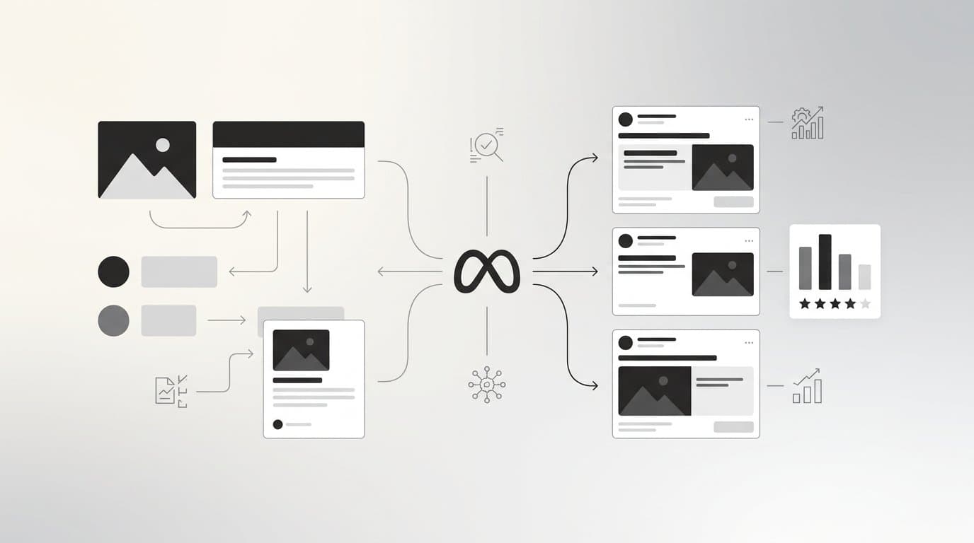
Carousel ads are one of the most versatile formats available on Meta. Instead of a single static image or video, you get multiple cards, each with its own image, headline, and link. That flexibility is powerful, but it also means there are many ways to get it wrong.
Most advertisers treat carousel ads like a slideshow, uploading a few product photos and calling it a day. The brands seeing real returns think about carousels differently. They treat each card as a deliberate step in a story, a funnel, or a showcase with a clear purpose behind every swipe.
This guide breaks down eight carousel ad strategies with real-world context for how each approach works, what makes it effective, and how to implement it in your own campaigns. Whether you are running e-commerce, lead generation, or brand awareness campaigns on Meta, at least a few of these approaches will apply directly to your situation. The goal is not just to inspire you with pretty examples but to give you a repeatable framework you can build on.
1. The Sequential Story Arc
The Challenge It Solves
Most ads demand attention without earning it. A single static image has one shot to hook someone mid-scroll. The sequential story arc solves this by spreading your message across multiple cards, giving you room to build tension, create curiosity, and earn the swipe rather than just asking for a click.
The Strategy Explained
Structure each carousel card as a chapter in a narrative. Card one is your hook. It should stop the scroll with a provocative question, a bold visual, or a relatable pain point. The middle cards build context, introduce your solution, and add supporting detail. The final card delivers your CTA to an audience that has already invested time in your story.
This format works because it mirrors how good direct response copy is structured. You create a problem, amplify it, then resolve it. The swipe behavior on mobile makes this feel natural rather than forced, especially when each card visually connects to the next.
Implementation Steps
1. Write your narrative as a short script before designing anything. Identify the hook, the tension, and the resolution.
2. Design card one around the hook with minimal text and a high-contrast visual that demands attention.
3. Use cards two and three to expand on the problem or introduce your product's context.
4. Reserve the final card exclusively for your CTA with a clear, single action you want the viewer to take.
Pro Tips
Keep visual continuity across all cards with a consistent color palette and typography. When the cards feel like they belong together, audiences are more likely to swipe through to the end. Treat card one like the subject line of an email. If it does not create curiosity, the rest of the story goes unread. Strong ad creative starts with the hook, not the headline.
2. The Multi-Product Showcase
The Challenge It Solves
When you have a catalog and an audience that does not yet know which product is right for them, a single-product ad forces you to guess. The multi-product showcase lets the audience self-select, showing multiple options in a single ad unit so discovery happens naturally within the swipe.
The Strategy Explained
Feature multiple products across cards with consistent visual framing and a unique value proposition on each card. The key word is consistent. Each card should feel like it belongs to the same family, same background style, same typography, same framing, even though the product changes. This consistency signals quality and intentionality.
This format works especially well for e-commerce brands targeting audiences in the discovery phase. Rather than committing to one product, you let the carousel act as a mini storefront. Each card links directly to that product's page, so the path from interest to purchase is as short as possible.
Implementation Steps
1. Select three to six products that represent different price points, use cases, or audience segments.
2. Shoot or generate product visuals with a consistent background, lighting, and framing style across all cards.
3. Write a single-sentence value proposition for each product that speaks to its specific benefit, not just its name.
4. Link each card directly to that product's landing page rather than a generic homepage or collection page.
Pro Tips
Put your best-selling or most visually striking product on card one. Audiences who swipe further are already engaged, so card one needs to earn that initial interest. Tools like AdStellar's Bulk Ad Launch let you generate multiple card variations quickly, mixing different products and headlines so you can test which combinations drive the most swipe-throughs and conversions.
3. The Before-and-After Reveal
The Challenge It Solves
Abstract benefit claims are easy to ignore. Saying your product "transforms results" means nothing without contrast. The before-and-after format makes transformation concrete and visual, giving audiences something tangible to compare rather than a promise they have heard before.
The Strategy Explained
Use early cards to establish a relatable problem or starting point. Show the messy desk, the cluttered spreadsheet, the underperforming ad account, or whatever starting state your audience recognizes. Then reveal the transformation in later cards. The contrast between the two states does the persuasion work for you.
This format is widely recognized in conversion copywriting as one of the most effective ways to communicate value because it taps into a fundamental human interest in change and improvement. It is applicable across far more industries than the obvious ones. SaaS tools, productivity apps, marketing platforms, and service businesses can all use this structure effectively.
Implementation Steps
1. Identify the specific "before" state your audience is living in right now, and make it as relatable as possible.
2. Design the before cards with visual cues that signal struggle: cluttered layouts, red metrics, or chaotic workflows.
3. Design the after cards with clean, aspirational visuals that contrast sharply with the before state.
4. Add a brief caption on each card that narrates the transformation without over-explaining it.
Pro Tips
The before state should feel slightly uncomfortable for your audience. If they do not recognize themselves in it, the contrast will not land. Pair this format with strong ad copy that speaks directly to the emotional shift between the two states, not just the functional difference.
4. The Feature Breakdown
The Challenge It Solves
Buyers of higher-consideration products need information before they commit. Cramming every feature into a single ad creates noise. The feature breakdown carousel solves this by giving each key capability its own card, paired with the specific pain point it addresses, so the education feels focused rather than overwhelming.
The Strategy Explained
Dedicate one card to each key product feature, and pair it with the specific problem that feature solves. This is not a feature list. It is a problem-solution pairing repeated across cards. Each card should answer the question: "What does this do for me?" not "What does this do?"
This format works particularly well for SaaS products, apps, and higher-ticket items where the purchase decision involves research and comparison. It meets prospects at the consideration stage with the information they are already looking for, rather than pushing them toward a CTA before they are ready.
Implementation Steps
1. List your product's top five to seven features and translate each one into a customer-facing benefit statement.
2. Design each card around one feature with a simple visual that illustrates the benefit, not just the feature itself.
3. Write a short headline for each card that leads with the pain point, then introduces the solution.
4. Use the final card as a summary CTA that references the features covered and invites the next step.
Pro Tips
Order your cards by the pain points your audience cares about most, not by the features you are most proud of. If you are unsure which pain points resonate most, your ad insights from previous campaigns will tell you which messaging has driven the most engagement. Let the data guide the card order.
5. The Social Proof Stack
The Challenge It Solves
Trust is the single biggest barrier between a warm prospect and a conversion. A single testimonial is easy to dismiss. A carousel that stacks multiple forms of social proof, testimonials, reviews, results, and user-generated content, creates a cumulative credibility effect that is much harder to ignore.
The Strategy Explained
Build trust by stacking testimonials, reviews, or results across carousel cards. The key is variety. Mix text-based quote cards with visual proof elements like screenshots, star ratings, or real user photos. This variety keeps the carousel from feeling repetitive while the consistent theme of social proof reinforces credibility through repetition.
Social proof is one of the core persuasion principles documented in behavioral psychology. When people see that others have already made a decision and benefited from it, the perceived risk of making the same decision drops significantly. The carousel format amplifies this by presenting multiple proof points in sequence rather than a single isolated testimonial.
Implementation Steps
1. Gather your strongest testimonials, reviews, and results. Prioritize specificity over enthusiasm. Specific results are more credible than generic praise.
2. Alternate between quote-based cards and visual proof cards to maintain visual variety across the carousel.
3. Design each card with the reviewer's name, role, or context visible. Anonymous testimonials carry less weight.
4. Close with a CTA card that connects the social proof to a clear next step, such as a free trial or demo request.
Pro Tips
If you have access to user-generated content, prioritize it over polished studio testimonials. Authentic-looking proof often outperforms highly produced versions because it feels less like advertising. AdStellar's AI Ad Creative tools can help you generate UGC-style avatar content that captures this authentic quality without requiring real actors or a production budget.
6. The Step-by-Step Tutorial
The Challenge It Solves
Audiences are skeptical of ads that only sell. Tutorial-style content shifts the dynamic by leading with value first. When someone learns something useful from your carousel, they associate your brand with expertise rather than interruption, which makes the eventual CTA feel like a natural next step rather than a pitch.
The Strategy Explained
Number each card as a step in a how-to process related to your product's use case. This positions your brand as an authority, rewards curious swipe behavior, and creates natural opportunities to reference your product within the instructional flow. The tutorial does not need to be exhaustive. It needs to be genuinely useful within the constraints of a few cards.
Think of it like a mini content piece delivered in ad format. The audience gets real value from the swipe, and your product appears as the tool that makes the process easier or faster. This is a recognized content marketing principle applied to a paid format, and it works because it changes the audience's relationship with the ad from passive viewer to active learner.
Implementation Steps
1. Choose a process your target audience genuinely wants to understand, ideally one where your product plays a natural role.
2. Break the process into three to six discrete steps, each of which can be explained in a single card.
3. Number each card visually so the sequence is immediately clear, and keep the copy on each card focused on one action.
4. On the final card, introduce your product as the tool that makes the entire process faster or more effective, then include your CTA.
Pro Tips
The tutorial topic should be closely aligned with a problem your product solves, but the tutorial itself should stand on its own as useful content. If the steps only make sense when using your product, it reads as a sales pitch. If the steps are genuinely helpful and your product appears as an accelerant, it reads as authority. For more on building authority through paid content, explore what is performance marketing and how educational formats fit within a broader funnel strategy.
7. The Comparison Card Strategy
The Challenge It Solves
Prospects evaluating your product are almost certainly comparing it to alternatives. Ignoring that reality in your ads means letting the comparison happen without your input. The comparison card strategy lets you shape that evaluation on your terms, positioning your offer as the obvious choice without requiring you to attack competitors directly.
The Strategy Explained
Use carousel cards to contrast your offer against common alternatives or the status quo. The most effective version of this format is not "us versus them" but "the old way versus the better way." Frame the comparison around the problem your audience is trying to solve and show how different approaches stack up against each other, with your product naturally coming out ahead.
Comparison-based advertising is a long-standing direct response technique. The carousel format is particularly well-suited for it because you can dedicate individual cards to each comparison point rather than cramming everything into a single cluttered graphic. Each card makes one clear argument, and the cumulative effect is a compelling case for your product.
Implementation Steps
1. Identify the two or three most common alternatives your audience considers, including doing nothing or using a manual process.
2. Build one card per comparison point, framing each as a contrast between the limitation of the alternative and the advantage of your approach.
3. Use consistent visual design across comparison cards so the format feels structured and credible rather than reactive.
4. Avoid naming specific competitors. Focus on categories of alternatives or the "status quo" approach to keep the framing constructive.
Pro Tips
The comparison works best when it speaks to frustrations your audience already has with current solutions. If you are unsure what those frustrations are, look at your ad insights and customer feedback to identify the language your audience uses to describe what they are trying to move away from. That language belongs in your comparison cards.
8. The Retargeting Carousel
The Challenge It Solves
Warm audiences are close to converting but need a different message than cold traffic. Generic retargeting ads that show the same creative someone already ignored are a missed opportunity. The retargeting carousel solves this by combining familiarity with fresh context, showing people products they have already shown interest in alongside complementary items and urgency-driven copy.
The Strategy Explained
Show warm audiences products they have already viewed alongside complementary items, paired with urgency-driven copy. This strategy leverages existing brand familiarity. The audience already knows who you are. Your job is to give them a reason to act now rather than later.
The carousel format is ideal for retargeting because it allows you to present multiple products or offer angles in a single ad unit. Someone who viewed one product might convert on a complementary one. Someone who dismissed a full-price offer might respond to a bundle or a limited-time incentive. The carousel gives you multiple chances to find the right trigger.
Implementation Steps
1. Segment your warm audience by behavior: product page viewers, add-to-cart abandoners, and past purchasers each deserve different card sequences.
2. Lead with the product or category the audience has already viewed, then follow with complementary or related items on subsequent cards.
3. Add urgency-driven copy that is specific rather than generic. "Only a few left" is stronger than "Limited time offer" when it is accurate.
4. Test a dedicated final card with a stronger incentive, such as a discount code or free shipping offer, reserved for your highest-intent audience segments.
Pro Tips
Retargeting carousels benefit enormously from dynamic creative capabilities. Rather than manually building a separate carousel for every audience segment, tools like AdStellar's AI Campaign Builder can analyze your past campaign data, rank your creatives and audiences by performance, and build targeted campaigns that match the right cards to the right audience automatically. Pair this with dynamic creative optimization principles to keep your retargeting fresh and relevant as audiences move through the funnel.
Your Implementation Roadmap
Eight strategies might feel like a lot to take in at once, so the most practical thing you can do is narrow your focus based on where your audience currently sits in the funnel.
Cold traffic benefits most from story arcs, feature breakdowns, and social proof stacks. These formats educate, build trust, and create the familiarity that makes later conversion possible. Warm and retargeting audiences respond better to product showcases and urgency-driven retargeting carousels, where the goal is to convert intent that already exists rather than build it from scratch.
Start by picking the format that aligns with your current campaign objective. Build a focused set of cards around that strategy and track swipe-through rate alongside your conversion metrics. Swipe-through rate tells you whether the carousel is earning engagement. Conversion metrics tell you whether that engagement is translating into results. You need both data points to understand what is actually working.
Once you identify which approach resonates with your audience, scale it and layer in additional formats. A sequential story arc that works for cold traffic can be paired with a retargeting carousel for warm audiences, creating a cohesive multi-touchpoint experience across the funnel.
The creative production side of carousel testing used to be the bottleneck. Generating multiple card variations, testing different headlines and visuals, and identifying your top performers across combinations took significant time and resources. AdStellar changes that equation. With AI-powered creative generation, bulk ad launch capabilities, and a Winners Hub that surfaces your top-performing creatives, headlines, and audiences in one place, you can run carousel tests at a scale that was previously only accessible to large teams with large budgets.
If you are ready to move beyond manual carousel building and start testing at scale, Start Free Trial With AdStellar and see how AI-powered creative generation can accelerate your carousel testing and help you find your winners faster.