A Meta campaign can look polished in review and still miss in market. The edit is clean, the headline reads well, and the CTA makes sense. Then spend ramps, click-through stays weak, and the account never finds efficient scale.
That usually happens because the review process judged the ad as a finished asset, while Meta now rewards creative systems that generate fresh angles, fast feedback, and clear performance signals. Broad targeting can still work, but only when the creative gives the algorithm enough variation to find traction across placements, audiences, and intent levels.
Creative now does more than support targeting. It carries the load. A weak concept gets exposed quickly, and a strong one can outperform a carefully segmented setup that relies on audience slicing to compensate for average messaging.
The practical shift is straightforward. Teams need classic fundamentals, strong hooks, clear value props, mobile-native formats, believable UGC, and direct CTAs. They also need a modern testing workflow that can turn one offer into multiple creative hypotheses without slowing production. That is where AI-assisted tools such as AdStellar AI fit. They help teams move from one-off ad making to structured iteration, where strategy, variant generation, and optimization stay connected.
The sections that follow focus on the part that still decides performance in most accounts: the ad itself.
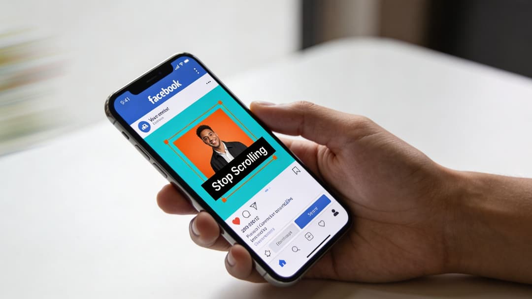
1. Hook Viewers in the First 3 Seconds
Your ad enters the feed between a friend’s photo, a Reel, and a message notification. If the opening does not make immediate sense, the scroll wins.
That is why the first three seconds carry more weight than the rest of the edit. I regularly see solid offers underperform because the ad spends its opening on a logo sting, a slow pan, or setup that belongs in a longer brand video. Meta rewards creative that communicates fast. The viewer should understand the problem, the payoff, or the product use case before their thumb moves again.
Build hooks before you build full ads
Treat the hook as a separate asset, not a detail inside the final edit. One offer should produce several opening concepts that all feed into the same body creative. That gives you a cleaner read on what stopped the scroll.
A practical hook set usually includes:
- Problem-first open: Name the frustration in plain language.
- Immediate outcome: Show the result before the explanation.
- Fast on-screen text: Make the point clear with sound off.
- Visible motion: Product handling, a face to camera, or an in-use moment usually beats a static first frame.
This matters even more if you are trying to scale creative testing without turning production into a bottleneck. Tools such as AdStellar AI help teams generate multiple hook directions from one core angle, then turn the winners into broader creative variants. That is the useful AI application here. It speeds up iteration without replacing judgment.
Most bad Facebook videos aren’t bad all the way through. They’re bad at the start.
There is a trade-off. UGC-style hooks often earn attention faster because they feel native in feed, but polished brand creative can still work if the first frame gets to the point. The mistake is assuming production quality creates stopping power on its own.
A simple review standard helps. Watch the ad once on mute. If the value proposition is still fuzzy after a quick glance, the hook needs work. Cut setup, bring the product forward, or rewrite the opener so the promise lands earlier.
If your team is also refining the message attached to each opening angle, this guide to mastering Facebook ad copy for higher conversions gives a useful framework for pairing hook concepts with stronger copy variants.
Later in the creative review process, use a simple reference to calibrate tone and pacing.
2. Test Copy Variations with Different Value Propositions
A lot of advertisers think they’re testing creative when they’re really just testing visuals. The image changes, the video changes, maybe the thumbnail changes, but the copy says the same thing every time. That leaves a huge amount of demand undiscovered.
The same product can win with very different messages. Slack can be framed as a productivity tool, a collaboration layer, or a way to reduce communication chaos. Glossier can lean into self-expression or product efficacy. Peloton can sell results, consistency, or community. Different buyers latch onto different reasons.
Match the message to the moment
Cold traffic usually needs the sharpest benefit. Warm audiences often respond better to proof, reassurance, or urgency. If you use one generic line across every stage, you flatten performance.
A simple copy matrix helps:
- Convenience angle: Faster, easier, less effort
- Economic angle: Better value, lower waste, stronger efficiency
- Identity angle: Who the buyer becomes after using it
- Social proof angle: Why other people trust it
- Urgency angle: Why now matters
Copy testing works best when you change one thing at a time. If you rewrite the headline, body text, CTA, and visual all at once, you won’t know what moved performance. Teams that want cleaner testing often benefit from a structured guide to mastering Facebook ad copy for higher conversions.
Practical rule: Test different promises before you test tiny wording changes.
This matters even more now because Meta rewards strong engagement signals. If your copy creates clearer relevance, the algorithm gets better feedback. The common mistake is over-refining audiences while under-testing value props. In practice, the better move is usually the reverse. Build multiple angles around the same offer, launch them into a broad audience, and let the platform learn from the response.
What doesn’t work is copy that tries to say everything. The best performing ads usually communicate one idea cleanly. If your brand has six benefits, pick the one most likely to get the click and let the landing page carry the rest.
3. Use Authentic User-Generated Content UGC
A polished studio ad can look great in a review meeting and still lose in the feed. A founder clip shot on an iPhone, a customer unboxing at the kitchen table, or a simple product demo filmed in natural light often gets the thumb stop because it matches how people already consume content on Facebook and Instagram.

What strong UGC actually looks like
Good UGC still needs craft. The creator should surface a real problem fast, show the product in use, and close with a specific outcome that sounds believable in the creator’s own voice. The difference is tone, not discipline.
The trade-off is straightforward. Raw footage can feel trustworthy but under-explain the product. Brand-safe scripting can improve clarity but strip out the reason people believed the creator in the first place. The best middle ground is a loose framework: one pain point, one use case, one proof moment, one CTA.
Teams without a deep creator roster can still build this format. A practical starting point is learning how to create UGC-style ads without creators, then turning support calls, review emails, founder walkthroughs, and post-purchase questions into scripts that sound like real customer language.
UGC gets more useful when the asset library is built for testing, not just posting. One creator might sell the emotional payoff. Another might explain the product better. A third might win with a stronger opening line. AI helps sort those differences faster. Tools and workflows covered in mastering Facebook ads artificial intelligence for smarter campaigns can help teams tag themes, compare hooks, and scale new variations without losing the original voice that made the ad work.
That matters if you are managing volume across multiple offers, audiences, or product lines. Creative strategy still sets the direction. AI shortens the path from a promising testimonial to ten testable variants built around different objections, price sensitivities, or usage scenarios.
The common mistake is fake UGC. Over-scripted reads, forced enthusiasm, and creator copy that sounds like legal review kill trust fast. If the ad feels manufactured, performance usually follows.
Keep one standard in place. Every UGC ad should answer a simple question: would this still sound credible if a customer sent it to a friend? If the answer is no, revise the script, shorten the claim, or pick a different spokesperson.
Teams comparing production workflows or testing stacks often review the top PPC platforms for 2026 alongside their creative process, especially when they need a faster path from raw customer footage to structured campaign testing.
4. Leverage Data-Driven Creative Optimization Based on Historical Performance
A campaign scales for three days, then CPA drifts up and nobody can explain why the new ads lost to an older, less polished asset. That usually means the account is producing creative, but not storing usable learning.
Historical performance is not a museum of old ads. It is working input for the next brief. If winning ads keep relying on founder-led openings, demo-first visuals, testimonial proof, or price framing, treat those patterns as starting constraints. Creative judgment still matters, but it should start from evidence.
The problem inside many Meta accounts is operational, not strategic. Naming is messy. Concepts are not tagged. Teams remember the winner but forget why it won, where it won, and which audience saw it first. Six weeks later, the same angle gets rebuilt from scratch.
A better process is simple and repeatable:
- Pull performance with the asset: Save the ad, primary text, headline, hook, offer, audience, placement, and post-click result in one record.
- Tag for patterns that matter: Mark each asset by hook type, proof device, creator style, product angle, funnel stage, and format.
- Review winners against near-winners: The useful insight is often in the gap between a clear winner and the ad that almost worked.
- Write new briefs from proven ingredients: Ask for three new concepts built on known patterns, not ten random ideas.
AI helps, not by replacing creative strategy, but by reducing the manual work required to spot repeatable patterns across dozens or hundreds of ads. Teams using AdStellar AI or similar workflows can group assets by hook, message, and visual structure much faster, then turn those findings into new test batches without losing the original strategic intent. The workflow outlined in mastering Facebook ads artificial intelligence for smarter campaigns is useful if you want to connect Meta performance history to a cleaner creative testing system.
One practical trade-off matters here. If you optimize too narrowly around past winners, creative gets stale and the account starts repeating itself. If you ignore past winners, testing becomes expensive guesswork. The right balance is usually 70 to 80 percent iteration on proven patterns and 20 to 30 percent exploration around new hooks, offers, or visual treatments. You do not need a new idea every time. You need a better version of an idea that already showed signal.
Placement history matters too. An ad that wins in Reels may lose in Feed because pacing, framing, and text treatment work differently by surface. Creative analysis gets sharper when teams track performance by placement before they request variants. If your team is building more vertical assets from those learnings, the Instagram Story specs for 2026 guide is a practical reference for format decisions that affect production quality.
There is also a bigger media buying shift behind this. As noted earlier, Meta now does more of the targeting work inside broader audience setups, which puts more pressure on creative quality and creative fit. That makes historical pattern recognition more valuable, not less.
One adjacent planning question is channel allocation. Teams comparing Meta against a broader paid media stack often review the top PPC platforms for 2026. Inside Meta, though, the account that documents creative learning clearly usually compounds results faster than the account that just keeps launching new ads.
5. Optimize for Mobile-First Design and Vertical Video Formats
A strong concept can still lose the moment it hits a phone screen. The usual failure pattern is familiar. The product looks sharp in a desktop preview, the copy reads fine in a deck, and the edit feels polished. Then Meta serves it in Reels or Stories, the text gets crowded by interface elements, the opening shot feels slow, and the message never lands.
Mobile constraints shape creative performance more than many teams want to admit. People scroll fast, hold the phone at arm’s length, and often watch without sound. Creative has to earn attention under those conditions, not under ideal review conditions inside Ads Manager.

Design for thumb-speed viewing
Vertical 9:16 should be the starting point for net-new video. It fills the screen, feels native in Stories and Reels, and gives the offer more visual real estate without asking the viewer to work for it.
That does not mean every asset needs the same treatment. Feed placements can still perform with 4:5, especially for product-led creative or statics with strong composition. The practical rule is simple. Build for full-screen attention first, then adapt only when a placement clearly justifies it. Teams using AI-assisted workflows like AdStellar AI can speed this up by generating placement-ready variants from one approved concept instead of sending designers back for manual resize work every round.
A few production rules consistently prevent waste:
- Make text readable at a glance: If the main promise needs effort to read, simplify it or enlarge it.
- Keep key elements inside safe zones: Leave room at the top and bottom so platform UI does not cover the headline, product, or CTA.
- Show the product or outcome early: Mobile viewers rarely wait for a slow reveal.
- Use captions with intent: Include them when voiceover carries meaning. Skip them when they crowd the frame.
- Cut faster than you would for desktop video: Dead space feels longer on a phone.
The trade-off is creative density. Teams often try to fit every claim, badge, and proof point into one vertical frame because mobile space feels limited. That usually hurts performance. One clear idea per asset beats a cramped ad that tries to handle awareness, objection handling, and conversion in the same 15 seconds.
This is also where planning intersects with testing. If you are tailoring mobile creative by funnel stage or customer intent, these audience segmentation strategies for scaling growth help align format choices with who is seeing the ad and why.
If you also run Instagram placements aggressively, this guide to Instagram Story specs for 2026 helps keep creative usable across placements without rebuilding everything from scratch.
Mobile-first design is not about copying TikTok style on every ad. It is about making sure the creative reads fast, looks native, and survives the realities of how Meta inventory is consumed.
6. Implement Audience-Specific Creative Testing Segmentation Strategy
A campaign can be built correctly and still stall because the same ad is trying to persuade three different audiences at once. The cold prospect needs a reason to care. The site visitor who bounced needs proof or clarification. The repeat buyer needs a new angle entirely. One message rarely carries all three.
Broad targeting still works on Meta. Generic creative still underperforms.
The better approach is to segment creative by buying context first, then test message variations inside each audience bucket. In practice, that usually means building around cold, warm, and hot intent groups, then matching each group to a different job the ad needs to do.
- Cold audiences: Lead with the problem, the use case, or the payoff. Clarity matters more than detail.
- Warm audiences: Add proof. Use reviews, comparisons, before-and-after outcomes, or objection handling.
- Hot audiences: Reduce friction. Focus on urgency, trust, product fit, shipping, returns, or a timely reminder.
Creative operations often break down. Teams spend weeks refining interests, lookalikes, and exclusions, then run one or two tired ads across all of them. Meta can find pockets of demand, but it still needs the right message to convert that demand efficiently.
A stronger setup uses fewer audience buckets and more creative angles inside each bucket. That gives the algorithm room to find buyers while giving the ad a better chance of matching intent. If you need a planning model, these audience segmentation strategies for scaling growth map cleanly to campaign structure.
AI helps here if you use it with discipline. Tools like AdStellar AI can speed up versioning by turning one core concept into multiple hooks, proof frames, and CTA combinations for different audience states. The trade-off is quality control. Faster production is useful only if the variants reflect real differences in motivation, not cosmetic rewrites of the same ad.
One practical check is to review the click destination alongside the ad. If the creative speaks to a specific audience need, the landing experience should carry that same thread. Ecommerce teams that want to optimize product pages with image text can use that same principle to keep ad promise and page message aligned.
Segment for intent first. Age, gender, and interests matter less than whether the person needs education, reassurance, or a reason to act now.
7. Use Clear, Benefit-Driven Calls-to-Action CTAs
A prospect watches 12 seconds of your video, reads the headline, nods along, then stalls at the button. That drop-off usually is not a targeting problem. It is a CTA problem.
Clear CTAs do two jobs. They tell people what to do next, and they make the next step feel worth the click. Generic prompts like “Learn More” can work, but they often leave too much ambiguity, especially if the offer asks for time, money, or contact details.
The fix is simple. Write the CTA around the outcome, not the platform default.
For ecommerce, that might be “Find Your Size” or “Shop the Starter Kit.” For SaaS, “See the Dashboard” usually outperforms a softer ask if the buyer already understands the category. For lead gen, “Get My Quote” or “Check Eligibility” sets clearer expectations than “Submit,” which says nothing about the payoff.
Match the CTA to the real level of intent
Cold traffic usually needs a lower-friction ask. Warm traffic can handle a stronger one. If someone is seeing your brand for the first time, “Watch the Demo” may convert better than “Start Free Trial.” If they already visited pricing or added to cart, the opposite can be true.
Scalable testing is particularly important. Tools like AdStellar AI can help teams generate multiple CTA angles from one core offer, but the useful versioning is strategic, not cosmetic. “Learn More,” “Read More,” and “See More” are not three real tests. “Find Your Shade,” “See Real Customer Results,” and “Shop the Bundle” are.
A practical review standard:
- State the next step clearly: Tell people what happens after the click.
- Name the benefit: Tie the action to a result, not a form field or button label.
- Keep message match tight: The ad promise, CTA, and destination should feel connected.
- Respect buyer readiness: Do not ask for a purchase when the creative only educated.
I also look for CTA consistency across the whole path. If the ad says “Get a quote in 60 seconds,” the landing page should repeat that promise near the top and remove anything that makes the process feel longer or harder. For commerce brands, that same principle applies to visual hierarchy. If you are refining how text on images supports the click without cluttering the design, these examples on how to optimize product pages with image text are useful inspiration.
One final rule: if the CTA could fit on any ad in your account, it is probably too vague. The best CTAs sound specific because they are tied to a specific buyer motivation, offer, and next step.
8. Test Static Images vs. Video vs. Carousel Formats
A common account pattern looks like this. The team has one strong offer, one audience worth scaling, and a format bias that came from the last campaign. They push video because video won before, or stay with static because it is faster to produce. That shortcut usually hides useful information.
Format is a testing variable, not a creative preference. The same message can win or lose based on how much explanation the buyer needs before the click. A skincare brand may get stronger cold traffic performance from a short creator video that shows texture, application, and social proof. The retargeting layer may respond better to a carousel that compares bundles, shades, or before-and-after outcomes. For B2B, a static ad can work if the promise is simple, but a screen recording often does a better job of making the product understandable.
Keep the core promise consistent while the format changes. If the hook, offer, and audience all shift at once, you are no longer testing format. You are testing a different ad.
A practical setup:
- Static image: Useful for clear offers, strong product visuals, and fast iteration.
- Video: Useful when motion, demonstration, pacing, or a human face helps explain value.
- Carousel: Useful when the buyer needs comparison, sequential proof, feature breakdowns, or multiple products in one unit.
I look at format choice through production economics too. Video can outperform, but it often costs more to make, takes longer to refresh, and creates more ways to miss. Weak pacing, a slow opening, or unclear captions can drag down an otherwise good concept. Static is faster to test in volume. Carousel gives you more space to sell, but only if each card has a job.
This is also where an AI-assisted workflow helps. AdStellar AI can help teams spin one concept into multiple format-ready asset sets, which makes it easier to test a message as a static image, a short video script, and a carousel sequence without rebuilding the strategy from scratch. The useful part is not volume by itself. It is getting structured variation into market fast enough to learn which format fits which audience and funnel stage.
One rule holds up across accounts. A strong message should adapt across more than one format. If it only works once, in one packaging style, the concept may be narrower than it looks.
The mistake is treating format winners as permanent truths. Video does not always win. Carousels do not always mean more intent. Static does not always mean weak engagement. The right call depends on product complexity, buyer awareness, placement mix, and how much proof the creative needs to deliver before the click.
9. Implement Continuous Ad Creative Refresh and Rotation
You launch a winner, scale spend for two weeks, and then performance starts slipping. CTR softens. CPM holds or rises. CPA creeps up even though nothing obvious broke. In many accounts, that is creative fatigue, not an audience problem or a platform problem.
The fix is a refresh system. Strong teams keep the winning idea in market and rotate new expressions of it before decline gets expensive.
Refresh the angle before you rebuild the campaign
A full creative reset is slower than is typically feasible, and usually unnecessary. The better move is to protect the core message and change the parts buyers notice first. New opening frames, a different spokesperson, a tighter headline, a stronger proof point, or a revised offer framing can extend a concept that already has signal.
As noted earlier, benchmark data still shows users respond to relevant ads. The pattern I see more often is simpler. Accounts lose momentum when they stop putting fresh variants into circulation.
A practical refresh cadence looks like this:
- Keep the winning concept: If the message still fits the market, do not retire it after one tired execution.
- Change high-visibility elements first: Test the hook, thumbnail, first three seconds, headline, creator, or CTA before rebuilding everything.
- Match refresh speed to funnel stage: Prospecting ads usually fatigue faster because they need broader reach and repeated exposure control. Retargeting ads can often run longer if the offer and proof stay relevant.
- Build the next batch early: Start production while current ads are still stable, not after costs spike.
There is a real trade-off here. More variation improves your odds of avoiding fatigue, but random variation creates messy learning. Rotation works best when each new asset changes one or two variables on purpose. That gives the team a clean read on whether the drop came from the hook wearing out, the visual losing stopping power, or the offer no longer pulling hard enough.
This is also where AI can make the process operational instead of chaotic. AdStellar AI helps teams turn one approved concept into multiple refresh-ready variants, which makes it easier to test new openings, creators, and copy angles without restarting strategy from zero. The gain is not creative volume by itself. The gain is structured volume that keeps testing live and learning usable.
Good advertisers do not wait for obvious burnout. They rotate early, keep the concept, and refresh the packaging.
10. Leverage Emotional Triggers and Storytelling in Creative Narratives
A familiar account problem looks like this. The offer is solid, the media buying is clean, click-through rate is acceptable, but conversion rate stays soft because the ad explains the product without making the outcome feel important.
That usually happens when creative stays at the feature level. People buy a mattress for better sleep, but they also buy the feeling of waking up without pain. They buy budgeting software for visibility, but also for control and relief. Emotional framing does not replace performance discipline. It gives the product a reason to matter.
The practical move is to choose one emotional angle for each concept and build the ad around it. Relief. Confidence. Belonging. Momentum. Control. Trying to stack all of them into one ad usually weakens the message.
A simple narrative structure works well:
- Tension: Start with a real frustration, doubt, or desire the audience already recognizes.
- Change: Show what shifts after the product enters the picture.
- Outcome: End on the practical and emotional result the buyer wants.
For example, a skincare brand targeting new customers might open on the frustration of trying product after product without consistency. The middle shows a simple routine and visible proof. The ending lands on confidence, not just ingredients. A B2B SaaS ad can do the same thing with a different emotion. Instead of “all your reporting in one place,” the stronger story is “stop walking into Monday meetings unsure of the numbers.”
Story has to stay believable. If the pain is overstated or the transformation sounds inflated, results usually get worse because the ad feels written by a marketer, not recognized by a buyer. Specific details help. Show the missed workout, the cluttered dashboard, the unopened invoice stack, the overflowing returns bin. Concrete moments create emotional weight faster than abstract claims.
This is also a good place to combine classic copy judgment with AI-assisted testing. AdStellar AI can help teams generate multiple narrative variants from one approved angle, such as a relief version, a confidence version, and a progress version, without turning the test plan into guesswork. That matters because emotional resonance is rarely universal. A cold prospect may respond to frustration and curiosity, while a warmer audience often converts better on certainty and identity.
If an ad is getting attention but not enough action, the missing piece is often not another feature bullet. It is a clearer story about what changes in the buyer’s life once the product is in it.
Facebook Ad Creative: 10-Point Comparison
| Strategy | Implementation complexity | Resource requirements | Expected outcomes | Ideal use cases | Key advantages |
|---|---|---|---|---|---|
| Hook Viewers in the First 3 Seconds | Low–Medium; requires creative testing | Short-form video edits, visual design, testing budget | Higher 3s view rates; improved delivery and lower CPA | Short social video ads; mobile feed placements | Stops the scroll; boosts early engagement |
| Test Copy Variations with Different Value Propositions | Medium; structured A/B framework needed | Copywriters, test matrix, sufficient budget for significance | Identifies top-converting messaging; lowers CPL/CPA | Audience expansion; messaging refinement at scale | Data-driven messaging; reveals audience psychology |
| Use Authentic User-Generated Content (UGC) | Medium; sourcing and rights management | Creator partnerships, curation, legal clearance | Higher engagement and trust; lower production cost | Cold/warm audiences; trust-sensitive categories | Credibility and relatability; cost-efficient creative |
| Leverage Data-Driven Creative Optimization | High; requires data integration and analysis | Historical campaign data, analytics/AI tools, skilled analysts | Faster winner discovery; consistent scaling and higher ROI | Large accounts; iterative campaign portfolios | Removes guesswork; predictive, repeatable formulas |
| Optimize for Mobile-First Design and Vertical Video | Medium; reformatting and mobile testing | Vertical/square assets, editing, mobile previews | Higher completion rates; better delivery and lower bounce | Mobile-heavy audiences; Reels/Stories placements | Maximizes mobile real estate; improved viewability |
| Implement Audience-Specific Creative Testing (Segmentation) | High; segmentation and tracking complexity | Many creative variants, precise targeting setup, analytics | 30–50% better conversion rates for matched segments | Multi-audience products; B2B persona-driven campaigns | Personalization at scale; reduced ad fatigue |
| Use Clear, Benefit-Driven Calls-to-Action (CTAs) | Low; copy and placement testing | Copy testing, button design, landing page alignment | Increased CTR and qualified clicks; improved conversion efficiency | Direct-response, product and lead-gen ads | Removes friction; aligns user expectation and action |
| Test Static Images vs. Video vs. Carousel Formats | Medium; produces multiple format types | Image design, video production, multiple asset variants | Identifies best-performing format; optimizes CPA by audience | E-commerce inventories; content-format discovery | Format-specific advantages; fuller product storytelling |
| Implement Continuous Ad Creative Refresh and Rotation | Medium–High; ongoing scheduling and ops | Continuous creative pipeline, automation, performance monitoring | Maintains engagement; prevents CPM escalation from fatigue | Evergreen campaigns; high-frequency cold traffic | Reduces ad fatigue; sustains CPM and CTR efficiency |
| Leverage Emotional Triggers and Storytelling | Medium–High; narrative development required | Story-driven scripts, higher production quality, testing | Greater memorability, engagement, brand affinity | Brand-building; high-consideration purchases | Emotional resonance; stronger long-term loyalty |
Turn Creative Best Practices into Repeatable Wins
Teams often don’t struggle because they lack ideas. They struggle because they don’t have a repeatable system for turning ideas into learning. That’s the fundamental difference between scattered creative effort and durable performance. The best facebook ad creative best practices only matter when your team can apply them consistently, measure what happened, and feed those lessons into the next launch.
That system starts with accepting how Meta works now. The platform has moved further toward creative-led performance, broader targeting, and machine-learning-driven delivery. That shift changes where your effort should go. Instead of spending most of your time slicing audiences into smaller buckets, you’ll usually get more out of building stronger hooks, sharper messaging angles, better UGC inputs, and a cleaner testing structure.
The list above works best when treated as one operating model, not ten disconnected tips. Hook quality improves video performance. Better copy testing reveals stronger value propositions. UGC adds trust. Audience-specific creative improves relevance across the funnel. Strong CTAs convert the attention you paid for. Format testing shows which packaging makes the message land. Refreshing winners keeps campaigns alive longer. Storytelling gives the product emotional traction.
There’s also a real trade-off every growth team has to manage. More testing creates more complexity. More creative variants create more naming issues, more review cycles, more production requests, and more room for messy execution. That’s why many teams stall after agreeing with the strategy. They know they should test more, but they can’t produce, launch, and analyze enough creative fast enough to keep up.
The practical fix is to simplify the workflow. Keep a tight set of creative themes. Standardize naming. Separate concept tests from polish tweaks. Store historical winners in a way your team can use. Build refreshes from proven assets instead of reinventing the wheel every cycle. If you’re testing broad audiences, give the algorithm enough creative diversity to learn from. If you’re segmenting by funnel stage, tailor the message to buying context instead of endlessly layering interests.
This is also where tooling can help if the process is already clear. AdStellar AI is one option for teams that want to generate larger volumes of creative, copy, and audience combinations, connect historical Meta performance through OAuth, and use AI-based ranking to organize what to scale. Used well, a platform like that doesn’t replace judgment. It reduces the manual bottlenecks that stop good testing programs from becoming consistent.
Start smaller than you think. Pick one offer. Build three hook angles, three copy angles, and two format variations. Launch them with clear naming, broad enough delivery, and one success metric that matters for the campaign objective. Review the results objectively. Keep the winning structure, not just the winning ad. That’s how strong accounts compound performance over time.
Creative excellence on Meta isn’t about finding a magic asset. It’s about building a feedback loop your team can run every week.
If you want to operationalize these facebook ad creative best practices faster, AdStellar AI gives your team a way to generate bulk creative, copy, and audience variations, launch them into Meta, and learn from performance data in one workflow.