You launch a Meta campaign with strong visuals, clean copy, and a decent offer. The banners look polished. The audience targeting seems reasonable. Then the numbers come in, and the pattern is familiar: plenty of impressions, some clicks, weak downstream performance, and a nagging feeling that the creative is talking to everyone and persuading no one.
That usually isn't a media buying problem. It's a relevance problem.
It's generally accepted that personalised engagement banners work in theory. The hard part is operational. Building a few audience-specific creatives is manageable. Building dozens or hundreds, keeping them on-brand, mapping them to the right segments, and learning fast enough to improve performance without burning out the team is where most programs stall.
Why Generic Banners Are Costing You Revenue
Generic banners fail for a simple reason. They flatten intent.
A first-time visitor, a repeat buyer, a cart abandoner, and a high-value customer don't need the same message. Yet many Meta accounts still run one creative concept per campaign and call it testing. That approach keeps production simple, but it gives up relevance at the exact moment a user decides whether to engage.
The business cost isn't subtle. Brands delivering strong personalized experiences achieve up to 45% higher conversion rates and 50% higher engagement, and one beauty brand recorded a 14% rise in product detail page visits by greeting returning visitors with personalised banners instead of showing the same generic banner to everyone, according to Sender's personalization statistics.
That gap matters because paid social is compounding. If the banner earns more qualified clicks, the landing page gets better traffic. If the landing page gets better traffic, conversion quality improves. If conversion quality improves, your account learns from stronger signals. Generic creative breaks that chain at the top.
What generic creative gets wrong
Most underperforming banner programs share a few habits:
- One message for mixed intent: Prospecting, retargeting, and loyalty audiences see near-identical offers.
- Design-first thinking: Teams obsess over visual polish before deciding what should change by audience.
- Manual production limits: Creative ideas get cut because nobody has time to make all the variants.
- Weak feedback loops: Performance gets judged at the ad level, not at the message-by-segment level.
Generic banners often look efficient inside the workflow and expensive inside the ad account.
There's also a psychological cost. Broad banners usually force vague copy. The safer the message, the less specific it becomes. "Shop now" and "limited-time offer" can fill space, but they rarely speak to where a person is in the buying journey.
The real bottleneck isn't knowing better
Marketers don't need to be convinced that relevance wins. They need a way to produce relevance without turning campaign setup into a production sprint every week.
That's where the conversation has to shift. Personalisation isn't just a creative tactic. It's an operating model. If you're still treating banners as one-off assets instead of flexible ad components, you're asking a manual process to solve a scale problem.
A useful place to reset that thinking is this breakdown of web banner ad strategy and execution, especially if your current process still starts with static creative files instead of audience logic.
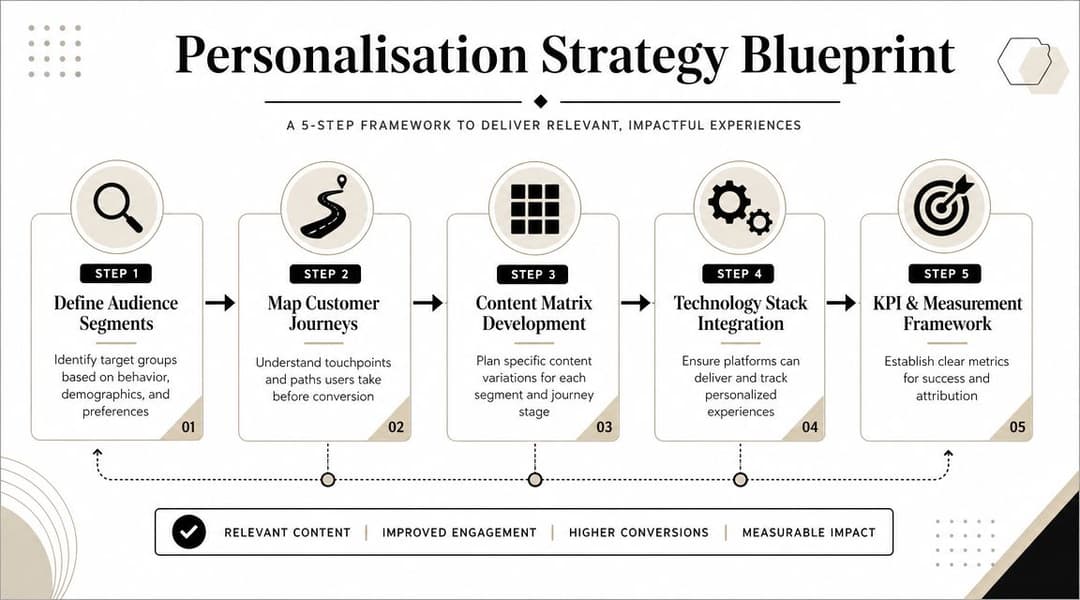
Planning Your Personalisation Strategy
Personalisation breaks when teams jump straight into design. Before anyone touches copy or layout, decide three things: who you're talking to, what signal qualifies them for a different message, and how deep that personalization should go.
The opportunity is larger than commonly understood. Only 35% of companies successfully achieve omnichannel personalization, yet brands that do report 3.1 times higher customer lifetime value, based on Involve.me's marketing personalization statistics. The gap isn't just technical. It's strategic. Teams overcomplicate the architecture or underdefine the audience logic.
Start with audience behavior, not demographics
Age and gender can still help with reporting, but they rarely produce the best banner decisions on their own. Strong personalised engagement banners usually respond to behavior.
A practical segmentation model often includes groups like these:
- First-time visitors: They need trust signals, product framing, and a low-friction CTA.
- Product viewers: They already showed category interest. Message around urgency, comparison, or proof.
- Cart abandoners: Focus on objection handling. Shipping, returns, reassurance, or a timed incentive may matter more than broad brand messaging.
- Repeat customers: Show complementary products, reorder cues, or loyalty-focused messaging.
- High-intent lead segments in SaaS: Swap ecommerce offers for use case relevance, demo hooks, or category pain points.
Not every account needs all of these on day one. What matters is separating people by what they've done, not just who they are.
Map signals to messages
Most personalization failures come from bad mapping. A team has data, but the message doesn't reflect the signal. Someone viewed a premium product line and gets a generic discount banner. A returning customer sees an acquisition offer. A lead who engaged with a pricing page gets a top-of-funnel explainer ad.
Use a simple matrix:
| Audience signal | Banner angle | CTA style |
|---|---|---|
| First visit | Value proposition and social proof | Learn more |
| Product/category view | Category-specific benefits | Shop category |
| Cart abandonment | Friction reduction or urgency | Complete purchase |
| Returning customer | Welcome back or cross-sell | Reorder or discover more |
| High-fit SaaS traffic | Pain point plus use case | Book demo |
Many marketers find value in reading ECORN's guide to AI personalization, because it helps frame personalization as a system of audience signals and content rules, not just a collection of ad variations.
Define your personalization tiers
You don't need to jump straight to one-to-one messaging. In fact, it's often not advisable.
A more workable model is a tiered approach:
Tier one, light personalization
Swap only one element, usually headline or CTA, by broad segment. Example: new visitor versus returning visitor.Tier two, modular personalization
Change multiple components together, such as image, offer, and copy block, based on funnel stage or product interest.Tier three, dynamic personalization
Use real-time or near-real-time signals to alter the banner experience based on recency, inventory context, promotion windows, or customer status.
Planning rule: If your team can't explain why a segment deserves a different message, it probably shouldn't be a separate creative path yet.
Keep the system small before you scale it
Teams often build too many segments before they know what drives lift. That's how production workload explodes. Start with segments that have obvious intent differences and meaningful audience size. Add nuance only after the first round of tests tells you where relevance is paying off.
For Meta specifically, this usually means balancing two realities. You want enough segmentation to sharpen message fit, but not so much fragmentation that learning slows or operational complexity takes over. Good strategy sits in that middle ground. Clear audience logic. Few enough variables to manage. Strong enough message differentiation to matter.
Designing Banners That Adapt and Convert
Once the strategy is clear, the creative work gets easier. Not easier in the sense of effortless, but easier because each banner has a job.
The most effective personalised engagement banners are modular. Think Lego bricks, not posters. You aren't designing one finished asset. You're designing a system of interchangeable parts: headline, supporting line, product visual, offer badge, proof element, and CTA. Those parts can be assembled differently for different segments without making the creative feel random.

Build a creative kit, not a single ad
A scalable banner design system usually contains:
- Headline variants: One for discovery, one for urgency, one for re-engagement, one for loyalty.
- Image families: Product-only, product-in-use, lifestyle, category montage, or UI-focused visuals for SaaS.
- Offer modules: Discount, free shipping, bundled value, demo incentive, trial message, or no-offer version.
- Trust elements: Ratings, guarantees, testimonials, return policy cues, or customer logos.
- CTA options: Shop now, finish checkout, see bestsellers, book demo, compare plans.
The point isn't to use every component in every banner. The point is to make each component swappable without redesigning the whole asset.
Match the creative change to the audience signal
Some personalisation changes are high-impact because they align tightly with known behavior.
A few examples:
- A returning ecommerce visitor sees "Welcome back" language and products from the category they browsed.
- A cart abandoner gets a banner that reduces friction rather than introducing a new product story.
- A repeat skincare buyer sees replenishment language or a complementary product bundle.
- A SaaS visitor from a feature page gets a banner framed around the exact use case they explored.
In this area, teams often overdo novelty and underdo clarity. If a user abandoned checkout, don't surprise them with a flashy brand message. Help them resume the decision they already started.
Use motion and urgency carefully
Dynamic elements work when they reinforce intent. They fail when they feel decorative.
According to Branch's smart banner performance data, ecommerce sites using countdown timers within personalized banners have seen conversion rate boosts of over 20% and average order value uplift of 86%. That result doesn't mean every countdown timer will help. It means urgency can work when paired with relevant segmentation and a believable offer.
A practical rule:
If the dynamic element doesn't answer "why should this person act now?", it probably belongs in the bin.
For Meta banners, useful adaptive elements include:
- Countdown modules for genuine promotion windows
- Product recommendations based on viewed categories
- Welcome-back copy for known returning users
- Bundle framing for customers who already bought a related item
- Inventory-sensitive messaging when scarcity is real and current
Keep layouts stable while content changes
One of the biggest design mistakes in scaled personalization is changing too many visual variables at once. That makes banners harder to compare and can create a robotic feel across variants.
Keep these stable across a creative set:
| Keep stable | Let it vary |
|---|---|
| Brand colors | Headline |
| Typography system | Offer block |
| Logo placement | Product image |
| Overall layout | CTA wording |
| Core design hierarchy | Trust cue |
That structure protects brand consistency and makes testing cleaner. It also reduces design fatigue for the team because new variants don't require rebuilding the entire asset.
If you're refining the craft side of banners at the same time, this guide on how to maximize display advertising ROI is useful for reviewing fundamentals like hierarchy, contrast, and CTA clarity before you layer in personalization logic.
Design for production, not just presentation
A banner can look excellent in Figma and still be impossible to scale. That's why production constraints need to shape the design system from the start.
Ask practical questions early:
- Can the headline area handle short and long copy?
- Will product imagery crop cleanly across placements?
- Does the CTA still stand out when the offer module is removed?
- Can a loyalty message replace a discount without breaking the layout?
- Will the system work for static and lightweight animated versions?
This mindset becomes even more important when multiple buyers, designers, or clients are involved. The best-performing system usually isn't the most visually ambitious. It's the one that stays coherent across many variants and gives the team room to test.
For a deeper look at adaptable layouts and production-friendly creative systems, this resource on advertising banner design principles is a helpful companion.
Automating Banner Generation and Launch with AI
The strategy can be sound. The design system can be modular. The program still falls apart if launching personalised engagement banners requires hours of repetitive setup.
That's the core problem AI solves. Not the thinking. The repetition.
Teams rarely struggle to come up with five strong personalized concepts. They struggle to turn those concepts into hundreds of usable combinations across audiences, formats, placements, and offers without introducing errors or delaying launch windows.
The manual burden is well known. Data cited in this overview of campaign scaling notes that AI-driven ad platforms can accelerate campaign launches with personalized banners by up to 40%, directly addressing the production bottleneck that slows testing and iteration in real accounts, as referenced in the provided campaign launch workflow source.
What automation should actually do
A lot of marketers hear "AI banner generation" and picture generic creative made without strategy. That's not the right model.
Useful automation acts more like a factory that assembles pre-approved components according to clear rules. Human operators still decide:
- Which audience segments matter
- Which message angles belong to each segment
- Which offers are allowed
- Which layouts fit the brand
- Which success metric governs optimization
The platform should handle the repetitive parts:
- Combining modular creative assets into valid banner variants
- Mapping those variants to audience groups
- Applying naming conventions and campaign structure
- Launching combinations without manual duplication
- Syncing performance data back into the workflow
A practical workflow for Meta teams
In a modern setup, the process usually looks like this:
Connect the ad account securely
The platform reads campaign structure and historical performance, usually through OAuth-based access rather than manual file passing.Upload or sync modular creative assets
Headline sets, product visuals, logos, CTAs, and offer blocks become reusable components.Define audience rules
Returning visitor, cart abandoner, repeat purchaser, high-intent lead, category-specific browser. These rules tell the system which combinations make sense.Generate controlled variants
Instead of brute-forcing every possible combination, strong systems constrain outputs to combinations that are strategically valid.Push campaigns live and monitor at scale
Launch moves from manual ad assembly to bulk deployment with traceable structure.
The win isn't just speed. It's preserving strategic intent while removing repetitive assembly work.
That distinction matters. If automation produces a mess of low-quality variants, it creates more cleanup than value. If it produces structured experiments based on real audience logic, it expands what the team can test.
Why agencies and lean teams benefit first
Large teams can hide manual inefficiency for a while. Small teams can't. Agencies, startups, and in-house growth teams managing many product lines feel the bottleneck immediately because every new segment creates more assets, more QA, and more launch coordination.
The result is predictable. Teams narrow testing not because the ideas are weak, but because the process is slow.
This is a useful point to watch a more tactical walkthrough:
The best use of AI is selective scale
Not every banner deserves to be personalized. That sounds counterintuitive, but it's one of the main lessons from scaled creative operations.
Automate where message relevance is likely to change user behavior:
- Mid and lower funnel retargeting
- Repeat purchase campaigns
- Category-specific product sets
- High-intent SaaS audience clusters
- Multi-client agency workflows with similar campaign architecture
Don't automate noise. If a segment doesn't need a distinct message, adding one only creates clutter.
This is why the strongest AI workflows combine generation with decision rules. They don't just make more banners. They make more purposeful banners, faster. If you're evaluating what that kind of system should include, this breakdown of an AI banner maker workflow is a good benchmark for separating useful automation from novelty.
Testing and Measuring What Truly Matters
Launching personalized banners is the easy part compared with learning from them properly.
A lot of teams still judge creative by click-through rate alone. CTR can be useful for diagnosing whether the banner earns attention, but it doesn't tell you whether the audience-message pairing is commercially sound. Some highly clickable creatives bring weak buyers. Others attract curiosity without purchase intent. That's how accounts end up rewarding the wrong ads.

One caution matters here. Broad personalization can underperform in niche segments. The provided source notes that without micro-segmentation, some campaigns see a 15% ROAS drop, which is why ranking banner variants by CPL or CPA within each audience group is more reliable than judging performance in aggregate, based on the cited audience optimization reference.
Start with business metrics, then diagnose with engagement metrics
The measurement stack should have layers.
Use business outcomes to decide winners:
- ROAS when revenue is the main objective
- CPA when you're buying purchases, demos, or other conversion events
- CPL when lead quality needs tighter control
- Customer lifetime value directionally, especially for repeat-purchase brands
Use softer engagement metrics to diagnose what happened:
- CTR
- Landing page view rate
- Add-to-cart rate
- On-site progression
- Frequency and fatigue signals
That order matters. Engagement helps explain. Business metrics decide.
Test one meaningful variable at a time
Personalization creates many possible tests, so discipline matters more, not less.
A clean testing rhythm often looks like this:
| Test type | Example | What it tells you |
|---|---|---|
| Message angle | Welcome back vs limited-time offer | Whether familiarity or urgency drives action |
| Offer format | Free shipping vs bundle value | Which incentive better resolves hesitation |
| CTA wording | Complete order vs Shop now | Whether direct intent language improves response |
| Visual treatment | Product-only vs lifestyle image | Which creative context suits the segment |
| Trust cue | Reviews vs guarantee | What lowers perceived risk fastest |
If you change audience definition, copy, offer, and layout all at once, you learn very little. You might find a winner, but you won't know why it won.
Measurement rule: Test the smallest change that could plausibly move the metric you care about.
Segment-level reading beats account-level reading
Many teams often miss the point of personalised engagement banners. They review creative globally and conclude that Variant B beat Variant A. In reality, Variant B may have won because one large audience carried the result while two smaller but important audiences disliked it.
Read results at the segment level whenever possible:
- Returning users may respond to reassurance, not discounts.
- Cart abandoners may convert on urgency, but only if the product is already familiar.
- B2B audiences may ignore price-led messaging and respond better to use-case clarity.
That doesn't mean slicing the data into unusable fragments. It means reviewing the data at the same level you used to define the message.
Don't optimize for social vanity
Marketers often inherit reporting habits from social content teams. Engagement rate, reactions, and generic click benchmarks can be useful context, and if you need a reference point for broader social reporting norms, these benchmarks for social media strategy can help frame expectations. But ad creative should still be judged against conversion economics, not popularity.
A banner isn't there to entertain. It's there to move the right person toward the right action at an acceptable acquisition cost.
Build a review cadence that leads to action
Performance review should produce decisions, not dashboards. A simple weekly cadence works well:
- Pause combinations that clearly miss target economics.
- Keep promising variants alive if downstream metrics are improving, even if CTR isn't flashy.
- Promote winners within each segment, not just across the whole account.
- Feed learnings back into the next batch of variants.
- Retire stale messages before fatigue drags results down.
If your current reporting still treats all banner variants as isolated ads rather than components inside a learning system, it helps to revisit a stronger framework for how to measure advertising effectiveness.
Advanced Personalised Banner Strategies FAQ
How should you adapt personalised engagement banners in a privacy-first environment
The safest approach is to rely less on invasive identity assumptions and more on consented first-party signals, contextual relevance, and broad behavioral patterns you can legitimately act on.
For Meta campaigns, that usually means building creative logic from inputs like recent site behavior, customer status, product category interest, CRM stage, and declared preferences. You don't need hyper-granular surveillance to make a banner more relevant. You need a clean rule for why one audience should see one message and another audience should see something different.
A few practices hold up well:
- Use first-party events carefully: Purchase history, viewed categories, and lifecycle stage can support relevant messaging without overreaching.
- Lean into contextual creative: Match banner content to the product category, funnel stage, or page theme rather than trying to infer too much about the person.
- Reduce dependency on brittle identifiers: If a personalized rule collapses the moment tracking becomes less precise, it's probably too fragile.
- Write copy that feels useful, not invasive: "Complete your order" is usually better than copy that implies excessive knowledge about the user's actions.
For teams refining dynamic delivery logic, it's worth understanding how dynamic creative optimization works in practice, especially when signal quality varies across platforms and placements.
How do you avoid the creepy factor and creative fatigue
Personalization feels creepy when the ad reveals too much, too specifically, or too often. It feels stale when the same personalized idea keeps repeating after the user has already ignored it.
The fix isn't to stop personalizing. It's to lower the intensity and improve rotation.
Use these guardrails:
- Personalize the problem, not the private detail: Refer to the category or need state rather than making the ad sound like surveillance.
- Rotate message families: If the audience has already seen urgency, try reassurance or proof. If they've seen discount framing, test convenience or curation.
- Cap repetitive offers: A banner that keeps shouting the same incentive teaches users to tune out.
- Separate retargeting stages: Someone who visited once shouldn't get the same message as someone who abandoned checkout twice.
- Refresh assets on a schedule: Even winning concepts wear out if the same visual pattern stays in market too long.
A good rule of thumb is simple. If the user would understand why they're seeing the message, it usually feels fine. If the copy feels like it knows too much, pull it back.
Relevance builds trust only when the message feels timely and reasonable.
How can B2B SaaS teams use these tactics without forcing ecommerce logic onto a longer sales cycle
B2B SaaS teams should personalize around use case, role, buying stage, and objection type rather than around discounts or product bundles.
That changes the banner framework significantly. A prospect reading feature pages may need proof of fit. A return visitor from a comparison page may need differentiation. A lead who visited pricing may need a lower-friction CTA, such as seeing implementation details or booking a focused demo.
A workable SaaS banner matrix might include:
| Audience type | Better banner angle | Weak banner angle |
|---|---|---|
| New category traffic | Problem framing and proof | Hard demo ask immediately |
| Returning product-aware visitor | Use case relevance | Generic brand slogan |
| Pricing-page visitor | Objection handling and CTA clarity | Broad awareness message |
| Existing lead | Next-step action | Introductory explainer |
| Customer expansion audience | Cross-sell or adoption message | Acquisition-style offer |
The creative should still be modular. The modules just change. Instead of discount badges and shipping cues, SaaS teams swap in industry proof, integration callouts, implementation reassurance, customer logos, and role-specific copy.
What doesn't change is the discipline. Clear segment logic. Controlled creative variation. Measurement tied to pipeline outcomes rather than superficial engagement.
AdStellar AI helps performance teams turn personalised engagement banners into a repeatable operating system instead of a manual production headache. If you're managing Meta campaigns and need to generate, test, and scale large volumes of audience-specific creative without losing control of ROAS, CPL, or CPA, explore AdStellar AI.