Great ad banners don’t just happen. They’re the result of a clear strategy, compelling visuals, and copy that actually convinces people to click. It’s way more than just making something look good; it’s about understanding who you’re talking to and what you want them to do. That’s how you turn viewers into customers.
Building Your Banner Ad Strategy Before You Design
It’s tempting to jump straight into Photoshop or Canva, but that's a classic mistake that costs marketers a ton of money down the line. A beautiful banner without a solid strategy behind it is just a pretty picture—it's not an asset that’s going to grow your business. Before you touch a single pixel, you need to lay the groundwork. This prep work is what separates ads that get ignored from those that bring in conversions day after day.
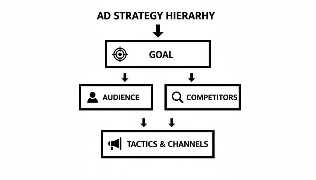
First things first, you need to get crystal clear on your campaign’s main goal. "Brand awareness" is way too fuzzy. You need a specific, measurable target. Are you trying to hit a $4 cost-per-lead? Or maybe you're aiming for a 3:1 return on ad spend (ROAS)? Nailing down this north-star metric from the start means every design choice you make will serve a real business outcome.
Profile Your Ideal Customer
Next up, go deeper than surface-level demographics and build a practical profile of your ideal customer. What specific, nagging problem does your product solve for them? Think about their biggest pain points, what motivates them, and what frustrates them daily.
Answering these questions is how you craft messaging that truly connects. For instance, instead of just targeting "small business owners," you might zero in on "e-commerce founders who are sick of dealing with abandoned carts." That level of detail completely changes the headline, imagery, and overall vibe of your ad.
This kind of solid customer profile is also the backbone of any good paid social media strategy, ensuring your message is consistent and effective no matter where it shows up.
Analyze the Competitive Landscape
Finally, do a quick scan of the competition. And don't just look at your direct rivals; check out other brands that are successfully reaching a similar audience. What’s their visual style? What kind of language are they using in their calls-to-action?
The point here isn’t to copy them, but to spot patterns and find gaps you can exploit. To get your own creative juices flowing and make sure your banners don't just blend in, it pays to have a good system for collecting design ideas.
By checking out what your competitors are doing, you can quickly see which tactics are overused and find a way to be different. If everyone in your space is shouting with bright, bold colors, maybe a clean, minimalist design is exactly what you need to cut through the noise.
This whole strategic phase—defining goals, knowing your audience, and scoping out the competition—is what turns banner design from a guessing game into a calculated plan. It ensures your creative work is laser-focused on getting measurable results, making your design not just eye-catching, but incredibly effective.
Get Your Sizes and Hierarchy Right
Okay, you've got your strategy locked in. Now comes the fun part—actually designing the banner. This is where we get into the nuts and bolts of what makes an ad work. Choosing the right dimensions for your banner isn't just about fitting into a website's designated slot; it's a strategic move that dictates how visible and effective your ad will be.
But even a perfectly sized banner will fall flat if the design is a chaotic mess. You have a fraction of a second to grab someone's attention. That’s where visual hierarchy becomes your best friend. It’s the art of telling someone's eyes exactly where to look: first at the headline, then the image, and finally, that big, beautiful call-to-action button. When you nail the hierarchy, you guide a user from curiosity to a click without them even thinking about it.
For a deeper dive into the general principles, this article on visual hierarchy in web design is a great starting point.
Top Performing Banner Ad Sizes and Their Use Cases
While there are dozens of ad sizes out there, you don't need to master them all. In reality, a handful of them do most of the heavy lifting across the Google Display Network and Meta. Focusing on these tried-and-true formats is the quickest way to maximize your reach without spreading your design efforts too thin.
Here's a quick rundown of the sizes that consistently deliver the best results.
| Dimension (pixels) | Common Name | Optimal Placement | Primary Use Case |
|---|---|---|---|
| 300x250 | Medium Rectangle | Embedded within text content, sidebars | High-performing & versatile for both desktop and mobile |
| 336x280 | Large Rectangle | Embedded within text content, sidebars | Offers a bit more space for visuals than the 300x250 |
| 728x90 | Leaderboard | Above the main content, forum signatures | Excellent for brand awareness at the top of a page |
| 300x600 | Half Page | Sidebars | Demands attention with its large vertical space |
| 1080x1080 | Square | Meta (Facebook/Instagram) Feeds | The standard for in-feed social media placements |
| 1080x1920 | Vertical | Meta (Facebook/Instagram) Stories & Reels | Full-screen, immersive experience for mobile-first audiences |
Getting the placement right is just as important as the size itself. A Leaderboard ad, for example, is great for top-of-funnel awareness, while a Half Page gives you the real estate to tell a more compelling story and drive conversions.
Of course, if you're running ads on Meta, the game changes. Square (1080x1080) and Vertical (1080x1920) formats are non-negotiable for dominating Feeds and Stories. For a complete guide on that, check out our breakdown of the ideal size for Facebook ads.
Guiding the User’s Eye: A Simple Framework
With your dimensions picked out, it’s time to arrange the elements inside the banner. Don’t overcomplicate it. Every high-converting banner has three core components that work together.
- The Hook (Your Value Prop): This is your main event—a killer headline paired with a striking image. It needs to be the most dominant element on the banner. Make it big, bold, and impossible to ignore.
- The Brand (Your Logo): Your logo needs to be there to build recognition and trust, but it shouldn't steal the show. Stick it in a corner where it’s visible but not distracting.
- The Goal (Your CTA): This is where you want them to go. The call-to-action button should pop. Use a bright, contrasting color and clear, action-oriented text like "Shop Now" or "Get 50% Off."
This structure mirrors your overall ad strategy—from high-level goals down to the tactical execution on the banner itself.
Just like your strategy follows a logical flow, your banner's design needs to create a clear visual path for the user.
A strong visual hierarchy isn't just good design—it's your primary weapon against "banner blindness." People are hardwired to ignore ads. A clear visual path is the only way to cut through the noise and get your message across.
The fight for attention has never been tougher. Back in the early 2000s, banners might have pulled a click-through rate (CTR) of 0.2% to 0.3%. Fast forward to today, and the average CTR has plummeted to around 0.05%. In this environment, hitting even a 1-2% CTR is a massive win, which is exactly why every single design choice you make is so critical.
Writing Ad Copy That Actually Converts
A killer visual might earn you a half-second glance, but it's the words on your banner that actually earn the click. While your design is there to create that initial spark of intrigue, your ad copy is what closes the deal. This is where you turn a passive scroller into an active lead by showing them exactly what's in it for them.
Think of it as your world's fastest sales pitch. You have just a few seconds to pinpoint a problem, present your product as the perfect solution, and tell the user precisely what to do next. Every single word has to count.
Crafting Headlines That Stop the Scroll
Your headline is, without a doubt, the most important piece of text on the entire banner. Its only job is to be so interesting that it makes someone stop and pay attention. The best headlines usually hit on a specific pain point or shout a powerful benefit from the rooftops.
For example, a headline like "Project Management Software" is just noise. It’s boring and easy to ignore. A much better alternative? "Finish Projects 2x Faster." This one works because it immediately communicates a real, tangible result, making it way more compelling for a busy professional.
Here are a few other angles you can take with your headlines:
- Ask a question: "Tired of High Ad Costs?"
- Focus on the benefit: "Unlock Your Team's Full Potential"
- Create some urgency: "Last Chance for 50% Off"
The Art of the Call-to-Action
Once you’ve grabbed their attention with a great headline, the call-to-action (CTA) tells them what to do next. This is where so many ads fall flat. Vague CTAs like "Learn More" or "Click Here" are total conversion killers because they lack punch and direction. Your CTA needs to be a clear, action-focused command.
The best CTAs use strong verbs that promise value. Swapping "Submit" for "Get Your Free Quote" or "Learn More" for "Watch the Demo" can make a huge difference in click-through rates. Why? Because the user knows exactly what they're getting in return for their click.
This is exactly why a powerful CTA is a non-negotiable part of any guide to writing great ad copy that drives real results.
The text on your CTA button should feel like the natural next step after reading your headline. If your headline promises a discount, the CTA should be "Claim Your Discount." Offering a guide? "Download the Guide." The goal is to make the decision to click feel effortless. Every element has to work together to create a smooth path from seeing the ad to taking action.
Choosing the Right Banner Ad Format
Deciding between a static image, an animated GIF, or a short video for your banner is a bigger deal than you might think. This choice directly hits your campaign's performance, and the "right" format isn't about what looks coolest. It's about what works for your specific goal, your budget, and the platform you're running on.
Each format has its own strengths and weaknesses, and you need to weigh them carefully.
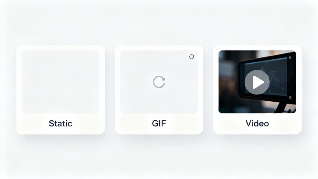
Static banners are the absolute workhorses of display advertising. They're quick to make, have small file sizes that load instantly, and get a single, clear message across immediately. This makes them perfect for direct-response campaigns where the whole point is to get someone to click right now with an unmissable offer.
But that simplicity can be a double-edged sword. In a visually packed feed, a static image can easily become invisible. And that’s where a little motion can make all the difference.
When to Use Animated Banners
Animated banners, usually GIFs or HTML5 animations, are a fantastic middle ground. They introduce just enough movement to naturally draw the human eye, making them much harder to ignore than a flat image. In fact, some research shows that video and animated banners can perform 3 to 6 times better than their static cousins.
This format really shines in a few specific scenarios:
- Showcasing Multiple Features: You can cycle through a few key product benefits or different images without making the design feel cluttered.
- Highlighting a CTA: A simple animation can make your call-to-action button pulse or subtly shift color, guiding the user’s focus right where you want it.
- Creating a Micro-Story: Even a simple three-frame animation can tell a story, like showing a quick "before" and "after" state.
The trick is to keep the animation smooth and purposeful. A jerky, frantic animation just feels like spam and will turn people off. The goal is to capture attention, not assault their senses.
Deciding to Invest in Video Ads
Video is, without a doubt, the most engaging format. It's also the one that requires the biggest investment in both time and money. Short video ads are ideal for top-of-funnel, brand-building campaigns where you’re trying to forge an emotional connection or explain a more complex idea.
A well-produced video ad can communicate a brand's personality and solve a customer's problem in a way that static images or simple GIFs just can't match. It’s about telling a story that resonates.
So, how do you choose? Think about your campaign objective.
If you're running a limited-time flash sale and need to blast a simple message out quickly, a crisp static banner is your best bet. If you want to demonstrate how a specific feature of your software works, an animated GIF is probably perfect. But if you're launching a new product and need to build real excitement and brand affinity, investing in a short video ad will almost certainly deliver the highest return.
Nailing the right format is the first real step toward a successful advertising banner.
A Practical Framework for A/B Testing Your Banners
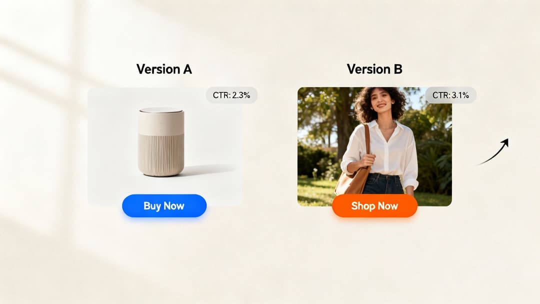
The best banner ads are never a one-shot deal. They’re born from relentless testing and refinement. Guesswork is the fastest way to burn through your ad budget, which is why a structured approach to optimization is non-negotiable. This is where A/B testing becomes your most powerful ally—it’s the process that turns good creative into great creative by letting data, not your gut, call the shots.
This whole process kicks off with a solid hypothesis. You aren't just flinging random variations at the wall to see what sticks. Every single test should be designed to answer a specific question. For instance, you might hypothesize: "A lifestyle image will outperform a product-only image because it helps users visualize the benefit in their own lives." This gives your test a clear purpose and makes the results easy to actually learn from.
Prioritizing Your Tests For Maximum Impact
You can test just about anything—headlines, images, calls-to-action, color schemes—and it's easy to get lost in the weeds. The secret is to start with the variables that have the biggest potential to move the needle. You'll get much bigger wins from testing a completely new value proposition than you will from tweaking a button color from blue to green.
To help you get started, here's a simple framework for prioritizing your tests based on what’s most likely to drive a significant impact.
A/B Testing Priority Matrix for Banner Ads
| Element to Test | Potential Impact Level | Example A vs. B |
|---|---|---|
| Value Proposition / Headline | High | "Save Time on Invoicing" vs. "Get Paid 2x Faster" |
| Primary Image or Video | High | Product Shot vs. Lifestyle Photo of Customer |
| Call-to-Action (CTA) Text | Medium | "Sign Up" vs. "Get Your Free Trial" |
| Color Scheme | Medium | High-Contrast CTA vs. On-Brand CTA |
| Ad Copy / Body Text | Low | "Trusted by 10,000+ businesses." vs. "Join over 10,000 happy customers." |
This matrix helps you focus your energy on high-impact elements first, ensuring your initial tests have the best chance of producing meaningful results.
Remember the golden rule: test one variable at a time. If you change the headline, the image, and the CTA all at once, you’ll have no clue which change was responsible for the lift (or dip) in performance. If you want to dive deeper into the methodology, you can learn more about what A/B testing is in marketing and how to apply it effectively.
Measuring Success With The Right Metrics
Once your test is live, how do you know which version actually won? You need to focus on the right metrics. For banner ad design, two metrics are absolutely critical:
- Click-Through Rate (CTR): This tells you how effective your ad is at grabbing attention and earning a click. It’s your first signal that the creative is compelling.
- Conversion Rate: This measures what happens after the click. It reveals whether you’re attracting the right kind of audience and if your landing page delivers on the ad’s promise.
Industry benchmarks show just how much messaging matters. CTRs can vary wildly. For example, some addiction treatment services see a 5.9% CTR because of the emotional urgency, while the average Google Display Ad barely scrapes by at 0.46%. Knowing these differences helps you set realistic goals for your own campaigns.
By methodically testing one element at a time and tracking both CTR and Conversion Rate, you create a powerful feedback loop. Each test provides a clear data point that informs the next, systematically improving your banner’s performance and overall campaign ROI over time.
How to Scale Your Creative Production with AI
Let’s be honest: manually cranking out every single banner variation is a massive production bottleneck. It’s slow. It’s expensive. And worst of all, it kills your ability to test creative ideas at the speed your campaigns actually need.
If you want to scale your advertising banner design, you have to get smarter about how you create.
This is where AI-powered platforms change the game entirely. Instead of your design team spending days building a handful of ads, you can generate hundreds of high-quality variations in a matter of minutes. This isn't just about moving faster—it's about fundamentally shifting from testing a few educated guesses to exploring a massive creative landscape to find what really works.
From Manual Labor to Data-Driven Automation
The real magic behind these systems is the data. Tools like AdStellar don’t just generate random designs; they plug directly into your ad accounts to analyze historical performance. They see what’s already resonating with your audience.
The platform pinpoints the specific creative ingredients—the headlines, images, and CTAs—that are driving the best results against your most important metrics. This turns your creative strategy from a guessing game into a data-backed system, building your next campaign on a foundation of proven winners.
The goal of AI in creative production isn't to replace designers. It's to give them superpowers. By automating the soul-crushing work of creating endless variations, you free up your team to focus on high-level strategy and breakthrough concepts.
Launching Campaigns Optimized from Day One
Once the AI has identified your top-performing components, it starts assembling new ad combinations, intelligently tailored to different audience segments. This means you can launch campaigns that are already optimized to perform right out of the gate.
This approach creates a powerful feedback loop that just keeps getting smarter:
- Generate: Instantly create hundreds of ad variations based on past wins.
- Launch: Push them live across all your platforms with a single click.
- Analyze: The AI gets to work, tracking performance and identifying the new top performers.
- Iterate: Those fresh insights immediately fuel the next wave of even smarter ads.
This automated cycle ensures your creative is always evolving based on real-world data, not just assumptions. For agencies, finding the right AI tools for marketing agencies is the first step toward building this kind of efficient, results-driven system for your clients.
Diving Into Common Banner Design Questions
Even with the best strategy in hand, you’re bound to hit a few specific snags during the design process. It happens to everyone. Let's tackle some of the most common questions that pop up, so you can refine your creative and make sure you’re not leaving performance on the table.
What Are the Most Common Mistakes in Banner Design?
By far, the biggest mistake is a cluttered design. Trying to cram too many messages, a wall of text, or competing visual elements into a tiny space just confuses people. Your ad will get ignored—instantly. This usually goes hand-in-hand with a weak or nonexistent call-to-action that leaves users wondering what to do next.
Another classic error is a lack of brand consistency. If your ads don't look and feel like you, audiences will never build recognition over time. And finally, creating one-size-fits-all banners is a huge missed opportunity. Tailoring your design for different placements and audiences is where you’ll see engagement really take off.
Here’s a great rule of thumb I always use: the "5-second rule." If someone can't understand your value proposition and what you want them to do within five seconds, your design is too complicated. Simplicity almost always wins.
How Much Text Is Too Much on a Banner?
Keep your copy minimal and punchy. Your goal should be a powerful headline of four to six words, maybe a very brief supporting line if it's absolutely necessary, and a CTA that’s just two or three words. That’s it.
Overloading a banner with text is the fastest way to trigger "banner blindness," where users' eyes just slide right past your ad. Let the visuals and a short, snappy headline do the heavy lifting. You're trying to communicate one single, primary benefit—not list every feature your product has.
How Can I Make My Banner Ads More Accessible?
This is a big one, and it's crucial for reaching the widest possible audience. Making your ads accessible isn't just a "nice-to-have"; it's smart marketing.
- Prioritize High Contrast: Use online checkers to make sure there's enough contrast between your text and background colors. This is a game-changer for users with visual impairments.
- Use Legible Fonts: Stick to clear, readable fonts. Avoid overly decorative or thin script styles that are hard to decipher at a glance.
- Provide Alt Text: Always, always include descriptive alt text for your images. This allows screen readers to interpret the ad's content for visually impaired users, so your message still lands.
Ready to stop the manual grind and scale your creative production? AdStellar AI automates bulk ad creation, letting you launch hundreds of data-backed variations in minutes. Discover how AdStellar helps you test faster and drive more revenue from Meta.