Figuring out the ideal size for a Facebook ad really comes down to one thing: placement. But if you need a versatile workhorse for Feed ads, a 1080x1080 pixel (1:1 aspect ratio) image is your best bet. For the full-screen experience in Stories and Reels, you absolutely want a 1080x1920 pixel (9:16 aspect ratio) vertical creative.
Your Quick Reference Guide to Facebook Ad Sizes
Let's be honest, keeping track of Facebook's ad specs can feel like a full-time job. Every placement seems to have its own set of rules. This guide is your cheat sheet—the essential dimensions you need to get your ads live without any guesswork.
The name of the game is maximizing screen real estate, especially on mobile, where the vast majority of your audience will see your ads. An ad that fits the screen perfectly feels native, less like a clunky interruption, and almost always performs better.
This visual breakdown covers the three most important ad sizes for the placements that are driving the most results right now: Feed, Stories, and Reels.
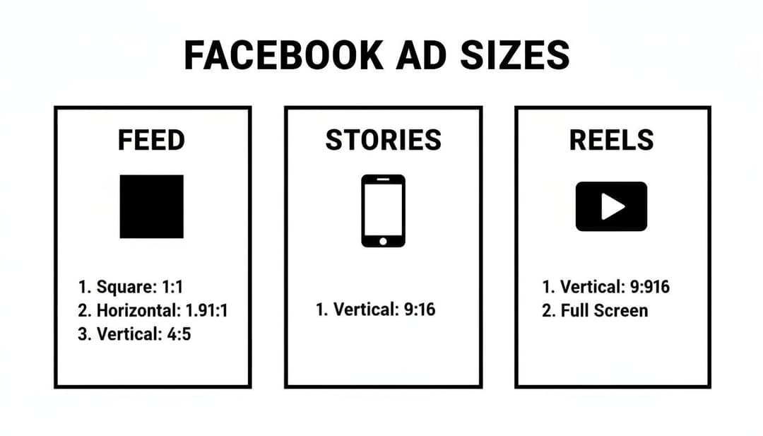
The biggest takeaway here is the split between square (1:1) and vertical (9:16) formats. It’s a clear signal that you need to be creating assets specifically for where they'll appear. One size does not fit all.
To make things even easier, here's a quick reference table with the specs that matter most.
Facebook Ad Sizes Quick Reference Chart
This chart summarizes the most common and effective ad sizes you'll need for Facebook's key placements. Think of it as your go-to list for building high-performing creative.
| Placement | Aspect Ratio | Ideal Resolution (Pixels) | Best For |
|---|---|---|---|
| Feed | 1:1 | 1080x1080 | Universal visibility on mobile and desktop feeds. |
| Stories & Reels | 9:16 | 1080x1920 | Full-screen, immersive vertical video and images. |
| Right Column | 1.91:1 | 1080x566 | Desktop-only ads, great for retargeting. |
| In-Stream Video | 16:9 | 1920x1080 | Ads appearing within other video content. |
Getting these dimensions right from the start saves you a ton of headaches and ensures your ads look exactly how you designed them.
Key Placements and Their Ideal Sizes
If you’re just getting started or want to focus your efforts, mastering the specs for the highest-impact placements is the way to go.
- Facebook Feed: The gold standard here is a 1:1 aspect ratio (1080x1080 px). This square format looks great on mobile feeds, giving you a solid chunk of screen space without getting cut off.
- Stories & Reels: These placements demand a vertical 9:16 aspect ratio (1080x1920 px). Anything less and you're leaving valuable screen space on the table. Go full-screen for a truly immersive experience.
Sticking to these recommended sizes is non-negotiable if you want your ads to display correctly. It prevents that awkward, unprofessional cropping that can completely hide your message or, even worse, your call-to-action button.
Why Ad Sizing and Ratios Are Critical for Performance
Before we get into the nitty-gritty pixel counts, let's talk about why getting the size of your Facebook ads right is so important. This isn't just about making your creative look pretty; it directly hits your campaign's reach, costs, and ultimately, its success.
Think about it from a user's perspective. When an ad fits its placement perfectly—like a vertical 9:16 ad filling the entire screen in Stories—it feels native and seamless. But a poorly sized ad with ugly black bars or awkward cropping? It immediately screams "I'M AN AD!" and people scroll right past. That kind of friction doesn't go unnoticed by Meta's algorithm, which can penalize you with lower reach and higher costs.
Connecting Ad Size to Campaign Metrics
The link between correct ad sizing and your key performance indicators (KPIs) is impossible to ignore. When your visuals are optimized for their placement, you command more screen real estate and grab attention far more effectively. This naturally leads to a higher click-through rate (CTR) because users are just more likely to engage with something that looks professional and polished.
This better user experience also contributes to a higher relevance score. Meta wants to show its users content they actually like, and it rewards advertisers who provide it.
Properly sized ads deliver a better viewing experience, which can directly lead to a lower Cost Per Click (CPC). When more people click your ad relative to its impressions, the platform sees it as more relevant and may charge you less for each interaction.
The Mobile-First Imperative
Here’s a stat that should guide every creative decision you make: over 80% of Facebook users access the platform only on mobile devices. This makes a mobile-first mindset non-negotiable. It's the only way to win.
Mobile screens are vertical. That's why formats like 1:1 (square) and 9:16 (vertical) consistently crush traditional landscape ads in mobile-heavy placements like the Feed and Reels.
Optimizing for mobile means your ad is instantly viewable without anyone needing to turn their phone sideways or squint at a cropped image. If you ignore this, you're failing to connect with the overwhelming majority of your audience and just wasting ad spend. Understanding how your ad delivery impacts cost metrics is fundamental; for a deeper look, you can explore the relationship between cost per impression and its impact on campaign bidding.
Mastering Ad Dimensions for Facebook and Instagram Feeds
The Facebook and Instagram Feeds are some of the most valuable digital real estate you can buy. It's where people spend a huge chunk of their scrolling time, making it the perfect spot to grab their attention. If you want your ads to succeed here, getting the dimensions right isn't just a recommendation—it's essential.
While Meta technically supports a few different aspect ratios, one size has consistently dominated Feed ads on both platforms: the 1:1 square format. For almost any campaign targeting the Feed, this is your best starting point.
The Power of the 1:1 Square Ad
The ideal resolution for a square Feed ad is 1080x1080 pixels. This size hits the sweet spot, giving you crisp, high-resolution clarity without being so large that it slows down loading times for users. Its power comes from how perfectly it maximizes screen space on mobile devices, ensuring you don't get any weird or accidental cropping.
When Meta's ad platform shifted to a mobile-first experience, savvy marketers quickly realized that the 1:1 square format at 1080x1080 pixels was a game-changer. Why? Because over 80% of Facebook users are on mobile exclusively. Square ads simply fill more of that screen, which makes a huge difference in visibility. The data backs this up—campaigns using 1:1 formats have seen as much as a 15% higher click-through rate (CTR) compared to old-school landscape ads, partly because they stand out more.
To keep everything running smoothly, stick to these technical specs:
- Recommended Resolution: 1080x1080 pixels
- Aspect Ratio: 1:1
- Supported File Types: JPG, PNG (for images); MP4, MOV (for videos)
- Maximum Image File Size: 30MB
- Maximum Video File Size: 4GB
- Video Duration: 1 second to 240 minutes (but trust me, shorter is almost always better)
Exploring the 4:5 Vertical Alternative
While the 1:1 square is your workhorse, the 4:5 vertical format (1080x1350 pixels) is a powerful option if you want to make an even bigger splash on mobile Feeds. This taller format eats up even more vertical screen real estate, pushing organic posts and other distractions further out of sight.
The 4:5 aspect ratio is a great choice when your creative is already vertical, like a portrait-style product photo or a video shot specifically for mobile. It's especially effective for single-image or single-video ads where your main goal is to stop the scroll with a totally immersive visual.
Pro Tip: Never use a 4:5 ad in a carousel. Carousel cards are designed to be square, so Meta will automatically crop your beautiful 4:5 vertical creative to fit into a 1:1 box. This almost always results in cutting off crucial parts of your image or video.
Ultimately, deciding between 1:1 and 4:5 comes down to your creative assets and campaign goals. But a solid grasp of the strategic placement of advertising is what separates a good decision from a great one. Both formats are fantastic for the Feed, but the key is to design your ad for the aspect ratio you choose, not just try to make something fit.
Perfecting Your Specs for Stories and Reels Ads
Stories and Reels have completely changed the game, demanding a totally different creative approach than what works for the traditional Feed. These are full-screen, immersive, sound-on experiences. If your ad creative isn't built for that environment from the ground up, you're setting yourself up to fail.
Honestly, trying to run a square or landscape ad in these placements is one of the most common and costly mistakes a performance marketer can make. It creates those awkward black bars, feels jarring to the user, and immediately screams "I'm an out-of-place ad." To win here, you absolutely have to design for the vertical canvas.
The Undisputed King: The 9:16 Vertical Ratio
For both Facebook Stories and Reels, there's only one size that truly matters: a 9:16 aspect ratio with a resolution of 1080x1920 pixels. This is the only dimension that fills the entire mobile screen, giving you that seamless, native look that grabs maximum attention without any weird cropping.
The impact of getting this right is huge. A 9:16 vertical ratio at 1080 x 1920 pixels is an absolute powerhouse for Stories and Reels, known to drive up to 41% higher engagement rates. Considering the massive global audience on these placements, using the full-portrait size ensures your creative is fully visible and can seriously slash your acquisition costs. For a deeper dive into how different sizes perform, it's worth checking out some broader benchmarks and guidelines.
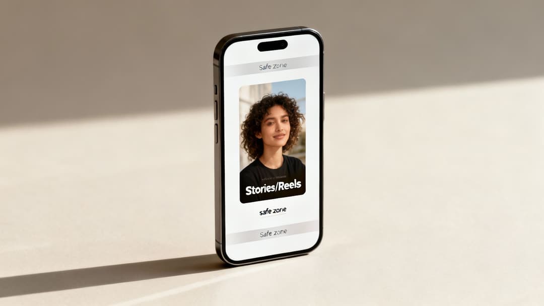
Understanding Safe Zones for Maximum Impact
So you've got your creative filling the whole 1080x1920 canvas—great. But hold on, because not all of that space is actually visible. Meta overlays its own interface elements, like the profile icon, username, and call-to-action buttons, right over your ad at the top and bottom. If you place your logo or key text in those areas, it's going to get covered up.
This is where understanding safe zones becomes absolutely critical. Just think of it as the core viewable area where your most important stuff has to live.
- Top Safe Zone: Keep about 14% (roughly 250 pixels) from the top of your creative clear of any essential elements.
- Bottom Safe Zone: The bottom needs even more breathing room. Leave approximately 35% (about 672 pixels) clear to avoid having the CTA button and captions slapped on top of your message.
By keeping your core message, branding, and subtitles within this central safe area, you pretty much guarantee 98% viewability for your ad's most important components. No more frustratingly hidden logos or CTAs.
Key Technical Specs and Creative Best Practices
Getting the resolution and safe zones right is half the battle. Your Stories and Reels ads also need to meet some specific technical requirements and follow a few creative best practices to really perform. Think fast-paced editing and an immediate value prop.
Here are the key specs you need to know:
- Recommended Resolution: 1080x1920 pixels
- Aspect Ratio: 9:16
- Image File Types: JPG, PNG
- Video File Types: MP4, MOV
- Maximum File Size: 30MB for images, 4GB for videos
- Video Duration: 1 second to 60 minutes for Reels (but let's be real, ads under 15 seconds almost always perform best)
On the creative side, you have to grab attention within the first two seconds. Use bold text overlays, dynamic motion, and always, always include sound—a huge percentage of users watch this content with the audio on.
Technical Specs for All Other Meta Ad Placements
While the Feed, Stories, and Reels get all the glory, a smart Meta advertising strategy leverages the entire ecosystem. These other spots—like In-Stream videos, Marketplace, and the classic Right Column—are where you can catch users in different moments and mindsets. But each one has its own unique rulebook for creative specs.
If you ignore these requirements, Meta will automatically crop or resize your ads, and the result is almost always a distorted, unprofessional-looking creative that kills performance. To make sure your ads look sharp everywhere they show up, you need to build for each specific placement. Let's break down the specs for these less common but still incredibly valuable ad locations.
Facebook In-Stream Video Ads
In-stream video ads pop up as short breaks in the videos people are already watching on Facebook. Since users are already leaned-in and engaged, this can be a powerful placement, but your ad has to feel like a natural part of the experience, not a jarring interruption.
- Recommended Resolution: 1920x1080 pixels
- Aspect Ratio: 16:9 (landscape) or 1:1 (square)
- Video Duration: Stick to 5 to 15 seconds. It’s the sweet spot for grabbing attention without making people impatient.
- Maximum File Size: 4GB
- Supported File Types: MP4, MOV
A quick pro-tip: even though a 1:1 square video is an option, most native video on Facebook is 16:9. Using a landscape ad here often feels less disruptive to the viewer, which can lead to better reception and higher completion rates.
Facebook Marketplace and Search Results Ads
Facebook Marketplace is a goldmine. Users are here with high intent, actively looking to browse and buy. An ad in this environment can capture someone right at the moment of decision. The same goes for ads in search results, where people are actively looking for something specific.
For both of these placements, your visuals need to be crystal clear and straightforward.
- Recommended Resolution: 1080x1080 pixels
- Aspect Ratio: 1:1 (square)
- Maximum File Size: 30MB
- Supported File Types: JPG, PNG
Because these placements are all about the product, the 1:1 square ratio gives you the perfect canvas to showcase an item without weird cropping. Your ad should feel like a natural, organic listing to really perform well. This is where a solid grasp of visual hierarchy comes in handy, and many of the same banner ad design principles are surprisingly effective here.
Facebook Right Column Ads
The Right Column ad is a true original, one of Facebook's very first ad formats. It’s a desktop-only placement, which makes it a fantastic choice for retargeting campaigns aimed at people who’ve already browsed on a computer or for driving traffic to landing pages where a bigger screen helps.
Since it sits next to the main feed, it needs a little extra visual punch to pull the eye away from the main content.
| Specification | Recommendation |
|---|---|
| Recommended Resolution | 1080x1080 pixels |
| Minimum Resolution | 254x133 pixels |
| Aspect Ratio | 1:1 (square) is now the standard |
| Max File Size | 30MB |
You might see older guides talking about a landscape ratio for this placement, but Meta has pretty much standardized the Right Column to favor the 1:1 square format. This is actually great news for advertisers, as it creates consistency with Feed ads and makes it way easier to repurpose your best-performing square images.
Audience Network and Messenger Ads
The Audience Network is your ticket to showing ads beyond Facebook's walls, across a huge collection of third-party apps and websites. Messenger ads, on the other hand, appear right in the main inbox tab, catching users when they're in the middle of conversations.
These placements are flexible, but vertical and square formats are what you'll use most often.
- Audience Network (Native, Banner, Interstitial): You’ll need a 9:16 vertical (1080x1920 pixels) creative for those full-screen interstitial ads and a 1:1 square (1080x1080 pixels) for the native banner spots.
- Messenger Inbox: This placement primarily uses a 1:1 square (1080x1080 pixels) ad that shows up between conversations in the main chat list.
To really succeed across all these different environments, you can't just rely on one creative. The key is to build a flexible library of high-quality assets in 1:1, 9:16, and 16:9 formats. That way, your message always gets delivered with maximum impact, no matter where your audience happens to see it.
Creative Best Practices for High-Performing Ads
Getting the technical specs right is just the start. Let's be honest, even a perfectly sized ad will fall flat if the creative doesn't grab attention and make people feel something. The ads that really move the needle are a smart mix of technical precision and scroll-stopping creativity.
You might remember the old 20% text rule, where Facebook would outright penalize images with too much text overlay. While Meta has dialed back the strict rejections, the core principle is still gold. Ads with minimal text on the actual image just perform better. They feel more native, less like a screaming billboard, and let your visual do the talking.
If you're unsure, you can still run your creative through Meta's Text Overlay Tool. An "OK" rating is what you're aiming for. Anything higher might see your ad's reach throttled. The idea is to let the main ad copy do the persuasive work. After all, once the visual hooks them, it's the words that close the deal. For a deep dive, check out this guide on how to write ad copy that actually converts.
Designing for a Sound-Off World
Think about where people scroll through their feeds: on the bus, in a waiting room, late at night. A huge percentage of users watch videos with the sound off. If your video’s message depends entirely on a voiceover, you’re talking to a mostly empty room.
This is why designing for a sound-off experience isn't optional—it's essential. Use bold, clear captions or text overlays that are easy to read on a small screen. Make sure they’re timed perfectly with the visuals to tell a coherent story. This simple step ensures your message lands, sound or no sound.
Visual Hierarchy and Brand Presence
Good design guides the eye. That's visual hierarchy in a nutshell. You need to tell the viewer exactly where to look first. Use contrast, color, and scale to make the most important thing on the screen—your product, your offer, your CTA—pop immediately.
It's also critical to get your brand in front of them within the first 3 seconds of a video. This could be a quick logo animation or just showing your product being used. Early branding is key for recall, even if someone only watches for a moment before scrolling on.
Key Takeaway: The best ads have a crystal-clear focal point and get the brand across almost instantly. The goal isn't just to stop the scroll; it's to make a memorable impression in a handful of seconds.
Here are a few quick tips to put this all into practice:
- Use High-Resolution Imagery: Don't sabotage a great ad with fuzzy visuals. Always upload at the highest resolution the placement allows (e.g., 1080x1080) for a sharp, professional look.
- Create a Clear Focal Point: Don't make people guess what your ad is about. Center your product or the main subject to draw the eye right where you want it.
- Optimize Your CTA: Your call-to-action button should be impossible to miss. Use a contrasting color and punchy, action-focused text.
When you combine these creative strategies with the right technical specs, you get ads that don't just fit the feed—they own it. For some great real-world examples, browse through these Facebook ad copy examples to get some fresh ideas for your next campaign.
Streamlining Creative Production with AI Tools
Let's be honest: manually creating and resizing assets for every single Meta placement is a huge drag on any marketing team. It’s not just a time sink; it’s a process practically begging for human error. One wrong crop or an improperly sized ad can kill a campaign’s performance before it even gets a single impression. This is the kind of repetitive work that pulls your best people away from strategy, where they should be.
The smarter approach is to bring modern AI tools into your workflow to automate the entire creative adaptation process. These platforms can take one "master" creative and spit out hundreds of variations in minutes, each one perfectly formatted for its destination. This guarantees every ad meets the ideal size for Facebook ads, whether it's a 1:1 square for the Feed or a 9:16 vertical for Reels.
Bulk Generation and Automatic Resizing
Imagine uploading a single, high-quality image or video and getting back perfectly cropped and sized versions for every placement you’re targeting. That’s the magic of AI-powered creative production. Instead of a designer spending hours in Photoshop, the system handles the resizing on its own, preserving the visual integrity and keeping your most important elements in the safe zones.
This unlocks the ability for teams to test a much higher volume of creative concepts without the usual production delays.
- Master Creative Input: You start with one high-resolution asset.
- Placement Selection: Pick all your target placements (e.g., Feed, Stories, Audience Network).
- AI-Powered Output: The tool generates optimized versions for each placement instantly.
Using AI for Performance Insights
Good AI tools don't just stop at resizing. The more advanced platforms can plug directly into your ad account to analyze historical performance and give you real, actionable advice. These systems can see which formats, aspect ratios, and creative styles are actually driving results for your specific goals, whether that's ROAS, CPL, or anything else.
This data-driven feedback loop helps you move past guesswork. The AI might point out that your 4:5 vertical images are crushing your 1:1 squares in the feed. That's a clear signal to double down on what’s working and put your creative resources where they'll have the most impact.
For a deeper dive into how these systems work, our guide on using AI for Facebook ads breaks it all down. To seriously upgrade your creative output, you should also check out some of the top AI video creation tools and product promo video makers out there today.
Frequently Asked Questions About Facebook Ad Sizes
Diving into Meta's ad specs can feel like navigating a maze. A lot of questions pop up, especially when your campaign performance hangs in the balance. Getting the sizing details wrong is an easy way to burn through time and your ad budget.
This section cuts straight to the chase, giving you direct answers to the most common questions about the right size for Facebook ads. We'll cover what happens when you use the wrong specs, how file sizes can secretly sabotage your campaigns, and why the "one-size-fits-all" approach is a recipe for poor results.
Can I Use One Ad Size for All Placements?
Technically, yes. Meta's Advantage+ Placements will let you upload a single creative and then try to automatically crop it for everywhere else. But should you? Absolutely not.
An ad that looks perfect in a 1:1 Feed placement becomes a mess when it's awkwardly forced into a 9:16 Stories frame. This automatic cropping often chops off crucial parts of your image, lops off your headline, or even hides your call-to-action. It creates a jarring, unprofessional experience for the user.
For the best results, you need to create assets specifically for the main aspect ratios you're targeting.
The most effective strategy is to build a small library of core assets: 1:1 for Feeds, 9:16 for Stories and Reels, and maybe a 1.91:1 for certain link-based ads. This small bit of extra work ensures your message lands perfectly, no matter where it's seen.
What Happens If I Upload the Wrong Ad Size?
When you upload an image or video with the wrong aspect ratio, Facebook's system does its best to make it work. Unfortunately, its "best" usually isn't very good.
You'll run into a few common problems:
- Awkward Cropping: The main focus of your creative—maybe your product—gets partially cut off, completely losing its impact.
- Unreadable Text: Important text overlays can be sliced in half, turning your compelling message into gibberish.
- Pillarboxing: This is when ugly black bars appear on the sides or top and bottom of your ad to fill the empty space. It screams "I didn't size this right."
In some cases, your ad might even get rejected if the automatic crop pushes it below the minimum resolution requirements. Bottom line: using the wrong size hurts performance, tanks engagement, and drives up your cost-per-result.
Does Image File Size Affect Ad Performance?
Yes, absolutely. File size is a critical, and often overlooked, factor in ad performance. You should always aim for the highest resolution possible (like 1080x1080 pixels), but you have to stay within Meta's file size limits—which is usually under 30MB for images.
Massive files take longer to load. This is especially true for users on slower mobile data connections, which is a huge chunk of your audience. A slow-loading ad means people will just scroll right past it before it even finishes appearing. You just paid for an impression that no one really saw. The goal is to find that sweet spot between crisp visual quality and a small, fast-loading file.
How Does Ad Size Impact Cost and ROAS?
Your ad's dimensions have a direct line to your campaign's cost-efficiency and Return On Ad Spend (ROAS). It's simple, really. When your creative is perfectly optimized for its placement—like a full-screen 9:16 video in Reels—it feels native and provides a much better user experience.
Meta's algorithm picks up on this and rewards your ad with a higher relevance score.
A higher score often leads to lower CPMs (Cost Per 1,000 Impressions) and CPCs (Cost Per Click), making your ad budget go further. More importantly, an ad that properly fills the screen is more immersive, more engaging, and far more likely to drive conversions. This boosts your ROAS. Conversely, a poorly sized ad will always underperform, driving your costs up and delivering a disappointing return.
Ready to stop guessing and start scaling? AdStellar AI automates bulk ad creation, letting you generate hundreds of perfectly-sized creative, copy, and audience combinations in minutes. Cut the manual work and double down on what’s working with AI-powered insights. Launch, test, and scale your Meta campaigns 10x faster by visiting https://www.adstellar.ai.