Great banner ad design isn't just about making something that looks good. It's a careful mix of eye-catching visuals, sharp copy, and a can't-miss call-to-action, all squeezed into some pretty tight size and file constraints. The real goal is to grab someone's attention and drive them to act.
Why Most Banner Ads Fail and What to Do About It

Let’s be real for a second—most banner ads are completely ignored. It's a tough truth that every performance marketer has to face. We're up against something called "banner blindness," a defense mechanism users have developed to automatically tune out the blizzard of disruptive, irrelevant ads they see every day.
But it wasn't always like this.
The very first banner ad ever, a simple little thing for AT&T back in 1994, was a total novelty. People were curious, and it scored a mind-blowing 44% click-through rate (CTR). Fast forward to today, and the average CTR for a standard display ad is a painful 0.05%. That's not just a drop; it's a cliff.
This table really puts the decline into perspective:
Banner Ad Click-Through Rate (CTR) Decline Over Time
| Era | Average CTR | Key Factor |
|---|---|---|
| 1994 (The First Ad) | 44% | Novelty and user curiosity. |
| Early 2000s | 2-5% | Increased ad volume, but still a viable discovery tool. |
| Mid-2010s | ~0.1% | Proliferation of ad networks and early banner blindness. |
| Present Day | ~0.05% | Hyper-saturation, sophisticated ad blockers, and user fatigue. |
This dramatic fall highlights just how much user behavior has shifted. The playbook that worked even five years ago is now obsolete.
The Shift From Generic To Data-Driven Design
So, what went wrong? The core issue is that too many campaigns are still churning out static, one-size-fits-all creative. These ads feel generic because they are generic. They don't speak to the user's context, needs, or where they are in their buying journey. The result is just more noise, leading to wasted ad spend and annoyed users.
To get results today, your banner design process has to be smarter. It's less about pure aesthetics and more about a data-driven strategy built on:
- Personalization: Crafting messages and visuals that resonate with specific audience segments.
- Dynamic Creative: Using tech to automatically serve different ad versions based on user data, behavior, or even the weather.
- A Crystal-Clear Value Prop: Answering the user’s unspoken question—"What's in it for me?"—in less than a second.
The game has changed. We're not just chasing clicks anymore. We're trying to deliver a relevant experience that helps move a customer along their journey, even if they don't click right away.
Seeing The Full Picture
This modern approach means we have to look beyond the click. A well-placed, relevant banner ad can do wonders for brand recall and influence future purchases, even without a direct interaction. This is where you start caring about metrics like view-through conversions. Taking the time to understand what a view-through conversion is and how to track it gives you a much richer story of your campaign’s total impact.
By getting a handle on why most banner ads fail, you can sidestep the common traps and start building campaigns that actually connect with people. The rest of this guide will give you a practical framework to do just that.
Building a Foundation with the Right Ad Specs
Before you even think about color palettes or copy, a winning banner ad starts with getting the technical details right. Seriously. Nailing the specs isn't just a boring item on a checklist—it directly affects whether your ad gets seen, how fast it loads, and ultimately, how well it performs.
Trying to design without knowing the specs is like building a house with no blueprint. It’s messy, and it’s going to fall apart. Ad networks have standards for a reason; they need everything to fit neatly on publisher sites. While there are tons of sizes out there, only a handful truly dominate the ad space, scooping up most of the impressions.
Prioritize the Top-Performing Ad Sizes
Don't waste your energy creating a dozen different ad sizes. The smart move is to focus on the formats that consistently deliver the best results.
If you’re going to master one size, make it the 300x250 Medium Rectangle. It’s the undisputed champion of banner ads—versatile, visible on both desktop and mobile, and a rock-solid performer. In fact, the 300x250 accounts for a staggering 25.6% of all ads delivered. It's that big of a deal.
To give you a quick reference, here are the heavy hitters you should prioritize.
Top Performing Banner Ad Sizes and Use Cases
This table breaks down the most valuable IAB-standard sizes, what they're called, and where they work best.
| Dimension | Common Name | Primary Use Case | Device |
|---|---|---|---|
| 300x250 | Medium Rectangle | Embedded within content, sidebars | Desktop & Mobile |
| 336x280 | Large Rectangle | Similar to 300x250, offers more space | Desktop |
| 728x90 | Leaderboard | Above the main content, header area | Desktop |
| 300x600 | Half Page | Sidebars, next to content | Desktop |
| 320x100 | Large Mobile Banner | Top or bottom of the screen | Mobile |
Focusing on these core sizes gives your campaigns the best possible shot at reaching a wide audience. As you get comfortable, our guide on designing ads that convert goes deeper into creative strategies for each of these high-impact formats.
Choosing the Right File Format
The file format you choose is a constant balancing act between visual pop and performance. Each has its pros and cons.
- JPG (or JPEG): This is your best friend for static images and photos. It offers great compression, keeping file sizes small without a huge hit to quality.
- PNG: Need a transparent background for a logo or a design element? PNG is the way to go. Just be aware that the file size will probably be larger than a comparable JPG.
- GIF: GIFs are mostly a thing of the past for professional banner ads. Their limited color palette and clunky animations often lead to big, slow-loading files. There are better options now.
- HTML5: This is the current industry gold standard for any ad with animation or interactivity. HTML5 gives you smooth motion and crisp graphics, all wrapped up in a lean, efficient package.
The golden rule? Keep your final file size under 150KB. A slow-loading ad is an ad that never gets seen, which means you’re just wasting money on impressions that don’t even render.
Getting these fundamentals locked in—size, format, and file weight—is absolutely non-negotiable. It’s the technical groundwork that ensures your beautifully designed ad actually gets a fair chance to capture attention and drive clicks. With this foundation solid, you're ready to move on to the fun part: the creative.
Designing Creatives That Actually Convert
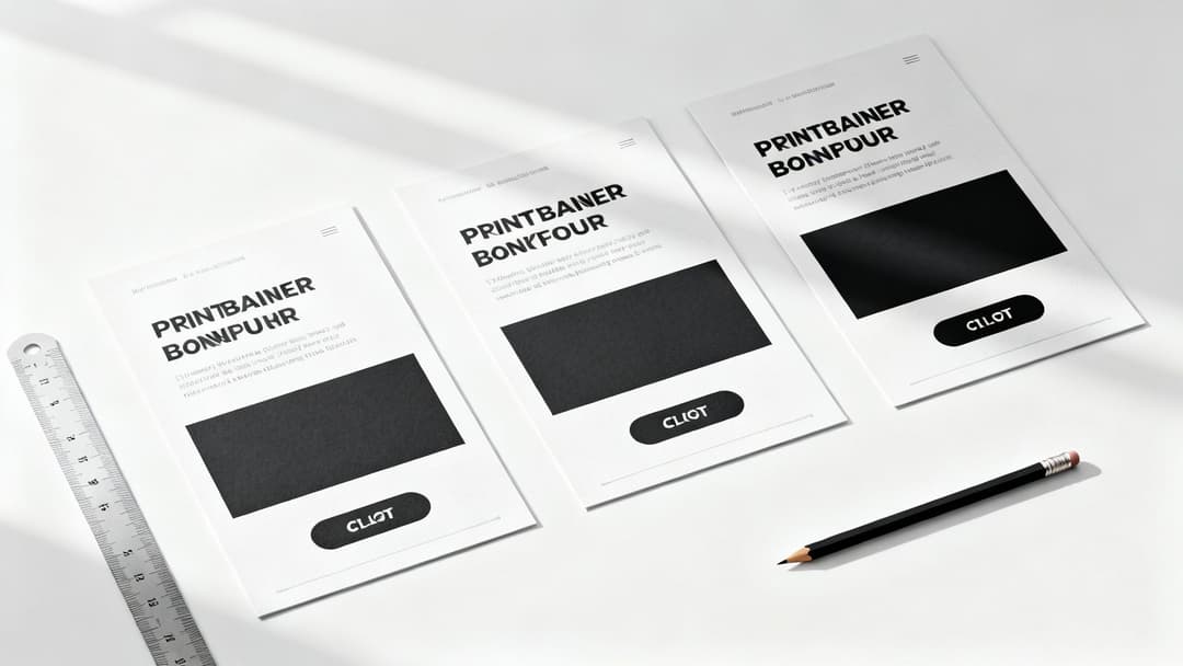
Alright, you’ve got your ad specs nailed down. Now for the fun part: blending a little art with a lot of science. A banner ad that actually performs is more than just a pretty picture; it's a masterclass in high-speed communication. You literally have a fraction of a second to grab someone's attention, get your point across, and get them to click.
It really boils down to three things working in perfect harmony. First, you need a clear visual path for the eye to follow. Then, you need copy that connects instantly. Finally, you need a call-to-action that’s impossible to miss. Get that sequence right, and you've turned a potential scroll-by into a click.
Master the Visual Hierarchy
Visual hierarchy is your secret weapon for controlling where a user looks. It’s all about making deliberate design choices that create a natural flow, leading someone’s eye from your main message straight to your CTA button.
Think of your banner as a tiny, super-focused landing page. What's the absolute first thing someone needs to see? Make that the most dominant element on the canvas.
- Your Value Proposition: This is your headline, the hero of the ad. Give it the biggest, boldest font. It has to immediately answer the question, "What's in it for me?"
- Supporting Imagery: Any image or graphic should support the value prop, not fight it for attention. A clean product shot or an aspirational lifestyle image usually does the trick. If you want to get really good at this, learning how to create AI Generated Images that convert is a game-changer.
- The Call-to-Action (CTA): This has to stand out. It’s the final stop on their visual journey.
Your logo needs to be there, of course, but it shouldn't be the star of the show. Tuck it into a corner to build brand recognition without distracting from the main event.
Write Copy for Small Spaces
Writing for banner ads is an exercise in ruthless editing. There's zero room for fluff. Every single word has to pull its weight and serve one purpose: earning the click.
This means your headline has to be a short, punchy, benefit-driven statement. Don't just say "High-Quality Running Shoes." Instead, try something like, "Run Faster, Hurt Less." The first is a feature; the second is a benefit that solves a real problem for the user.
Your ad copy must connect with a user's need or desire in an instant. Focus on the outcome they will get by clicking, not just on the features of your product.
For a deeper look at crafting text that truly connects, we've got a whole guide on writing great ad copy that resonates with audiences. Keep any other text to an absolute minimum—a short sub-headline is usually all you need.
Design an Irresistible Call-to-Action
The CTA is where the magic happens. It isn't just a button; it's the final nudge that converts a passive viewer into an active click. The design and wording here are absolutely critical.
- Color and Contrast: The button needs to pop off the screen. Use a color that contrasts sharply with the ad's background while still feeling on-brand. If your ad has a blue background, a bright orange or green button will command attention.
- Action-Oriented Words: Use strong, clear verbs that tell people exactly what to do. "Shop Now," "Get Your Free Trial," and "Learn More" are classics for a reason—they leave no room for confusion.
- Placement: Put the button where the eye naturally ends up after reading your headline and seeing your image. More often than not, this is the lower-right section of the banner.
By thoughtfully designing the visual flow, tightening your copy, and crafting a CTA that begs to be clicked, you're building a banner ad that’s engineered for performance from the very beginning.
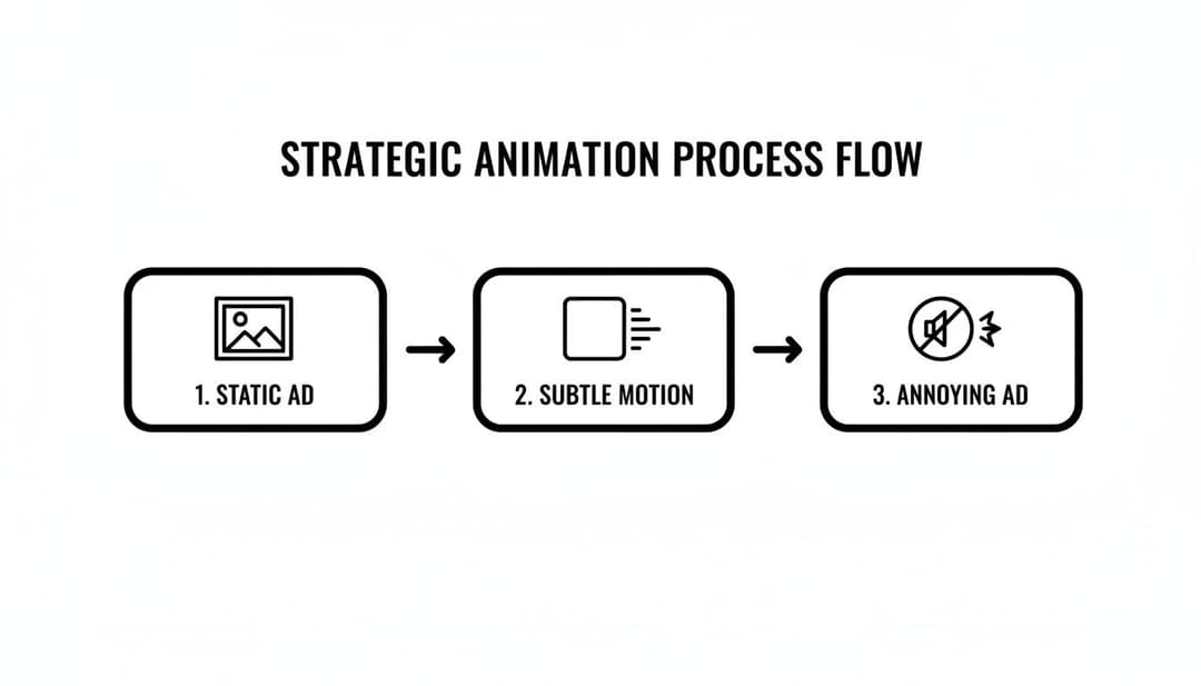
Using Motion and Animation Strategically
In a digital space this crowded, a little bit of movement can be the difference between getting noticed and getting completely ignored. Using motion in your banner ad design is a fantastic way to draw the eye, but you have to walk a fine line. There’s a big difference between captivating and just plain annoying.
We've all moved past the distracting, flashing GIFs of the early internet. The goal isn't to create a mini-movie. Instead, think of animation as a way to add emphasis and guide the viewer's journey through your ad. Subtle, purposeful motion—often built with modern formats like HTML5—can dramatically lift engagement without overwhelming someone.
A simple fade-in for your headline, a gentle slide for a product shot, or a subtle pulse on your CTA button can make a massive impact.
Keeping Motion Purposeful and Performant
Once you add animation to the mix, you’ve got a few new technical details to worry about. For any performance marketer, a slow or clunky ad is a wasted impression, plain and simple. The key is to keep everything light and efficient.
- Looping Limits: Your animation shouldn't run on an infinite loop. Most ad networks recommend keeping it to 15-30 seconds at most. After that, the ad needs to settle on its final, static frame.
- File Size is Still King: Animation adds weight. You have to be aggressive about optimizing every asset to stay under that crucial 150KB rule. This ensures your ad loads instantly, even on a spotty connection.
- Accessibility Matters: Any text that moves needs to maintain high color contrast throughout the animation. And definitely avoid any rapid flashing or strobing effects—they can be harmful to some users and are an easy way to get your ad flagged by the platforms.
The best animation serves a clear purpose. It should highlight a key feature, introduce the value proposition sequentially, or draw the final focus to the call-to-action. If the motion doesn't help tell the story or guide the user's eye, it’s just noise.
Choosing the Right Animation Style
The type of animation you choose has to align with your brand and your campaign goals. You don't need complex character animations to be effective; in my experience, the simplest effects often work best.
Imagine a banner for a new SaaS product. Instead of throwing all the features at the user at once, you could animate the key benefits to appear one by one. This builds a compelling case right before the "Start Free Trial" button appears. This kind of controlled reveal is far more effective.
This approach is actually a core component of more advanced strategies. If you want to go deeper, understanding what dynamic creative optimization is will show you how personalized animated elements can be served to different user segments for even better results.
When it's all said and done, strategic animation makes your banner ad feel more alive and interactive. By keeping your motion subtle, purposeful, and optimized for performance, you can capture attention and guide users toward that click without sacrificing a fast, accessible experience.
How to Scale Creative Production and Testing with AI
If you've ever tried to manually build and test every single banner ad variation for a campaign, you know the pain. It's a slow, painstaking process that completely drains your agility and frankly, leads to burnout. For modern performance marketing teams, the workflow has to evolve from that kind of manual grunt work to a smarter, automated system. This is where AI comes in.
Platforms like AdStellar AI are completely changing the game. Forget spending days stuck in a design tool. You can now generate hundreds of creative and copy variations in a matter of minutes. This shift is crucial—it moves your team away from guesswork and into a data-backed system built for speed and scale.
From Manual Labor to Automated Insights
The core idea here is pretty straightforward: connect your ad accounts, like Meta, directly to an AI platform. Doing this gives the system access to analyze your historical campaign data—every click, every conversion, every single impression. It starts learning what your audience has actually responded to in the past, identifying the winning patterns in your imagery, headlines, and calls-to-action.
Once the AI has chewed on that data, it can get to work.
- Generate Hundreds of Variations: It takes your best-performing images, headlines, and CTAs and combines them into a massive number of ready-to-test ad combinations.
- Maintain Brand Consistency: You can use pre-set templates to make sure every single ad, no matter the variation, stays perfectly on-brand with your logos, fonts, and colors.
- Push Campaigns Live Instantly: The real time-saver is launching complex, multi-variant tests directly to your ad platforms with a single click. This alone can save hours of tedious setup.
The goal is to test and iterate on your creative at a scale that's simply impossible to do by hand. This allows you to quickly discover the specific combinations that truly improve your Return On Ad Spend (ROAS).
For teams looking to build out their own systems, you can also investigate leveraging APIs for creative automation with tools like Canva, which opens the door to generating personalized banner ads at an unprecedented rate.
Using Data to Fuel Future Creative
This isn't just about making ads faster; it's about making them smarter. An AI-driven approach creates a powerful feedback loop. As new campaign data rolls in, the platform continuously refines its understanding of what works. It then ranks your top-performing creatives, audiences, and messages against the KPIs that actually matter to your business, like Cost Per Acquisition (CPA).
This process is about moving from static, one-off designs to a dynamic and ever-improving creative engine.
The implications for campaign management are huge. It frees up your team from mind-numbing production tasks and lets them focus on high-level strategy—where human expertise really shines. For an even deeper dive, you can explore our complete guide on using https://www.adstellar.ai/blog/ai-for-facebook-ads to see how these principles apply in a real-world context.
Ultimately, integrating AI into your banner ad design process is how you turn creative chaos into campaign clarity. It's how you unlock more revenue with far less wasted effort.
Got Questions About Banner Ad Design? We’ve Got Answers.
Even with a solid game plan, a few questions always seem to pop up when you're deep in the trenches of banner ad design. Performance marketers are constantly running into the same hurdles, so let's clear the air on some of the most common ones.
What Are the Biggest Banner Ad Design Mistakes People Make?
Hands down, the number one mistake is clutter. It's so tempting to try and squeeze in every last benefit, multiple images, and a convoluted call-to-action, but you just end up with visual noise. A banner that’s too busy is a banner that gets ignored.
Another huge one is creating a disjointed user journey. If your ad has a certain vibe and makes a specific promise, the landing page needs to match that—perfectly. When there's a disconnect, you break the user's trust and your conversion rates plummet. It has to feel like a seamless handoff.
And finally, so many people still forget to design for mobile first. It’s 2024. The vast majority of your impressions are going to be on a small screen, so if your design isn't crystal clear and compelling on a phone, you're just throwing money away.
Seriously, How Many Ad Variations Should I Test?
Look, there's no magic number here, but the approach is what really matters. If you're running tests manually, you absolutely have to isolate your variables. Otherwise, your data is meaningless. For example, you might test 3-5 headline variations against your best-performing image, or maybe try 3-5 different images while keeping the headline the same.
When you're testing by hand, changing one thing at a time is non-negotiable. If you change the headline and the image, you’ll never know which one actually moved the needle.
But this is where AI tools completely change the game. With the right platform, you can throw that one-variable-at-a-time rule out the window. These tools let you test hundreds of combinations of headlines, images, and CTAs all at once, helping you find those winning patterns way faster than any human ever could.
Which KPIs Actually Matter for Banner Ads?
Everyone obsesses over Click-Through Rate (CTR), and while it's a decent starting point, it doesn't pay the bills. A high CTR with zero sales is just a vanity metric. To truly understand if your designs are effective, you need to track the KPIs that are directly tied to revenue.
Here’s what you should be focused on:
- Conversion Rate: Of the people who clicked, how many actually did the thing you wanted them to do (buy, sign up, etc.)?
- Cost Per Acquisition (CPA): Simple and powerful. How much did you spend to get one new customer from that ad?
- Return On Ad Spend (ROAS): This is the big one. For every dollar you put in, how many dollars did you get back?
And don't sleep on View-through Conversions (VTCs). This metric is crucial for understanding the bigger picture. It tracks people who saw your ad, didn't click, but ended up converting later. VTCs show you the branding impact and halo effect of your creative, proving its value beyond just the immediate click.
Ready to stop the manual grind and scale your creative testing? AdStellar AI can help you launch, test, and scale your Meta ad campaigns 10x faster. Generate hundreds of ad variations in minutes and discover your winning combinations with AdStellar AI.