Creating an Instagram carousel is pretty straightforward on the surface: you just pick a few photos or videos, put them in order, and hit "publish." But really, this format is so much more than a simple slideshow. It's a way to tell a deeper story, break down a complex idea, or show off a product from every angle, all in a single, swipeable post.
Why Instagram Carousels Are Your Secret Weapon for Engagement

Let's get right to it. Instagram carousels aren't just another content format—they’re a strategic play to grab and hold your audience's attention. A big reason they work so well is that the algorithm seems to love them.
One of the coolest things about carousels is how Instagram might show your post to a user more than once, leading with a different slide each time. It’s a clever trick that basically gives you a second (or third) shot at getting noticed, bumping up your post's visibility without you having to lift a finger.
The Power of Dwell Time and Storytelling
This isn't just about sharing more photos; it's a calculated way to increase dwell time—how long someone actually spends looking at your post. When someone stops their scroll to swipe through your slides, it sends a strong signal to the algorithm that your content is interesting. That little boost can make a huge difference in your organic reach.
For performance marketers who live and breathe metrics like ROAS and CPL, carousels are an absolute goldmine. They're perfect for:
- Detailed Tutorials: Breaking down a "how-to" into simple, easy-to-follow steps.
- Product Showcases: Highlighting different features, angles, or ways to use a single product.
- Brand Storytelling: Walking your audience through your brand's mission or origin story in a compelling way.
The data doesn't lie: carousels have become an absolute powerhouse. They consistently outperform single images and even Reels on the engagement metrics that actually move the needle.
Data-Backed Performance Dominance
Recent analysis shows just how much carousels dominate the feed. A massive study looking at over 15 million posts found that carousels, on average, pulled in nearly triple the impressions of single images and double the impressions of Reels. That's a performance gap you just can't ignore.
Ultimately, mastering the carousel isn't just about posting content. It's about creating an interactive experience that keeps people engaged and drives real results. For more deep dives into digital marketing and growth, check out the RebelGrowth blog.
Planning Your Carousel Content for Maximum Impact

Before you even think about opening a design tool, let’s talk strategy. A killer carousel isn’t just a random collection of pretty pictures—it’s built on a solid concept that tells a story, pulling your audience from the first slide all the way to the last.
Think of it like a mini-presentation. A service-based business, for example, could use the classic Problem-Agitate-Solution framework. A fitness coach might start with a slide that asks, "Struggling with workout motivation?" and then guides the user toward a solution. E-commerce brands often get great traction with simple Before-and-After transformations or by showing off a single product from every conceivable angle.
But none of that matters if you can’t get the first slide right. Consider it your digital billboard; it has one job, and one job only: to stop the scroll.
Crafting an Unskippable Hook
That first slide needs to be absolutely irresistible. It’s the only part of your carousel that most people will ever see in their feed, so it has to spark immediate curiosity or deliver instant value.
Here are a few hook ideas that almost always work:
- Ask a Provocative Question: "Are You Making These 3 Common Marketing Mistakes?" This instantly engages anyone in that field and promises a clear takeaway.
- Present a Bold Statement: "Most Social Media Advice Is Wrong." A statement like this challenges a popular belief and makes people tap to find out why.
- Showcase a Compelling Result: Hit them with a powerful "after" photo or a screenshot of amazing metrics. Nothing demonstrates value faster than proof.
A great carousel feels like a conversation. Each slide should build on the last, guiding the user on a journey that ends with a clear action. If a slide doesn't serve the story, cut it.
Once you have your hook and a rough outline of your narrative, it's time to get your assets in order. This is a crucial part of learning how to create a carousel post on Instagram that actually looks professional. Of course, knowing who you're talking to is just as important; if you need to sharpen your targeting, you can learn more about audience segmentation strategies to make sure your content hits the mark.
Preparing Your Assets for Quality
Instagram is notorious for its aggressive file compression, which can quickly turn a beautiful design into a blurry, pixelated mess. To avoid this, you need to prep your files correctly from the start. Getting the specs right is non-negotiable if you want to look polished and professional.
Instagram Carousel Asset Specifications
To make things easy, here’s a quick-reference table with the technical specs you’ll want to follow. Sticking to these guidelines ensures your images and videos look sharp and display correctly on any device.
| Asset Type | Recommended Resolution (Pixels) | Aspect Ratio | File Format | Notes |
|---|---|---|---|---|
| Image | 1080 x 1350 (Portrait) | 4:5 | .JPG or .PNG | Takes up more screen space in the feed. |
| Image | 1080 x 1080 (Square) | 1:1 | .JPG or .PNG | Classic format, but less prominent. |
| Video | 1080 x 1350 (Portrait) | 4:5 | .MP4 | Recommended for maximum vertical impact. |
Here’s a pro tip: always go with the 4:5 portrait aspect ratio if you can. It simply takes up more vertical real estate on the screen, making your post more dominant and harder to ignore in the feed.
And here's the most important rule of all: make sure every single slide in your carousel uses the exact same dimensions. Mismatched sizes create a jarring, unprofessional swiping experience that will send users scrolling right past your post.
Designing Slides That Make People Swipe

Okay, now for the fun part: bringing your story to life visually. A truly great carousel guides someone from one slide to the next without them even realizing they're swiping. You don't have to be a graphic designer to pull this off, either. The secret is focusing on clarity, keeping your branding consistent, and ending with a powerful final slide that tells people exactly what to do next.
Your main goal is to create a seamless visual experience. The easiest win here is consistent branding—sticking to the same fonts, color palette, and logo placement on every slide. This creates a cohesive look that feels professional and intentional, reinforcing who you are with every single swipe.
Creating a Natural Swiping Motion
The biggest design challenge is making that swipe feel like a natural reflex. The best way to do this is with subtle visual cues that signal there’s more to see.
- Subtle Arrows or Icons: A simple arrow pointing right or a "Swipe for more" text overlay on the edge of the slide works wonders. It's a direct, no-nonsense instruction that leaves no room for confusion.
- Connecting Elements: This is one of my favorite tricks. Try extending a visual element, like a line graphic or a background shape, from the edge of one slide into the next. It creates a visual "thread" that pulls the user along, making them curious to see where it leads.
For instance, a marketing agency could have a winding road graphic that meanders across all 10 slides, with each "stop" revealing a different marketing tip. This not only encourages swiping but turns the whole carousel into a slick mini-infographic. If you're getting hung up on dimensions, we have a complete guide on the best size for Instagram photos to make sure your designs look crisp.
A successful carousel isn't just a collection of images; it’s a single, interactive experience. Every slide should feel like part of the same conversation, making the user want to see what’s next.
Balancing Text and Imagery
Remember, your carousel is going to live on a small mobile screen, so visual clarity is everything. Overcrowding a slide with too much text or busy images is a guaranteed way to make users swipe away from your post, not through it.
Keep your text large, legible, and brief. One key idea per slide is a fantastic rule to live by.
Think of your slides like mini billboards. You have a second or two to get your message across before the user moves on. Use high-contrast colors to make text pop, and be sure to break up text-heavy slides with a compelling photo or even a short video clip. A well-placed video can dramatically increase how long people spend on your post and serves as a great pattern interrupt to re-engage their attention.
The number of slides you use also plays a huge role. While you can add up to 10, you don't always need to. However, data suggests that for in-depth educational guides, using more slides can skyrocket your saves and shares. To get into the weeds on this, you can explore the insights from True Future Media's strategic playbook on how to best use that "story real estate."
Writing Captions That Complement Your Carousel
Your visuals might tell the story, but it’s the caption that closes the deal. It’s tempting to just describe what’s on the slides, but that's a missed opportunity. A great caption should add another layer of value, offering extra context or a personal story that the images alone can't convey.
Those first two lines are everything. Before Instagram hides the rest of your text behind that "...more" link, you need to give people a reason to tap. Think of it as a second hook, one that works with your cover slide to create undeniable curiosity. You could ask a provocative question or tease a key insight they'll only find by reading on.
Structuring Your Caption for Readability
Let's be real: nobody wants to read a wall of text on their phone. The trick is to make your caption feel light and easy to digest. Break it up into short, punchy paragraphs—just a sentence or two is perfect.
A few simple formatting moves can make a world of difference:
- Strategic Emojis: Use them to inject some personality or as a clever way to create bullet points. They’re fantastic for guiding the eye down the page.
- Line Breaks: White space is your best friend. Adding a simple line break between thoughts makes the entire caption feel more approachable and less like a chore to read.
Your caption isn’t just there to inform; it’s there to start a conversation. A well-structured caption feels welcoming, inviting your audience to become part of the story instead of just passively swiping by.
Crafting a Call to Action That Works
We can do better than the generic "Link in bio." To really get people to engage, your call to action (CTA) needs to be direct, valuable, and perfectly matched to the carousel's content. Give them a clear, simple next step. For a deeper dive, our guide on how to write a call to action has some great frameworks.
Instead of the old standbys, try prompts that encourage genuine interaction:
- "Swipe to see how it turned out, then drop your favorite step in the comments!"
- "Save this guide for your next project so you have it when you need it."
- "What's the one thing you struggle with most? Let me know below so I can help."
Finally, let's talk hashtags. Don't just dump a list of popular keywords at the end. A smart hashtag strategy is a mix. Use broad, high-volume tags for reach, sprinkle in some niche-specific ones to attract your ideal audience, and always include a unique branded hashtag to build a community. This balanced approach is how you get your carousel in front of the right people.
Uploading and Scheduling Your Carousel Like A Pro
You've got your slides designed and a killer caption ready to go. Now, it's time to get your carousel out into the world. This is the part of your workflow that can either save you a ton of time or turn into a serious bottleneck, especially if you’re trying to manage a full content calendar.
For a quick, one-off post, publishing directly from the Instagram app is totally fine. The process is dead simple: tap the "+" icon, pick your assets, reorder them, paste in your caption, and hit "Share." It works great for spontaneous, in-the-moment content.
But for any serious marketer, brand, or agency, living inside the app for every post is just not efficient. The real power comes from using desktop tools that let you plan, collaborate, and schedule ahead of time. This is how you build a consistent and sustainable content machine.
Using Meta Business Suite to Streamline Your Workflow
The Meta Business Suite (what used to be Creator Studio) is basically your command center for publishing across both Instagram and Facebook right from your computer. Honestly, it offers a much more organized and powerful way to manage your carousels.
The calendar view alone is a game-changer. It lets you see your entire content plan at a glance, making it easy to schedule posts for the absolute best times. If you're not sure when that is, you can learn more about finding the best days to post to social media and give your post the best shot at maximum reach from day one.
Here’s my typical process inside the Business Suite:
- Pick Your Profile: First things first, make sure you’ve selected the right Instagram account.
- Create Your Post: Hit the "Create post" button and choose "Add Photos" to upload all your carousel slides at once.
- Arrange and Optimize: Now you can drag and drop the slides into the perfect storytelling order. This is also where you add alt text for accessibility—a crucial step that way too many people skip.
- Drop in Your Caption & Details: Paste your pre-written caption, add a location tag, and tag any relevant accounts or collaborators.
Professionalism in social media management isn’t just about making great content; it’s about having a system. Scheduling posts from your desktop isn't just a convenience—it’s a core part of a strategic, scalable workflow.
For those of us managing a high volume of content, it's worth exploring tools that allow for uploading content directly, as they can offer an even more powerful alternative to the native tools.
The infographic below breaks down the simple but effective structure of a high-performing caption. It all comes down to three parts: the hook, the call to action, and the hashtags.
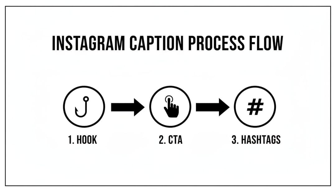
This visual flow really drives home the point that every part of your caption has a job to do, from grabbing attention right away to driving engagement and expanding your reach.
Advanced Features in Meta Business Suite
Beyond just basic scheduling, the Business Suite has some powerful features that can squeeze more value out of every single post. Don't just upload and walk away; make sure you’re using these.
If you have Instagram Shopping set up, you can easily tag products directly on your slides. This is huge—it turns your carousel into a mini-storefront and makes it incredibly easy for people to buy.
Another great tool is the collaborator feature. This lets you co-author a post with another account, which means it gets shared to both of your audiences at the same time. It's a simple way to effectively double your reach. Mastering how to create a carousel post on Instagram means using every tool you have at your disposal, and these advanced features are too good to ignore.
You hit "publish." Now what?
The real work begins after your carousel goes live. This is where you dig into the performance, figure out what your audience actually cares about, and use that feedback to make your next post even better. It’s a crucial loop for any creator serious about growth.
First things first, jump into your post's Instagram Insights. Don't just get distracted by the vanity metrics like likes. The numbers that truly matter are the ones that signal genuine interest and value.
- Saves: This is the gold standard. A save means someone found your content so useful they bookmarked it for later. It's one of the strongest indicators that you’ve created something genuinely valuable.
- Shares: When someone shares your carousel, they're not just passing it along; they're vouching for it to their own audience. This is a massive driver for organic reach and a powerful signal of trust.
- Reach vs. Impressions: It's easy to mix these up, but understanding the difference is key to knowing how your content is spreading. Our guide on what impressions are on Instagram breaks this down in more detail.
Finding the Drop-Off Points
One of the most powerful (and often overlooked) features in your Insights is the per-slide data. This tells you exactly how far people swiped through your carousel.
See a massive drop-off after slide three? Go back and look at that slide with a critical eye. Was the text confusing? Was the design a bit of a mess? This is direct, actionable feedback from your audience telling you where your storytelling lost its punch.
This kind of manual analysis is incredibly insightful, but let's be honest—it’s not a scalable strategy. Once you've identified a winning formula, the real challenge is replicating that success without burning out yourself or your team. This is exactly where AI can be a total game-changer.
Carousel posts are proven reach multipliers. Recent data shows that for accounts over 50K followers, carousels consistently outperform Reels in key metrics like saves, shares, and overall views, generating an average of 30,809 impressions per post. Discover more insights about Instagram performance on loopexdigital.com.
Scaling Your Creative Production With AdStellar AI
Imagine this: you take the raw data from your best-performing carousel—the hook that grabbed attention, the specific slides that earned the most saves—and use it as fuel for an entire campaign. That's precisely what a platform like AdStellar AI is designed to do.
Instead of building one post at a time, you can bulk-generate hundreds of creative variations all based on what you already know works. The AI can test different hooks, shuffle your value points, and automatically assemble new campaigns from your proven winners.
Suddenly, your one-off success story becomes a data-driven engine for growth. You’re no longer guessing what might work; you're scaling what does work. This intelligent approach is fundamental to mastering how to create a carousel post on Instagram that delivers consistent, repeatable results.
Your Top Instagram Carousel Questions, Answered
As you start putting carousels together, a few questions always seem to pop up. Let's run through some of the most common ones I hear so you can sidestep any potential issues and build your posts with confidence.
Can You Mix Videos and Images in One Carousel?
You absolutely can, and honestly, you should be.
Tossing a video into a sea of static images is a brilliant way to jolt someone out of their mindless swiping. That sudden motion acts as a "pattern interrupt," grabbing their attention and making them pause. This little trick can seriously boost the time people spend engaging with your post.
My biggest piece of advice here: Keep your aspect ratios consistent. If you start with a 4:5 vertical image, make sure every single slide—video included—is also 4:5. Nothing looks more amateur than Instagram awkwardly cropping your assets from one slide to the next.
What’s the Perfect Number of Slides?
This is the classic "it depends" scenario, but I can give you some solid guideposts.
If you're creating a deep, educational piece of content—something you want people to save and come back to—go long. Aim for 8-10 slides to pack in as much value as possible.
But for a quick product feature or a simple, punchy tip? 3-5 high-impact slides will do the job perfectly. The goal isn't just to fill all ten slots; it's to tell a complete, compelling story where every single slide earns its keep and pulls the viewer all the way to your final call to action.
Ready to turn your best-performing carousels into a scalable growth engine? With AdStellar AI, you can bulk-generate hundreds of ad variations based on your winning content, test different hooks, and launch data-driven campaigns in minutes. Stop guessing and start scaling what works. Discover how AdStellar AI can automate your Meta ad campaigns.