Writing a great call to action is part art, part science. It’s a blend of a clear, direct command with a compelling benefit that hits home with your audience. The real secret? Ditching generic phrases like "Click Here" and instead using language that answers the user's unspoken question: "What's in it for me?"
A powerful CTA doesn’t just ask; it promises value and shows a clear path to getting it.
Why Your Call to Action Is More Than Just a Button

Let's be clear: a call to action isn't just a button. It's the make-or-break moment where a user decides to engage or bounce. It’s the final instruction in your marketing message—the bridge between someone passively scrolling and actively converting. You can craft the most brilliant ad campaign in the world, but if that final ask is weak, the entire effort falls flat.
Think of it as the climax of your sales pitch. Everything you’ve said and shown leads to this one, single request. It’s where your audience goes from being merely interested to becoming a lead, a subscriber, or a customer. Shockingly, research shows that a staggering 70% of small business websites lack a clear CTA on their homepage. That’s a massive, avoidable missed opportunity.
The Core Elements of a High-Converting CTA
To really get why a CTA is so crucial, you have to see its role within broader marketing strategies. A killer call to action isn’t an accident; it’s a carefully engineered prompt built on proven principles. Throughout this guide, we'll dive deep into mastering these core components:
- Clarity and Simplicity: Your audience needs to know exactly what to do and what happens when they click. No confusion, no friction.
- Action-Oriented Language: We’re talking strong, commanding verbs that grab attention and inspire someone to act right now.
- Value Proposition: What’s the payoff? Clearly spell out the benefit the user gets by taking that next step.
- Urgency and Scarcity: Give them a compelling reason to act now instead of putting it off for later.
Understanding the human element is a huge piece of this puzzle. When you learn more about the psychology of advertising, you start to see how a great CTA taps into cognitive biases that drive our decisions. By mastering these elements, you’ll learn how to write a call to action that doesn’t just ask for a click—it earns it.
Defining Your Goal Before You Write a Single Word
Before you even think about slick verbs or the perfect button color, stop. The single most important step in crafting a call to action that actually works is defining its one, measurable purpose.
A CTA without a clear goal is like a ship without a rudder—it might look nice, but it's not going anywhere useful. Every click has to map directly back to a real business outcome.
Are you trying to generate high-quality leads, drive immediate sales, or get more demos on the calendar? Each of these goals requires a completely different CTA. Your main campaign KPI has to be the North Star guiding every word you write.
Aligning Your CTA with Business Metrics
Vague goals get you vague results. Forget about just aiming for "more clicks." Instead, your CTA needs to align with the specific performance marketing metrics that actually impact your bottom line.
Think about it this way:
- Goal: Drive Leads (CPL Focus): A B2B SaaS company needs to fill its pipeline. A CTA like "Start Your Free 14-Day Trial" is specific, packed with value, and directly supports the goal of getting new users at a target Cost Per Lead.
- Goal: Maximize Sales (ROAS Focus): An e-commerce store is running a flash sale. They need to turn window shoppers into buyers, now. "Claim 20% Off Your First Order" creates urgency and is laser-focused on boosting Return On Ad Spend.
- Goal: Secure Demos (CPA Focus): A company selling high-ticket software needs qualified conversations. A low-friction ask like "Book a 15-Minute Demo" is the perfect fit for a Cost Per Acquisition model. Understanding how this plays into your budget is key, which is why you need to know your customer acquisition cost calculation.
When you nail this alignment, your CTA becomes the obvious next step for the user, perfectly matching their intent with your business objective.
A CTA's success isn't measured in clicks alone. It’s measured in the quality and cost-effectiveness of the actions those clicks produce. The goal dictates everything—the language, the offer, and the entire experience that follows.
Once your goal is set, think about how the CTA fits into your broader landing page optimization best practices. After all, the button is just one piece of a much larger conversion puzzle.
Matching Your Goal to the Funnel Stage
Where a user is in your marketing funnel completely changes what you can ask them to do. Someone who just discovered your brand is almost never ready to "Buy Now," but they might be very interested in "Download Free Guide."
Let's break it down:
- Top of Funnel (Awareness): At this stage, you're building trust. Stick to low-commitment actions. Think "Learn More," "Watch the Video," or "Explore Features."
- Middle of Funnel (Consideration): The user knows they have a problem and you might have the solution. Offer more concrete value with CTAs like "Get a Free Consultation" or "Download the Case Study."
- Bottom of Funnel (Decision): They're ready to make a choice. It's time for direct, high-intent CTAs. This is where "Get Started Today" or "Request a Quote" shine.
By matching your CTA to the user's mindset at each stage, you create a smooth journey from discovery to conversion. It feels helpful, not pushy. Getting this foundational step right ensures every word you write from here on out serves a clear, strategic purpose.
Crafting CTAs with Powerful Action and Value
The best calls to action boil down to a simple, effective formula: Action + Value. The action is what you want someone to do, and the value is the crystal-clear benefit they get for doing it. This is precisely why generic CTAs like "Submit" or "Click Here" fall so flat—they only tell people what to do, completely ignoring the crucial "What's in it for me?" question.
Moving past these weak, lazy phrases is your first real step toward writing CTAs that actually convert. Instead of a button that just says "Download," you frame it as an offer: "Get Your Free Ebook." See the difference? One is a command, the other is an opportunity. This small shift in wording changes the entire dynamic.
Choosing Verbs That Drive Action
Every great CTA starts with a strong, action-oriented verb. This single word sets the tone and implies the level of commitment you're asking for. Forget passive language. You need words that build momentum and make the next step feel obvious and exciting.
Here are a few of my go-to, high-impact verbs:
- Get: Perfect for when the user is receiving something tangible (e.g., Get Your Quote).
- Try: Lowers the barrier to entry by suggesting a no-risk, exploratory action (e.g., Try Our Platform Free).
- Reserve: Creates a sense of securing something that might be limited (e.g., Reserve Your Spot).
- Claim: Implies taking ownership of an exclusive deal or offer (e.g., Claim Your Discount).
- Unlock: Suggests gaining access to premium, hidden, or valuable content (e.g., Unlock the Full Guide).
Your verb has to match your offer perfectly. If you're giving away a guide, "Get" or "Download" makes sense. If you're running a flash sale, "Shop" or "Claim" hits the right note. The right verb makes the user’s next move feel both intuitive and irresistible. For a masterclass in this, check out some examples of great ad copy to see how top-tier marketers pair powerful verbs with compelling offers.
This diagram breaks down how a well-defined goal and its KPI should directly shape the call to action you write. It’s not just about picking a punchy phrase; it's the final, critical step of a larger strategy.
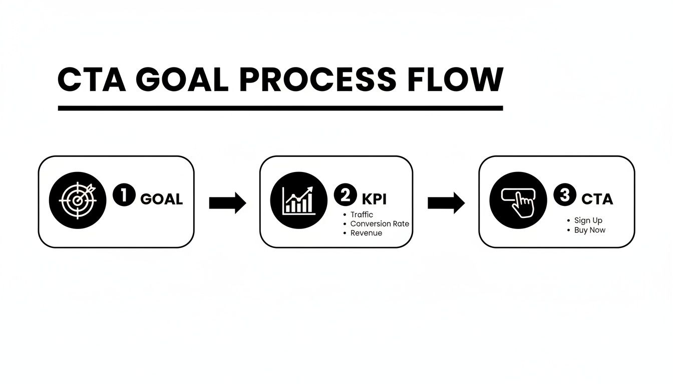
As you can see, your CTA isn't an afterthought. It's the execution point of your entire marketing plan.
Transforming Weak CTAs into High-Impact Commands
Let’s look at some real-world examples of this transformation. Moving from a generic request to a value-packed command makes a world of difference in your conversion rates.
| Goal | Weak CTA Example | Strong CTA Example | Why It Works Better |
|---|---|---|---|
| Lead Generation | Submit Form | Get Your Free Marketing Plan | Focuses on the valuable outcome for the user, not the boring action. |
| Webinar Sign-Up | Register | Save My Seat | Creates a sense of personalization and scarcity. |
| Sales Promotion | Shop Now | Get 50% Off Your First Order | Highlights the specific, compelling benefit of clicking. |
| App Download | Download | Start Your 30-Day Free Trial | Emphasizes the risk-free opportunity, not just the download itself. |
This table clearly shows the shift from a passive, company-focused request to an active, customer-centric offer. The strong examples give the user a reason to care and a clear vision of what they'll gain.
Injecting Urgency and Scarcity
Human beings are hardwired to avoid missing out. This psychological trigger, known as Fear of Missing Out (FOMO), is one of the most powerful tools in your CTA toolkit. By adding a touch of urgency (a time limit) or scarcity (a quantity limit), you give people a compelling reason to act now instead of putting it off.
A user's intent to act is highest at the moment they see your offer. Adding urgency prevents them from delaying the decision, which often leads to no decision at all.
Let's break it down with a couple of examples:
- Urgency: "Shop the Sale Before It Ends Tonight" uses a hard deadline to drive immediate action. The user knows if they hesitate, the opportunity is gone for good.
- Scarcity: "Claim Your Spot—Only 10 Left" taps into limited availability to boost the offer's perceived value. When something is scarce, it instantly feels more exclusive and desirable.
You don't have to be overly aggressive here. Even a gentle nudge can make a huge impact. Simple phrases like "Limited-Time Offer," "While Supplies Last," or "Offer Ends Friday" are easy ways to build that crucial momentum and get users off the fence.
Tailoring Your CTA for Different Platforms

A great call to action is a chameleon. To be effective, it has to adapt to its environment. The punchy, direct CTA that crushes it in a Meta ad will feel jarring and out of place in a long-form email newsletter. You have to understand the context of each platform to write CTAs that feel natural and actually get people to click.
Think about it: your audience's mindset shifts dramatically as they move from a social feed to a dedicated landing page or their own inbox. A one-size-fits-all approach just ignores this reality and leaves a ton of conversions on the table.
Optimizing CTAs for Meta Ads
On platforms like Facebook and Instagram, you're fighting for attention in a fast-scrolling, visual-first world. People aren't there to read a novel; they want to be entertained and discover something new. This means your CTA needs to be incredibly concise and play well with Meta's native buttons.
The goal here is to complement the button, not just repeat it. If the button says "Shop Now," your ad copy should build anticipation for that action.
Let's imagine a campaign for a 20% discount on athletic shoes:
- Weak Approach: The ad copy says, "Shop our new shoe collection now," and the button also says "Shop Now." It’s redundant and completely uninspired.
- Strong Approach: The ad copy frames the benefit: "Step Up Your Game with 20% Off." Now the user is primed with the value, making the "Shop Now" button the logical, compelling next step.
The key is to use your ad copy to provide the why (the value) and let the platform’s button provide the what (the action).
Crafting CTAs for Landing Pages
A landing page is your home turf—a controlled environment designed for a single purpose: conversion. Unlike a social feed, you have the user’s focused attention. Here, your CTA strategy can be a bit more sophisticated, often involving both primary and secondary calls to action.
Your primary CTA should be the main event. Make it bold, benefit-driven, and impossible to miss. For our 20% discount offer, this would be a prominent button that screams, "Claim My 20% Discount Now."
But not everyone is ready to buy immediately. That's where a secondary CTA comes in. It offers an alternative for users who aren't quite ready to commit, keeping them engaged without pushing for the hard sell. This might be a less prominent text link like, "See the full shoe collection." This simple strategy lets you capture interest from people at different stages of readiness.
Where you put your CTA is just as important as what it says. Strategic positioning can have a massive impact on your results. Research shows that personalized CTAs perform a staggering 202% better than generic ones. And just placing your CTA "above the fold" can boost conversions by as much as 317%.
Writing CTAs for Email Marketing
Email is personal. It's a channel built on relationships and trust, and your CTAs need to reflect that. You have more space to build a narrative, so your call to action can serve as the climax of a compelling story or offer.
For our 20% off shoe campaign, an email CTA can be woven in multiple ways:
- Primary Button: A visually distinct button is still essential. A CTA like "Get My 20% Off" works perfectly.
- In-Text Links: Sprinkle CTAs naturally into the email copy. For example, "Don't miss your chance to grab the perfect pair of running shoes before the sale ends."
Your email CTA is a direct invitation to a loyal subscriber. It should feel less like a public announcement and more like a personalized offer, guiding them from their inbox to the exact product or deal you promised.
The most effective emails often use a combination of a bold button and contextual in-text links, giving readers multiple opportunities to act. If you want to learn more about getting your offers in front of the right eyes, you might find our guide on the placement of advertising helpful.
Testing and Measuring Your CTA Performance
Nailing a great call to action is a fantastic start, but it's just that—a start. The real magic happens when you let data take the wheel. After all, you can't improve what you don't measure. This is the moment you shift from making educated guesses to making data-driven decisions that turn good CTAs into absolute conversion machines.
Simply throwing a CTA out there and hoping for the best is a surefire way to burn through your ad budget. What you really need is a solid framework for constant, iterative improvement.
The Science of A/B Testing Your CTAs
A/B testing is your single most powerful tool for dialing in your CTAs. It’s a straightforward concept: create two (or more) versions of your ad or landing page, change just one thing between them, and see which one pulls in better numbers. You’d be shocked at how a tiny tweak can create a massive lift in conversions.
To get clean, reliable results, the key is to test one variable at a time. Here are a few ideas to get you started:
- Action Verb: Does "Get Your Demo" work better than "Request Your Demo"? The only way to know for sure is to test it.
- Value Proposition: Is "Save 50% Today" a stronger hook than "Shop Our Biggest Sale"? Let your audience decide.
- Button Color: It sounds almost too simple, but switching a button from blue to green can sometimes have a surprisingly significant impact on click-through rates.
- Placement: See what happens when you move your CTA from the bottom of the page to right above the fold. Does it grab more eyeballs?
This kind of rapid experimentation is exactly what platforms like AdStellar AI are built for, letting you spin up and test hundreds of copy and creative variations without the manual grind. For a deeper dive into the methodology, our guide on what is A/B testing in marketing is a great place to start.
Don't just test to find a winner. Test to understand why it won. Every result—good or bad—gives you a clue about what motivates your audience, an insight you can carry forward into every future campaign.
Key Metrics That Truly Matter
A high click-through rate (CTR) feels great, but it’s only one piece of the puzzle. A CTA that gets a million clicks but generates zero sales isn't a success; it's a vanity metric. To get the full picture, you have to look further down the funnel.
The metrics that actually define a winning CTA are the ones tied directly to your business goals:
- Conversion Rate: This is the big one. It’s the percentage of people who actually took the desired action after clicking your CTA.
- Cost Per Conversion (CPA): How much are you spending for each lead, sale, or sign-up? A truly great CTA should drive this number down.
- Return on Ad Spend (ROAS): This is the ultimate bottom line. For every dollar you put in, how much revenue did that CTA bring back out?
Landing pages are where these metrics really come to life. As of Q4 2024, the average landing page conversion rate hovers around 6.6%, which already blows the typical 2.4% seen on general website pages out of the water. But the top 10% of performers push that number even higher to 11.5% or more, proving what's possible with relentless optimization. (Unbounce.com has more insights on these benchmarks).
This data just goes to show the incredible power of a dedicated, highly optimized user experience—all driven by a clear and thoroughly tested call to action.
Of course. Here is the rewritten section, crafted to sound completely human-written and natural, following all your provided instructions and examples.
Common CTA Mistakes That Are Quietly Killing Your Conversions
Even seasoned marketers make mistakes that can quietly sabotage conversions. A seemingly small misstep in your call to action can bring an otherwise perfect campaign to a screeching halt. Think of this as your final pre-flight check, making sure every CTA you launch is clear, compelling, and ready to fly.
Let's start with the most common offender: CTA clutter. This is what happens when you bombard users with too many choices on a single page or ad. A landing page screaming "Start Your Trial," "Book a Demo," and "Download the Ebook" all at once is a recipe for decision paralysis. When people get confused, they usually do nothing at all.
The fix is surprisingly simple. Focus on one primary goal for each asset. Pick the single most important action you want someone to take and build your main CTA around that. If you absolutely need other options, demote them to secondary, less prominent links.
Using Vague or Mismatched Language
Another surefire conversion killer is lazy, generic language that doesn't connect with what the user actually wants to do. Buttons like "Submit" or "Learn More" are just plain uninspired. "Submit" is all about what you're getting, not what they're receiving. And "Learn More"? That's often a huge missed opportunity when you really want them to buy something or start a trial.
Your CTA is a promise. If your ad promises a free trial but the button on your landing page says "Sign Up," that tiny disconnect creates friction and chips away at trust. Consistency is everything.
Always be specific and frame the CTA around the benefit. Instead of "Submit," try something like "Get My Free Guide." Ditch "Learn More" on a product page for "See Pricing" or "Explore Features." This kind of clarity sets the right expectations and moves the user forward with confidence.
Flying Blind Without Performance Data
You can't craft a great CTA in a vacuum. Without knowing the benchmarks, you have no idea if your results are good, bad, or just average. Conversion rates swing wildly depending on the industry and where your traffic is coming from, and that context is critical for setting realistic goals.
For example, the average conversion rate for organic search traffic hovers around 2.7%. But paid search is a completely different ballgame. The average conversion rate in Google Ads climbed to 7.04% in 2023—that's nearly three times higher. Knowing these numbers helps you diagnose your CTA’s performance and tells you where to put your energy. You can find more detailed stats on conversion rates by industry here.
By dodging these common pitfalls—clutter, vague language, and a lack of data—you can ensure your calls to action don’t just ask for a click, but actually earn that conversion.
Ready to stop guessing and start scaling? With AdStellar AI, you can launch, test, and analyze hundreds of CTA variations in minutes, not hours. Our AI-powered platform identifies what resonates with your audience and automatically scales your winning campaigns.