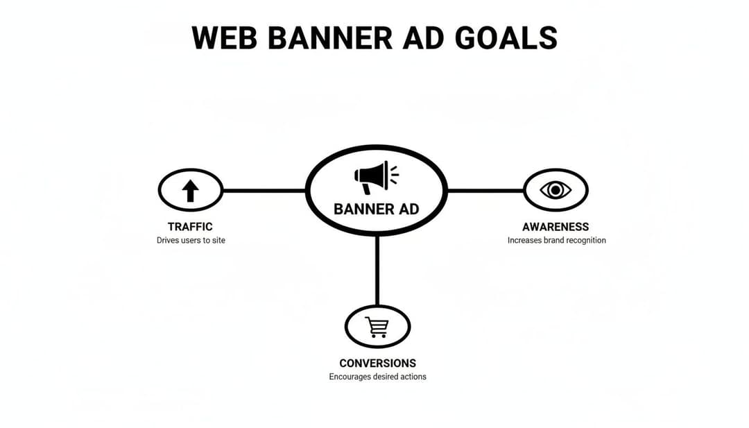
At its core, a web banner ad is that rectangular ad you see plastered across websites. Think of it as a digital billboard, but instead of being on the side of a highway, it’s placed on the internet’s busiest properties—the sites your ideal customers visit every single day. The goal is simple: grab their attention, pull them over to your website, and turn them into a customer.
Why the Web Banner Ad Still Dominates Digital Advertising
It’s tempting to write off the humble banner ad as a fossil from the early days of the internet. But despite being one of the oldest forms of digital advertising, it’s far from extinct. In fact, it remains a powerhouse, commanding a huge slice of global ad spend.
Anyone who tells you banner ads are “dead” simply isn’t looking at the data. Display advertising, which is driven by web banners, continues to attract massive investment year after year. Why? Because when you get them right, banners deliver consistent, measurable results for everything from building brand awareness to driving immediate sales.
The Challenge of Banner Blindness
Of course, we have to talk about the elephant in the room: banner blindness. We’ve all done it. You land on a page and your eyes automatically skate past the ads, tuning them out completely. It's a real phenomenon where users have trained themselves to ignore anything that looks like an ad.
This is a genuine challenge, but it's not a dealbreaker. If anything, it’s the very reason that smart, creative strategy is so critical today. It forces us to be better marketers. We'll dive deep into specific tactics to slice right through banner blindness later in this guide.
To appreciate their power, you need to see where banners fit in the bigger picture. A great guide on Display Ads vs Search Ads breaks down their different jobs. In short, banners are masters at creating initial demand, while search ads are there to capture it. Getting this balance right is the key to a truly effective marketing strategy.
A web banner ad is not just a static image; it's a versatile tool for storytelling. It can introduce a problem, showcase a solution, and provide a clear path to action, all within a compact, visually engaging format.
The Three Main Types of Web Banner Ads Explained
Before we get into the weeds of design and strategy, let’s quickly break down the main types of banner ads you'll encounter. Each has its own strengths and is best suited for different goals.
Here’s a quick-reference guide to help you choose the right format for your campaign.
| Ad Type | Description | Primary Use Case |
|---|---|---|
| Static Banners | Simple image-based ads (JPG, PNG) with a fixed design. They are quick to create and load fast. | Building brand awareness and delivering a straightforward, single-focus message. |
| Animated Banners | Ads that use motion (GIF, HTML5) to tell a short story or highlight multiple features in a sequence. | Capturing user attention, breaking through banner blindness, and demonstrating product features. |
| Interactive Banners | Advanced HTML5 ads that allow users to engage directly, such as playing a mini-game or filling out a form. | Boosting engagement rates and providing a memorable, hands-on brand experience. |
Understanding these formats is the first step. Static banners are great for simple, bold messages. Animated banners help you tell a slightly bigger story and grab more attention. And for a truly memorable experience, interactive ads invite the user to play, making your brand stick in their mind.
What Banner Sizes and Formats Should I Use?
Picking the right size and format for your banner ad isn't just a technical detail—it's one of the most critical decisions you'll make for your campaign. Think of it like buying ad space in the real world. A massive skyscraper ad might seem impressive, but if it’s in the wrong place or interrupts someone’s view, it’s just expensive noise. The wrong choice can kill your campaign before it even has a chance.
The sweet spot for banner ad performance lies in how well it fits into a webpage's natural flow. Ads that feel like part of the furniture, rather than an unwanted guest, just work better. For instance, getting your ad above the fold—the area a user sees without scrolling—can boost your click-through rate (CTR) by a whopping 18–30%. This is why a few specific sizes have become the reliable workhorses of the industry.
Before we get into sizes, let's be clear on what you're trying to achieve. Is it brand awareness? Driving traffic? Or are you going straight for the sale?
As you can see, a single banner can wear many hats. Your goal will heavily influence both your design and your choice of format.
The Most Impactful Banner Ad Sizes
You'll come across dozens of ad sizes, but honestly, only a handful truly dominate. These are the standard sizes set by the Interactive Advertising Bureau (IAB), which means they're supported by virtually every major ad network. Sticking to these ensures your creative looks great no matter where it shows up.
The a-team of the banner ad world includes:
- 300x250 Medium Rectangle: This is the undisputed champion. It’s versatile enough to fit snugly within blog content, sidebars, and even on mobile screens without being disruptive. It's a go-to for both branding and direct-response campaigns for a reason.
- 728x90 Leaderboard: You've seen this one a million times. It sits right at the top of a webpage, giving it prime viewability. If you have a high-impact brand message to deliver, this is your billboard.
- 160x600 Wide Skyscraper: This tall, skinny ad lives in the sidebars. Its biggest advantage? It stays in view as users scroll down the page, making it a fantastic choice for retargeting campaigns where you want to keep your brand top-of-mind.
The 300x250 Medium Rectangle is so effective because it plays nice with how we read online. It slots into the content grid so seamlessly that it feels less like a jarring ad and more like a natural part of the page.
With the global display ad market hitting a projected $247 billion in 2026, these formats are doing the heavy lifting. The 300x250 in particular often pulls in the highest click rates, thanks to its prime placement within content. If you want to understand its power, you can get a full breakdown of the 300 x 250 banner ad and its strategic uses.
Top Performing Web Banner Ad Sizes and Their Strategic Use Cases
To make it even clearer, here’s a quick-glance table breaking down the most popular IAB sizes and where they shine. These are the formats that consistently deliver results for performance marketers.
| Banner Size (Name & Dimensions) | Common Placements | Primary Use Case | Key Advantage |
|---|---|---|---|
| Medium Rectangle (300x250) | Embedded within content, sidebars | Branding & Direct Response | High engagement, versatile placement |
| Leaderboard (728x90) | Top of the page, above the main content | Brand Awareness | Maximum initial viewability |
| Wide Skyscraper (160x600) | Sidebars | Retargeting & Sustained Awareness | Stays visible during scrolling |
| Large Rectangle (336x280) | Embedded within content, sidebars | Direct Response | Larger canvas for more copy/visuals |
| Half Page (300x600) | Sidebars | High-Impact Storytelling | Large, immersive format grabs attention |
| Mobile Leaderboard (320x50) | Top or bottom of mobile screens | Mobile-Specific Branding | Standard for mobile web, high reach |
Choosing from this list is a great starting point for any campaign. You’re tapping into formats that publishers have already optimized their sites for and that users are accustomed to seeing.
Technical Specs: File Types and Size Limits
Okay, you've picked your dimensions. Now for the technical stuff. The file type and size are just as crucial. One determines what your ad can do (is it static or animated?), while the other determines how fast it loads.
Common File Types
- JPG/PNG (Static): The bread and butter. These are simple image files that load fast and are perfect for a single, powerful message. Use PNG if your ad needs a transparent background.
- GIF (Animated): The original animated format. GIFs use simple frame-by-frame motion, but they're clunky. Their limited color palette and larger file sizes have made them mostly obsolete in favor of HTML5.
- HTML5 (Animated/Interactive): This is the gold standard for modern display ads. HTML5 banners are like mini-websites, capable of complex animations, interactive elements, and even video. They can boost performance by over 2x compared to a boring static ad.
Finally, a word on weight. Every ad network has strict file size limits—usually around 150 KB. Why? Because a heavy ad slows down the entire webpage, creating a terrible user experience that reflects poorly on everyone. Always optimize your images and code to stay under that limit without sacrificing quality. It’s a non-negotiable part of the game.
Designing Banner Ads That Capture Attention and Convert
A great web banner doesn’t just exist; it has a job to do. It gets a few precious seconds to slice through the endless scroll, land a message, and convince someone to act. This isn't about luck or just splashing bright colors on a screen. It’s about a smart, focused approach to design and copy that leads the viewer’s eye—and their mind—toward one single goal.
Think of it like a perfectly composed photograph. A great photo has a clear subject, uses contrast to pull you in, and tells a story without a single word. Your banner ad has to do all that, but in a much more crowded room. To pull it off, we need to nail three core pillars: a strong visual hierarchy, killer copy, and a call-to-action that’s impossible to ignore.

Establish a Clear Visual Hierarchy
Visual hierarchy is simply the art of telling someone’s eyes where to look first, second, and third. An ad without it is a confusing mess. An ad with it is an intuitive guide that just makes sense.
Start with your most important piece. Is it a stunning product shot? A bold headline? Your logo? Whatever it is, make it the hero. Use size, color, and contrast to make it pop off the screen. For instance, a brightly colored object against a muted background instantly becomes the star of the show.
Here’s a simple but incredibly effective trick: use human faces. Our brains are wired to notice and connect with them, which can give your engagement a serious boost. If your brand has a human benefit, show it.
A well-designed banner ad follows a simple, three-part structure. First, the value proposition grabs attention. Second, the brand logo builds recognition. Third, the call-to-action drives the click. Each element should be distinct yet cohesive.
Write Compelling and Concise Copy
You have almost no space and even less time, so every single word has to earn its spot. Your headline is your first—and maybe only—shot to hook them. It must be short, punchy, and all about what’s in it for the user. Don't waste time describing your product; sell what it does for them.
Good vs. Bad Headline Examples
Bad: "Our Advanced CRM Software" (So what? It just describes the product.)
Good: "Close More Deals, Faster." (Now we’re talking. This highlights the benefit.)
Bad: "New Season Collection Now In" (Vague, boring, and uninspired.)
Good: "50% Off Your Summer Wardrobe" (Specific, urgent, and packed with value.)
The goal is to immediately answer the viewer’s silent question: "What's in it for me?" Be direct, use numbers to make your point, and sprinkle in some urgency or exclusivity if you can.
If you want to dig deeper, exploring different takes on web banner ad design can spark some fresh ideas and introduce you to more advanced techniques.
Create an Irresistible Call-to-Action
The call-to-action (CTA) is the final, make-or-break moment. This is the button that turns a passive scroller into an active lead. Forget weak, generic phrases like "Click Here" or "Submit"—they communicate zero value. Your CTA should be action-oriented and finish the sentence, "I want to..."
For example, instead of "Learn More," try "Get Your Free Trial." The second option is specific, gives the user a sense of ownership, and promises a real benefit.
The design of your CTA button is just as critical as the words on it.
- Contrast is Key: The button’s color absolutely must stand out from the rest of the ad. If your banner is mostly blue, a bright orange or green button will practically scream for a click.
- Make it Obvious: It has to look like a button. Use a familiar rectangular or rounded shape with a clear border or shadow to make it feel tangible and clickable.
- Keep it Simple: One CTA per ad. Giving people too many choices often leads to them choosing none at all. Focus every element of your web banner ad on driving a single, primary action.
By mastering these three pillars—hierarchy, copy, and CTA—you stop creating background noise and start building an active, persuasive tool that commands attention and, most importantly, drives conversions.
Your Playbook for Winning Web Banner Ad Campaigns
Moving beyond a single, beautifully designed banner is where the real magic happens. A great ad is a solid start, but a cohesive campaign is what actually builds predictable, scalable growth. This all comes down to matching your message and creative to where a potential customer is on their path to purchase.
Think of it like you're fishing. Sometimes you need to cast a huge net just to see what's out there (prospecting). Other times, you need a small, specialized net to go after a specific fish that got away (retargeting). Each one needs a different approach to get the job done.
You’ll build your entire strategy around three core campaign types: brand awareness, prospecting, and retargeting. Each one has a distinct job, from introducing your brand to a totally cold audience to finally sealing the deal with someone who’s just a click away from buying.
Aligning Your Banners with the Sales Funnel
Your creative and copy must change for each stage of the customer journey. You wouldn't show the same ad to someone who’s never heard of you as you would to someone who just abandoned their shopping cart an hour ago.
Top of Funnel (Awareness/Prospecting): The goal here is simple: get seen. Your ads should have a bold value proposition, eye-catching visuals, and focus on building brand recognition. The message is more educational and problem-focused—definitely not a hard sell.
Middle of Funnel (Consideration): At this point, people know they have a problem and are actively looking at solutions. Your banners can start showcasing specific features, flashing testimonials, or driving them to a case study. The call-to-action might be something like "Discover the Features" or "See How It Works."
Bottom of Funnel (Conversion/Retargeting): This is where you bring it home. Retargeting campaigns are your secret weapon here, targeting users who have already been to your site. The message needs to be direct, often showing the exact product they were looking at or an exclusive offer to push them over the edge, like "Get 15% Off Today."
Retargeting works because it focuses your ad spend on an audience that’s already qualified. You're not shouting into the void anymore; you're having a one-on-one conversation with someone who already raised their hand.
Today, most banner campaigns are driven by programmatic advertising, which is just a fancy term for an automated system that buys and places your ads. Programmatic is the engine that makes all of this sophisticated targeting possible. The growth here is wild; programmatic ad spend in the US alone blew past $180 billion in 2025.
While the average click-through rate (CTR) for a generic display ad hovers around a humble 0.46%, well-executed retargeting banners can pull in a 3–4x higher CTR, proving just how effective they are.
Budgeting and Bidding Strategies
How you pay for your ads has a huge impact on your campaign's results. You have to match your bidding strategy to what you’re trying to achieve. For banner ads, it boils down to three main models:
CPM (Cost Per Mille): You pay for every 1,000 times your ad is shown (impressions). This is your go-to for brand awareness campaigns where the main goal is just to get as many eyeballs on your ad as possible, clicks or not.
CPC (Cost Per Click): You only open your wallet when someone actually clicks your ad. This is perfect for prospecting and traffic campaigns because you're only paying for users who are interested enough to engage.
CPA (Cost Per Acquisition): You only pay when someone completes a specific action, like making a purchase or signing up for a newsletter. This is the ultimate performance-based model, tailor-made for retargeting and conversion-focused campaigns where ROI is king.
By getting a handle on these campaign types and bidding models, you can build a smart strategy that goes way beyond just putting ads out there. To really sharpen your skills, you can dive deeper with our guide on display ad targeting strategies. This is how you turn a simple web banner into a machine that predictably generates revenue.
How to Measure and Optimize Campaign Performance
Launching a banner ad campaign without a solid measurement plan is like throwing money into a black hole. You know it’s gone, but you have no idea what, if anything, it accomplished. To make sure your budget is actually working for you, you have to look past the flashy "vanity metrics" and dig into the data that tells the real story of performance and profit.
This all starts by tracking the right Key Performance Indicators (KPIs). Sure, clicks are a starting point, but they barely scratch the surface. A smart, data-driven approach means getting a much clearer view of how people are actually engaging with your ads and what actions those clicks (or even views) are leading to.
The Metrics That Actually Matter
To get a complete picture of your campaign's health, you need to watch a handful of essential metrics. Think of each one as a different instrument on your dashboard—together, they show you what’s working, what isn't, and exactly where you can make improvements.
Click-Through Rate (CTR): This is the most basic one, showing the percentage of people who clicked your ad after seeing it. A high CTR feels great and shows your creative is grabbing attention, but it's not the end goal. A sky-high CTR with zero conversions just means you're good at getting people to click, not buy.
Viewability: This metric answers a simple but critical question: was your ad actually seen? An impression counts as viewable if at least 50% of the ad is on-screen for one second or more. You should be aiming for a viewability rate of 70% or higher. Anything less, and you're paying for ads that never even had a chance to make an impact.
Conversion Rate: This is where the rubber meets the road. Your conversion rate tracks the percentage of users who took the action you wanted—like making a purchase or signing up—after clicking your ad. This metric is what directly connects your ad spend to real business results.
Don’t just look at the last click. Modern attribution models can show you how your banner ads contributed to conversions even when they weren't the final touchpoint. An ad might not get the click, but it could be the reason a user later searched for your brand.
From Measurement to Optimization
Once you have a steady stream of data flowing in, you can shift from just watching the numbers to actively improving them. This is the fun part—turning insights into action and systematically making your campaigns better over time. The best way to do this? Disciplined A/B testing.
A/B testing (or split testing) is simple in theory: you create two or more versions of an ad and run them at the same time to see which one performs better. It takes all the guesswork out of the equation and lets the data tell you what your audience responds to.
What to A/B Test in Your Banner Ads
- Headlines: Pit a benefit-driven headline against one that asks a question. Or try a bold statistic versus a straightforward statement.
- Images: Test a clean product shot against a lifestyle photo. Sometimes, an image with a human face can make all the difference.
- Call-to-Action (CTA): This is a big one. Test the button copy ("Get Your Free Trial" vs. "Start Now") and even the button color (is green or orange more compelling?).
The golden rule of A/B testing is to only change one variable at a time. If you change both the headline and the image, you’ll have no idea which change was responsible for the results. Keep your tests running until you have enough data to be confident the outcome isn’t just random chance—that’s called reaching statistical significance.
Ultimately, all these metrics and tests are meant to answer two questions: Are you making money, and is your ad spend efficient? That’s where you get into Cost Per Acquisition (CPA) and Return on Ad Spend (ROAS). To truly grasp the profitability of your campaigns, you need to know how to calculate Return on Ad Spend (ROAS). You can also go a level deeper by reading our guide on how to measure advertising effectiveness. By continuously testing, learning, and iterating, you can turn your banner ad campaigns into a predictable engine for growth.
Beating Banner Blindness With Smarter Creative Tactics
Ever wonder why your beautifully designed banner ads seem to get lost in the noise? You're likely running into a powerful opponent every performance marketer faces: banner blindness.
It's a simple, subconscious habit. Over years of browsing, we’ve all trained our brains to be ruthlessly efficient, focusing only on the main content of a page and mentally tuning out anything that looks like an ad. Think of it as your brain’s built-in ad blocker, dismissing the visual clutter on the sides and top of a webpage.
Just like you might ignore the same old storefronts on your daily drive, users automatically filter out anything that screams "I'm an ad!" The second they sense a promotion, their brain disengages to save energy. For us marketers, that's a huge wall to climb.

Keep Things Fresh to Fight Ad Fatigue
The first time someone sees your ad, it might grab their attention. But by the tenth time? It’s just digital wallpaper. This is ad fatigue, and it’s one of the main causes of banner blindness. Once your ad frequency gets too high without a change, performance inevitably tanks.
The best defense is a good offense, and in this case, that means creative refreshment. This doesn’t mean a total brand overhaul every week. Instead, it’s about a steady, ongoing process of introducing new visuals, different copy, and updated offers to keep your campaigns from going stale.
Banner blindness isn't just a theory; the numbers prove it's a real challenge. A staggering 86% of internet users subconsciously ignore banner ads, leading to an average click-through rate of a dismal 0.06%. One proven tactic to break through is using human faces in your ads, which can lift performance by up to 40%.
Break Through the Noise with Motion and Native Design
To cut through that indifference, your ad needs to interrupt the user’s passive scrolling without being obnoxious. This is where a little bit of modern design savvy comes in handy.
- Subtle HTML5 Animation: Forget the loud, flashy animations of the past. Instead, use gentle motion to draw the eye. Think about a call-to-action button that pulses slightly or text that fades in one element at a time. This subtle movement is often just enough to catch a glance without annoying the user.
- Native Ad Formats: These are the chameleons of the ad world. Native ads are built to match the look, feel, and function of the website they appear on. By blending in with the surrounding content, they feel less like a disruptive ad and more like a genuinely helpful recommendation, which can make a world of difference for engagement.
By understanding the psychology driving banner blindness and using these smarter creative tactics, you can transform your ads from overlooked wallpaper into assets that actually capture attention and drive results. For a deeper look at making your ads pop, check out our guide on how to enhance ad visibility.
Even when you’ve nailed down your strategy, a few practical questions always pop up during a banner ad campaign. Let’s tackle some of the most common ones we hear from marketers in the trenches.
What Is a Good CTR for a Web Banner Ad?
This is the million-dollar question, but the honest answer is: it depends. The industry-wide average for display ad CTR sits somewhere around 0.46%, but treating that as your benchmark can be misleading.
A "good" click-through rate is entirely relative. For a top-of-funnel prospecting campaign aimed at a brand-new audience, hitting anything above 0.5% is a solid start. You're casting a wide net, so you expect a lower bite rate.
But for retargeting? You need to set your sights much, much higher. These are people who've already visited your site and shown interest. A CTR in the 1-2% range is what you should be aiming for here. The real key is to stop worrying about industry averages and start benchmarking against your own historical performance. Focus on beating your own numbers.
Should I Use Static or Animated Banners?
In almost every A/B test I've ever seen or run, animated HTML5 banners smoke their static cousins. The engagement and click-through rates can often be double. That subtle movement is just incredibly effective at catching the user's eye and breaking through the "banner blindness" we all develop.
That said, the animation has to have a purpose. Use it to guide the eye through your value prop, spotlight a key benefit, or make your call-to-action impossible to miss. Wild, distracting animations will backfire and just annoy people.
Of course, there are exceptions. If your message is super simple for brand awareness, or you're dealing with a platform that has ridiculously tight file size limits, a sharp, well-designed static banner can still do the job. When in doubt, test both.
How Can AI Tools Help With Banner Ad Campaigns?
This is where things get really interesting. AI-powered platforms are completely changing how we approach creative development and optimization. Forget spending a whole day manually cranking out a few ad variations.
AI can spit out hundreds of creative and copy combinations in the time it takes to grab a coffee. It then crunches the performance data in real time, telling you exactly which images, headlines, and CTAs are actually driving results. It takes the guesswork out of the equation and lets you scale what's working, automatically.
Ready to stop guessing and start scaling? AdStellar AI automates the entire creative and testing process, letting you generate and launch hundreds of high-performing ad variations in minutes. Discover how AdStellar AI can unlock more revenue with less effort.