If you've ever worked in digital advertising, you know the feeling. You're surrounded by a dizzying array of banner sizes, each promising to be the one that finally cracks the code. But amidst all the noise, one format has quietly, consistently delivered results for years.
It’s the 300 x 250 banner ad, better known in the industry as the Medium Rectangle. This isn't just another box on a webpage; it's the dependable workhorse of display advertising, known for its incredible versatility and knack for driving real engagement.
The Unsung Hero: Why the 300x250 Ad Is So Dominant
So, what makes this specific size so special? It strikes a perfect balance. It’s large enough to make a visual impact but small enough to fit neatly into a website's content without screaming for attention.

Take a look at how naturally the 300 x 250 ad fits into a page. You'll find it tucked into sidebars or embedded right in the middle of an article, feeling less like an interruption and more like part of the experience. This placement flexibility is a huge part of its success story.
Think of it this way: if a webpage were a magazine, the giant leaderboard ads are the full-page spreads. They're impossible to miss, but you might flip right past them. The 300 x 250 is more like a well-placed sidebar feature—it catches your eye as you read, offering something relevant without derailing your focus. This "just-right" sizing helps it avoid the "banner blindness" that plagues so many other ad formats.
To put it all in perspective, here’s a quick rundown of what makes the Medium Rectangle a go-to for so many performance marketers.
300x250 Medium Rectangle At a Glance
| Attribute | Details and Impact |
|---|---|
| High Inventory | It’s available on nearly every website that sells ad space, simplifying media buys. |
| Proven Performance | Consistently delivers high click-through and conversion rates across industries. |
| Placement Versatility | Works beautifully in sidebars, within articles, and at the end of content. |
| Balanced Size | Big enough for a compelling creative but small enough to be non-intrusive. |
| Mobile-Friendly | It's a top-performing ad unit on mobile devices, which is critical today. |
Ultimately, these attributes create a format that's not just popular, but a true performance powerhouse.
A Favorite for a Reason
There's a simple reason the Medium Rectangle is everywhere: both advertisers and publishers love it. This creates a powerful cycle of supply and demand that benefits everyone.
Publishers prefer it because it fits seamlessly into their site layouts, preserving the user experience they work so hard to create. In turn, advertisers flock to it because of the massive inventory and its proven track record. This universal appeal means you can run a 300 x 250 ad campaign across a huge slice of the internet, reaching your audience wherever they happen to be.
The Medium Rectangle isn't just popular; it’s a performance driver. Its ability to blend into content naturally makes it less jarring to users, often resulting in higher viewability and engagement metrics compared to more disruptive ad formats.
The Proof Is in the Performance
This isn't just talk; the numbers back it up. The 300x250 banner consistently tops the performance charts on major ad platforms.
In fact, industry benchmarks show this ad size often delivers the highest click-through rates (CTR) among desktop formats. It's not uncommon for it to outperform other standard sizes by 20-30%, especially when it’s placed within content where users are already focused. You can dig deeper into these banner ad size findings and see how they impact campaign results.
This data highlights a critical point for any advertiser: context is everything. When someone is actively reading an article or browsing a feed, a well-designed 300 x 250 ad feels less like an ad and more like a relevant suggestion. That contextual fit is the secret sauce behind its high performance.
Designing a High-Impact 300 x 250 Ad
So, you get why the 300 x 250 is a powerhouse. Now for the fun part: making it actually work. The difference between an ad that gets ignored and one that gets clicks comes down to the creative. It's a tiny canvas, so every single element has to pull its weight to grab attention and get someone to act—all in a matter of seconds.
The best-performing ads I’ve seen all nail three things, every time:
- A Killer Value Proposition: The one-liner that instantly answers, "What's in it for me?"
- Unmissable Visuals: The design and imagery that stop the scroll cold.
- A No-Nonsense Call-to-Action (CTA): The clear, direct instruction telling them what to do next.
Get these three ingredients right, and you're not just making an ad that gets seen. You're building one that gets results.
Crafting Your Value Proposition and Copy
On a 300 x 250 banner, you have no room for fluff. Every word is prime real estate. Your copy has to be short, sharp, and hit home immediately. The goal is to communicate your main benefit before the user's brain has even processed what it's looking at.
A great rule of thumb? Aim for under 15 words total for your headline and any supporting text. This forces you to be ruthless and cut anything that doesn’t directly scream "value."
For instance, ditch the corporate jargon like, "Our company provides innovative software solutions for modern businesses." Instead, hit them with a direct benefit: "Save 10 Hours a Week on Admin Tasks." The second one solves a problem, the first one just describes a product.
A powerful value proposition isn't about what your product does; it's about what your customer gets. Focus on the outcome, not the features.
Building an Unmissable Visual Experience
Your ad isn't just sitting there in a vacuum; it’s fighting for eyeballs with every other article, image, and notification on the page. Strong design is how you win that initial glance. The most critical principle here is visual hierarchy.
Think of visual hierarchy as a tour guide for the user's eye. You're telling them exactly where to look and in what order. For a 300 x 250 banner ad, that path should be dead simple:
- Headline/Main Visual: This is the hook. It has to be the first thing they see.
- Value Proposition: The quick text that gives them the "why."
- CTA Button: The final stop, making it obvious what to do next.
To make this happen, use high-contrast colors that pop against the website's background. A bright, bold CTA button on a more muted background is a classic move because it works—it naturally draws the eye. Keep it clean. Simplicity is your ally in such a small space; a cluttered ad is an ignored ad. For a deeper look at creative that converts, check out our full guide to advertising banner design.
And don't forget your logo. It needs to be there for brand recall, but it shouldn't be the main event. Tucking it into a corner is standard practice. It gets the job done without distracting from your core message.
The All-Important Call-to-Action
The CTA is the moment of truth. It's the final handshake that turns a passive viewer into an active lead. It needs to be clear, direct, and just a little bit persuasive.
Effective CTA Best Practices:
- Use Action Words: Kick it off with a strong verb. "Get," "Shop," "Learn," "Try," and "Subscribe" are your friends.
- Add a Dash of Urgency: Phrases like "Shop Now," "Limited Time Offer," or "Get Your Free Trial" nudge people to act immediately, not later.
- Design It to Be Clicked: Make your CTA a clear, defined button. Use a color that stands out, a legible font, and give it a shape that screams "press me."
Think of the whole ad as a two-second conversation. The headline makes them look, the value prop gets them interested, and the CTA closes the deal. Without a crystal-clear CTA, even the slickest ad on the internet is just a pretty picture.
Getting Through the Technical Gauntlet
You've designed a killer ad with a message that pops. But all that creative effort is for nothing if it gets rejected by the ad network. Think of the technical specs as the gatekeeper—if you don't have the right key, your ad isn't getting in.
This isn't just about following rules to get your ad approved. It's about performance. A file that's too big will bog down a webpage, annoying users and tanking your ad's viewability before anyone even sees it. While every ad network has its own slightly different rulebook, they all share the same goal: keeping the web experience fast and clean.
Choosing the Right File Format
The file format you pick for your 300 x 250 banner ad has a huge impact on how it looks, how fast it loads, and whether it can be animated. There’s no single "best" format; it all comes down to what you’re trying to achieve with your creative.
To make the right call, you need to know what each format brings to the table.
File Format Comparison for 300x250 Banners
| File Format | Best For | Pros | Cons |
|---|---|---|---|
| JPG | Static ads with photos or complex color gradients. | Great compression keeps file sizes small. Universally supported. | Doesn't support transparency. Loses quality with each save. |
| PNG | Static ads with logos, sharp lines, or transparent backgrounds. | Retains crisp image quality. Supports transparency perfectly. | File sizes can be larger than JPGs for complex images. |
| GIF | Simple, looping animations. | Easy to create. Supported everywhere. | Limited to 256 colors. Can result in large, clunky files. |
| HTML5 | Interactive or complex animations and video. | Allows for rich media, video, and user interaction. Small file size for high-quality animation. | More complex to create (requires coding or specialized tools). |
Ultimately, the choice between a static JPG/PNG and an animated HTML5 ad depends entirely on your campaign goals and creative vision. If you're looking for a deeper dive, this guide on technical specifications for display ads is a great resource.
Mastering Ad Network Constraints
Every platform, from the massive Google Display Network to smaller programmatic exchanges, has strict technical limits. Following these rules is non-negotiable. While they can differ slightly, a few numbers are practically universal for a 300 x 250 banner ad.
The single most common reason for an ad to get rejected is file size. The industry-standard limit you absolutely must stay under is 150KB. Going even a single kilobyte over will get you an instant rejection from most major networks, including Google.
This diagram helps visualize how these technicals fit into the bigger picture, connecting your core message with your visuals and call-to-action.
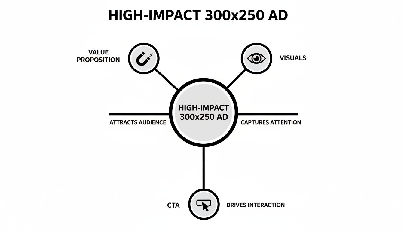
As you can see, even a technically perfect ad will fall flat if the strategy isn't sound. The message, design, and CTA have to work together.
Beyond file size, animation rules are the next big hurdle, particularly for GIF and HTML5 ads. Most networks cap animation loops at a maximum of 30 seconds. After that, the ad has to come to a complete stop. This is done to prevent ads from being endlessly distracting and creating a poor user experience.
To get a better sense of the nuances between platforms, you can check out our breakdown of the top ad networks for advertisers.
Measuring Performance and A/B Testing Your Ads
Launching a 300 x 250 banner ad without tracking its performance is like flying a plane without any instruments. You might be moving, but you have no idea if you're headed in the right direction, how much fuel you have left, or if you're about to crash.
Great marketers don't rely on luck. They measure everything that matters and use that data to make their next move smarter than the last. Impressions and clicks are just the beginning of the story; they tell you people saw your ad, but not if it actually worked.
To see the real business impact, you need to look past these surface-level numbers and focus on the Key Performance Indicators (KPIs) that connect directly to your bottom line.
Key Metrics That Truly Matter
For any 300 x 250 banner ad campaign, a few core KPIs will paint a crystal-clear picture of whether you're succeeding or just spending money.
These are the metrics you absolutely need to track:
- Click-Through Rate (CTR): This is the percentage of people who click your ad after seeing it. A poor CTR is a huge red flag that your design, headline, or offer just isn't cutting through the noise.
- Conversion Rate (CR): This is the gold standard. It measures the percentage of users who take the action you want—like a purchase or a sign-up—after clicking your ad. This tells you if your ad and landing page are actually persuasive.
- Cost Per Acquisition (CPA): This is the bottom-line cost of getting a new customer. Simply divide your total ad spend by the number of conversions. It answers the most critical question: "How much did it cost me to win this customer?"
- Return on Ad Spend (ROAS): The ultimate measure of profitability. ROAS shows you the total revenue you earned for every dollar you spent. If your ROAS is above 1.0, you're profitable. If it's not, you're losing money.
Focusing on these KPIs will change how you think about your campaigns. A high CTR is nice, but if no one converts, it's a vanity metric. A low CPA and a high ROAS are what separates a good campaign from a great one.
A Roadmap for Effective A/B Testing
Once you know what you’re measuring, you can start making it better. This is where A/B testing—also called split testing—comes into play. It’s a simple, methodical way to compare two versions of an ad to see which one performs better.
The golden rule of A/B testing is to only change one variable at a time. If you change both the headline and the button color, you'll never know which one made the difference.
To get the most out of your 300 x 250 banner ads, you have to get comfortable with the principles of A/B testing in marketing. The key is to start with the elements most likely to give you the biggest wins.
A/B Testing Priority List:
- The Headline: This is your first impression. Test different value propositions. For example, does "Save Time on Invoicing" work better than "Create Invoices in 30 Seconds"?
- The Call-to-Action (CTA): Experiment with the text and the button design itself. See if "Get Started Free" beats "Sign Up Now," or if a bright green button gets more clicks than a subtle blue one.
- The Visuals: Your image or graphic is doing a lot of heavy lifting. Try a product shot against an illustration, or see if a photo with a human face builds more trust than a generic graphic.
- The Offer: The incentive itself can make or break a campaign. Test whether a 10% discount drives more sales than a "Free Shipping" offer.
By methodically testing these elements, you can turn small, data-backed tweaks into major performance gains over time. To dive deeper into this topic, check out our guide on what A/B testing is in a marketing context.
Remember, continuous testing isn't just a task—it's the engine that turns an average campaign into a high-performing revenue driver.
Winning 300 x 250 Banner Ad Examples
Theory is great, but let's be honest—nothing beats seeing what actually works out in the wild. The quickest way to truly grasp what makes a 300 x 250 banner ad click is to pull apart a few winning examples.
By checking out ads from different corners of the digital world, from high-speed e-commerce to complex SaaS platforms, you can see how the best brands blend design, copy, and a little bit of psychology. Think of it as building your own creative toolkit, filled with proven ideas you can grab for your next campaign.
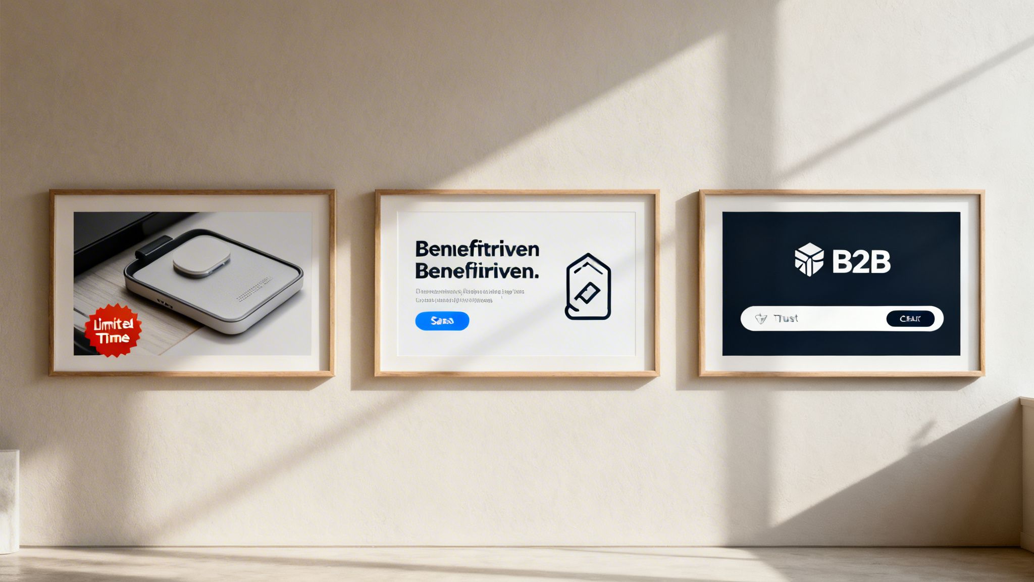
E-Commerce Example: The Power of Urgency
First up, let's picture an e-commerce brand selling athletic shoes. Their 300 x 250 banner ad is clean and simple: a sharp, professional shot of their newest running shoe pops against a plain white background.
But the headline is where the magic happens. It doesn't just say "New Shoes." It hits you with an immediate reason to care: "Limited Time: 25% Off". The visual path is perfect—your eye goes right to the shoe, then to the bold offer, and lands squarely on a bright, can't-miss call-to-action button that says "Shop Now."
So, why is this ad so effective?
- Crisp Visuals: A high-quality photo lets the viewer mentally "own" the shoe before they even click, building that initial desire.
- Clear Value: The 25% discount is a simple, powerful hook that everyone understands instantly.
- Urgency: "Limited Time" is a classic for a reason. It taps into our fear of missing out (FOMO) and pushes for a decision now, not later.
This combination turns a simple ad into a powerful, time-sensitive sales pitch. It's a formula that works because it directly targets the buyer's decision-making process and gets them to act.
SaaS Example: The Benefit-Driven Approach
Now, let's switch gears to a SaaS company with a project management tool. Their 300 x 250 banner ad plays a completely different game, one focused on benefits. Instead of a product screenshot, you might see a clean, abstract graphic that feels modern and organized.
The headline is the real hero here: "Stop Juggling Tasks. Start Finishing Projects." It speaks directly to a massive pain point for anyone in their target audience. Right below it, a smaller line of text adds a dose of credibility: "Used by 50,000+ teams."
The CTA is also different. It's a lower-commitment ask, like "Start Your Free Trial."
For SaaS and B2B, the goal isn't always an immediate sale. It's often about building trust and getting a user to take the next step in the journey, like signing up for a trial or demo. This ad perfectly aligns with that goal.
This ad works because it sells an outcome—a less chaotic workday—not just software features. It also cleverly uses social proof ("50,000+ teams") to build trust and lower the barrier to trying something new.
B2B Example: Building Trust and Authority
Finally, imagine a B2B firm that offers financial services. Their audience is professional, careful, and looks for expertise above all else. Their 300 x 250 banner ad has to reflect that with a more professional and buttoned-up design.
The color scheme is probably dominated by blues and grays, colors that create a sense of stability and trust. The headline is all business, positioned as an expert insight: "Unlock Smarter Portfolio Insights." Instead of a flashy discount, this ad might feature a small logo bar at the bottom, showcasing well-known companies they partner with.
The CTA isn't about buying; it's about value: "Download Our Report."
This ad is a masterclass in knowing your audience. It ditches the hard sell and focuses on establishing authority by offering valuable content, positioning the company as a trusted guide. If you want to see more examples of how different brands build their ad creatives, you can dive into our guide to digital marketing creatives.
Common Questions About the 300 x 250 Banner
Even after you've nailed the design, specs, and testing strategy, a few practical questions always seem to surface right before you hit "launch." This section is your go-to guide for quick, clear answers on the 300 x 250 banner ad.
Think of it as your final pre-flight check. We're tackling the common sticking points that can cause last-minute headaches, so you can get your campaign live with total confidence.
What Is the Standard File Size Limit?
This is probably the most frequent—and most critical—question we get. For a 300 x 250 banner ad, the universal maximum file size is 150KB.
That number isn't just a suggestion. Ad networks like the Google Display Network enforce this limit religiously to make sure web pages load quickly and don't frustrate users. A heavy ad slows down the entire site, which is bad for the user, the publisher, and your campaign's performance.
Sticking to the 150KB rule is non-negotiable. It’s the very first technical hurdle your ad will face, and failing it means an automatic rejection that can stall your whole campaign.
Is the 300 x 250 Ad Still Effective on Mobile?
Absolutely. In fact, it continues to be one of the best-performing ad units on mobile devices. While it got its start in the desktop era, its neat, rectangular shape works surprisingly well on smaller screens.
On mobile, you'll often see the Medium Rectangle appear as an "in-content" ad, placed right inside an article or social feed. Because it fits so cleanly with the surrounding text and images, it feels less like a disruptive pop-up and more like part of the content.
On mobile, where every pixel of screen space counts, the 300 x 250 banner's ability to get a message across without overwhelming the user is a huge plus. It respects the user experience, which almost always leads to better engagement and viewability.
Can I Use Video in a 300 x 250 Banner Ad?
Yes, you can, but you won't be using a typical video file like an MP4. To pull off video-like motion, you’ll need to create an HTML5 banner.
HTML5 is a flexible format that supports rich media, letting you build dynamic, eye-catching ads with animations and even short video clips. It’s far more engaging than a static image, but there are a few things to keep in mind:
- File Size Is King: That 150KB limit still applies. Your video, code, and any other assets must be heavily optimized to fit.
- Animation Length: Most ad networks will cap your animation or video loop at 30 seconds. After that, the ad has to settle on a static final frame.
- Complexity: Building an HTML5 ad is a bigger lift than making a simple JPG or GIF. It usually requires coding knowledge or specialized tools like Google Web Designer.
While it's more involved, a well-made HTML5 ad can give your campaign a serious performance boost, making it a great option for high-impact creative.
How Should I Budget for a 300 x 250 Campaign?
Budgeting for a 300 x 250 banner campaign has less to do with the ad size and more to do with your marketing goals. There’s no fixed cost—it all depends on your bidding model (like CPM or CPC), how specific your targeting is, and how competitive your industry is.
A great way to start is by setting a small test budget you're comfortable with for a week or two. The goal is to gather some initial data. During this test, you'll want to watch two metrics closely:
- Cost Per Click (CPC): How much are you paying every time someone clicks your ad?
- Conversion Rate: What percentage of those clicks are actually turning into leads or sales?
With that baseline, you can figure out your Cost Per Acquisition (CPA). For instance, if your CPC is $2.00 and it takes 50 clicks to get one sale (that's a 2% conversion rate), your CPA is $100. From there, you can build a smarter budget based on how many new customers you want to bring in. To get a fuller picture of ad attribution, it's also worth understanding what a view-through conversion is.
Why Does My Ad Get Rejected for Animation Speed?
If your animated GIF got rejected, it's likely because of its speed. Ad networks have rules not just for the total animation length (30 seconds), but also for how fast it moves. Most platforms require animated GIFs to run no faster than 5 frames per second (FPS).
This rule is all about user experience. An ad that's flashing or moving at a frantic pace is incredibly distracting and can even be seizure-inducing. It's annoying, and it reflects poorly on both your brand and the publisher. Keeping your animation smooth and under the 5 FPS limit ensures it gets approved and doesn't alienate your audience.
Ready to stop wrestling with manual ad setup and start scaling your campaigns with data-backed precision? AdStellar AI automates the entire process, letting you launch hundreds of ad variations in minutes and discover your top performers with AI-driven insights. Find out how you can build, test, and optimize your Meta ads 10x faster.
Learn more about AdStellar AI and supercharge your ad performance