You launch a campaign on Friday afternoon. The copy is sharp, the offer is strong, the audience build is clean, and the creative team swears the assets are ready. By Monday, one ad set is underdelivering, another has awkward cropping in preview, and a Story unit is hiding the product name behind Instagram’s interface.
That’s the part many teams learn too late. Instagram ad sizes aren’t a formatting detail. They’re a delivery and performance variable. Get them wrong and you waste budget on assets that never had a fair shot.
I’ve seen this happen most often when teams reuse one asset across Feed, Stories, Reels, Explore, and carousel placements to save time. That shortcut usually creates a more expensive problem. A Feed image that looks balanced in design review can feel cramped in placement. A Story ad with a clean layout in Figma can lose its CTA the moment Instagram overlays native UI. A carousel that should tell a product story ends up looking inconsistent because cards weren’t built to the same ratio.
If you’re juggling client approvals, launch deadlines, and too many creative versions, keep this guide close. It’s built to help paid social teams make fewer avoidable mistakes, ship faster, and protect performance. If you also manage Facebook placements alongside Instagram, this companion reference on Meta ad sizes from AdStellar is useful to keep in the same tab.
The Instagram Ad Spec Trap
A common failure pattern looks harmless at first. A designer exports one polished square asset, the media buyer drops it into multiple placements, and Ads Manager accepts it. The campaign goes live, but the asset only really fits one environment.
In Feed, that square might be fine. In Stories, it can feel boxed-in or poorly adapted. In Reels, it often looks like a resized ad instead of native content. Nobody broke a policy, but the ad still loses.
That’s why spec discipline matters. Creative quality isn’t just about visuals, brand voice, or offer clarity. It’s also about whether the asset was built for the screen where people see it.
Practical rule: If an asset needs cropping instructions in Slack, it probably should’ve been rebuilt for that placement.
The cost isn’t only visual. Teams burn hours in review cycles, rebuild approved assets under deadline pressure, and delay testing because the ad unit wasn’t assembled correctly the first time. On agency accounts, that delay compounds across clients. On in-house teams, it slows creative iteration when speed matters most.
The fix is simpler than most workflows make it. Use the right dimensions from the start. Respect placement-specific safe areas. Treat previews as a QA step, not a nice-to-have. And don’t let “accepted by the platform” fool you into thinking the asset is right.
Quick Reference Guide to Instagram Ad Specs 2026
If you need the fast version, these are the formats performance teams use most often when working through instagram ad sizes.
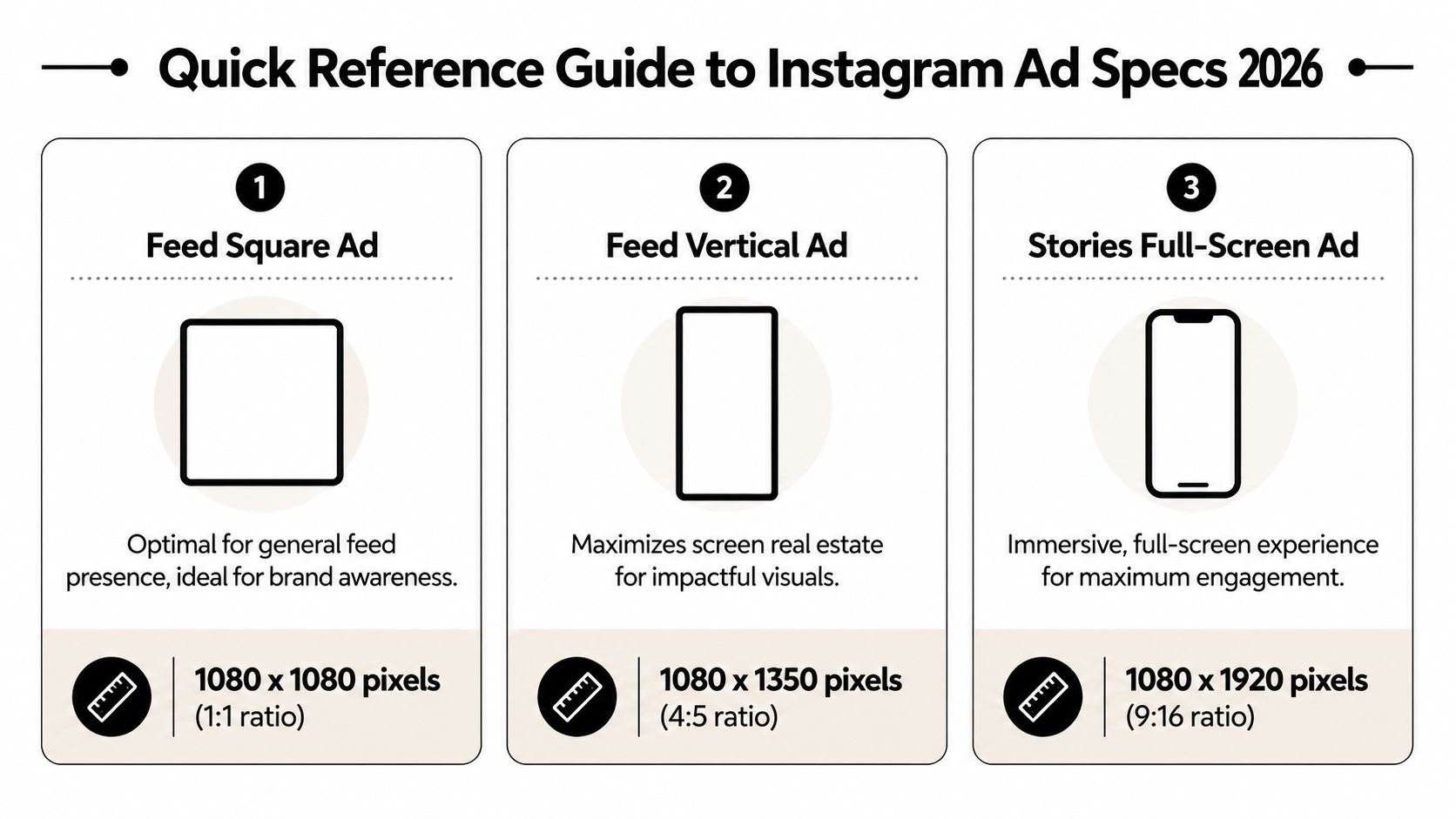
The three dimensions to memorize
Feed square ad
Use 1080 x 1080 pixels at a 1:1 ratio. This is the safe default when you need broad compatibility and a clean, balanced frame.Feed vertical ad
Use 1080 x 1350 pixels at a 4:5 ratio. This is usually the stronger Feed option because it occupies more vertical space on screen.Stories full-screen ad
Use 1080 x 1920 pixels at a 9:16 ratio. This is the full-screen portrait format built for mobile viewing.
How to use this cheat sheet
The fastest way to create friction in production is to design one master ad and hope it stretches cleanly across every placement. It rarely does. A better workflow is to choose a primary placement, then build native variants for the others.
For a quick cross-platform planning reference, Sup Growth's Facebook and Instagram ads guide is a practical companion because it helps teams think beyond a single surface and plan assets for mixed Meta distribution.
| Placement type | Recommended size | Aspect ratio | Best use |
|---|---|---|---|
| Feed square | 1080 x 1080 | 1:1 | General feed presence, simple product shots, graphic-led creative |
| Feed vertical | 1080 x 1350 | 4:5 | Scroll-stopping feed creative, richer visual storytelling |
| Stories | 1080 x 1920 | 9:16 | Full-screen mobile creative, direct response, immersive offers |
Keep this part bookmarked. It’s the fastest pre-flight check before you hand assets to design, upload to Ads Manager, or build templates in a creative automation tool.
Mastering Instagram Feed Ad Dimensions
Many still treat Feed as the easiest placement. That’s partly true. It’s more forgiving than Stories or Reels. But Feed is also where small creative choices create visible differences in attention and scroll behavior.
The most important decision is the frame itself.
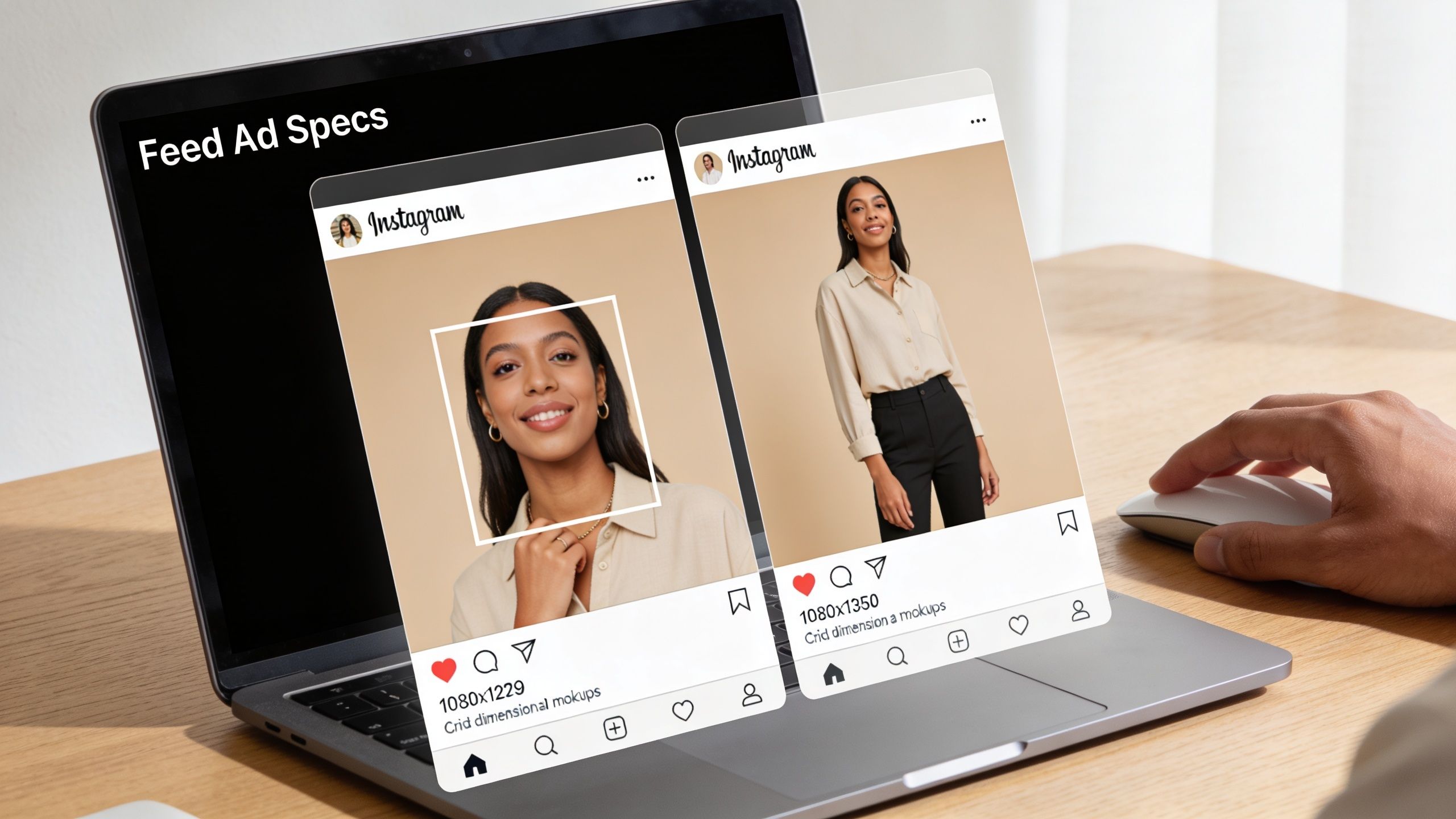
Why 4 to 5 usually wins in Feed
For Feed placements, 1080×1350 pixels at a 4:5 ratio performs better than 1080×1080 at 1:1 because it takes up more vertical screen space as people scroll, according to Proven SaaS on Instagram ad sizes. Square is still acceptable, but 4:5 gives the creative more room to hold attention inside the feed.
That extra screen presence matters in practice. A taller unit gives you more room for the product, the person, the headline, or the visual proof point without making the ad feel crowded. If you’re running ecommerce, fashion, beauty, or app demo creative, that added height is often useful.
There’s a trade-off, though. Feed isn’t a free-form canvas. Instagram may mask images outside the 4:5 to 1:1 range, so pushing beyond those boundaries creates avoidable rendering problems in placement previews and delivery.
Build Feed assets with the crop in mind. If the visual only works at the exact edge of the frame, it’s fragile creative.
Square still has a role
Square isn’t obsolete. It’s still a good fit when:
- The design is graphic-led and centered around a bold offer or simple text hierarchy.
- You need cleaner reuse across placements that don’t benefit from tall imagery.
- The product shot is naturally compact, such as a packaged item on a neutral background.
Square also tends to be easier for teams working from existing social assets, especially if the brand already produces organic Instagram posts in a 1:1 format. The mistake is assuming “easier to produce” means “better for paid.” Those are different questions.
Practical Feed build rules
When I review Feed assets with creative teams, I’m looking for a few recurring issues more than anything else:
Top-heavy layouts
If all the visual weight sits in the top third, the ad can look cramped in preview. Spread attention anchors more deliberately.Micro text
Feed gives you more room than Stories, but mobile still punishes tiny typography. If the value proposition needs zooming, the ad is already struggling.Overdesigned borders or mock device frames
These reduce usable space inside the ad. In Feed, they often make the creative feel smaller than it is.
Feed video considerations
Feed video needs the same placement logic as static. If your video is built for 4:5, let the key motion, opening frame, and on-screen messaging live comfortably within that space. Don’t rely on edge details.
Use the first moments to establish one thing clearly: product, problem, transformation, or offer. Teams often make Feed video weaker by treating it like a miniature brand film. Simpler usually travels better in a crowded scroll.
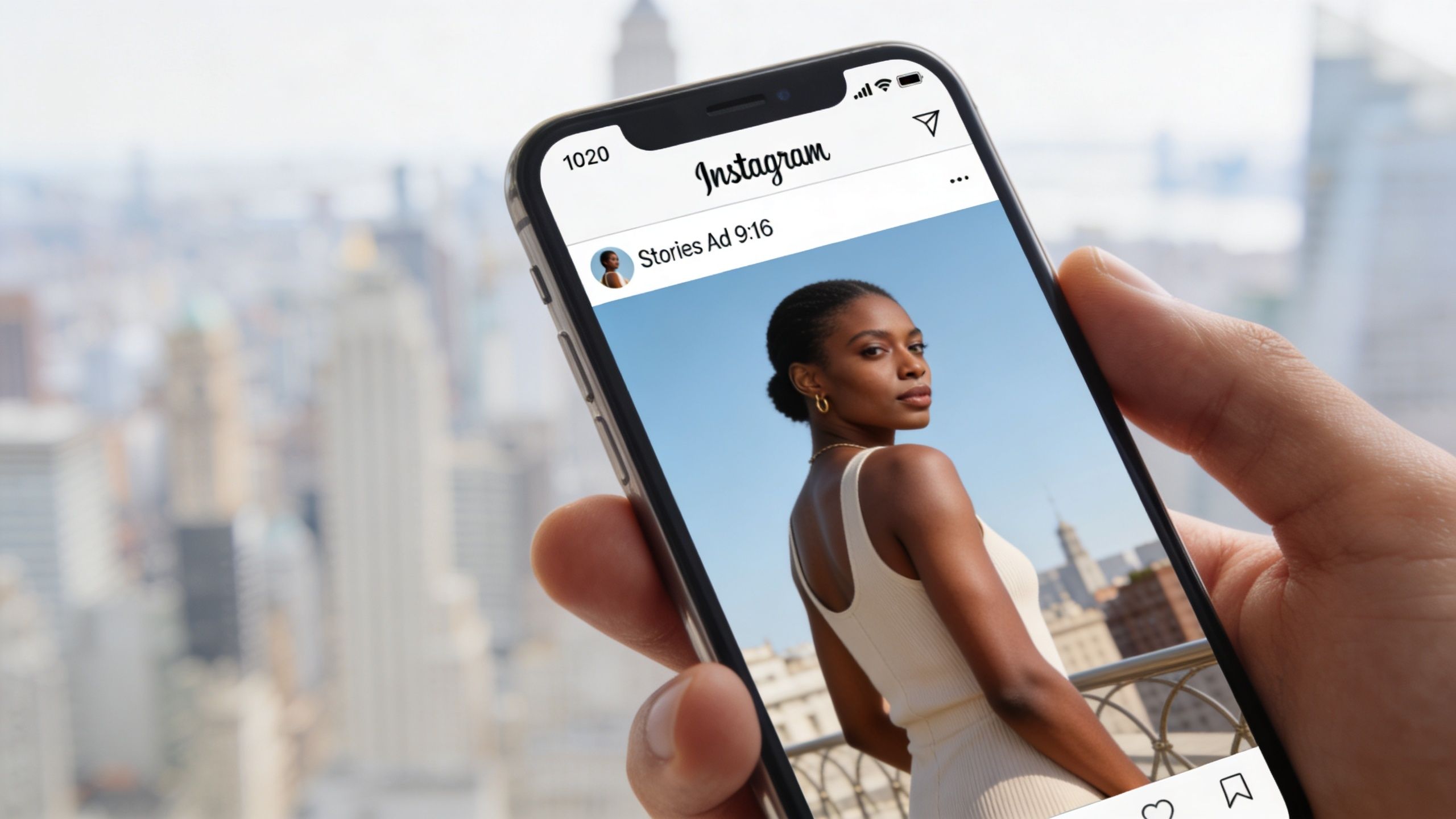
Optimizing for Full-Screen with Stories Ad Sizes
Stories is where bad spacing gets exposed immediately. The format is full-screen, mobile-first, and unforgiving if your text or logo sits in the wrong place.
Instagram Stories ads require 1080 × 1920 pixels at a 9:16 ratio, and you need to leave 250 pixels clear at the top and 340 pixels clear at the bottom so important elements don’t get covered by profile icons or call-to-action buttons, according to Snappa’s Instagram ad size reference.
If you’re building story-specific assets regularly, this deeper breakdown of Instagram Story specs is worth keeping nearby for production QA.
The safe zone is not optional
Designers usually understand dimensions. Safe zones are where teams slip. A Story can technically be the correct size and still be badly built because the important content sits under Instagram’s interface.
The top area gets crowded by profile and sponsorship UI. The bottom area gets crowded by the CTA area and interaction layer. If your product name, price, hook, or logo lives there, users won’t see it cleanly.
A solid Story layout usually follows this pattern:
- Top section holds background imagery or low-priority visual texture
- Middle section carries the main message and the product focal point
- Bottom section stays visually quiet so the CTA remains readable
That middle band is where your ad has to do the work.
What good and bad composition looks like
Bad Story composition usually has one of three problems. The headline is pinned too high. The CTA phrase is baked too low into the artwork. Or the product is scaled so large that key details sit right where the interface lands.
Good Story composition feels almost restrained. It leaves breathing room. The ad doesn’t try to use every pixel. It uses the center of the screen intentionally and accepts that platform UI owns part of the canvas.
If your Story creative feels slightly underfilled in the raw design file, it often looks right once Instagram overlays its interface.
Handling Story video without losing the plot
Stories supports both static and video assets. Images can remain on screen briefly before users move on, and video over 15 seconds is automatically split into separate Story cards, as noted in the earlier Snappa-backed specification. That changes how you should script longer narrative creative.
Don’t treat a longer Story ad as one uninterrupted piece. Build it as a sequence that can survive card breaks.
Here’s a simple working structure:
- Card one should identify the offer or product immediately.
- Card two can add proof, demo, or a stronger visual explanation.
- Card three and beyond should reinforce action, not restart the story.
A quick visual walkthrough helps when teams are reviewing Story layout logic:
If your Story ad only makes sense after several seconds of setup, it probably belongs in a different format.
Winning on Reels with the Right Ad Format
Reels uses the same portrait orientation many teams associate with Stories, but the creative behavior is different. Treating Reels as “just another 9:16 placement” is one of the fastest ways to make it feel like an ad jammed into a native environment.
The practical difference is the interface. Reels has engagement icons, captions, and audio metadata sitting over the content in a way that changes how viewers process the frame. Stories feels like a tap-through environment. Reels feels like a content stream. That means the ad needs stronger motion cues and a more native editing rhythm.
Reels should feel edited for Reels
Reels creative works better when it looks like it belongs next to organic short-form video. That doesn’t mean copying trends blindly. It means avoiding polished assets that feel stiff, overframed, or obviously repurposed from another channel.
A few patterns tend to hold up:
Open with motion immediately
Static title cards waste the first beat. Start with action, a product-in-use moment, or a visual switch.Make on-screen text short
Reels viewers move quickly. Long explanatory copy blocks don’t survive well here.Design for sound-on, but don’t depend on it
Audio can improve the experience, but the visual structure still needs to communicate on its own.
Native beats polished when polished looks foreign
Teams often overproduce Reels. They add long logo stings, cinematic pacing, and transitions that belong in a brand video deck. On Instagram, that can create distance instead of interest.
A stronger approach is to build creative around one action or one proof point. Show the product. Show the before and after. Show the interface. Show the use case. Then move to the next beat quickly.
Reels rewards clarity in motion. If the audience has to decode the format before they understand the offer, you’ve already lost attention.
Text and CTA placement in Reels
Even without fixed pixel rules cited here, the operating principle is straightforward. Keep critical text away from areas where interface elements usually sit, and avoid pushing your CTA into the lower edge of the frame.
In practice, that means:
- keep the main hook in the upper-middle or center band
- avoid tiny subtitles hugging the bottom
- don’t pin logos into corners where native controls can compete with them
If your team uses one 9:16 master file for both Stories and Reels, review both previews before launch. A layout that survives one environment can still feel crowded in the other.
Boosting Engagement with Carousel Ad Specs
Carousel ads are one of the few Instagram formats where the spec choice connects directly to user interaction. A person doesn’t just view the ad. They decide whether to swipe. That makes sequencing, consistency, and card-level design more important than teams often realize.
There’s also a clear reason performance marketers keep coming back to the format. Carousel image ads average a 1.92% engagement rate per post versus 1.74% for standard images, a 9.3% lift over single images, according to Foreplay’s Instagram ad sizes analysis. That’s why carousel remains a strong format for ecommerce, DTC, and any offer that benefits from multiple frames.
If your team needs a strategic refresher on how carousel content works beyond paid media, this guide to carousel post meaning is a useful companion.
Core carousel specs that matter
Carousel supports 2 to 10 images per ad in the verified guidance above. For image carousels, each image can be up to 30MB, with support for 1080 x 1080 pixels and either 1:1 or 4:5 aspect ratios in the cited specification. For video carousels, each card supports up to 60 seconds and a maximum file size of 4GB, though the same verified source notes that shorter card-level videos are generally a better creative choice.
The operational rule is simple. Keep the cards visually consistent. Once one card feels like it belongs to a different campaign, swipe-through intent drops.
| Carousel element | Verified spec |
|---|---|
| Number of cards | 2 to 10 |
| Image card resolution | 1080 x 1080 supported |
| Image aspect ratios | 1:1 or 4:5 |
| Max image file size | 30MB per image |
| Max video file size | 4GB per card |
| Max video length | 60 seconds per card |
When carousel outperforms single-image creative
Carousel is strongest when the swipe itself helps sell the product. That usually happens in a few scenarios:
Product range storytelling
One card per item, variation, use case, or bundle component.Feature education
Especially useful for SaaS, apps, and tools where one static image can’t explain the product.Before-and-after sequencing
Strong for services, skincare, fitness, home improvement, and visual transformations.Step-by-step buying logic
Card one hooks attention, card two explains, card three reduces friction, card four pushes action.
A weak carousel is just a stack of disconnected statics. A strong carousel has momentum from card to card.
What doesn’t work in carousel
The most common carousel mistake is making every card say the same thing with different art. If the first card already contains the whole message, users have no reason to continue.
Another mistake is overloading each frame. Carousel gives you more total space, not a license to cram every card with dense copy. Each card still needs one clear job.
Think of carousel as a sequence, not a gallery. Every swipe should answer the question created by the previous card.
Specs for Explore, Shops, and Other Placements
Secondary placements matter because they’re where asset reuse usually gets sloppy. Teams focus on Feed, Stories, and Reels, then let Explore or shopping surfaces inherit whatever is available. That’s efficient until the creative starts looking stretched, cropped, or contextually off.
The practical move is to treat these placements as extensions of your core asset system. They usually perform best when you repurpose from Feed-ready creative rather than from Story-first layouts.
If you need a planning lens for how these surfaces fit into a broader channel mix, this overview of placement in advertising helps frame the decision.
Explore placement logic
Explore is still a discovery environment. People are browsing, not necessarily responding to a direct pitch with the same intent they might show after retargeting. That changes how your creative should feel.
Use assets that look natural alongside discovery content. In most accounts, that means Feed-style creative travels better into Explore than heavily branded Story layouts. Clean product imagery, straightforward hooks, and strong focal points tend to hold up.
Shops and commerce-led placements
Shops and related commerce surfaces need functional clarity more than cleverness. The ad should make the product easy to identify, easy to compare, and easy to tap into. If the asset relies on tiny detail or design flourishes, it usually loses selling power.
A few practical rules help here:
Lead with the product
Don’t make the user hunt for what’s being sold.Use familiar Feed-safe compositions
If a product image already works well in a 1:1 or 4:5 context, it’s often a safer base asset for commerce surfaces.Keep the message narrow
Shops placements don’t need a manifesto. They need clarity.
The full-funnel production mindset
Secondary placements work better when your team builds a creative system instead of isolated one-off assets. That means:
| Asset type | Where it usually adapts well | Main caution |
|---|---|---|
| Feed square | Explore, some commerce surfaces | Can feel visually smaller than taller feed assets |
| Feed 4:5 | Feed-first discovery surfaces, some shopping use cases | Important edge details may not travel cleanly everywhere |
| Story/Reel 9:16 | Full-screen placements | Usually poor as a fallback for Explore or shop-style browsing |
The point isn’t to build custom art for every possible slot. It’s to know which original asset gives each placement the best starting point.
Technical Specs and Creative Safe Zones Explained
Most creative problems blamed on “platform weirdness” are export and layout problems. The file is too compressed, the image wasn’t built at the intended resolution, or the composition falls apart the moment Instagram changes how it previews the asset.
The baseline technical rules in the verified data are straightforward. Images use JPG or PNG in the cited Story guidance, with a maximum of 30MB. Video support includes MP4 or MOV, with a maximum file size of 4GB in the same verified source context. Carousel and Story specs also reinforce those same practical file boundaries.
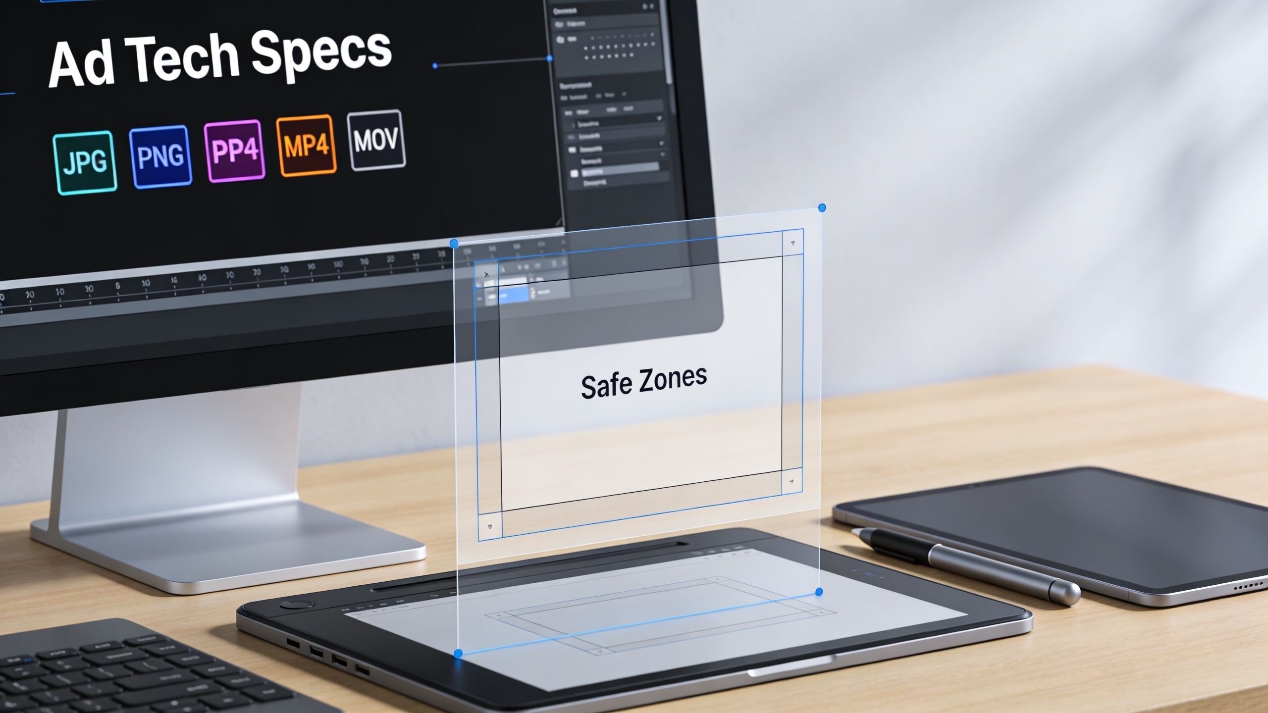
Safe zones are really about resilience
Safe zones aren’t only for Stories. They’re a broader design discipline. A strong ad keeps its core message intact even when the platform changes the preview shape, masks part of the frame, or displays the asset in a tighter crop.
That’s especially relevant for Feed assets. A 4:5 ad may render beautifully in-feed, but if the design only works because text sits at the absolute top or bottom edge, the creative is brittle. Resilient creative keeps the product, hook, and visual focal point in a central working area.
A simple way to pressure-test any asset is to ask two questions:
- If this crops slightly tighter, does the message still make sense?
- If UI overlays part of the frame, do we still keep the selling point visible?
If the answer is no, the ad needs a rebuild, not a launch.
File prep habits that prevent quality loss
A few technical habits save a lot of cleanup later:
Export at the intended placement dimensions
Don’t upscale a smaller image and hope the platform fixes it.Use the right file type for the job
Static should stay clean and sharp. Video should be exported in a format Instagram handles well.Review the actual preview in Ads Manager
The design file is only half the truth. Placement preview shows the operational version.
Good-looking raw files don’t guarantee good-looking ads. The preview inside the ad platform is the real creative QA environment.
One master file rarely solves cross-placement safely
Teams want one universal file because production load is real. But one-file workflows usually create trade-offs that show up later as weaker ads. It’s fine to start from a shared concept or master layout system. It’s not fine to assume the same final asset should run everywhere untouched.
If you need cross-placement consistency, standardize the message hierarchy, not just the canvas. Keep the same hook, product proof, and CTA logic across versions. Then resize and reposition for the actual placement.
Common Ad Spec Mistakes and How to Fix Them
The same spec mistakes keep surfacing in paid social accounts because they’re easy to miss during production and expensive to catch after launch. Most aren’t dramatic. They’re small errors that erode quality or create friction in review.
The mistakes that show up most often
Using one asset for every placement
This saves time upfront and costs performance later. Build placement-native variants instead of stretching one design across Feed, Stories, Reels, and secondary surfaces.Ignoring safe areas
The ad can be technically valid and still fail visually when text or branding lands under interface elements.Exporting low-quality source files
If the uploaded file already starts soft, compression won’t save it. Start with clean source assets at the correct dimensions.Crowding the frame
Designers sometimes try to “use all the space.” On Instagram, that usually means the ad has no visual hierarchy.Skipping final placement preview
The preview catches issues that design review misses. It should be part of launch workflow, not an optional last glance.
The direct fixes
A good troubleshooting process is blunt and fast:
- Match the canvas to the placement first.
- Reposition text into the safe working area.
- Re-export from the source file, not from a compressed derivative.
- Check the ad in placement preview before publishing.
- If it still looks adapted, rebuild it natively.
For teams managing high creative volume, manual QA becomes fragile. That’s where workflow tools can help enforce consistency. Platforms like Canva and Adobe Express can help with template-based resizing, and tools built for Meta campaign operations can handle more of the production-to-launch chain. AdStellar AI is one example. It generates bulk Meta creative variations, organizes campaign builds, and pushes combinations live through Meta workflows, which is useful when teams need spec-compliant variants across many ad sets. If policy compliance is part of your bottleneck, this reference on Facebook ads policy is a practical check before launch.
The larger point is simple. Human review is still necessary, but it breaks down when teams are resizing, duplicating, and checking dozens of variants under time pressure. Systems help. Templates help. Native placement design helps even more.
If your team is producing large volumes of Meta creative, AdStellar AI is worth evaluating as an operational tool. It helps performance marketers generate and launch many creative, copy, and audience combinations faster, which is especially useful when instagram ad sizes, placement variants, and compliance checks start slowing campaign velocity.