You launch a campaign on a tight deadline. Creative is approved internally, budgets are loaded, audiences are clean, and then Instagram rejects the ad because the file type is wrong, the ratio is off, or the text sits where the CTA overlays it. Sometimes the ad gets through and that’s worse. It runs, but the crop is ugly, the product is cut off, and the message looks amateur on mobile.
That is the actual issue with instagram ad specifications. They are not merely administrative trivia. They affect delivery, presentation, click quality, and how fast a team can iterate when performance starts drifting. If you manage paid social long enough, you learn that most “creative problems” start as formatting problems.
The teams that handle this well don’t treat specs as a final checklist. They build around them from the first concept. That matters whether you’re running ecommerce, SaaS, lead gen, or local services. If you work in a regulated category, the margin for error gets even smaller. That’s one reason resources like LPagery's lawyer PPC guide are useful. They show how quickly channel mechanics and conversion economics collide when every click is expensive.
The Hidden Cost of Incorrect Ad Specs
A bad spec can waste money in two ways. First, the ad never gets out of review. Second, it serves in a compromised format and underperforms.
The second failure is one frequently overlooked. A feed creative designed too loosely for mobile can lose its focal point after cropping. A story asset with text parked too low can end up fighting the CTA area. A video exported too small can look soft on a modern phone even if the original edit looked fine on desktop. None of that shows up as a neat error message in Ads Manager.
What usually goes wrong in practice
The pattern is familiar:
- Design starts from one master asset: Someone builds a square concept and forces it into Stories, Reels, Feed, and Profile Feed.
- Mobile UI gets ignored: Buttons, profile details, and overlays cover key copy.
- Export settings get treated as an afterthought: The asset technically uploads, but compression does the damage later.
The expensive mistake isn’t just rejection. It’s approving a creative that looks acceptable in a desktop preview and weak on an actual phone.
There’s also an operational cost. Every rejection triggers re-exporting, re-uploading, re-review, and a new internal approval loop. That slows testing velocity. On performance accounts, that delay matters because creative fatigue doesn’t wait for the design team to catch up.
A useful way to think about instagram ad specifications is this. They define the playable field. Your creative strategy still matters more than the template, but if the template is wrong, the strategy never gets a fair shot.
Why Adherence to Specs Drives Better Performance
A campaign can pass review, spend budget, and still lose because the asset was built for the wrong placement. I see this most often with creative that looked fine in design review, then underdelivered once it hit Feed, Stories, or Reels on an actual phone. The ad was technically approved. The performance problem showed up later in thumb-stop rate, CTR, and conversion rate.

Specs affect delivery quality because they shape how much of the ad is visible, how readable the message is, and whether the placement feels native. A 9:16 asset built for Reels uses the screen the way Instagram expects. A square asset forced into that slot usually wastes vertical space, shrinks the subject, or pushes text into UI-heavy zones. That hurts the first second of attention, which is the part you pay for before a user decides to keep watching or scroll.
The practical upside is simple. Correct specs protect the creative idea you already paid to produce.
Why format discipline improves results
A spec-compliant ad tends to perform better for operational reasons, not just aesthetic ones:
- More usable screen space: The asset fills the placement instead of floating inside it with dead space or awkward cropping.
- Cleaner hierarchy: Headline, product, price, and CTA stay legible on mobile, where Instagram ads reside.
- Better native fit: Creative built for the placement looks like content made for Instagram, not a resized leftover from another channel.
- Lower production drag: Teams spend less time rebuilding rejected or compromised assets and more time testing hooks, offers, and angles.
That last point matters more than many teams expect. If your team has to manually resize every winner for every placement, testing slows down. If you build spec-safe templates from the start, you can version faster, launch more combinations, and keep fatigue under control. That is where specs shift from a design checklist into a performance system.
There is also a scale benefit. Once the dimensions, safe zones, file settings, and text placement rules are standardized, automation becomes realistic. Creative ops tools and AI workflows can generate variants that stay inside guardrails instead of producing assets your media buyer has to reject at upload. If you need a broader placement strategy before you get into production rules, this guide to Instagram ad formats and placements helps frame which assets should be built for which objective.
The same principle carries into Meta more broadly. Teams handling both channels will see similar patterns in mastering Facebook Ads for revenue. Different placements have different specs, but the performance trade-off is consistent. Creative that matches the placement gets a fairer test.
Instagram Ad Specs Quick Reference Guide 2026
A campaign can look approved in the design file, then lose delivery quality the moment Instagram crops it, compresses it, or hides the CTA behind interface elements. That usually starts with one preventable mistake: the wrong spec for the placement.
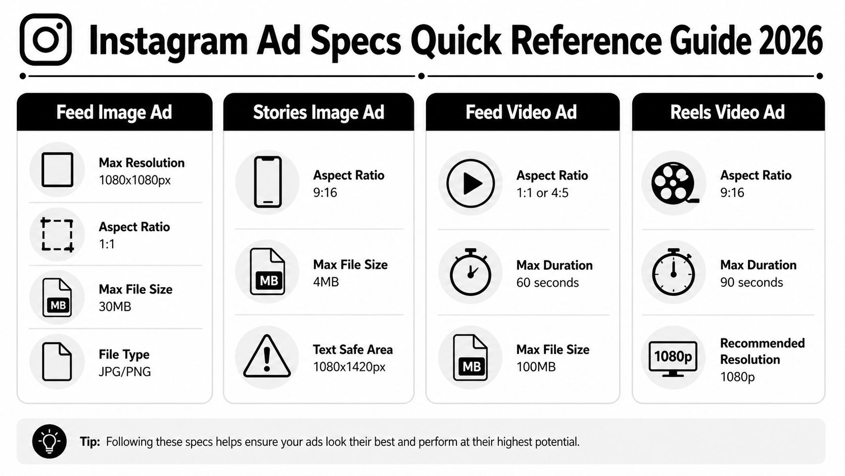
Core specs at a glance
| Format | Recommended resolution | Aspect ratio | File limit | File type |
|---|---|---|---|---|
| Feed image ad | 1440 x 1440 px | 1:1 | 30MB | JPG, PNG |
| Feed video ad | Minimum 1440 x 1880 px | 4:5 | 4GB | MP4, MOV |
| Stories image ad | 1440 x 2560 px | 9:16 | 30MB | JPG, PNG |
| Stories video ad | 1440 x 1800 px | 4:5 | 4GB | MP4, MOV |
| Reels image ad | 1440 x 2560 px | 9:16 | asset limits vary by placement and format | JPG, PNG |
| Reels video ad | 1440 x 2560 px | 9:16 | 4GB | MP4, MOV |
| Carousel feed ad | 1080 x 1080 px | 1:1 or 4:5 | 30MB per image, 4GB per video | JPG, PNG, MP4, MOV |
These numbers are the ones to keep in your production checklist. For platform-level requirements and placement behavior, use Meta's own ad creative guidance and placement documentation as the final check before export.
How to use the cheat sheet
Use this table as a preflight check for creative ops, not just a reference for designers. The practical order matters. Pick the placement, confirm the ratio, then build the asset. If that sequence gets reversed, teams end up resizing approved creatives at the last minute, and that is where text gets clipped, products get cropped, and performance data gets harder to trust.
Three checks catch most spec problems fast:
- Before briefing design: lock the placement and objective first, especially if the same concept will run in Feed, Stories, and Reels.
- Before upload: verify aspect ratio, pixel dimensions, file size, and file type together. One mismatch is enough to trigger compression or awkward reframing.
- Before launch: preview on a phone screen and check safe zones, captions, and CTA visibility in the actual placement.
This is also where scale starts to matter. A team handling ten creatives can fix spec errors manually. A team producing hundreds of variants for testing needs templates, naming rules, and automated QC so approved assets stay spec-compliant across placements and still move fast enough to improve ROAS.
If you need a placement-by-placement build plan after the quick scan, AdStellar’s guide to Instagram ad formats explained is a useful companion. Teams also get better results from pairing ads with organic growth, because the creative usually performs better when paid and organic assets follow the same visual system.
Detailed Specifications for Image Ads
A static image ad often fails before launch, not because the concept is weak, but because the file was built for the wrong placement. I see this in production all the time. A designer exports one square asset, the buyer checks every placement box in Ads Manager, and Instagram starts cropping product edges, shrinking text, or pushing important elements under the interface.
Feed image ads
For Feed Image Ads, build for flexibility first. Meta supports image ads across multiple aspect ratios in feed, but 1:1 and 4:5 are the safest working standards for most campaigns because they preserve framing better across devices and placements. In practice, 1080 x 1080 pixels works well for square, and 1080 x 1350 pixels works well for portrait feed creative.
Use JPG or PNG, and keep the file size controlled so upload, review, and delivery stay predictable. Oversized image files can still get compressed, and compression usually shows up in the worst places first: fine product detail, text edges, gradients, and skin tones.
Square feed creative is easier to repurpose. Portrait feed creative usually wins more screen space. That trade-off matters.
If the ad needs clean catalog presentation, a centered product shot, or a simple offer card, square is usually easier to scale across variants. If the ad depends on visual hierarchy and stopping power, 4:5 tends to perform better because it takes up more vertical real estate in the feed. The extra height gives you more room for a product, headline, and logo without forcing everything into a cramped composition.
Stories image ads
Stories require a different build, not a resized feed asset. The working standard is a 9:16 vertical image, typically 1080 x 1920 pixels, designed for full-screen mobile viewing. For teams producing a lot of vertical creative, this reference on Instagram Story specs is a practical bookmark.
The reason is simple. Stories have interface overlays at the top and bottom, so a design that looks balanced on a blank canvas can become unreadable once the profile name, CTA, and reply area sit on top of it. If text or product detail is too close to the edges, the ad may still serve, but the useful part of the creative gets partially covered.
A feed image stretched into Stories usually looks like a compromise. White space gets added, backgrounds blur, or the product ends up floating in the middle of a frame that was never meant to be vertical.
Practical rule: Design Stories natively in 9:16, and keep key text, logos, and product details away from the top and bottom UI zones.
Choosing between square and vertical
The format should match the job:
- Square feed images: Best for simple product shots, static promos, and creatives that need broad placement compatibility.
- Portrait feed images (4:5): Better when visual dominance in the feed matters more than reuse.
- Vertical Stories images (9:16): Best for one clear message, immersive framing, and mobile-first offers.
- Mixed placement campaigns: Build separate masters for feed and Stories, then automate exports and checks by placement.
That last point is where performance teams save money. One master file feels efficient, but at scale it creates hidden waste: more manual edits, more last-minute approvals, and more ads that pass review but underperform because the framing is off. The better system is a placement-based template library with fixed crop rules, safe zones, and naming conventions, so designers and media buyers are working from the same spec logic.
If your team is also pairing ads with organic growth, keep the visual system consistent across paid and organic posts, but export separate assets for each placement. That is how brands stay recognizable without forcing one file to do five different jobs.
Detailed Specifications for Video Ads
A video can clear review, spend smoothly, and still waste budget because it was exported for the wrong placement. The pattern is familiar. Feed cuts get uploaded in one ratio, Reels inherit a rushed crop, text drifts into UI zones, and the final asset looks softer in delivery than it did in Premiere.
The fix is not memorizing a few dimensions. It is building video by placement, with export rules your team can repeat at scale.
Feed video requirements
For Instagram Feed video ads, use MP4, MOV, or GIF, keep the file at 4GB or less, and stay within Meta’s supported aspect ratio range of 4:5 to 16:9. Meta also supports video length from 1 second to 60 minutes, although direct-response teams rarely benefit from using anywhere near that upper limit in feed placements. Source: Meta Ads Guide for Instagram Feed video ads.
In practice, 1080 x 1350 pixels is the working standard for 4:5 feed video because it fills more screen space than square without creating the framing problems that come with repurposed full-screen vertical assets. If your editors hand off a lower-resolution file, Instagram’s compression has less detail to preserve. That is when product edges go soft, subtitles lose crispness, and the creative starts looking cheaper than it is.
Use these production rules:
- Export feed-first masters at 1080 x 1350 for 4:5 placements.
- Keep file formats standard, usually MP4 with H.264, so uploads process cleanly across ad accounts and tools.
- Check the ad preview after upload, not just the source file, because compression artifacts often show up there first.
- Frame for thumb-stop viewing. Product, face, offer, and CTA need to read on a small screen in under a second.
Teams running paid social across Meta usually benefit from one shared export system for both platforms. This guide to video dimensions for Facebook ads is a useful reference if your designers are building one template library for multiple placements.
Reels and Stories video
Reels and Stories work best with 9:16 vertical video. Meta’s ads guide recommends 1080 x 1920 pixels for full-screen delivery, with video files in MP4, MOV, GIF, or JPG/PNG for supported creative types, a 4GB file size cap, and aspect ratio support centered on vertical presentation for these placements. Sources: Meta Ads Guide for Instagram Stories ads and Meta Ads Guide for Instagram Reels ads.
Actual performance concerns do not center on whether a horizontal video can be cropped to fit. Instead, the problem involves what gets lost during that process. Captions end up too high or too low, the subject shrinks, and the composition starts fighting the interface instead of using it.
That is why vertical planning should start before editing. Script for vertical pacing. Shoot with center framing and safe margins. Build text overlays away from the top and bottom interface areas. Then automate exports by placement so the media team is not fixing preventable spec problems in Ads Manager the night before launch.
This short explainer is useful if you need a visual refresher on setup and placement behavior:
Build vertical videos as vertical from the script stage. Cropping a landscape cut into 9:16 is usually a salvage operation, not a strategy.
Specifications for Carousel and Collection Ads
A carousel often fails before the first swipe. The cards load with mismatched crops, the first frame looks polished, the next looks like a resized Story asset, and performance drops for a reason that gets mislabeled as “creative fatigue.” In practice, it was a spec problem.
Carousel and Collection ads ask more from the user than a single image ad. They require a tap, a swipe, or a product browse. That extra interaction only happens when the format feels orderly. Spec compliance matters here because it protects pacing, visual continuity, and click intent.
Carousel feed ads
For Instagram carousel ads, Meta allows 2 to 10 cards. Image files can be JPG or PNG up to 30 MB, and video files can be MP4, MOV, or GIF up to 4 GB. Meta also supports 1:1 and 4:5 aspect ratios for feed delivery. Source: Meta Ads Guide for Instagram Feed carousel ads.
Those numbers matter operationally. If one card is built square and another is framed too tightly for vertical delivery, the unit starts to feel patched together. Users notice that friction fast, especially in product ads where they are comparing options card by card.
Consistency usually beats novelty in carousel production. Use one crop logic, one text treatment, and one pacing model across the full sequence. The best-performing carousels I have seen are built like a storyboard, not a folder of unrelated exports.
| Card approach | Usually works when | Usually fails when |
|---|---|---|
| Product sequence | You’re showing variants, features, or steps | Every card repeats the same shot |
| Narrative progression | You need before, problem, solution, proof | Card order feels random |
| Offer breakdown | You need to explain bundles or pricing logic | Too much text turns each card into a slide deck |
A practical rule: card one sells the swipe, not the whole story. If card one is overcrowded, the rest of the sequence never gets a chance. Keep the first card visually clean, make the next action obvious, and design the remaining cards to answer one question each.
If you need more build-out examples, this guide to carousel Instagram ads is a useful reference for placement-level execution.
Collection ads
Collection ads have a different failure mode. The hero creative earns the tap, then the product grid either confirms that click or wastes it.
Meta’s Collection format uses a cover image or video above a set of products and opens into an Instant Experience after the tap. The practical requirement is alignment. The hero asset and the catalog tiles need to look like they belong to the same campaign, same offer, and same visual system. Source: Meta Ads Guide for Collection ads.
Scale often breaks quality for many teams. The hero image gets art-directed. The catalog underneath is pulled from a feed with inconsistent crops, mixed backgrounds, or stale pricing. The result is a visible handoff between ad creative and product feed, and that handoff costs clicks and downstream conversion rate.
Keep the visual rules tight. Match crop style across the hero and product images. Audit the catalog feed before launch. If you automate creative generation at scale, set templates that enforce aspect ratio, safe margins, and naming conventions before assets hit Ads Manager. That reduces rejection risk and keeps your best-performing formats repeatable instead of one-off.
Understanding Text, Hashtag, and CTA Limits
Specs don’t stop at pixels. Copy has limits too, and truncation can wreck a good ad just as fast as a bad crop.
The core text limits
For Instagram ads, the most important text limits in the verified data are:
- Primary text: 125 characters
- Headline: 40 characters
- Hashtags: Maximum 30
Those limits appear in the verified specifications for feed video ads and broader placement guidance already referenced earlier in the article.
How to write within those limits
A lot of ad copy fails because the writer assumes the first line is only there to “set up” the core message. On Instagram, the first line often is the message.
Use this approach instead:
- Lead with the value: Put the offer or benefit in the opening words.
- Keep headlines compact: Headline space is best used for the most concrete promise, not a slogan.
- Use hashtags sparingly: You can use up to 30, but that doesn’t mean you should. Relevance matters more than volume.
If the ad needs a paragraph to make sense, the creative probably isn’t carrying enough of the load.
CTA buttons are placement-dependent inside Meta’s interface, but the principle is simple. Match the button to the user’s next action. “Shop Now” for products, “Learn More” for education, “Sign Up” for lead capture. Vague CTA selection creates friction because the visual promise and the button ask for different behaviors.
Common Pitfalls and Unwritten Rules
The ad looked clean in the design file. After launch, the price sat under the Reel UI, the CTA prompt was half-covered, and comments started asking for details that were already on the asset. That failure usually comes from treating the full canvas as usable space.
Safe zones are a production rule, not a design preference
Meta gives you placement specs. The interface still adds overlays, captions, profile elements, and buttons that compete for the same screen area. That is why a creative can pass upload checks and still underperform once it serves.
The practical fix is simple. Keep decision-making content in the center of the frame. Put decorative elements near the edges, not the offer, not the price, not the proof point, and not the spoken-word subtitles if the video depends on them.
For 9:16 assets, I use a conservative layout standard across Stories and Reels because it reduces surprises during launch QA and cuts down on placement-specific revisions later.
A workable rule set:
- Keep logos and key copy clear of the top UI area
- Keep prices, subtitles, and CTA-style text out of the bottom overlay area
- Reserve the center band for the message the user must understand in one glance
That approach gives up a little visual real estate. It usually gets better delivery quality because the ad stays readable in the placements that matter.
Auto-fit is where good creatives break
A single asset pushed across every placement saves time at export and creates problems everywhere else. Square feed assets get awkwardly cropped in Stories. Vertical videos lose side padding in some previews. Text that looked balanced in one ratio becomes cramped in another.
Teams often lose performance at this stage without noticing it in reporting. CTR drops, thumb-stop rate weakens, and the account blames the hook or the audience when the underlying problem is framing.
Build by placement first. Then adapt the concept across ratios. The extra production work pays for itself.
Compression starts before Instagram touches the file
Instagram will recompress your media. If the source file is already soft, noisy, or exported too many times, the final ad will look cheap. That matters more than many teams admit, especially for product close-ups, UGC face shots, and motion graphics with small text.
Use the cleanest master file available. Export once per placement. Avoid recycling assets that came from messaging apps, slide decks, or old campaign downloads. Every extra compression pass strips detail, and Instagram does not put it back.
“Technically compliant” can still look like an ad nobody wants to watch
Text-heavy creative often clears review and still performs poorly. Feed and Reels placements reward speed. If the user has to read a block of copy to understand the offer, the ad asks for too much work too early.
A better standard is native readability. One message. One focal point. One clear next step.
Three mistakes show up often in underperforming accounts:
Designing to the edges instead of the visible area
Important information gets covered by interface elements.Using one master file for every placement
One ratio always pays the price.Packing the asset with copy because the caption has limits
The creative becomes harder to process, not more persuasive.
Design for what the user can actually see on-screen, not for the full export dimensions.
The unwritten rule is the one that protects ROAS. Passing spec checks gets the ad live. Building for visibility, readability, and placement behavior is what keeps it performing.
How to Scale Spec-Compliant Creatives with AI
The operational challenge isn't unfamiliarity with the specs; it's producing enough compliant variants for every placement without turning the creative process into a spreadsheet and export marathon.
Manual resizing works when you’re launching a few ads. It falls apart when you’re managing multiple audiences, multiple hooks, multiple offers, and multiple placements at once. The risk isn’t just slower output. It’s inconsistency. One version gets the wrong ratio, another uses the wrong crop, another slips through with text too close to the CTA zone.
What automation should handle
At minimum, a creative workflow should automate:
- Placement-specific resizing
- Template-safe text positioning
- File-type and dimension checks before upload
- Variant production for feeds, stories, reels, and carousel cards
That’s the practical case for using a platform built around bulk creative production. One option is AdStellar AI, which automates large-volume ad creation, generates spec-compliant variations, and pushes campaigns live through Meta workflows. On accounts with frequent testing cycles, that kind of system reduces the amount of manual QA that usually sits between concept and launch.
The bigger advantage is process control. When the tool handles ratios, safe placement logic, and consistent exports, the media buyer can spend more time on hooks, offers, segmentation, and decision-making. That’s where performance really moves.
Quickly Troubleshooting Ad Rejections
When an ad gets rejected, don’t start by rewriting the copy. Start with the mechanical checks. Rejections tied to instagram ad specifications are often faster to fix than policy-edge issues.
Fast rejection checklist
Use this order:
- File type check: Images should be JPG or PNG. Videos should be MP4 or MOV.
- Dimension check: Confirm the asset matches the intended placement, not just a generic Instagram size.
- File size check: Oversized files can create avoidable upload and processing issues.
- Text placement check: Review whether UI overlays may be obscuring key content.
- Visual quality check: Look for blur, pixelation, or damaged exports.
Match the rejection to the likely cause
| Rejection pattern | First thing to inspect |
|---|---|
| Low-quality or disruptive content | Resolution, compression, text clutter |
| Unsupported format | File type and export settings |
| Cropped or unreadable creative | Aspect ratio and safe-zone placement |
If the rejection reason is vague, use the ad preview on mobile and compare it against the exported original. The differences usually tell you where the problem starts.
For policy-side issues that sit beyond formatting, this overview of Facebook ads policy is a useful companion reference.
Frequently Asked Questions About Ad Specs
A few questions come up repeatedly, especially when teams are adapting one campaign across several placements.
FAQ on Instagram Ad Specifications
| Question | Answer |
|---|---|
| Can I use one creative for Feed, Stories, and Reels? | You can, but you usually shouldn’t. Different placements need different compositions, and one master file often creates crop or overlay problems. |
| What image formats are supported? | The verified specs support JPG and PNG for image ads. |
| What video formats are supported? | The verified specs support MP4 and MOV for video ads. |
| How long can a feed video ad be? | Verified data allows 1 second to 60 minutes for feed video ads. |
| How much primary text should I write? | The verified limit is 125 characters. In practice, shorter opening lines usually read better on mobile. |
| How many hashtags can I use? | The verified maximum is 30 hashtags. Most performance ads don’t need to use the full allowance. |
| What’s the safest way to handle vertical placement text? | Keep essential text and branding in the central visible area and avoid the top and bottom edges because safe-zone guidance varies. |
| If my ad looks blurry after upload, what should I do? | Re-check the source resolution, export quality, and placement-specific dimensions. Blurry delivery often starts with a weak input file. |
If you keep running into the same formatting problems across accounts, that’s usually a workflow issue, not a one-off mistake.
If your team is spending too much time resizing assets, fixing preventable rejections, and rebuilding the same ad for every placement, AdStellar AI can help standardize the process. It’s built for launching and testing Meta campaigns at scale, with automation for bulk creative generation, placement-ready variations, and faster campaign setup so paid social teams can focus more on performance decisions and less on production cleanup.