Your ads are spending. Impressions keep coming. CTR doesn’t move, CPC stays stubborn, and the creative that worked last quarter now blends into the feed.
That’s usually the moment teams start swapping headlines, changing thumbnails, or blaming audience fatigue. Sometimes the problem is simpler. The format is doing too little work.
If you’re searching for carousel post meaning, the basic definition won’t help much. A carousel is a swipeable post made of multiple cards. Useful, but incomplete. For a performance marketer, a carousel is a way to earn more attention inside the same ad unit, tell a tighter story, and create more conversion opportunities without forcing everything into one image.
That matters more on Meta than is commonly recognized. If you need a quick grounding in the broader model, this primer on performance marketing fundamentals helps frame why format choice affects CPA and ROAS, not just engagement.
Beyond the Static Image Why Carousels Matter Now
Single-image ads still have a place. They work when the message is simple, the offer is obvious, and the audience already understands the product. But once competition rises and your audience has seen your angle before, static creative starts losing force fast.
Carousels solve a different problem than many might assume. They aren’t just “posts with more images.” They create a sequence. That sequence gives you room to handle objections, show the product from multiple angles, and move a cold user from curiosity to action in steps instead of trying to do it in one frame.
That’s why the format keeps showing up in serious paid social accounts. A carousel can act like a product page preview, a testimonial stack, a mini explainer, or a before-and-after narrative. It gives the user a reason to keep interacting instead of making a snap ignore-or-click decision on the first impression.
Practical rule: When one image can’t carry the whole pitch, don’t cram harder. Break the message into cards.
Creative fatigue also hits carousels differently. With static ads, the whole ad wins or loses on one visual and one message. In a carousel, each card can do a distinct job. One card stops the scroll. Another demonstrates the product. Another adds proof. Another closes with the CTA.
That structure is why smart growth teams treat carousels as a scaling format, not a design variation. You get more surface area for testing, more narrative control, and more ways to learn what the audience responds to.
What a Carousel Post Really Is A Story in Slides
A carousel post is best understood as a story told in cards. On the surface, it’s a post that lets users swipe through multiple images or videos. In practice, it behaves more like a miniature pitch deck.
Instead of asking one image to do everything, you assign each slide a job. The first card earns attention. The next cards build understanding. The final card asks for action.

Why swiping changes user behavior
A static post is passive. Someone sees it, judges it, and scrolls or clicks. A carousel introduces a small commitment. The swipe sounds minor, but it changes the psychology of the interaction. The user is no longer just viewing. They’re progressing.
That progression is valuable because it creates intent. Every slide should answer the question the previous one created. Done well, the user leans in instead of bouncing.
This helps explain why carousel posts outperform simpler formats so often. According to Echelon Media’s carousel post analysis, carousel posts average nearly 2% engagement, compared with 1.74% for images, and they get 1.4 times more reach and are saved twice as often.
Think of it like a sales conversation
A weak carousel is just a gallery. A strong carousel has flow.
Here’s the difference:
- A gallery shows assets: product shot, team photo, screenshot, logo.
- A sales narrative sequences assets: pain point first, then proof, then mechanism, then outcome, then CTA.
That’s the carousel post meaning for marketers. It’s not “multiple media in one post.” It’s sequenced persuasion.
A good carousel doesn’t dump information. It controls what the user understands first, second, and last.
What carousels do well
Carousels work best when the audience needs context before clicking. That often includes:
- Product education: Walk through features one card at a time.
- Offer framing: Explain what’s included before asking for the sale.
- Objection handling: Use middle cards to answer “Will this work for me?”
- Proof stacking: Spread testimonials, results framing, or use cases across the sequence.
If your product needs explanation, comparison, or demonstration, a carousel gives you a cleaner path than a static image ever will.
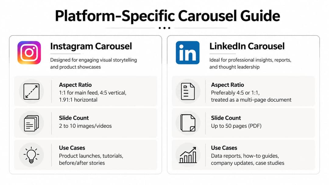
Carousel Specifications and Use Cases by Platform
Format strategy breaks when teams assume every platform treats carousels the same way. They don’t. User intent changes by platform, and the technical constraints shape what kind of story you can tell.
On Meta platforms, carousels support up to 20 slides on Instagram at 1080x1080 pixels, and swiping increases dwell time by 1.4x, which corresponds with a 1.4x reach boost according to Sprinklr’s carousel post guide. That’s not just a design detail. It affects delivery and visibility.
The quick comparison marketers actually need
| Platform | Max Cards | Aspect Ratio | Primary Use Case |
|---|---|---|---|
| 20 | 1:1 or 4:5 | Product stories, tutorials, offer education | |
| Varies by placement and setup | 1:1 commonly used | Retail offers, lead-gen sequences, catalog-style storytelling | |
| Multi-page carousel-style documents are common | 4:5 or 1:1 works well visually | B2B education, frameworks, reports | |
| Multi-image storytelling varies by format | Vertical-first creative usually fits behavior | Step-by-step inspiration, guides, visual discovery |
Instagram and Facebook
Instagram is where most performance teams should sharpen their carousel craft first. The swipe behavior fits the feed, visual sequencing is intuitive, and users are used to educational, product-led, and comparison-led stories.
Facebook can still work well for carousels, especially in retail, local offers, and broader-interest audiences. But the creative usually needs to be simpler. Less visual subtlety, clearer copy, faster framing. If your team needs a broader view of Facebook ad types, including carousels, that comparison is useful before you choose placements.
A practical resource on Instagram carousel post strategy is also worth reviewing if your team is building Meta-first creative systems.
LinkedIn and Pinterest
LinkedIn carousels aren’t usually about impulse clicks. They work when you package expertise into a clear progression. Think frameworks, teardown slides, benchmark summaries, and problem-solution thinking for B2B buyers.
Pinterest is different again. Users often arrive looking for ideas they can save, revisit, or act on later. That makes carousels useful for tutorials, visual checklists, and step-by-step content where the sequence itself is the value.
Platform fit matters more than platform presence. The same carousel concept rarely performs equally well everywhere.
The practical takeaway is simple. Don’t port one carousel everywhere with minimal edits. Adjust the pacing, density, and CTA to match how people use each platform.
The Performance Impact Why Carousels Drive Better Results
Performance marketers care about one thing first. Does the format improve the economics of the campaign?
With carousels, the answer is often yes, because the format creates more opportunities for interaction inside a single impression. More attention tends to produce stronger click behavior, and stronger click behavior usually gives the algorithm cleaner signals to optimize around.
The strongest paid-media case comes from PostNitro’s review of carousel performance, which reports that carousel ads can deliver up to 10x higher click-through rates, 30 to 50% lower cost per conversion, and 20 to 30% lower cost per click than static formats.
Why those gains happen
Those results don’t appear by magic. Carousels improve performance when they solve one of these problems better than static ads:
- Message compression: A single image can’t explain the offer clearly.
- Product complexity: Users need multiple views, features, or use cases.
- Trust gap: One frame isn’t enough to build confidence.
- Audience uncertainty: The user needs a few beats before they’re ready to click.
A carousel can show the product in use, add proof, compare options, and land the CTA without sending the user away too early. That makes the click more informed, which often means better traffic quality after the click too.
Better for testing, not just storytelling
Another reason carousels matter in paid social is that they let you test inside the creative itself. You’re not just running one image against another. You’re testing message order, proof types, product angles, copy framing, and CTA placement within the same unit.
That becomes powerful when you pair it with disciplined campaign structure. If you’re already working through Instagram carousel ads in a paid acquisition context, you know the win isn’t “make it swipeable.” The win is giving Meta more useful engagement signals while preserving a coherent story.
For teams thinking beyond format and into execution, this roundup of Instagram engagement strategies is a helpful complement because it places carousels in the wider feed-performance mix.
Where teams get it wrong
Carousels underperform when marketers treat extra cards as extra space for clutter. More cards don’t automatically mean more persuasion.
Common failure points include:
- Weak opening card: If slide one doesn’t earn the swipe, the rest doesn’t matter.
- Redundant middle slides: Repeating the same claim in different visuals kills momentum.
- Late proof: Waiting too long to establish credibility loses colder traffic.
- Soft final CTA: Ending with branding instead of a direct next step wastes intent.
The format is strong because it creates structure. If there’s no structure, you’ve just made a static ad longer.
How to Create Carousels That Convert
The best converting carousels read like direct-response copy broken into visual beats. They aren’t pretty decks. They’re arguments with pacing.
Start by deciding what the user needs to believe before clicking. Then assign those beliefs to cards in order.

Use the hook problem solution CTA flow
A practical framework is hook, problem, solution, CTA. It works because it mirrors how people evaluate ads in-feed.
According to Quso’s carousel format breakdown, Meta’s carousel algorithm prioritizes stronger initial cards, and carousels that follow a hook-problem-solution flow can increase completion rates by 15 to 25%.
Here’s how to apply that:
Hook on slide one
Lead with a claim, question, visual contrast, or product outcome. Don’t start with your logo or a generic product shot.Problem on early slides
Name the pain clearly. For ecommerce, that might be fit, quality, durability, or decision overload. For SaaS, it might be manual work, slow reporting, or wasted spend.Solution in the middle Show the product doing the job. Include demos, feature callouts, proof snippets, and use-case framing.
CTA at the end
Ask for a concrete next step. Shop, learn more, book demo, start trial. Don’t hide the ask.
Design rules that actually help conversion
A few creative choices consistently improve usability:
- Keep visual rhythm consistent: The user should feel they’re moving through one story, not separate ads.
- Write less per card: Dense copy lowers swipe momentum.
- Front-load your strongest material: Put your best proof and clearest value earlier than feels comfortable.
- Use contrast intentionally: If every card screams, none of them stand out.
One of the easiest ways to get unstuck is reviewing strong Instagram Carousel post ideas and translating the underlying structures into your own vertical, rather than copying visual style.
A quick walkthrough helps if your team is building these for the first time:
What usually doesn’t work
Teams often sabotage carousel performance with good intentions. They try to say too much, add too many design motifs, or save the best insight for the end.
Keep the first card strong enough to win on its own. Treat every later card as reinforcement, not rescue.
If you’re building these at scale, tools such as Canva for layout systems, Figma for modular design, and platform-specific ad builders can help standardize production. AdStellar AI is one option for teams that need to generate and launch multiple carousel variations from historical Meta inputs, especially when testing many creative and audience combinations at once.
Measuring Success and Smart A/B Testing for Carousels
A carousel isn’t “working” because people liked it. For paid social, you need to know where the sequence is helping and where it’s leaking intent.
That means looking past top-line engagement and reading the ad like a funnel. Slide one earns the stop. Middle cards maintain interest. Final cards convert that attention into action.

Metrics worth watching
For carousel campaigns, focus on metrics that reveal sequence quality:
- CTR: Your clearest signal that the story is creating action.
- CPC: Useful for spotting whether stronger engagement is translating into cheaper traffic.
- Cost per conversion or lead: The real test for direct response.
- Engagement by card: If available in your workflow, this helps identify weak or strong frames.
- Landing page behavior: Better carousel clicks should produce more qualified sessions, not just more volume.
If your team needs a more disciplined experimentation workflow, this guide on how to test ads systematically gives a solid framework for separating creative insight from random variation.
High-value A/B tests
Don’t test everything at once. Keep the narrative stable and change one major variable.
Try these first:
- Slide one angle: Test benefit-led versus curiosity-led openings.
- Narrative type: Compare product-first carousels against problem-first carousels.
- Proof style: Run testimonials versus feature demonstrations in the middle cards.
- Card count: Shorter sequences often sharpen the message. Longer ones can work when the product needs explanation.
- Final CTA card: Compare direct asks against softer educational asks.
How to read the results
If CTR rises but conversion quality drops, the carousel may be creating curiosity without clarity. Tighten the middle cards so the click is more informed.
If CPC improves but conversions don’t, the format may be earning cheap traffic from broad interest rather than buyer intent. In that case, sharpen the opening promise and make the CTA more specific.
If users engage but don’t click, the carousel may be functioning as content rather than an ad. That’s not always bad, but it means the sequence isn’t moving enough people toward action.
The goal isn’t maximum swipes. The goal is profitable movement from first card to click to conversion.
Inspiring Carousel Examples from Leading Brands
Good examples help because the mechanics become obvious once you see them in use.
B2B SaaS feature tutorial
A SaaS brand often gets the most from a carousel when the product isn’t instantly understandable in one screenshot. The strong version opens with the operational pain, then uses the next slides to show workflow, outcome, and a simple CTA.
Why it works: the user doesn’t need to decode the product alone. The brand handles the explanation in sequence, which lowers friction for colder audiences.
DTC product showcase
DTC brands usually get the best mileage from carousels when they resist the urge to show only polished studio shots. A stronger sequence mixes product angles, in-use context, detail close-ups, and one or two proof-focused cards.
Why it works: the carousel answers the buying questions that a shopper would normally resolve on a product page. That can make the click more intentional and the traffic more qualified.
Educational brand mini lesson
An educational business, coach, or media brand can use a carousel as a compact lesson. Slide one opens with a sharp claim. The middle cards break down the idea step by step. The final card offers the next action.
Why it works: people save content that helps them do something specific. The sequence itself becomes the value.
Thought-leadership and ad inspiration
For inspiration on what persuasive paid creative looks like in the wild, this collection of great Facebook ad examples is useful because you can reverse-engineer which concepts would translate well into a carousel sequence.
The common thread across all strong examples is simple. Each card has a role. Nothing is there just to fill space. When teams start thinking this way, their carousel creative usually gets sharper fast.
Frequently Asked Questions About Carousel Posts
How many slides should a carousel have
Use as many as the story needs, and no more. If you can make the case in fewer cards, do that. Shorter carousels often force better discipline. Longer ones work when the product needs explanation, comparison, or proof stacking.
Are carousels good for B2B lead generation
Yes, especially when the audience needs education before clicking. In B2B, carousels work well for pain-point framing, workflow explanation, feature walkthroughs, and objection handling. The best ones feel like a tight sales narrative, not a corporate brochure.
Should I use all images, all videos, or mixed media
It depends on what the message needs. Images are usually easier to control and scan quickly. Video can help when motion proves the product better than a still frame. Mixed-media carousels can work well when the sequence stays coherent and the first card is still strong enough to earn the swipe.
Do carousels help with Meta algorithm performance
They can, because the format creates more interaction opportunities than a static unit. That matters when the creative is structured well. But the algorithm won’t save a weak sequence. If the opening is flat or the story drags, performance falls apart quickly.
What’s the biggest mistake teams make with carousel ads
They treat extra cards as extra room instead of extra responsibility. Every slide needs a purpose. If a card doesn’t stop, explain, prove, or convert, cut it.
If your team is producing lots of Meta creative and wants a faster way to build, test, and scale carousel variations, AdStellar AI is built for that workflow. It connects to Meta Ads Manager, uses historical performance data to rank creative and audience combinations, and helps teams launch large batches of ads without turning setup into a manual production job.