Many still treat the instagram carousel post like a design format. That's the wrong frame. It's a performance format.
Multiple 2025 to 2026 studies reported approximately 10% average engagement for carousel posts, versus 6% for Reels and 2 to 3% for single-image posts, driven in part by Instagram's re-serve behavior that gives carousels a second chance in-feed with a different preview slide, as summarized by Carouselli's review of recent carousel vs Reels data. If you're managing CPA and ROAS, that should change how you build creative.
A strong instagram carousel post holds attention longer, creates more opportunities to earn saves, and gives you multiple surfaces to test message-market fit inside one asset. Enterprise teams have used that logic for years. What's changed is that smaller growth teams can now apply the same testing discipline without building a huge creative operation first.
Why Carousel Posts Dominate the Instagram Feed
Carousel posts have been averaging about 10% engagement in recent benchmarks, well ahead of other common Instagram formats cited earlier in this article. For a performance team, that gap is not a branding footnote. It changes how many chances a single creative gives you to earn attention, qualify intent, and move someone closer to conversion.
The format fits how people browse the feed. Users can scan the first card, decide in a second whether the topic is relevant, and keep swiping only if each next slide pays off. That behavior rewards message sequencing. It also gives marketers more room to test angle, proof, and offer framing inside one asset instead of betting everything on one thumbnail or one three-second Reel hook.
Carousels have a built-in delivery advantage
Instagram can re-serve a carousel with a different slide shown first if the original impression did not get engagement. That gives the post another opportunity to earn the swipe without producing a second asset. In practice, that means one carousel can behave like multiple hooks packaged into one unit.
That is useful in both paid and organic distribution. Reels often win on broad reach. Carousels usually hold up better when the buyer needs a few beats to understand the value proposition, compare options, or process proof.
Practical rule: Use a carousel first for education, comparisons, objection handling, product breakdowns, and step-by-step claims.
Saves are the other reason carousels keep outperforming. A user may not comment or click on first exposure, but they will save a post that helps them make a decision later. That signal has more downstream value than empty reach.
If reporting is still centered on reach alone, teams will misread creative quality. A better baseline is to separate exposure from actual attention, then judge whether the post generated a next step. This guide to Instagram impression metrics and how to interpret them helps clean that up.
Why performance teams keep coming back to carousels
A key advantage is control. A carousel lets you stack a hook, a pain point, a product explanation, social proof, and a CTA in a sequence that mirrors a landing page. That is why strong media buyers keep using the format for retargeting, mid-funnel education, and offer clarification.
It also maps well to disciplined testing frameworks that used to be limited to larger teams. Instead of testing one ad against another in a blunt way, you can vary only the first slide, only the proof slide, or only the CTA card, then measure how those changes affect hold rate, saves, clicks, CPA, and ROAS. That is a more scalable way to learn.
Here’s the practical trade-off:
| Format | Best use | Main strength | Main weakness |
|---|---|---|---|
| Carousel | Education, product explanation, comparisons, retargeting | Higher engagement and stronger intent signals | Usually slower to scale on pure discovery |
| Reel | Broad awareness, creator-style hooks, top-of-funnel | Wider initial distribution | Weaker depth when the message needs multiple steps |
| Single image | Simple offers, announcements, one visual idea | Fast to produce and easy to digest | Limited narrative room |
Good carousel strategy starts with strong concepts, not extra slides. If the team needs inspiration before building a testing matrix, these 10 fresh Instagram carousel post ideas are a useful starting point.
What changed recently is execution speed. Enterprise teams have used modular creative testing for years. Now smaller growth teams can do the same thing with AI support, structured templates, and faster variation production. Tools like AdStellar reduce the manual work, so the advantage is no longer reserved for brands with a large creative bench.
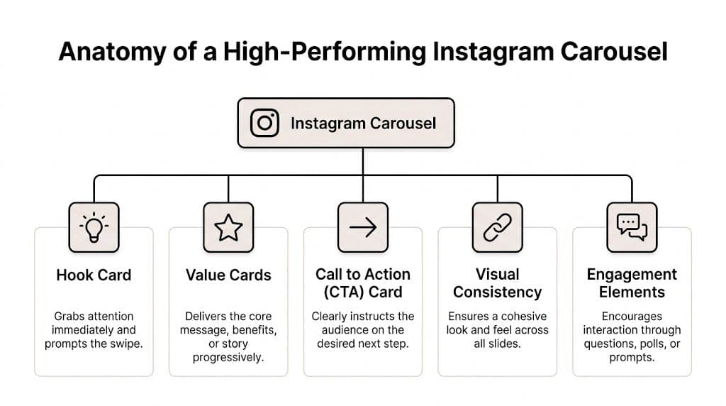
Anatomy of a High-Performing Instagram Carousel
Carousel posts can hold attention longer than single-image posts because they give you more than one chance to earn the swipe. The best ones are built like conversion assets, not design exercises. Every slide needs a clear role, and the sequence needs to move a user from curiosity to action without wasted frames.
Start with the right canvas
Format decisions affect performance before copy or design enters the picture. Creator Flow's carousel optimization guide notes that 1080x1350 portrait is the practical default for feed visibility, and that engagement peaks at 10 slides, with only a small share of carousels using the full sequence. That gap matters. Brands often cut the story short, then blame weak results on the offer or the audience.
The trade-off is simple. More slides give you room for education, proof, comparison, and objection handling. Too many weak slides lower completion and make the post feel padded. Use the slide count the idea can support, not the fewest slides your designer can finish quickly.
Use a slide sequence that earns the swipe
High-performing carousels usually follow a predictable structure because users respond to clear pacing.
- Hook card. The first slide stops the scroll with tension, a claim, or a clear payoff.
- Context card. Early slides frame the problem so the rest of the carousel feels relevant.
- Value cards. Middle slides deliver the proof, explanation, examples, or product logic.
- Pattern shift. A screenshot, UGC-style asset, chart, or short video can reset attention.
- CTA card. The final slide asks for the next step clearly.
- Caption support. The caption adds context, qualifiers, or a simple prompt.
One weak slide can break the chain.
Enterprise-style testing becomes useful for smaller teams. Instead of treating the carousel as one creative unit, break it into modules and test the parts that change outcomes. Test one hook against another. Test a proof slide with a testimonial versus a stat. Test a CTA card that asks for a click versus one that asks for a save. AI tools like AdStellar make that workflow practical even if the team does not have a large creative bench.
Hooks do the commercial work
The first slide carries more weight than the rest of the deck. If it reads like a category label, users skip. If it creates a reason to care, swipes go up.
"3 skincare tips" tells users the topic. "Why your skincare routine stops working after week 2" gives them a reason to continue.
That difference matters in paid social because the first card shapes hold rate, downstream clicks, and eventually CPA. In practice, I treat slide one like a headline test in a landing page program. It deserves the same level of iteration.
Mix media to keep momentum
Visual monotony kills swipe depth. A carousel made entirely of static text cards can still work, but performance usually improves when the sequence changes pace at the right moment.
A mixed-media slide often does that job better than another block of copy. One product demo clip, one screen recording, or one founder video can refresh attention without turning the post into a Reel. Use motion where it helps comprehension or restores interest. Do not add video just to check a format box.
Build continuity without making every slide look the same
Strong carousels feel connected, but they do not repeat the same composition ten times. Uniformity helps branding. Variation helps retention. You need both.
Use a simple system:
- Typography: Keep headline and body styles stable.
- Color: Repeat a small set of brand colors.
- Layout rhythm: Alternate dense slides with cleaner ones.
- Progress cues: Number slides or use directional cues so the user expects another frame.
- Proof placement: Put testimonials, results, or screenshots where skepticism is highest, not only at the end.
This is also where scalable testing frameworks help. Once the base system is set, teams can produce controlled variations fast instead of redesigning from scratch every time. That is how larger performance teams learn quickly, and it is increasingly how smaller teams should work too.
If the team needs raw material before building a test matrix, these 10 fresh Instagram carousel post ideas can help generate angles that map to education, proof, product storytelling, and comparison formats.
What works and what usually doesn't
A high-performing carousel tends to share the same characteristics across industries.
| What works | What underperforms |
|---|---|
| One clear promise per carousel | Too many ideas competing in one sequence |
| First slide built for curiosity or pain | First slide that reads like a title page |
| Slides that progress logically | Information dumped in no clear order |
| Proof placed before the ask | CTA shown before trust is built |
| Visual shifts that reset attention | Same layout repeated across every frame |
Publishing mechanics matter too. If the team needs a clean workflow for formatting and posting finished assets, this guide on how to post on Instagram and Facebook covers the operational side.
The best carousels feel easy to consume because the structure is doing the work. That is usually the difference between a post that collects passive likes and one that drives stronger engagement, better click quality, and more efficient spend.
Crafting and Publishing Your Carousel Post
Execution is where many teams slow down. The strategy is usually fine. The workflow isn't. If you don't have a repeatable way to move from idea to published asset, you'll either post too little or ship rushed creative that wastes a strong concept.

Pick an angle before you touch design
Start with the audience tension, not the visual treatment. Ask what job the carousel needs to do.
For paid social, the common jobs are simple:
- Educate when the offer needs explanation
- Compare when buyers are weighing alternatives
- Demonstrate when the product value is easiest to show
- Handle objections when conversion stalls late in the funnel
- Frame the offer when pricing or bundling needs context
Weak carousels usually begin when teams choose "tips," "behind the scenes," or "product shots" as content types, but they never define the actual persuasion goal. Content categories aren't strategy.
Storyboard the swipe path
Before opening Canva, Figma, or Adobe Express, sketch the slide flow in plain text. Not polished copy. Just jobs.
A practical storyboard might look like this:
| Slide | Job |
|---|---|
| 1 | Hook with tension or promise |
| 2 | Name the problem clearly |
| 3 | Agitate with a familiar mistake |
| 4 | Introduce the better approach |
| 5 | Show the product or process |
| 6 | Add proof or example |
| 7 | Clarify benefit |
| 8 | CTA |
This step cuts wasted design time. If the sequence feels weak as a text outline, better visuals won't save it.
Most carousel production problems are really messaging problems wearing a design costume.
Write slide copy that can survive a thumb scroll
Each slide needs to communicate fast. Instagram isn't a slide deck in a conference room. People are scanning on a phone.
Good carousel copy usually follows a few rules:
- Lead with the point. Don't warm up.
- Use fewer words per slide. Dense slides get skipped.
- Write for interruption. Assume someone lands on slide two or three.
- Keep headline hierarchy obvious. One main idea, then support.
- Save nuance for the caption. The slide should still work without it.
Slide one deserves extra attention because it controls whether the rest gets seen. Strong first slides tend to make a specific promise, open a loop, or challenge a bad assumption. Weak ones describe the topic too generally.
If your team needs a practical walkthrough for the in-app posting flow itself, this guide on how to post multiple photos on Instagram is a helpful operational reference.
Design for swipe behavior, not just aesthetics
Carousel design is interaction design. You're not building a poster. You're building momentum across frames.
A few practical design choices help:
Make the first slide visually distinct
Slide one should look like an entry point, not a random crop from the middle of the set. Use stronger contrast, a larger headline, and a composition that reads instantly in-feed.
Use continuation cues
A cut-off shape, arrow, numbered sequence, or phrase like "swipe to see why" can all work if they feel natural. The goal isn't to beg for interaction. It's to signal that the next frame contains payoff.
Reduce visual fatigue
If every slide uses the same template, people stop noticing differences. Alternate text-led slides with product shots, screenshots, charts, or short clips. Variation keeps the deck from feeling longer than it is.
Here’s a useful walkthrough if you're standardizing your cross-platform publishing process:
Publish differently for organic and paid
Organic posting and carousel ad setup look similar on the surface. Operationally, they're different.
For organic posts in the Instagram app, the focus is presentation. Select the slides in order, choose a cover slide that also works on the grid, write a caption that adds context without repeating every slide, and confirm tags, location, and accessibility fields.
For paid carousels in Meta Ads Manager, the focus shifts to control. You need clean asset naming, a deliberate card order, matching primary text and headline logic, URL consistency, and a clear CTA. The ad isn't just a post with budget behind it. It's a conversion asset, so every card should support the campaign objective.
A good internal publishing checklist also helps prevent avoidable mistakes. This guide on how to post on Instagram and Facebook is useful if your team is coordinating organic workflows across both placements.
Keep the process lightweight enough to repeat
Many teams don't fail because they lack ideas. They fail because every carousel feels custom-built from scratch. That's too slow.
Use templates for recurring use cases. Keep a bank of hook slides, proof slides, feature comparison slides, and CTA endings. Save layouts in Canva or Figma. Build reusable caption frameworks by funnel stage. The goal isn't to make everything identical. It's to remove the repetitive decisions so the important ones get more time.
An instagram carousel post should be easy to produce once the strategic choices are made. If it still takes your team forever, the bottleneck probably isn't creativity. It's the absence of a system.
Measuring and Optimizing Carousel Performance
A carousel can look excellent and still underperform. Post-launch analysis is where you separate taste from results.
The biggest reporting mistake is judging carousel performance the same way you'd judge a Reel. Reels often win on reach. Carousels often win on depth. Those are different jobs with different success signals.
Start with the right benchmark for the goal
Reels get 36% more reach than carousels, but carousels deliver 12% higher engagement and dominate saves, based on Buffer's 2026 Instagram statistics roundup. That's the core trade-off.
If a campaign is built for awareness, lower carousel reach isn't automatically a problem, but it is a constraint. If the campaign is built to nurture warm audiences, explain an offer, or build consideration, carousel depth usually matters more than broad distribution.
Here's the clean way to frame it:
| Goal | Metric that matters most | Better default format |
|---|---|---|
| Discovery | Reach and new audience exposure | Reel |
| Consideration | Saves, shares, comments, swipe progression | Carousel |
| Conversion support | Click quality, message clarity, objection handling | Carousel |
| Quick announcement | Immediate visibility of one message | Single image |
Read carousel metrics like diagnostic signals
A good carousel doesn't just produce one number. It gives clues about where persuasion is working or breaking.
Look closely at these signals:
- Saves: Strong saves usually mean the content was useful enough to revisit.
- Shares: High sharing often means the message is socially valuable or relatable.
- Comments: Comments reveal whether the post sparked reaction, confusion, or intent.
- Swipe-through behavior: This shows whether the hook and sequencing did their job.
- Click behavior on ads: For paid campaigns, low clicks with decent engagement often points to a weak CTA or offer mismatch.
If you need a primer on how Instagram defines and surfaces these metrics, this guide on Instagram Insight meaning is a useful reference for teams standardizing reporting.
A high-like, low-save carousel is usually entertaining. A high-save carousel is usually useful. Utility is the better signal when you're trying to move buyers toward action.
Use performance patterns to decide what to change
Optimization gets easier when you stop asking "did it work?" and start asking "where did it break?"
Here are common patterns and what they usually mean:
| Pattern | Likely issue | Best next move |
|---|---|---|
| Low engagement from the start | Weak first slide or poor audience-message fit | Rewrite the hook and tighten the promise |
| Strong opening, weak depth | Middle slides don't deliver enough value | Rework the narrative and cut filler slides |
| Good engagement, weak clicks | CTA lacks clarity or offer isn't compelling | Test a sharper final slide and stronger ad copy |
| Strong saves, weak comments | Helpful but not conversational | Add a more specific discussion prompt |
| Broad reach, weak downstream action | Format matched awareness, not conversion | Shift to a more educational or objection-handling carousel |
Compare carousels against your own library, not generic internet advice
Benchmarks are useful for framing expectations, but your strongest optimization loop comes from internal comparison. Put carousel posts into buckets by intent: educational, testimonial, feature-led, offer-led, founder-led, UGC-led. Then compare performance within those categories.
That changes the conversation. Instead of saying "carousels work," you learn that your audience saves feature comparison decks, comments on founder perspective carousels, and clicks more often on testimonial-led ads. That's actionable.
The best growth teams don't just measure whether a carousel performed. They build a memory of what kind of carousel performs for each stage of the funnel.
Advanced Carousel Ad Strategies and Split Testing
Teams that apply structured creative testing usually get more from the same spend. The gap is rarely design quality alone. It comes from whether each card has a job, whether the sequence matches buying intent, and whether the team can isolate what improved conversion.
For e-commerce campaigns, a YouTube summary of Meta Q4 2025 carousel findings points to a useful operating range. Carousels with 5 to 7 slides outperformed shorter 2 to 4 slide versions on ROAS. I treat that as a testing priority, not a rule. More cards give you room to build proof, handle objections, and frame the offer. Too many cards can still drag if the story gets repetitive.

Match the carousel structure to funnel temperature
Cold audiences usually need a sharper narrative. Warm audiences usually need proof density. Bottom-funnel audiences need a cleaner path to action.
That sounds obvious, but it changes how the cards should work.
PAS for problem-aware buyers
Problem, Agitate, Solution fits products where the pain is already understood and expensive to ignore.
A practical PAS sequence:
- Slide 1: Name the problem in plain language
- Slide 2: Show the cost of doing nothing
- Slide 3: Call out the failed workaround
- Slide 4: Present the better approach
- Slide 5: Show the product in use
- Slide 6: Ask for the click or purchase
This structure works well for software friction, skincare issues, operations bottlenecks, and products that replace a bad habit.
FAB for product education
Feature, Advantage, Benefit works when the product makes sense only after a short translation layer.
The mistake is stopping at the feature. Buyers do not care about a technical input unless the next card makes the outcome obvious. Use each slide to move from what the product has, to why that difference matters, to what the buyer gets in daily use.
Proof stacks for retargeting
Retargeting carousels often convert better when each card answers a different doubt. The buyer already recognizes the brand. The remaining job is risk reduction.
| Slide type | Role in the ad |
|---|---|
| Customer quote | Adds credibility |
| Before-and-after result | Makes the outcome concrete |
| Objection answered | Lowers hesitation |
| Product usage image | Shows how adoption looks |
| Offer reminder | Returns the user to action |
The best carousels behave like sequenced sales pages in miniature.
Test one variable per batch
A lot of teams call it testing when they swap the hook, rewrite the body cards, change the CTA, and alter the offer in the same round. That setup produces spend, not insight.
Enterprise creative teams solved this years ago with controlled matrices. Smaller teams can run the same discipline if production is organized. Keep one element variable, hold the rest steady, and name every asset clearly enough that reporting stays usable.
Start with the hook
Slide one usually has the highest influence on thumb-stop rate and early engagement. Test opening concepts against the same middle slides and same CTA card:
- pain-led hook
- proof-led hook
- curiosity-led hook
- outcome-led hook
This gives you a clean read on message angle before you spend time redesigning the full sequence.
Isolate the CTA card
If people swipe but do not click, the last card is often underperforming. Test the ask separately from the story.
Useful CTA variants include:
- direct purchase prompt
- softer learn-more prompt
- comparison-driven prompt
- urgency-framed offer
Test card count by objective
Card count changes how much persuasion you can fit into one impression. For prospecting, shorter sequences can keep the message tight. For warmer audiences, 5 to 7 cards often give enough space to layer benefit, proof, and objection handling without losing momentum.
For setup examples and implementation details, use this reference for carousel ad setup.
Build a repeatable testing matrix
The advantage lies not in one winning carousel. It is a system that keeps producing creative learnings you can scale across audiences and offers.
A simple framework is enough:
| Test batch | Variable | Constant | Success question |
|---|---|---|---|
| Batch A | Slide 1 hook | Same middle and CTA | Which opening earns the strongest first response? |
| Batch B | Card count | Same message and offer | How much story does this audience need? |
| Batch C | Proof type | Same hook and CTA | Does customer proof beat product proof? |
| Batch D | CTA card | Same front half | Which ask turns interest into action? |
This is the part smaller teams usually skip because production gets messy fast. AI changes that. A team does not need enterprise headcount to run enterprise-style creative testing anymore. It needs a clear hypothesis, controlled batches, and a workflow that can generate enough high-quality variations to make the spend teach you something useful.
Scale Carousel Production and Testing with AdStellar AI
The hard part about carousel strategy isn't knowing what to test. It's producing enough clean variations fast enough for testing to matter.
Manual workflows break down early. One marketer writes copy, a designer builds slides, a buyer duplicates ads, someone renames assets badly, and reporting comes back too late to tell you which message won. By that point, the team has learned less than it should have from the spend.
Why scale changes the quality of testing
Small teams usually test like this: one carousel, one backup version, maybe a different first slide if there's time. That limits what you learn. You can't isolate hooks, proof formats, CTA cards, and slide sequencing if every new version takes too long to build.
An AI-assisted workflow changes the economics of testing. It becomes realistic to create batches of variations around a single strategic question, then launch them in an organized way. That's how enterprise teams have approached creative learning for years. The difference now is accessibility.
What a scalable carousel workflow should do
A useful system for instagram carousel post testing needs to handle four jobs well:
- Generate variations quickly. Different hooks, proof angles, card order, and CTA endings.
- Keep structure consistent. So tests compare real variables instead of random creative noise.
- Push assets live without manual bottlenecks. Speed matters because delayed launch slows learning.
- Rank winners by business outcome. Not just by surface engagement.
When teams can do that, carousel production stops feeling like content creation and starts functioning like performance experimentation.
Where AdStellar AI fits
AdStellar AI is built for the exact operational gap that slows down carousel testing. It lets teams generate large numbers of creative, copy, and audience combinations quickly, then launch them through an efficient workflow. That matters because the most useful carousel insights usually come from patterns across multiple variants, not from a single hero asset.
It also matters that AdStellar connects performance feedback to future production. Once you know which hooks, value slides, or CTA structures are working, the next round shouldn't start from zero. The system should help you reuse what wins and retire what doesn't.
For teams trying to operationalize bulk testing, AdStellar's bulk launching workflow is the part that changes the pace of execution. It removes a lot of the repetitive setup work that usually makes ambitious testing plans collapse.
Better carousel strategy isn't enough if your team can only ship a handful of variants each cycle.
The practical outcome for growth teams
This isn't about using AI to make more mediocre ads. It's about making disciplined testing possible for teams that don't have enterprise headcount.
A smaller DTC team can test multiple hook families instead of arguing over one. An agency can create client-specific carousel variants without turning production into a bottleneck. A B2B growth team can compare educational, proof-led, and objection-handling decks without spending all week in manual setup.
That shift matters. The winning instagram carousel post usually isn't obvious upfront. It emerges from structured testing, clean feedback loops, and enough volume to spot patterns early. AI doesn't replace the strategy. It makes the strategy executable.
If you're serious about turning carousel ideas into a repeatable Meta growth system, AdStellar AI is worth a close look. It helps performance teams generate, launch, and learn from large volumes of ad variations faster, so you can test more hooks, more sequences, and more offers without getting buried in manual production.