You're probably in the same spot most paid media teams hit at least once a week. Design has delivered a few master files, launch is due today, and someone asks whether you need every banner size, just responsive assets, or both. Then the usual scramble starts. Exports, file compression, last-minute re-crops, and a rejection notice right when the campaign should be live.
That's why Google Display ad specs still matter so much. The Google Display Network is massive. One industry source says it reaches 90% of global internet users and up to 94% of U.S. internet users through a huge mix of placements, which is exactly why creative has to be built with format discipline from the start, not patched together at upload time (Google Display Network reach statistics). If your team also runs broader display programs, this overview of digital ad display formats and workflows is a useful companion.
Your Essential Guide to Google Display Ads Specs

Google Display ad spec guides often treat the job as if it were years ago. They dump a long list of pixel dimensions and leave you to figure out what matters. That's not how present-day operations work. Production systems should prioritize responsive placements, adding fixed sizes only where control or coverage justifies the extra work.
That shift changes the workflow. Instead of asking, “Which banner sizes do we need?” the better question is, “Which asset ratios give us durable coverage across placements without creating design debt?” That's the difference between a launch process that scales and one that breaks every time a campaign needs fresh creative.
What usually goes wrong
The failures are predictable:
- Teams export too many one-off sizes and spend time resizing instead of refining the message.
- Designers build beautiful source files that don't survive aggressive cropping.
- Media buyers upload assets late and discover the file size, format, or animation rules after the fact.
- Brand teams insist on exact layouts in placements where Google is going to reformat the ad anyway.
Practical rule: Build for how Google serves inventory now, not for how static banner checklists used to be organized.
The practical approach is simpler. Start with responsive display logic. Produce strong master assets in the key ratios Google favors. Keep a short set of proven static sizes ready for placements where fixed dimensions still matter. Use HTML5 only when the creative concept needs motion or interactivity, not because the format exists.
Why this guide is different
This is the working version of Google Display ads specs. It's meant for launch teams, not for passive reading. You'll get the exact technical constraints that matter, but, critically, you'll get the trade-offs behind them:
- when ratio-first production saves time
- when static banners are still worth making
- where file weight kills execution
- why some ad units get approved fast and others stall in review
If you're under deadline, the chart below is the fastest starting point.
Quick Reference Chart for Core Ad Specs
When I need a fast spec check before upload, I don't want a long explanation. I want one sheet that tells me what format I'm dealing with, what dimensions matter, and what's likely to fail. If your team is also designing for smaller placements, this guide to mobile banner ad formats is worth keeping nearby.
Google Display Ads Core Specs At-a-Glance (2026)
| Ad Format | Key Dimensions / Ratios | Max File Size | Supported File Types |
|---|---|---|---|
| Responsive Display Ads | 1200 × 628 (1.91:1) and 1200 × 1200 (1:1) are the most common image assets | Not specified in the verified data for this section | Not specified in the verified data for this section |
| Static Image Ads | Common recommended sizes include 300×250, 336×280, 728×90, 160×600, 320×100 | 150 KB | JPG, PNG, GIF |
| HTML5 Ads | Built as an uploaded ZIP bundle rather than a single image size | 600 KB compressed ZIP | One HTML document plus up to 39 media assets inside the ZIP |
A few operational notes matter here.
How to use this chart
- Responsive first: If the campaign is standard display and you don't need locked layouts, start with responsive assets.
- Static second: Add fixed-size banners when brand control matters, when a client insists on exact compositions, or when you already know a few legacy sizes are central to the buy.
- HTML5 selectively: Use HTML5 for richer concepts. Don't use it when a clean static file will do the job faster and with less approval risk.
The best spec sheet is the one that reduces production decisions, not the one that creates more of them.
That's the core split. Responsive is your scalable base. Static gives you precision. HTML5 gives you flexibility, but only if your build process is disciplined.
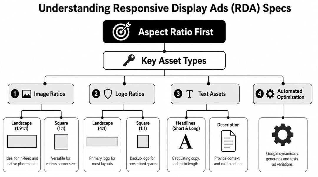
Responsive Display Ads (RDA) Specs and Ratios
Responsive Display Ads are an ideal starting point. Google's current guidance puts the emphasis on aspect-ratio-first production, not on building a giant export library of fixed banners. The most common image assets are 1200 × 628 (1.91:1) and 1200 × 1200 (1:1), and Google automatically resizes those assets across placements (Google's responsive display asset guidance).
That sounds simple, but the main benefit is production efficiency. Once your team accepts that Google will assemble and resize the final ad, you stop trying to force one perfect layout into every placement. You build flexible source assets instead.
The ratio-first asset set
For most campaigns, the baseline RDA image set should include:
- Image at 1.91:1 using 1200 × 628
- Square image at 1:1 using 1200 × 1200
- A horizontal logo treatment
- A square logo treatment
- Short copy that still makes sense when Google recombines it
The image pair does most of the heavy lifting. The wider asset tends to carry native and wider placements better. The square asset protects you when space gets tighter or a feed-like placement needs a more centered composition.
What works in production
Design these assets like modular components, not miniature posters.
- Keep the focal point centered enough that a crop won't destroy the image.
- Avoid edge-dependent messaging because text near borders often becomes the first casualty.
- Separate brand recognition from layout precision. Your logo should survive multiple renderings, not just one mockup.
- Write headlines that can stand alone because Google may pair them with different images and descriptions.
If the ad only works when every element appears in one exact position, it isn't built for responsive display.
A common mistake is handing Google an asset that already feels overdesigned. Dense text overlays, complex layered compositions, and thin margins often look good in a Figma frame but break when resized into unfamiliar placements.
The right mindset for RDAs
The old question was, “Which banners do we need to build?” The better modern question is, “Which assets can Google reassemble without making the ad look broken?”
That changes review standards inside the team. Instead of approving one final banner, you're approving a flexible system:
| Asset area | What to optimize for |
|---|---|
| Images | Clear subject, strong crop tolerance, simple hierarchy |
| Logos | Readable at small size, enough padding, no forced squeezing |
| Headlines | Standalone clarity, not dependent on surrounding copy |
| Descriptions | Reinforcement, not repetition |
| Brand elements | Consistent but not oversized |
If your team adopts that mindset, RDA production gets much easier. You'll spend less time exporting variants and more time improving the inputs that shape delivery.
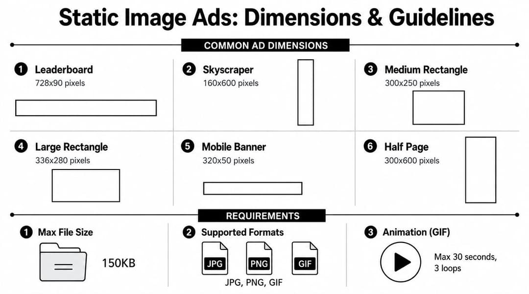
Static Image Ads (Uploaded) Specs and Dimensions
A common campaign handoff looks like this. The team approves one polished banner set, then asks which uploaded sizes are still worth producing now that Google pushes responsive inventory so hard. The practical answer is to treat static ads as a selective format, not the default system.
Static uploaded banners still earn their place when layout control matters more than flexibility. They are useful for regulated offers, fixed legal copy, strict brand lockups, and campaigns where the client wants to review the exact final unit before launch. But this format is no longer about building every historical banner size you can find. The smarter approach is to cover the few dimensions that still do real work, then put the rest of the effort into stronger ratio-first assets for responsive delivery.
If your workflow also includes direct buys or non-Google placements, this reference on web banner ad production is useful for keeping export conventions and file naming consistent across channels.
Core static sizes worth prioritizing
Start with the units that still show up often in trafficking requests and legacy inventory coverage:
| Size | Common name |
|---|---|
| 300×250 | Medium Rectangle |
| 336×280 | Large Rectangle |
| 728×90 | Leaderboard |
| 300×600 | Half Page |
| 160×600 | Wide Skyscraper |
| 320×100 | Mobile large banner |
That list is usually enough for a lean uploaded set. In practice, 300×250 and 300×600 do more work than a long tail of rarely requested sizes. Build those first, confirm the message holds up, then add more only if placement needs justify the production time.
Technical rules that shape the creative
The main technical constraint for static ads is file weight. Uploaded image ads need to stay at 150 KB or less, and the supported static formats are GIF, JPG, and PNG.
That limit affects design more than many teams expect:
- Dense photography gets heavy fast
- Gradients and soft shadows can introduce compression artifacts
- Small text loses clarity once the file is optimized
- Busy layouts tend to break first in narrow or short units
This is why static banner design works best when the hierarchy is blunt. One focal image. One message. One CTA treatment. If the concept depends on fine print, layered product callouts, and detailed background texture, the export usually turns into a compromise.
Where static ads still outperform responsive assets
Uploaded banners are the better choice when the creative idea depends on exact placement and exact spacing. That includes legal disclaimers that cannot shift, offers with tightly controlled typography, and concepts where the CTA style is part of the brand standard.
They also simplify QA. Media teams can review the final rendered unit, check text readability at actual size, and catch issues before launch instead of discovering them after Google reassembles assets in live inventory.
The trade-off is production load. Every extra size adds design time, export time, QA time, and another file that can fail review or go stale after a pricing update. Keep the set tight. Cover the dimensions that matter, respect the 150 KB ceiling from the start, and use static uploads where control is worth the added packaging work.
HTML5 and Animated Ads Technical Requirements
A campaign is due today, the static set is approved, and someone asks for a richer unit with motion, hover states, or product sequencing. That is usually when HTML5 creates problems. The format gives you more creative control, but it also introduces packaging, QA, and review risk that responsive and static assets avoid.
Use HTML5 when motion changes comprehension, not just appearance. Product demos, step-by-step reveals, and interactive retail units can justify the extra build work. If the goal is only to add light movement, an animated GIF or a short video asset is often easier to approve and maintain. Teams working with feed-driven creative should also review display dynamic ads and workflows before choosing HTML5, because dynamic systems can cover some of the same use cases with less manual packaging.
Core technical limits to check before upload
Google expects a single ZIP package built cleanly. In practice, the checks that matter most are simple:
- One HTML file as the primary document
- A limited supporting asset set
- A compressed ZIP that stays within Google's file-size cap
- Correct click handling and exit behavior
- A predictable folder structure with no broken references
The first review failure is usually size or packaging. The second is implementation. Creative teams focus on the animation, but trafficking teams end up fixing the bundle.
Where HTML5 builds usually break
These issues show up repeatedly in handoffs:
- Overbuilt asset bundles. Too many images, scripts, or sprite sheets push the ZIP over the limit fast.
- Messy file paths. Relative references break after export more often than designers expect.
- Click actions set up incorrectly. A good-looking ad that does not route clicks properly is still a failed ad.
- Animation that is too ambitious for the weight budget. Smooth motion, rich effects, and multiple scenes compete directly with file size.
- Third-party code or unsupported behavior. Extra libraries create review friction and can break rendering across placements.
The trade-off is straightforward. Richer creative usually means slower production, more QA passes, and a higher chance of rejection. That cost is worth paying only when motion is doing real communication work.
Animated GIF constraints
Animated GIFs sit in a separate bucket from HTML5, but teams often compare them because both add motion. GIFs are simpler to ship and easier to review. They are also much less flexible.
As noted earlier in the article, animated image ads are restricted in duration and playback behavior. They need to stay short, stop within the allowed time window, and run at a restrained frame rate. That is why GIFs work best for simple reveals, pulsing CTAs, or one visual transition. They break down fast when the concept depends on fluid movement, detailed product animation, or multiple message beats.
QA checklist before trafficking
Run this check before upload, not after rejection:
- Validate compressed file size.
- Confirm the ZIP opens to a clean, flat structure.
- Test every click and exit path.
- Check that fonts, images, and scripts load from approved local references.
- Watch the full animation for timing, loops, and any distracting motion.
- Open the unit in a browser outside the design tool export preview.
That last step catches a surprising number of issues.
If speed, broad compatibility, and low review friction matter more than custom motion, skip HTML5 and stay ratio-first with responsive assets. If the concept needs interaction or controlled sequencing, build HTML5 carefully and keep the file package as simple as possible.
Video Assets for Display Campaigns
Video inside Display campaigns is easy to overlook because advertisers often mentally separate “Display” from “YouTube.” In practice, video can support standard display workflows when you're using asset-based campaign formats and want a more dynamic presentation than static images alone.
The key distinction is simple. These are video assets used within display campaign environments, not standalone YouTube ad formats with their own buying logic, placements, and reporting expectations. Treat them as supporting assets inside a broader creative set.
When video belongs in a display build
Video is useful here when the product needs demonstration, when motion clarifies the offer, or when static creative can't communicate enough in one glance. It's less useful when the message depends on long explanation or when the available edit is basically a repurposed social clip with no adaptation for display contexts.
A practical rule is to keep the video focused and visually legible without assuming the viewer will commit full attention.
Production considerations
Use a short checklist before adding video to a display campaign:
- Lead with the visual point quickly. Don't save the brand or offer for the end.
- Design for silent comprehension. Many impressions won't get full audio attention.
- Protect framing across surfaces. Keep key content away from the edges.
- Match the surrounding asset system. The video should feel like part of the same campaign, not a separate creative idea.
Video can improve the flexibility of a display asset group, but only when the edit is disciplined. If the clip is cluttered, slow, or overloaded with text, it becomes another asset that undercuts the set instead of strengthening it.
Creative Best Practices for High-Performing Display Ads
Specs get the ad delivered. Creative gets the click and the conversion. Teams often obsess over dimensions, then ship banners with weak hierarchy, vague offers, and CTAs that disappear into the background.

What strong display creative usually has in common
The best-performing display ads usually share a few traits, regardless of size or format:
- One clear visual focal point
- A message that can be understood quickly
- A CTA that looks intentional
- Brand presence without brand clutter
That sounds basic, but most weak banners fail on exactly those points. They ask the user to decode too much at once.
The six habits worth enforcing
- Clear CTA: The button or action language should tell the user what happens next.
- Strong hierarchy: Decide what the eye should notice first, second, and third.
- Brand consistency: Use the right logo treatment, color system, and tone without overwhelming the layout.
- Variation testing: Swap headlines, images, and CTA language instead of treating one version as final forever.
- Audience relevance: A prospecting banner shouldn't look like a retargeting banner. The message has to match intent.
- Concise copy: Shorter usually wins in display because the placement rarely gives you patience.
Good display ads don't cram more in. They remove anything that competes with the main action.
Copy matters more than most banner teams admit
A lot of banner performance problems are really copy problems. Designers keep trying to solve them visually, but the core issue is that the headline is weak, the offer is generic, or the CTA doesn't create urgency. If your team needs a sharper framework for message construction, the Adwave guide to writing ads is a practical reference for tightening copy before it gets dropped into creative.
How this connects to workflow
When teams manage lots of variations, manual resizing and version control become the bottleneck. Tools like Google Ads' own asset workflows, design systems in Figma, and production platforms such as AdStellar AI can help adapt one creative concept into multiple ad-ready variants for channels including Google Display without rebuilding each file by hand.
That matters because creative testing falls apart when asset production is slow. If you can't produce clean variants quickly, you end up protecting mediocre control versions for too long.
Troubleshooting Common Asset Rejection Issues
Asset rejection usually isn't mysterious. It's usually a checklist problem. The fastest fix is to diagnose the rejection by format, then work backward from the technical rule that triggered it.
If your team is making bulk edits or re-uploading many assets after fixes, keeping Google Ads Editor download and workflow basics handy can make cleanup faster.
Common issues and direct fixes
| Problem | Likely cause | Fix |
|---|---|---|
| File size too large | Static image exceeds the allowed limit | Re-export, compress the source image, and remove unnecessary detail |
| Unsupported format | Wrong file type for uploaded image ads | Use GIF, JPG, or PNG for static image uploads |
| Animation rejected | GIF runs too long or doesn't stop properly | Shorten the animation and make sure it ends within the allowed duration |
| HTML5 upload fails | ZIP package is too large or poorly structured | Reduce asset weight, simplify the bundle, and validate the archive contents |
| Cropping looks wrong in responsive placements | Source asset wasn't built for flexible resizing | Rebuild around the key focal point with safer margins and cleaner composition |
The best way to prevent rejections
Don't wait until upload to QA the asset. Review it at export stage.
- Check weight before naming the final file
- Preview crops before approval
- Validate animation timing before handoff
- Treat HTML5 packaging as part of production, not a final admin task
A rejected ad usually reveals a broken workflow, not just a broken file.
That's the useful mindset. If the same rejection keeps happening, the problem isn't the individual asset. The process upstream needs to change.
Frequently Asked Questions About Google Display Specs
Do I need to make every static banner size?
No. Teams generally don't need a giant matrix of uploaded banners. Build responsive assets first, then add a small set of static sizes when you need exact layout control or know a campaign will benefit from those dimensions.
Should I choose static or responsive ads?
Use responsive ads when you want scale, faster production, and broader placement flexibility. Use static ads when exact composition matters, when approvals depend on fixed layouts, or when the brand team won't accept automated recombination.
A lot of mature accounts use both. Responsive does the broad coverage work. Static handles the placements where control matters more than flexibility.
What's the best way to handle logos in responsive ads?
Prepare logos as distinct assets, not as afterthoughts cut from a brochure or website header. Use versions that remain readable at small sizes, with enough padding so they don't feel cramped when placed into tighter layouts.
If a logo only works on one background or at one scale, it's not ready for responsive delivery.
Should I still bother with HTML5?
Only if the concept needs it. HTML5 is worth the extra setup when motion, sequencing, or interaction is central to the idea. If not, it often adds approval risk and production overhead without changing the outcome enough to justify the extra work.
What's the biggest mistake teams make with Google Display ads specs?
They confuse a spec list with a production strategy. Knowing dimensions is useful. Building a workflow around the right ratios, formats, file limits, and creative variants is what prevents launch-day chaos.
If your team is managing high-volume creative production across paid channels, AdStellar AI is one option to streamline asset variation, bulk ad creation, and launch workflows so you can spend less time packaging formats and more time testing messages that move performance.