You are probably dealing with one of two problems right now.
Either your team treats the mobile banner ad as a leftover format. It gets produced late, resized quickly, and judged harshly when it underperforms. Or you know banners still matter, but the workflow is dragging. Too many sizes. Too many placements. Too many creative combinations to build manually.
That gap between “we should test more” and “we can launch more” is where most banner programs stall. The format itself is not the issue. The bottleneck is production discipline, measurement, and the ability to scale learning without drowning in setup.
Done well, mobile banner ads still support awareness, retargeting, and direct response. They are simple enough to test fast, flexible enough to run across apps and mobile web, and structured enough for automation. That combination is why experienced media teams keep them in the mix.
Why Mobile Banner Ads Still Dominate in 2026
A familiar mistake is cutting banners from the plan because video feels more modern.
That usually happens in planning meetings where banners are framed as cheap inventory, useful only for reach. Then launch week arrives, spend needs to scale, and the team rediscovers the same truth. Banners are often the fastest way to put more creative into market, learn what messages resonate, and support retargeting without rebuilding the whole campaign architecture.
The scale alone should end the “outdated format” debate. In 2024, banner advertising accounted for $50.96 billion of US mobile ad spend, making it the third-largest format and roughly 25% of the total $202.59 billion market, according to Oberlo’s mobile advertising growth data. That is not a niche format hanging on for relevance. It is a core part of mobile media buying.
What keeps banners alive is not nostalgia. It is utility.
A mobile banner ad can be produced quickly, adapted across placements, and tested against different audiences without the production burden of heavier formats. For performance teams, that matters. Fast iteration usually beats perfect creative that takes too long to ship.
Banners also fit neatly into broader mobile execution. If you already run feed, story, or app campaigns, it helps to understand how banner thinking supports the wider placement mix across mobile advertising applications.
Practical takeaway: Teams that dismiss banners usually end up rebuilding them later for retargeting, prospecting support, or creative testing. It is better to treat them as a core format from day one.
The Anatomy of a Modern Mobile Banner Ad
A strong mobile banner ad works like a compact storefront sign. It has three jobs. Stop the scroll, explain the offer fast, and make the next action obvious.
If one of those jobs fails, performance falls apart. A beautiful ad with a vague offer gets ignored. A clear offer with weak hierarchy gets skimmed. A strong visual without a clear CTA wastes attention.

The core components
Many effective banners share the same building blocks:
- Primary visual: One image, product shot, or graphic that carries the ad at a glance.
- Value proposition: A short message that answers “why click?”
- Brand cue: Logo, recognizable product styling, or consistent color system.
- Call to action: A button or text treatment that tells the user what happens next.
- Layout discipline: Enough spacing and contrast to keep the ad readable on a small screen.
The mistake many teams make is treating all five elements as equally important. They are not. On mobile, the visual and value proposition do much of the work. The CTA finishes the job.
Static banners
Static banners use JPG or PNG assets. They are the easiest to produce, the easiest to approve, and often the cleanest format for direct-response testing.
Use them when you want:
- fast creative turnaround
- simple offer-driven messaging
- clean control in A/B tests
A static banner is often the right starting point for price-led promos, lead-gen offers, and retargeting reminders. If performance is weak, you can isolate whether the problem is the hook, the image, or the audience without animation muddying the read.
Animated banners
Animated banners usually use GIF-style motion or lightweight sequence-based creative. They are useful when you need to show progression, rotate product benefits, or direct the eye toward the CTA.
Good animation guides attention. Bad animation becomes noise.
Use animated banners when:
- the offer needs a little more explanation
- you want to reveal one message at a time
- a static frame feels too easy to ignore
Subtle motion usually beats aggressive movement. On mobile, users decide fast. Animation should support comprehension, not delay it.
Rich media banners
Rich media banners are typically built in HTML5. They allow interactive layers, more advanced motion, and more dynamic creative behavior.
This format is worth using when the ad experience itself adds value. Product carousels, dynamic showcases, or richer branded interactions can justify the added effort. It is less useful when your campaign only needs one clear click path.
Rule of thumb: If the message can land in a single frame, start static. If motion helps clarify the offer, test animation. If interaction changes the user experience in a meaningful way, use rich media.
Mobile Banner Ad Sizes and Technical Specifications
Many banner performance problems start before launch. Wrong size. Heavy file. Weak fit for the placement. Creative that looks fine in a mockup but collapses on a phone.
You avoid a lot of wasted spend by building for the sizes that matter.
The most common mobile banner formats remain 320x50, 320x100, 300x250, and 320x480, with those sizes widely used for mobile publishers and recommended across industry guidance for performance and usability. One important data point: the 320x50 standard banner accounts for approximately 12% of global ad impressions, while smart banners can lift eCPM by 20% to 30% by adapting to screen size, according to Directive Consulting’s mobile ad sizes guide.
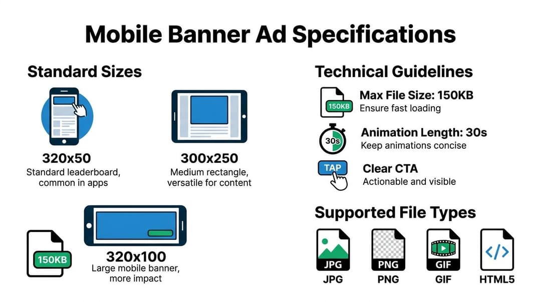
The sizes worth prioritizing
| Dimensions (Pixels) | Common Name | Primary Use Case & Placement | Max File Size (Typical) |
|---|---|---|---|
| 320x50 | Mobile Leaderboard | Best for top or bottom placements where you need low intrusion and broad compatibility | 150KB |
| 320x100 | Large Mobile Banner | Better when the creative needs more visual weight or clearer CTA visibility | 150KB |
| 300x250 | Medium Rectangle | Strong for in-content or mid-feed placements where visibility and message depth matter | 150KB |
| 320x480 | Full Banner or Full-Screen Style Unit | Useful when you want stronger visual presence on smaller screens | 150KB |
The sizes above are the practical core. If your team has limited design bandwidth, start there before adding more variants.
For deeper placement strategy around one of the most important formats, this breakdown of the 300 x 250 banner ad is worth reviewing.
What each size is good at
The 320x50 is the safe baseline. It fits almost everywhere and does not dominate the screen. That makes it easy to deploy, but also easier to ignore if the creative is generic.
The 320x100 gives you more room to create hierarchy. More headline space. Larger product shot. Cleaner CTA. If your 320x50 units feel cramped, move here first.
The 300x250 is often the most flexible size for persuasion. It can hold a real message, not just a logo and a button. This matters when you need to communicate a benefit, not just create exposure.
The 320x480 can work when visual impact matters more than minimal footprint. Use it carefully. A larger canvas helps only if the creative uses the space well.
Technical rules that prevent avoidable failures
Even strong concepts fail when the asset is built poorly. Keep these checks tight:
- File weight: Lighter files load faster and reduce placement issues.
- Animation control: If you use HTML5 or GIF-style movement, keep the sequence concise and purposeful.
- Readable text: Small-screen banners punish tiny fonts.
- Safe margins: Mobile crops and UI overlays can hide edge elements.
- Touch clarity: Buttons and CTA areas need enough contrast to be obvious.
Tip: Design the smallest version first. If the message survives in a constrained layout, scaling up becomes easier. The reverse is usually where teams get into trouble.
Designing Creatives and Copy That Convert
Creative is the biggest lever in banner performance because the format gives you so little time to earn attention.
Targeting matters. Placement matters. Landing page quality matters. But if the banner itself does not communicate a relevant offer instantly, the rest of the system never gets a chance to work.
The strongest banners reduce decision friction. They do not ask the user to decode the ad. They make the value clear, give the eye a logical path, and remove ambiguity from the click.
Visual hierarchy beats decoration
A mobile banner ad is not a mini homepage. It cannot carry five benefits, three badges, two CTAs, and a product collage without collapsing into clutter.
The best-performing creatives usually do three things well:
- Lead with one idea: One product, one promise, or one problem solved.
- Create a reading path: Visual first, message second, CTA third.
- Use contrast on purpose: The CTA should be the easiest interactive element to spot.
When teams overdesign banners, CTR often suffers because users cannot tell what matters. Clean structure wins more often than visual busyness.
Copy has to do less, not more
Banner copy should not sound like a landing page condensed into a tiny box. It should sound like the sharpest possible version of the offer.
That usually means:
- a short headline with a clear benefit
- optional supporting text only if it clarifies the headline
- a CTA that reflects the next step
If your copy team needs a solid framework for writing tighter performance messaging, this guide on how to write compelling ad copy that converts is a useful reference.
For banner-specific layout thinking, this article on designing an ad is also relevant.
What usually works
Some patterns repeatedly hold up in live campaigns:
- Offer-led banners: Good for promotions, retargeting, and time-sensitive pushes.
- Benefit-led banners: Better when the product needs positioning before price.
- Problem-solution banners: Strong for SaaS, services, or products solving a pain point.
- Native-style banners: Especially useful when you want the ad to feel less disruptive.
That last point matters. Native banners can boost engagement by up to 25% over static displays, and retargeting with banners can lift conversions by 10% to 15%, according to Mile.tech’s mobile ad sizes analysis.
What usually fails
Weak banner creative is surprisingly predictable.
It often includes one or more of these issues:
- Generic headlines: “Upgrade your business” says almost nothing.
- Visual mismatch: The image looks premium, but the copy sounds discount-led.
- Tiny branding: Users click, then fail to connect the landing page to the ad.
- Soft CTAs: “Discover more” is often less effective than a more direct next step.
- Multiple messages: Discounts, social proof, features, and urgency all competing in one frame.
Creative check: If someone saw your banner for one second, what would they remember? If the answer is “the colors looked nice,” the ad is probably underpowered.
Design for behavior, not approval meetings
Internal stakeholders often approve the ad that explains the most. Users usually click the ad that makes the fastest sense.
That is why banners should be reviewed in a mobile context, not just in design files. Look at them on a phone. Compare versions side by side. Ask which one is easier to understand without effort.
The banner that wins internal praise for detail is often the one users ignore. The one that feels slightly too simple in review is often the one that drives the better CPL.
How to Measure and Optimize Banner Ad Performance
A banner campaign can look busy and still be unprofitable. Lots of impressions. Plenty of creative variants. Regular reporting. No real learning.
Measurement fixes that, but only if you look at the right signals in the right order.
Start with the business outcome you care about most. For some teams that is ROAS. For others it is CPL, CPA, or qualified lead volume. The banner is only one part of the path, so judging it by clicks alone can lead you into bad decisions.

The metrics that matter
Many organizations track banner performance through four layers.
| Layer | What to watch | Why it matters |
|---|---|---|
| Delivery | Impressions, spend, reach | Confirms whether the campaign is serving as expected |
| Engagement | CTR, post-click behavior | Shows whether the creative earns attention |
| Conversion | Conversion rate, CPL, CPA | Tells you whether clicks turn into outcomes |
| Efficiency | ROAS or cost efficiency by audience and creative | Helps you scale the right combinations |
CTR is useful, but only in context. A high-CTR banner that attracts low-intent clicks can hurt efficiency. A lower-CTR banner that drives stronger downstream conversion can be the better asset.
Use the 300x250 as a testing workhorse
The 300x250 Medium Rectangle often delivers top CPMs and viewability, and for automated variant testing it is well suited to mid-feed environments. It can also drive 2x more engagement compared to smaller static banners, according to Publift’s guide to mobile banner sizes and types.
That matters because testing gets easier when the format can hold a meaningful message. If the banner is too constrained, you are not just testing creative. You are testing the limits of the format itself.
A repeatable testing workflow
Good optimization is not random experimentation. It is controlled comparison.
Test one variable at a time
If you change the image, headline, CTA, and audience all at once, you learn almost nothing.
Instead, isolate variables like this:
- Headline test: Same image, same CTA, two different offers.
- Visual test: Same copy, different product image or layout.
- CTA test: Same concept, different next-step wording.
- Format test: Compare a 320x50 against a 300x250 with the same message.
This is also where disciplined reporting matters. If you need a stronger framework for the broader measurement process, this guide on measure advertising effectiveness is useful.
Read the metrics in sequence
Do not jump straight from spend to sales.
Use a simple diagnostic chain:
- Low CTR, low conversions: Creative or placement problem.
- Good CTR, weak conversion rate: Landing page or audience mismatch.
- Good conversion rate, poor scale: Delivery constraint, bid issue, or too few variants.
- Strong results in one audience only: Break out customized creative instead of forcing one universal banner.
The point is not to memorize a dashboard. It is to ask the right next question.
A practical walkthrough can help when building your review rhythm:
What optimization usually looks like in real accounts
In practice, banner optimization is less glamorous than people expect.
You cut underperforming layouts early. You keep two or three message directions alive. You find that one audience responds to benefit-led copy while another needs an offer. You discover the “pretty” ad loses to the blunt one. Then you feed those findings back into the next round.
Key takeaway: The goal is not to find one perfect mobile banner ad. The goal is to build a system that produces better versions faster.
That is why measurement and production have to work together. The team that can learn quickly from creative data usually beats the team with the flashier first draft.
Avoiding Common Pitfalls in Banner Advertising
Banner ads do not fail because the format is broken. They fail because teams repeat the same avoidable mistakes and then blame the channel.
The two issues that come up most often are banner blindness and click fraud. Both are real. Neither should be treated as an excuse to stop testing.
According to AdPushup’s review of mobile ad sizes and formats, common critiques say banner units are “easily ignored due to static nature” and “prone to click frauds,” with ad ignore rates reaching up to 50%. That is exactly why execution quality matters.
Banner blindness is a creative and placement problem
Users ignore banners when the ad looks like every other banner. Predictable layout, stock visual, weak contrast, generic CTA. Their brains filter it out before conscious attention kicks in.
The fix is usually not louder design. It is smarter design.
A few reliable countermeasures:
- Use subtle motion: Gentle animation can direct the eye without looking spammy.
- Break template sameness: Change composition, not just colors.
- Match context better: Native-style placement often reduces the “ad slot” feel.
- Lead with relevance: A specific offer beats vague brand messaging.
If you keep launching banners that look like resized desktop ads, users will keep skipping them.
Click fraud is a traffic quality problem
Fraud is harder to spot because surface metrics can look healthy. CTR may appear fine. Spend may pace normally. But the click behavior does not translate into useful downstream action.
That is why experienced buyers do not stop at click metrics. They compare traffic quality, on-site behavior, and conversion patterns across placements and audiences. Suspicious pockets often reveal themselves through mismatch, not through one obvious red flag.
What practitioners should do
Treat risk control as part of campaign design:
- Review placement quality regularly. Do not assume every click is equal.
- Watch post-click behavior. If a banner gets attention but no real intent, investigate.
- Use creative that qualifies the click. Overly broad messages attract low-quality traffic.
- Rotate stale assets. Familiar banners are easier to ignore and easier to exploit.
- Separate prospecting from retargeting logic. Each needs different creative pressure.
Practical rule: If a banner looks easy to ignore and easy to misclick, it is probably bad for both performance and data quality.
Many organizations view banner blindness and fraud as fixed costs. That mindset is expensive. Better creative discipline, better placement review, and tighter measurement reduce both problems materially, even if they never disappear completely.
How to Scale Banner Ad Production with AI
Manual banner production works at small volume. Then the campaign mix expands.
You need more audiences, more offer angles, more placement-specific variants, more retargeting sequences, more tests against different hooks. The craft still matters, but the bottleneck shifts from design quality to production capacity.
That is where AI becomes useful. Not as a substitute for strategy, but as a way to operationalize it.

The manual workflow breaks in predictable places
Teams commonly encounter the same limitations:
- Variant creation takes too long
- Resizing introduces inconsistency
- Copy testing stalls because approvals pile up
- Winning patterns do not get reused fast enough
- Reporting lives in one place, creative decisions in another
The result is slower learning. You end up testing fewer ideas than the account needs.
What AI should handle
AI is most valuable when it takes repetitive production work off the team’s plate.
That includes:
- generating multiple banner concepts from one offer
- adapting copy lengths to different sizes
- producing creative variations for different audience angles
- surfacing which headlines, visuals, or messages are working
- turning winning combinations into the next launch batch
For teams using motion carefully, tools that support lightweight animation can also help. If you are exploring simple motion workflows, this overview of an AI image animator is a useful reference point.
What humans still need to own
AI can speed up asset generation. It should not set the strategy alone.
A strong workflow still needs a person to decide:
- what offer to push
- which audience segments matter most
- what level of brand consistency is essential
- when to stop testing and scale a winner
- whether the performance signal is strong enough to trust
AI increases velocity. It does not remove the need for judgment.
Turning production into a system
The biggest shift is mental. Stop thinking in terms of “the banner.” Start thinking in terms of a creative system.
A useful operating model looks like this:
| Stage | Manual approach | AI-assisted approach |
|---|---|---|
| Concepting | Team brainstorms a few versions | System generates many directions from one brief |
| Production | Designer resizes each unit manually | Variants adapt across formats faster |
| Testing | Limited combinations go live | Many copy and creative combinations launch together |
| Optimization | Team reviews results and rebuilds winners | Top messages and visuals feed the next iteration cycle |
One option in that workflow is AdStellar’s AI banner maker, which is built to generate banner variants, combine creative and copy options, and launch large batches into Meta workflows from a centralized system.
The core point is bigger than any single tool. AI makes banner programs more practical at scale because it closes the gap between insight and execution. If one headline family wins, the next wave can build from it quickly. If one audience responds to a visual style, that style can be extended without another long production cycle.
Operational takeaway: AI matters most after you already know how to judge a good banner. Without that foundation, automation just helps you produce more mediocre ads faster.
From Banners to Breakthroughs Your Path Forward
A mobile banner ad still earns its place when it is handled like a serious performance asset.
That means respecting the fundamentals. Use the right size for the placement. Build creative with clear hierarchy. Write copy that lands fast. Measure the ad against business outcomes, not just clicks. Fix blindness and fraud issues through better execution instead of writing the format off.
The bigger opportunity is workflow maturity. Manual creation teaches you what good looks like. Structured testing teaches you what works. AI-assisted production helps you apply those lessons at a scale that exceeds what many teams achieve with spreadsheet, resize requests, and scattered approvals alone.
The teams that win with banners are rarely the ones chasing novelty for its own sake. They are the ones running disciplined creative systems, learning quickly, and scaling what the data supports.
That is the path forward. Build the skill manually. Run the format with rigor. Then automate the parts that slow your team down.
If your team is producing too few variations, learning too slowly, or spending too much time on manual setup, AdStellar AI is worth evaluating. It is built to generate and launch large sets of creative, copy, and audience combinations, then use performance data to identify what deserves more budget and what should be cut.