To cover most of your bases on Meta, you really only need to master three core ad sizes. These are your 1:1 (square), 4:5 (vertical), and 9:16 (full-screen vertical) aspect ratios. If you get these three right, your creative will look sharp and native across almost every high-value placement on Facebook and Instagram.
The Complete Meta Ad Sizes Cheat Sheet for 2026
Trying to keep up with the specific creative specs for every single Meta placement can feel like a full-time job for media buyers and performance marketers. It’s a constantly moving target. While you could just rely on Meta's automatic cropping, that’s a rookie mistake. It often leads to awkwardly framed images, your key message getting chopped off, and, ultimately, wasted ad spend.
Taking a proactive approach and designing for the right meta ad sizes from the get-go isn't just a best practice; it's essential for maximizing performance.
This is especially true as Meta's algorithm continues to reward creatives that are built for their specific placement. Think about it: an ad that perfectly fits the immersive, full-screen experience of a Reel or Story is almost guaranteed to outperform a poorly cropped feed ad that was just shoehorned into that spot. When you design with the final placement in mind, you create a much better user experience, which almost always translates into higher engagement and a stronger ROAS.
Your Quick-Reference Guide to Ad Specs
To make your creative workflow a bit easier, you can think of ad specs in three main buckets. The infographic here breaks down the three most common aspect ratios you’ll be dealing with day in and day out.
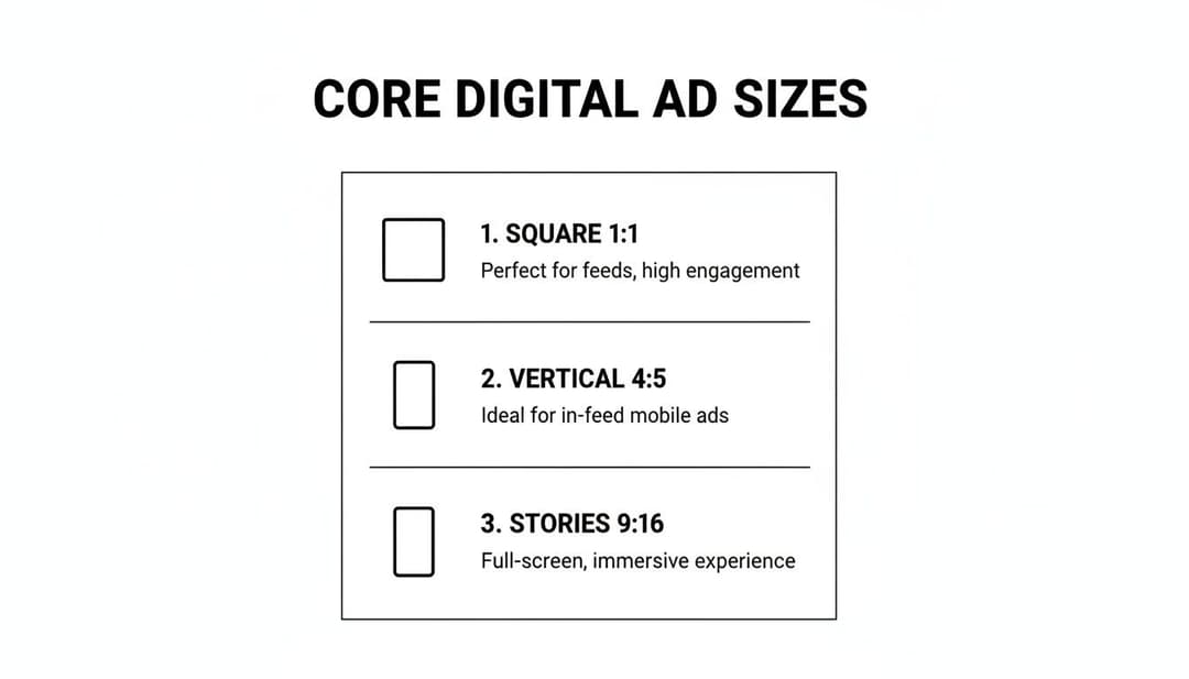
As you can see, each ratio is tied to a primary user experience—from scrolling through a feed to getting lost in a full-screen vertical video.
To get even more granular, I’ve put together a quick-reference table below. It details the precise dimensions, aspect ratios, file types, and size limits for every critical Meta ad placement. Bookmark this page so you can find the exact specs you need without any guesswork.
Meta Ad Dimensions and Specs for Top Placements in 2026
This table is your go-to cheat sheet for the most important placements across Facebook and Instagram. Use it to ensure every creative you produce is perfectly optimized for its intended spot.
| Placement | Recommended Dimensions (Pixels) | Aspect Ratio | Supported File Types | Max File Size |
|---|---|---|---|---|
| Facebook & Instagram Feed | 1080 x 1080 | 1:1 | JPG, PNG, MP4, MOV | 30 MB (Image), 4 GB (Video) |
| Facebook & Instagram Stories/Reels | 1080 x 1920 | 9:16 | JPG, PNG, MP4, MOV | 30 MB (Image), 4 GB (Video) |
| Facebook In-Stream Video | 1920 x 1080 | 16:9 | MP4, MOV | 4 GB |
| Facebook Marketplace & Search | 1080 x 1080 | 1:1 | JPG, PNG, MP4, MOV | 30 MB (Image), 4 GB (Video) |
| Instagram Explore | 1080 x 1080 | 1:1 | JPG, PNG, MP4, MOV | 30 MB (Image), 4 GB (Video) |
| Messenger Inbox Ads | 1080 x 1080 | 1:1 | JPG, PNG, MP4, MOV | 30 MB (Image), 4 GB (Video) |
Getting these specs right is your first step toward flawless creative execution. For a deeper look into the strategy behind each placement, you might want to check out our guide on the ideal size for Facebook ads. This cheat sheet will get you started on the right foot.
A Look Back: How We Got Here with Meta Ad Formats
To really get a handle on modern meta ad sizes, it helps to know the backstory. The platform’s ad capabilities didn’t just pop up overnight. They grew from a super simple, one-size-fits-all model into the sophisticated, AI-powered beast we all work with today. This history lesson explains why being adaptable is now the most important skill for any performance marketer.
Back when Facebook Ads first launched in 2007, life was pretty straightforward. An advertiser had one image, one headline, and one block of text, all built for a standard 1.91:1 aspect ratio that fit the handful of placements available. Want a different creative for mobile? You had to build a whole new ad set from scratch.
The Game-Changer: Algorithmic Assembly
Everything changed in 2017 with the arrival of Dynamic Creative. This was a massive turning point. Suddenly, we could upload a bunch of creative components—up to 10 images or videos, five headlines, and five primary texts—and just let Meta's AI mix and match them. One ad setup could spin up hundreds of variations on its own.
This shift from painstaking manual A/B testing to algorithmic assembly was a fundamental change in strategy. The goal was no longer to craft one single "perfect" ad. Instead, success became about feeding the algorithm a diverse menu of high-quality ingredients and trusting it to find the winning combos for different audiences and placements.
This evolution mirrors a bigger trend across digital marketing: we now work with the algorithm, not against it. By giving it creative variety, you’re basically empowering Meta's system to do the heavy lifting for you, matching your ads to what users are actually doing in real-time.
The march toward automation didn't stop there. In 2019, Multiple Text Options rolled out for key objectives like Traffic and Conversions, letting advertisers test copy variations even without a full Dynamic Creative setup.
All of this was supercharged by the explosion of mobile-first behavior and the rise of immersive formats like Stories and Reels. As users started spending more and more time in vertical, full-screen worlds, the need for placement-specific creative became a no-brainer. Just look at the numbers: Instagram's ad reach shot up by nearly 60% between January 2020 and January 2022, and it was these engaging new formats that fueled that growth. You can dig deeper into the shifts in Meta's ad reach numbers to see the trend for yourself.
For today's marketers, especially those using tools like AdStellar AI to generate creative variations, this history is more than just a fun fact. It’s the strategic bedrock for everything we do now. Understanding that Meta’s platform is built to test and adapt explains why providing assets in 1:1, 4:5, and 9:16 is no longer a "nice-to-have"—it's an absolute must for hitting peak performance and scaling your campaigns in a crowded auction.
Specifications for Feed and In-Stream Placements
If you're running ads on Meta, Feed and In-Stream placements are your bread and butter. These are the core ad experiences on both Facebook and Instagram, so getting the creative specs right is non-negotiable for anyone who’s serious about performance. While Meta gives you a little wiggle room, designing your creative with the optimal meta ad sizes from the start is the only way to avoid awkward crops and ensure your message truly lands.
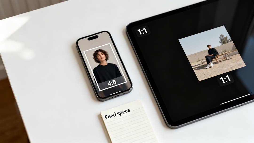
The two aspect ratios you'll see most often in the feed are 1:1 (square) and 4:5 (vertical). For years, the 1:1 format was the undisputed king, but the taller 4:5 ratio has quickly become a top performer, especially on mobile. It simply takes up more screen real estate, pushing competitors down the feed and grabbing more of your audience's attention.
Key Dimensions and Ratios
For most feed placements—we're talking Facebook Feed, Instagram Feed, and Facebook Marketplace—you should be building your creative for these two formats. You can technically upload other ratios, but they'll almost certainly get masked or cropped to fit, which never looks good.
Square (1:1 Aspect Ratio):
- Recommended Dimensions: 1080 x 1080 pixels
- Use Case: This is your universal soldier. It works perfectly for single images, videos, and every card in a carousel ad. It's a safe and reliable choice that renders cleanly almost everywhere.
Vertical (4:5 Aspect Ratio):
- Recommended Dimensions: 1080 x 1350 pixels
- Use Case: This is your mobile-first powerhouse. By occupying more vertical space, it can give your engagement and view time a serious boost. You're commanding more of the screen as people scroll.
Now, In-Stream video ads are a different beast. These are the ads that play before, during, or after other videos. For these, you’ll want a horizontal format that matches the standard video players people are used to.
- In-Stream Video (16:9 Aspect Ratio):
- Recommended Dimensions: 1920 x 1080 pixels
- Note: Viewer attention is short here, so keep these videos brief and to the point—think 5-15 seconds max.
Technical Specs and Text Limits
Getting the dimensions right is only half the battle. You also have to stick to Meta's file size and character limits to avoid any delivery issues or ugly truncation. These rules are in place to keep the user experience smooth and load times fast.
| Specification | Image Ads | Video Ads |
|---|---|---|
| File Types | JPG, PNG | MP4, MOV, GIF |
| Maximum File Size | 30 MB | 4 GB |
| Primary Text | 125 characters recommended | 125 characters recommended |
| Headline | 40 characters recommended | 40 characters recommended |
| Description | 30 characters recommended | 30 characters recommended |
Pro Tip: Sure, you can write more copy, but anything past the recommended character count is at high risk of getting cut off with a "...see more." This is especially true on smaller phone screens. Always front-load your most important message and call-to-action to guarantee they're seen.
Keeping your copy tight forces you to be clear and makes your ad much easier to scan. If you want to dive deeper into video-specific best practices, check out our comprehensive guide to Facebook video ad specifications. Nailing these guidelines for your feed and in-stream meta ad sizes is the first step to building a high-performing creative foundation.
Mastering Vertical Specs for Stories and Reels
Vertical, full-screen ads like Stories and Reels have completely changed the game. These placements are immersive, fast-paced, and demand a creative approach that’s built from the ground up for a mobile-first experience. You can't just crop a feed ad and expect it to work here. To win, you have to think like a user: full-screen, sound-on, and ready to swipe in a split second.
The gold standard for these placements is the 9:16 aspect ratio. This translates to a recommended size of 1080 x 1920 pixels. If you go smaller, your creative will look blurry and cheap. If you use a different ratio, Meta will either awkwardly crop your ad or slap on ugly colored bars to fill the screen. Both are instant engagement killers.
Designing for the Vertical Experience
But getting the dimensions right is just the start. The way people consume content in Stories and Reels is completely different from the traditional feed. They fly through content, so you have literally one second to grab their attention and stop the scroll.
This is where you have to be smart about the user interface. Unlike a simple feed ad, your beautiful vertical creative will have UI elements layered right on top of it.
- Top Area: This is where you’ll find the profile icon and username. It's a small but critical area to keep clear.
- Bottom Area: This space is much busier. It holds the call-to-action button, your captions, and all the engagement icons for likes, comments, and shares.
Think of these as "no-go" zones for your most important content.
The All-Important Safe Zone
The space between these UI elements is what we call the safe zone. This is your prime real estate. It's where your key visuals, your logo, and your core message must live to be seen. As a rule of thumb, keep all essential elements out of the top 15% and the bottom 20% of the screen.
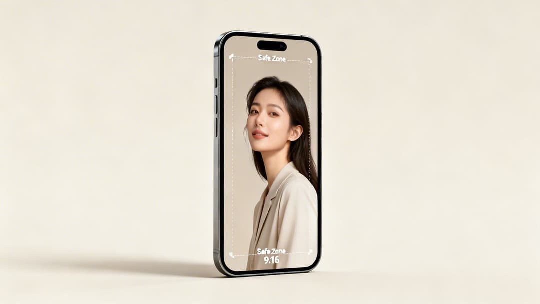
It’s simple, really: if your main product shot or headline creeps too close to the bottom, the "Shop Now" button could completely cover it. Your ad becomes instantly useless.
Always design with the interface in mind. Using a simple safe zone template or overlay in your design software will save you from making costly mistakes and ensure your message always lands.
To really get the most out of your vertical meta ad sizes, lean into the native feel of the platform. People want to see authentic, engaging content, not polished corporate videos. Try using interactive elements like polls and stickers—they can dramatically boost engagement. And since most people watch Reels with the sound on, a great audio track is a powerful storytelling tool. Aligning your creative with how people actually use the platform is non-negotiable.
For a deeper dive into this format, check out our complete guide on the ideal size of Instagram Stories. Adapting your other ad creatives to this vertical-first world is a must for any modern campaign.
Creative Specs for Carousel and Collection Ads
Alright, let's move beyond the basics of single images and videos. Meta gives us some seriously interactive formats like Carousels and Collections, which are gold for showing off multiple products or telling a deeper brand story.
These formats are built from the ground up to get people swiping and tapping. While they have their own unique creative specs, they're pretty straightforward once you get the hang of them. Nailing these meta ad sizes is the first step to creating an experience that users actually want to engage with.
Think about it: Carousels and Collections shift the user from just passively viewing your ad to actively exploring it. That little bit of interaction can make a huge difference in driving consideration and, ultimately, sales.
Mastering Carousel Ad Specs
Carousel ads are your ticket to showing 2 to 10 individual images or videos—what Meta calls "cards"—in a single, swipeable ad. This format is a workhorse. You can use it to highlight different product features, walk users through a step-by-step story, or just display a range of products from a new collection.
The most critical spec to get right is the aspect ratio for the cards.
- Aspect Ratio: 1:1 (square) is your best and safest bet. It’s the standard for a reason.
- Recommended Dimensions: 1080 x 1080 pixels for every single card.
- File Types: JPG, PNG, MP4, MOV.
- Max File Size: 30 MB for images, 4 GB for videos.
Sure, you might see an option for vertical (4:5) cards in some placements, but I always recommend sticking to the 1:1 ratio. It guarantees your creative looks sharp and consistent everywhere, from the Instagram feed to Messenger. The real magic, though, is designing the cards to flow together, creating a visual narrative that makes people want to swipe all the way to the end. If you want to dig deeper, check out our guide on how to design effective carousel Instagram ads.
Understanding Collection Ad Components
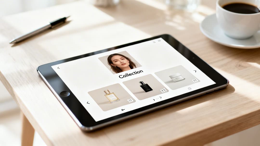
Collection ads are a whole different beast—they create an immersive, almost shop-like experience right inside the ad. They work by pairing a primary creative (an image or video) with an Instant Experience. This is a full-screen, lightning-fast storefront that pulls products directly from your catalog. When someone taps, they’re instantly browsing a product grid without ever leaving Facebook or Instagram.
The specs are basically broken into two parts: the main "cover" creative and the product catalog that feeds the Instant Experience.
I like to think of a Collection ad as a digital window display. The main creative is what grabs their attention on the street, and the Instant Experience is what invites them inside to browse the shelves. It’s one of the most powerful e-commerce formats Meta offers.
Here are the specs for that main cover creative:
- Image or Video Aspect Ratios: You've got options here. You can go with 1:1 (square) or 16:9 (landscape).
- Recommended Dimensions: Aim for 1080 x 1080 pixels for square or 1920 x 1080 pixels for landscape.
- Headline: Keep it to 40 characters or less.
- Primary Text: Around 125 characters is the sweet spot.
The products that appear below your main creative are pulled automatically from your Facebook Catalog. The images for these will be cropped into squares, so make sure your product photography is already optimized for a 1:1 ratio to avoid any weird cropping. One last thing: you need a minimum of four products in the selected product set for the ad to run.
Optimizing for Messenger and Audience Network
While Feeds, Stories, and Reels grab most of the spotlight, you can seriously expand your campaign’s reach by tapping into Meta's Messenger and Audience Network placements. Getting these right requires a specific approach, since ads here need to feel native to what the user is doing at that moment. Simply ignoring the unique meta ad sizes for these placements is a missed opportunity for valuable impressions and conversions.
It’s not just about showing up in more places; it’s about reaching people in totally different mindsets. An ad in Messenger should feel personal and conversational. An ad on the Audience Network, on the other hand, has to blend in seamlessly across thousands of different apps and websites.
Messenger Ad Specifications
Messenger gives you two main ways to connect: Inbox ads and Sponsored Messages. Both are built to either start or continue conversations directly with potential customers.
Messenger Inbox Ads: These pop up in the main chat list of the Messenger app, sitting right between a user's conversations. For this spot, the 1:1 aspect ratio is your go-to.
- Recommended Dimensions: 1080 x 1080 pixels
- File Types: JPG, PNG for images; MP4, MOV for video
- Key Insight: Your creative here is basically a conversation starter. It must be clean and compelling enough to earn a tap, so steer clear of cluttered designs and confusing messages.
Sponsored Messages: These are delivered to users who already have a chat thread open with your business page. The creative shows up right inside that existing conversation.
- Recommended Aspect Ratio: Meta officially suggests 1.91:1, but we’ve seen 1:1 work just as well.
- Creative Note: Since these messages are far more personal, your creative needs to match that tone. It's less about a hard sell and more about sparking re-engagement.
Audience Network Ad Sizes
The Audience Network pushes your ads out to a massive collection of third-party mobile apps and websites, showing them as native, banner, and interstitial ads. The name of the game here is flexibility, as your creative will appear in countless different layouts.
The Audience Network is where adaptive creative truly shines. Because you can't control the exact context, a well-designed ad that works across multiple sizes will always outperform a static one forced into a single format.
Here are the core specs to keep on your radar:
- Native, Banner, and Interstitial: The most common ratio is 16:9 (horizontal), but your ads might be automatically cropped or adjusted. To give the system maximum flexibility, always provide a 1:1 square asset as well.
- In-Stream Video: These are the video ads that run before, during, or after video content inside publisher apps. Stick to a 16:9 or 1:1 aspect ratio.
Using these extended placements successfully boils down to one thing: giving Meta’s system flexible creative assets it can work with. To get a deeper understanding of how Meta strategically chooses where to run your ads, check out our guide on placements in advertising.
Troubleshooting Common Ad Size and Creative Issues
Even with a perfect spec sheet in hand, technical glitches can still pop up and derail an otherwise solid campaign. We’ve all been there: unexpected cropping, ugly black bars, and low-resolution warnings are common frustrations that burn time and money. This guide will help you diagnose and fix these frequent issues with your Meta ad sizes, so your creative goes live looking exactly how you designed it.
One of the most common headaches is unexpected cropping. This is where Meta’s algorithm decides to chop off a key part of your image or video. It almost always happens when you upload a single creative and expect it to work across multiple placements with different aspect ratios. A perfect 1:1 square ad, for example, will get automatically cropped to fit a 9:16 vertical Story, which often means your logo or call-to-action gets hidden.
The fix? Either take the time to upload placement-specific assets or design with safe zones in mind from the start. As we covered in the section on vertical ads, just keeping your essential elements away from the very top and bottom edges prevents most of these awkward automatic crops and UI overlaps.
Fixing Resolution and Text Issues
Another frequent hurdle is the dreaded “low resolution” warning. You’ll see this flag when your image or video doesn’t meet the minimum pixel dimensions for a placement. Don't cut corners here. Always aim for the recommended size (like 1080x1080 pixels for a square ad) to make sure your creative looks crisp and professional, not blurry.
Similarly, aspect ratio mismatches are what cause those black or colored bars to appear around your ad. This happens when you try to force a creative into a placement it wasn't made for—think of a 16:9 landscape video running in a 1:1 square placement. The system adds bars to fill the empty space, making your ad look amateurish and immediately signaling a poor user experience.
The core principle is simple: match the creative to the container. Never try to cram a creative into a placement it wasn't designed for. Providing assets in the three core ratios (1:1, 4:5, and 9:16) solves most of these problems right off the bat.
Finally, while Meta has relaxed its old, strict "20% text" rule, ads with too much text overlay can still see their delivery throttled. If an ad is underperforming, try moving more of your message into the primary text and headline fields, keeping the visual itself clean and focused.
Nailing these technical details is more important than ever. With rising ad costs and double-digit YoY CPM increases in recent quarters, every single impression counts. You can't afford to waste money on poorly optimized creative. For more on this, you can discover insights about how Meta's ad platform has changed on Jumpfly.com.
Beyond the specs for individual ads, it's also smart to brush up on general best practices. For instance, you might want to learn about some common mistakes to avoid on your Facebook business page.
Meta Ad Size FAQ: Your Quick-Reference Guide
Let's be honest: keeping up with Meta's ad specs can feel like a full-time job. The moment you think you have it all figured out, something changes. I've put together this section to give you direct, no-fluff answers to the most common questions marketers and designers run into. Think of it as your cheat sheet for getting ads live faster without the usual headaches.
What Are the Three Most Important Ad Sizes for Meta?
If you want to get the most bang for your buck, you need to nail three key aspect ratios. Focusing on these will make sure your creative looks sharp and professional across the placements that actually drive results.
- 1:1 (Square): Your go-to size is 1080 x 1080 pixels. This is the workhorse for Facebook and Instagram Feeds, Carousel ads, and Messenger Inbox placements. It's clean, versatile, and always looks good.
- 4:5 (Vertical): Use 1080 x 1350 pixels. This is my personal favorite for mobile Feed ads. Why? It takes up significantly more screen real estate than a square ad, grabbing more attention as people scroll.
- 9:16 (Full-Screen Vertical): The standard here is 1080 x 1920 pixels. You absolutely cannot skip this one. It's essential for creating the immersive, native-feeling ads that dominate Stories and Reels.
Can I Just Use One Ad Size for All Placements?
Technically, yes. Meta’s Ads Manager will let you do it by automatically cropping or resizing your creative. But should you? Absolutely not. It's one of the fastest ways to kill your campaign's performance before it even starts.
Think about it from a user's perspective. When you see a horizontal ad awkwardly crammed into a vertical Story with huge black bars, it screams "lazy ad." It immediately breaks the user experience and signals low quality, which tanks engagement and drives up your costs. To get the best results, you have to design for the placement.
What's the Deal With the 20% Text Rule on Meta Ads?
Ah, the infamous "20% text rule." The old days, when Meta would flat-out reject any image with more than 20% text overlay, are long gone. But that doesn't mean you should start turning your images into text-filled billboards.
Meta's ad delivery system still heavily favors images and videos with minimal text. Ads with too much text on the creative itself often see reduced reach, lower delivery, or higher costs because they're seen as a lower-quality experience for users.
The best practice is simple: keep the text on your creative short and punchy. Let your primary text, headline, and description fields do the heavy lifting.
How Do I Handle Ad Creative Safe Zones?
Safe zones are your best friend, especially for full-screen ads. These are the areas of your creative that are guaranteed to be visible and won't get covered up by UI elements like your profile icon, the "Sponsored" tag, or call-to-action buttons. This is most critical for your 9:16 Stories and Reels ads.
A solid rule of thumb is to keep all your crucial elements—logos, key text, or the main part of your product shot—out of the top 15% and bottom 20% of the screen. This ensures your message always gets through, no matter what device someone is using.
Ready to stop guessing and start scaling? With AdStellar AI, you can generate hundreds of perfectly-sized ad creatives in minutes, test what works, and launch high-performing campaigns 10x faster. Learn more and book your demo today at AdStellar AI.