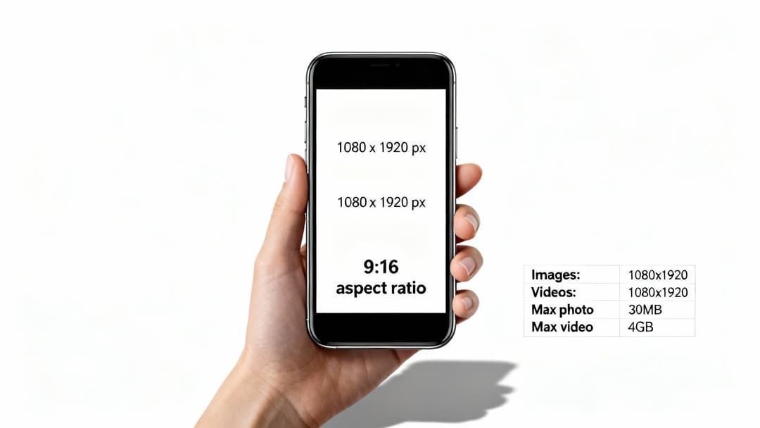
When it comes to Instagram Stories, the magic numbers are 1080 pixels wide by 1920 pixels tall. Nailing these dimensions is your first step toward creating professional, immersive content that grabs attention. This ensures your Story perfectly fills the screen on any modern smartphone, maintaining a clean 9:16 aspect ratio.
Your Quick Reference Guide to Instagram Story Specs
Getting the technical details right is the bedrock of a successful Story. If you submit assets that don't match Instagram's requirements, you're risking automatic cropping, fuzzy quality, or distracting borders. All of these hurt the user experience and, ultimately, your campaign's performance.
To help you get it right every time, here’s a quick-reference table covering the essential specs you need for both images and videos.
Instagram Story Technical Specifications
This checklist covers the must-know technical requirements before you export your final creative. Use it to ensure every Story you publish is optimized for maximum impact.
| Specification | Requirement |
|---|---|
| Dimensions | 1080 x 1920 pixels |
| Aspect Ratio | 9:16 (Vertical) |
| Image File Size | Maximum 30 MB |
| Video File Size | Maximum 4 GB |
| Video Duration | 1 second (minimum) to 60 seconds (maximum) |
| Image Formats | JPG, PNG |
| Video Formats | MP4, MOV (MP4 recommended) |
Double-checking these details before you upload can save you a world of headaches and ensure your content looks exactly as you intended.
Key Takeaways for Creatives
So why are these numbers so critical? A correctly sized Story fills the entire screen, capturing your viewer's complete attention without any awkward visual glitches. This seamless experience feels native to the platform, making your content feel far more engaging and professional.
Think about it: uploading a square 1080x1080 image forces Instagram to slap colored bars above and below it to fill the empty space. It immediately signals a low-effort post. Similarly, you could have a stunning, high-quality video that fails to upload simply because it exceeds the file size limit.
Mastering these simple rules is the first step toward effective visual storytelling on any platform. While these details are specific to Instagram Stories, you can see how technical requirements vary for other placements in our guide to video size for Facebook ads.
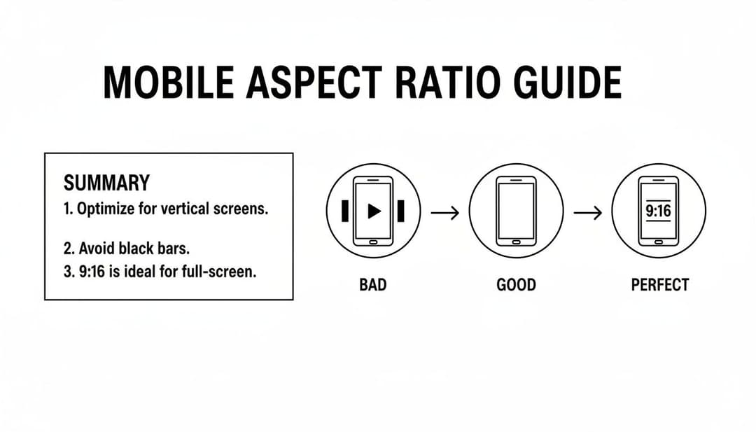
Why the 9:16 Aspect Ratio Is Non-Negotiable
While pixel dimensions like 1080x1920 dictate the quality of your Story, the 9:16 aspect ratio defines its shape. Think of it as the foundational rule for creating anything on Instagram Stories. This vertical format isn't just a suggestion; it’s specifically designed to create a mobile-first, immersive experience that fills every inch of a modern smartphone screen.
When your content perfectly matches this ratio, it feels native, professional, and commands a user's full attention. Stray from this standard, and the platform will make you regret it.
The Cost of Ignoring the Ratio
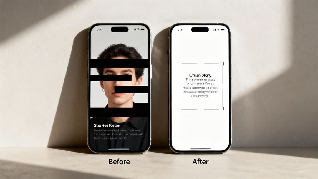
Uploading a square (1:1) or landscape (16:9) image forces Instagram to slap it in the middle of the screen, filling the empty void above and below with ugly, auto-generated color gradients. This is a dead giveaway that the content was repurposed or created without care.
These clumsy borders, known as letterboxing or pillarboxing, scream low-quality to viewers.
Beyond just looking amateurish, improperly formatted assets get punished. Instagram might automatically crop your creative in the worst possible way, chopping off crucial text, your logo, or the most important part of your visual. This doesn't just wreck your design; it kills engagement and can make your call-to-action completely disappear.
A Story that doesn’t fill the screen breaks the user’s immersive experience. It’s the digital equivalent of a TV ad with black bars—it feels out of place and makes the viewer much more likely to tap away.
Ultimately, aspect ratio and resolution are a team. The 9:16 ratio is the canvas, and the 1080x1920 resolution is the high-definition paint you use on it. You need both to create something that works. Respecting this rule is the first critical step in any successful ad campaign.
Understanding how to apply these technical rules to hit specific advertising goals is key, which you can dive into by learning about the strategic placement of advertising assets. Sticking to the 9:16 ratio ensures your message lands exactly as you intended, without compromise.
Mastering Instagram Story Safe Zones for Maximum Impact
So you’ve nailed the perfect 1080x1920 pixel dimensions. You're ready to go, right? Not so fast. One of the most common—and frustrating—mistakes is forgetting about the Instagram interface itself. It's a classic rookie error: you place your killer call-to-action or stunning logo right where Instagram slaps your profile icon or the reply bar on top of it.
This is where understanding safe zones is non-negotiable. Think of the safe zone as the prime real estate of your Story canvas—the central area where your content is guaranteed to be seen, free from any of Instagram's buttons or overlays. Ignoring it is like paying for a billboard and then letting someone park a truck in front of it.
Defining the No-Go Areas
The core principle is simple: keep your crucial elements away from the very top and bottom of the screen. Treat these areas as buffer zones to avoid any overlap with Instagram's built-in features.
Here’s a good rule of thumb to follow:
- Top Margin: Leave roughly 250 pixels of clear space at the top. This is where Instagram places your profile picture, username, and the little progress bars for multi-part Stories. Any text or logos you put there will get crowded out.
- Bottom Margin: Dedicate a similar 250-pixel margin at the bottom. This space is reserved for the "Send Message" field and, most importantly for advertisers, the "Swipe Up" link or interactive stickers. Placing your CTA here is a guaranteed way to make it invisible.
This visual shows exactly what we're talking about, highlighting how the native UI elements create these no-go zones at the top and bottom.
As you can see, the middle of the screen is where your message belongs. The top and bottom are for interaction, not information.
Visualizing Your Creative Canvas
Sticking to these margins from the get-go keeps your design clean, professional, and fully readable. Most good design tools even have templates with safe zone guides already built-in, which are a massive time-saver and help you avoid painful revisions later.
Designing within these constraints isn't about limiting creativity; it's about protecting your ad spend and making sure every single viewer sees exactly what you intended. A well-composed Story feels professional and trustworthy, while one with covered-up text just looks sloppy.
Getting the entire visual experience right—from dimensions to layout—is fundamental to a solid creative strategy. If you want to dive deeper into crafting compelling visuals, our guide on effective ad banners design is a great next step. At the end of the day, respecting Instagram's specs and safe zones isn't just a technical box to check. It’s how you set your campaigns up for success.
Choosing the Right File Formats and Sizes
Beyond just the pixel dimensions, the file type and size you use for your Instagram Stories can make or break their performance. It's a classic balancing act: you need stunning visual quality, but you also need lightning-fast loading times. Nobody's going to wait around for a clunky file to load.
When it comes to images, you're looking at two main players. JPG is your go-to for photographs and any complex images with a ton of colors. Its compression is fantastic for keeping file sizes small, which is a must for people viewing on mobile data. Then you have PNG, which is perfect for graphics, logos, or any designs with sharp lines and text. Its killer feature is transparency, letting you layer elements without a clunky solid background.
Recommended File Specifications
For video, the choice is much simpler. MP4 is the undisputed king for Instagram. When you're exporting your video, make sure you're using the H.264 codec. This combo gives you the best of both worlds—high-quality video packed into a nicely compressed file that’ll play smoothly on just about any device.
Here are the hard limits you absolutely need to stick to:
- Photos: Keep your JPG or PNG files under 30 MB.
- Videos: Your MP4 files need to stay below 4 GB.
Following these rules isn't just about avoiding upload errors. A file that's too big can cause your Story to lag for viewers on weaker connections, and that's a surefire way to get them to swipe away before they even see what you have to offer.
Compressing Files Without Losing Quality
If you find your files are tipping the scales, you’ll need to compress them. Most design software has built-in tools for this, and there are plenty of great online compressors that can shrink your file size with almost no noticeable drop in quality. For videos, a really effective trick is to just lower the bitrate a bit during the export process.
Getting a handle on Instagram's rules is one thing, but understanding the bigger picture of image optimization can really level up your content everywhere. For a deeper look, checking out the best image format for web performance offers some great insights that apply across the board. And when you're ready to make managing all these technical details a breeze, using a tool like an Instagram ad builder can automate the process and fold it right into your workflow.
Connecting Story Size to Campaign Performance
Getting the technical size of Instagram Stories right is so much more than a box-ticking exercise—it's what fuels campaign success. When your creative perfectly fits that 1080x1920 pixel canvas, you deliver a seamless, full-screen experience that feels completely native to the platform. That professional look builds trust and holds a user's attention way longer than a sloppy, poorly formatted ad.
Think about it: an improperly sized creative, like a square post awkwardly forced into a vertical frame, just screams low effort. It can instantly damage your brand's perception, leading to quick swipe-aways and totally wasted ad spend. At the end of the day, every single pixel matters for driving real business results like higher click-through rates and a better return on ad spend (ROAS).
Maximizing Engagement and Reach
The scale of Instagram Stories is just massive. The platform hit 500 million daily viewers only eight months after it launched—a milestone that took its competitor Snapchat six years to even get close to. For performance marketers, this translates into a gigantic audience, with 500 million people reachable via Story ads and 78% of Gen Z users active every month. You can find more great insights into Instagram user statistics on influencermarketinghub.com.
An ad that respects the platform's dimensions is an ad that respects the user's experience. This fundamental alignment is what separates high-performing campaigns from those that get ignored.
Correctly sized assets also get a subtle nod from the Instagram algorithm, which can boost your reach and the number of impressions your ad gets. By sticking to the proper size, you’re making sure your message is delivered clearly and professionally. For a deeper dive, you can explore more about what impressions on Instagram mean in our guide. In such a competitive feed, technical compliance isn't just a requirement—it’s your first step toward winning the user’s attention.
Common Mistakes to Avoid With Story Dimensions
Even if you nail the 1080x1920 pixel dimensions, a few small mistakes can completely undermine your creative. Getting familiar with these common pitfalls is the key to producing polished, professional content every single time—and it'll save you from frustrating revisions and wasted ad spend.
The most frequent error I see is people uploading assets with the wrong aspect ratio. Using a square (1:1) or landscape (16:9) photo forces Instagram to fill all that empty space with ugly, auto-generated color gradients. It instantly breaks the immersive feel of Stories and just screams low-quality content.
Pro Tip: Always design your creative in a 9:16 canvas from the very beginning. Trying to repurpose content from other platforms without reformatting it is a recipe for terrible engagement and a sloppy brand image.
Another critical mistake is ignoring the safe zones. If you place your logo, text, or call-to-action too close to the top or bottom, I guarantee it will be covered by Instagram’s user interface. Your message becomes unreadable and your CTA is rendered useless.
Checklist for Flawless Story Creatives
To sidestep these common issues, just run through this quick checklist before you publish. It’s a simple habit that catches problems before they go live.
- Wrong Aspect Ratio: Is your asset truly a vertical 9:16? A square or horizontal image will leave you with those distracting borders.
- Ignoring Safe Zones: Are all your key elements at least 250 pixels away from the top and bottom edges? Don't let the UI block your message.
- Low-Resolution Assets: Is your image a crisp 1080x1920 pixels? Uploading something smaller, like 720x1280, forces Instagram to stretch it out, leaving you with a blurry, pixelated mess.
- Unsupported Video Settings: Is your video an MP4 file using the H.264 codec? Using other formats can cause upload failures or weird playback issues for your viewers.
Keep in mind that these details are also crucial when reposting content to Instagram Stories, as you'll want to avoid awkward crops or cut-offs. Getting these specs right ensures a seamless, professional experience for your audience.
Frequently Asked Questions About Story Sizing
Even when you know the rules, specific questions always pop up in the middle of a project. I've put together some quick, direct answers to the most common questions I hear about Instagram Story sizes. Think of this as your go-to for handling those tricky scenarios with confidence.
What Happens If I Upload an Image That Is Not 1080x1920?
This is a classic mistake. If you upload something with the wrong aspect ratio, like a 1:1 square image, Instagram will try to fix it for you—and the result is never good. It automatically centers your image on a 9:16 canvas and fills the empty space with a cheap-looking, auto-generated color gradient. It screams "unprofessional" from a mile away.
On the flip side, if your image is the right 9:16 ratio but just has a lower resolution (say, 720x1280), Instagram will stretch it to fit the screen. This scaling almost always butchers the quality, leaving your creative looking blurry, pixelated, and just plain bad.
Can I Use the Same Creative for Instagram Stories and Reels?
Technically, yes, since they both use the same 1080x1920 pixel dimensions and 9:16 aspect ratio. But you really shouldn't. The user interface elements for Reels are completely different from Stories, with captions, icons, and usernames taking up a lot more real estate at the bottom.
If you just drop a Story creative into a Reels ad, there's a good chance your CTA or key message will be completely covered up. For the best results, you need to create slightly different versions for each placement. It's a small tweak that makes a huge difference.
The most effective ad creatives are purpose-built for their specific placement. A one-size-fits-all approach rarely delivers optimal performance, as each format has unique user expectations and interface layouts that must be respected.
What Is the Best Way to Ensure My Text Is Always Visible?
The most bulletproof method is to just stick to the safe zone guidelines. A solid rule of thumb is to keep any text, logos, or CTAs at least 250 pixels away from the top and bottom edges of your canvas. Seriously, just burn that number into your brain.
This buffer gives you enough breathing room so the profile UI at the top and the reply bar or "swipe-up" link at the bottom never block your message. Using pre-made templates with built-in safe zone guides in your design tools is the easiest way to get this right every single time.
How Does the Size of Instagram Stories Impact Ad Performance?
The impact is huge and immediate. When your ads are correctly sized to be full-screen, they feel native to the platform. They blend right in with organic content, grabbing the user's full attention and driving way more engagement.
Ads with black bars or awkward crops, on the other hand, are jarring. They look spammy and low-effort, which is a fast track to getting ignored. That bad user experience leads directly to lower view-through rates, fewer clicks, and a trashed Return On Ad Spend (ROAS). Nailing your creative size isn't just a best practice; it's the foundation of a successful campaign.
Ready to stop guessing and start scaling your Meta ads? AdStellar AI helps you generate hundreds of perfectly optimized ad creatives in minutes, test them intelligently, and double down on what works—all powered by AI. Launch faster and smarter at https://www.adstellar.ai.