Effective ad banner design is part art, part science. It’s all about creating digital ads that actually grab someone's attention, get a clear message across, and convince them to do something. This isn't just about making things look pretty; it's about engineering a banner that performs.
The Foundation of High-Impact Ad Banners
Let's cut through the generic advice. This is your real-world playbook for designing ad banners that get results. The gap between a banner that gets scrolled past and one that drives conversions is all about a solid strategic foundation. This isn't about chasing the latest design trends—it's about mastering the core principles that work time and time again, whether you're on Meta or the Google Display Network.
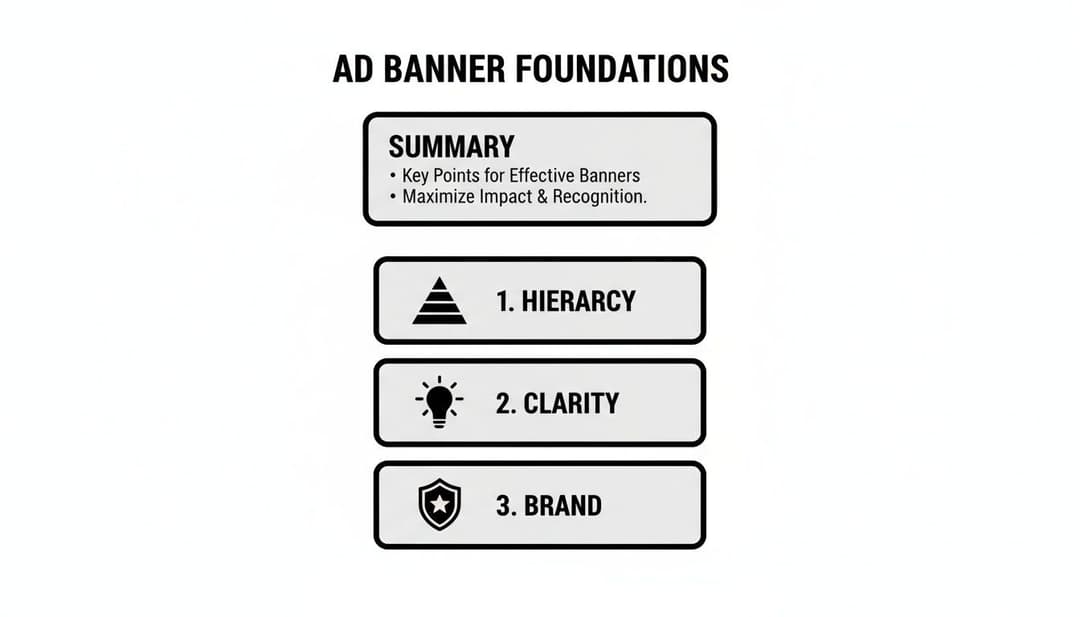
Everything rests on three pillars: visual hierarchy, message clarity, and brand consistency. If you can nail these, you're on your way to creating ads that make an immediate impact in a seriously crowded feed.
Why a Strong First Impression Matters
You have less than three seconds. That's it. Your ad banner has to communicate its value almost instantly. If someone has to squint and think about what you're offering, you've already lost them.
This is where a sharp visual hierarchy becomes your best friend. It guides the viewer’s eye exactly where you want it to go—from your killer headline or unique value prop straight to your call-to-action.
A well-designed banner doesn't just look good; it's a finely tuned communication machine. Its number one job is to stop the scroll, deliver a punchy message, and persuade someone to act, all in the blink of an eye.
Core Principles for Performance
To consistently pump out winning creatives, performance marketers don't rely on luck. They use a repeatable framework. It’s a disciplined approach, not just random artistic flair.
Here’s what that looks like:
- Message Clarity: Your copy needs to be short, sweet, and focused on the benefit. Always answer the silent question in the user's mind: "What's in it for me?" Ditch the jargon and stick to one compelling idea.
- Brand Consistency: Use your brand’s colors, fonts, and logo every single time. This isn’t just for looks; it builds recognition and, more importantly, trust. A banner that feels disconnected from the landing page it clicks through to creates friction and kills conversion rates.
- Action-Oriented CTA: Your call-to-action needs to be impossible to misunderstand and visually distinct. Use strong, active verbs. Create a little urgency or spell out the benefit of clicking. A great CTA is a huge piece of the puzzle when you're learning how to improve your click-through rate.
By building on these foundational pieces, you stop creating one-off designs and start developing a system for producing high-converting ad banners at scale.
Getting Your Ad Sizes and Tech Specs Right
Let's be honest, getting the technical details sorted for your ad banners feels like the boring part. But getting it wrong is a non-starter. A brilliant banner that’s the wrong size, too heavy, or an unsupported format might as well not exist—it’ll get rejected by the platform or load so slowly that users scroll right past it.
Think of the tech specs as the delivery truck for your ad. If the truck is too slow or doesn’t fit on the road, your message never arrives. In the world of programmatic auctions, every millisecond and every kilobyte counts. Ad networks will always prioritize banners that are lightweight and formatted correctly because they guarantee a good user experience.
Master the Ad Sizes That Actually Matter
You could get lost in the hundreds of ad size variations out there, but you don't need to. A small handful of formats consistently dominate the ad world and deliver the best results. If you focus your energy here, you'll get maximum reach without the headache.
These aren't just random numbers; they correspond to the most valuable real estate on websites and social feeds. In fact, just a few of these top-performing sizes often make up over 80% of all ad impressions served across the Google Display Network.
No matter which size you end up using, the core design principles remain the same.
As you can see, whether you're designing a huge leaderboard or a tiny mobile square, success always comes down to a clear hierarchy, a simple message, and strong brand consistency.
Why Your Size Choice Is a Strategic Choice
Picking an ad size isn't just a technical step; it's a strategic one. The 300x250 Medium Rectangle is an absolute workhorse. It fits neatly within article content on both desktop and mobile without screaming "I'm an ad!" This native feel is a huge part of why it performs so well.
On the other hand, the 728x90 Leaderboard is a desktop powerhouse, usually sitting right at the top of the page for immediate visibility. But for any mobile-first campaign, the 320x50 Mobile Leaderboard is a must-have, as it's built specifically for those smaller screens. It also helps to understand platform-specific requirements, like Facebook cover size dimensions, which can give you a ton of insight into responsive design.
Getting these details right is more important than ever. In 2022, global spending on digital banner ads hit a staggering $66.53 billion, and it's projected to soar past $87 billion by 2028. The data backs this up—studies analyzing billions of ad opportunities show that the top sizes consistently drive better engagement because they're optimized for how people actually browse.
Here's a quick reference guide to the dimensions that will give you the most bang for your buck.
Top-Performing Banner Ad Sizes for Meta & Display
| Ad Size (Pixels) | Common Name | Best Placement | Key Optimization Tip |
|---|---|---|---|
| 300 x 250 | Medium Rectangle | Embedded in content (articles, blogs) | Keep it simple. This size is viewed in-line, so a clear, scannable message is key. |
| 336 x 280 | Large Rectangle | Embedded in content, sidebars | Use the extra space for a slightly more detailed visual or a stronger callout. |
| 728 x 90 | Leaderboard | Top of page (above the fold) | Design for immediate impact. This is often the first thing a user sees. |
| 320 x 50 | Mobile Leaderboard | Top or bottom of mobile screens | Mobile-first is a must. Use large, legible text and a clear, tappable CTA. |
| 160 x 600 | Wide Skyscraper | Sidebars on desktop sites | Leverage the vertical space for storytelling or to showcase multiple product benefits. |
| 970 x 250 | Billboard | Top of page (premium placements) | Think big. This is prime real estate for high-impact brand messaging and visuals. |
Stick to these formats, especially when you're starting out, and you'll cover most of the high-value inventory on both Meta and the Google Display Network.
File Types and Size Limits: The Final Hurdles
Beyond the dimensions, your file type and size are the last technical hurdles. This choice affects everything from animation capabilities to, most importantly, how fast your ad loads.
- JPG: Your go-to for static images, especially photos. It offers fantastic compression, which keeps your file sizes tiny.
- PNG: Use this when you need a transparent background—perfect for logos or product shots that need to sit on top of a colored backdrop.
- GIF: The classic choice for simple, looping animations. Just be careful, as GIFs can get big and pixelated fast.
- HTML5: The modern gold standard for rich media ads. It lets you build complex animations, add video, and even create interactive elements for a far more engaging experience.
Ad platforms are notoriously strict about file size, usually capping banners at 150 KB. Why? To keep the web fast for everyone. A banner that takes too long to load is a banner that's never seen.
Always, always compress your images and optimize your code. Once you think you're done, use a tool to check your work. A good Facebook ads preview tool is perfect for this, letting you see exactly how your banners will look in a live environment. This final check is crucial for catching any small errors that could sink your campaign before it even starts.
The Anatomy of a Persuasive Ad Banner
This is where psychology and performance marketing really collide. A high-converting ad banner isn't just a jumble of nice-looking elements; it's a carefully engineered machine with three core parts: the visual, the copy, and the call-to-action (CTA).
Getting a handle on how these three components work together is the secret to creating ads that don't just get seen—they get clicked.
The entire design hinges on establishing a powerful visual hierarchy. Think of it as the invisible path you create for a user's eye, leading them seamlessly from your main image to your headline, and finally, right to that CTA button. When you nail it, the user processes the information exactly as you intended.

Crafting the Visual Foundation
Your visual is the first thing people see. It has to be a scroll-stopper that creates an instant connection. Choosing between an authentic photo and a custom illustration isn't just a style choice—it's a strategic one.
Authentic photos of real people tend to outperform polished stock images because they build trust and feel relatable. In fact, one study found that ads with authentic user-generated content saw a 5x higher click-through rate. On the flip side, illustrations can be fantastic for breaking down complex ideas or carving out a unique, ownable brand aesthetic.
Beyond the main image, color psychology plays a massive role in setting the mood.
- Urgency and Action: Reds and oranges are classic go-to's for CTA buttons because they create a sense of excitement and immediacy.
- Trust and Calm: You'll often see blues and greens used by financial or wellness brands to evoke feelings of security and peace.
- Energy and Optimism: Yellow is great for grabbing attention, but you have to use it sparingly to avoid overwhelming the design.
And don't forget about negative space—the empty areas around your design elements. Using white space effectively keeps your banner from looking cluttered and makes your core message and CTA really pop.
Writing Copy That Converts
Your ad copy is your banner's voice. It needs to be punchy, persuasive, and laser-focused on a single, compelling benefit. Generic fluff like "High-Quality Product" is meaningless noise. You have to tap into your audience's actual pain points and aspirations.
A strong headline should immediately answer the user's unspoken question: "What's in it for me?" Focus on the outcome, not just the features.
| Weak Copy (Feature-Focused) | Strong Copy (Benefit-Focused) |
|---|---|
| Our new software has AI features. | Stop Wasting Hours on Manual Tasks. |
| We sell comfortable sneakers. | Experience All-Day Comfort, Guaranteed. |
| Get a 10% discount today. | Save $25 on Your First Order. |
The goal is to craft a message so relevant that the user feels like you're speaking directly to them. This is a critical piece of the puzzle, and for anyone looking to go deeper, our guide on what to include in ad copy offers more actionable strategies. Every single word has to earn its place.
Finally, typography isn't an afterthought; it's a core design element. Readability and visual appeal are everything in a banner ad. Taking some time to learn about mastering design in typography can seriously elevate your banner's impact.
Mastering the Call-to-Action
The CTA is the final, crucial step. This is the moment of truth where you ask for the click. A good CTA is clear, action-oriented, and impossible to miss. Vague phrases like "Click Here" or "Submit" are weak because they don't communicate any real value.
Your CTA isn't just a button; it's a promise. It tells the user exactly what will happen next and what benefit they will receive by clicking. A great CTA reduces friction and builds momentum toward conversion.
To make your CTA stand out, use a high-contrast color that immediately draws the eye. The button's design should scream "I'm clickable!" The language you use is just as important.
Action-Driven CTA Examples:
- Get Your Free Trial (Instead of "Sign Up")
- Shop the Sale Now (Instead of "Learn More")
- Claim My Discount (Instead of "Submit")
- Start Building (Instead of "Continue")
Notice how each example uses a strong verb and communicates a clear, immediate benefit? This creates a sense of urgency and makes the decision to click feel both easy and rewarding. By dissecting and optimizing these three core components—the visual, the copy, and the CTA—you move from just making ads to strategically engineering persuasive ad banners that deliver real results.
Adopt a Framework for Creative Testing
Winning ad banners are almost never a one-shot stroke of genius. The truth is, they’re the carefully crafted result of relentless testing and smart iteration. The highest-performing growth teams I’ve worked with don't just guess what will work; they build a system to find out, relying on powerful creative frameworks to generate and validate ideas at scale.
This is a fundamental shift in mindset. You're moving away from designing one-off ads and toward building a continuous optimization engine. In this system, performance data isn't just a report you look at later—it's the direct fuel for your next creative sprint. Every test, win or lose, gives you valuable insights that sharpen your future designs.
Building Your Hypothesis-Driven Roadmap
Before you launch a single test, you need a clear hypothesis. A good hypothesis is a simple, testable statement that predicts an outcome. It's not just "let's try a blue button." It's "we believe a blue button will increase CTR by 10% because it has higher contrast against our background."
This approach forces you to think critically about every single element of your ad banners.
- Isolate Your Variables: This is the golden rule. Change only one major element at a time. If you change the headline, the image, and the CTA all at once, you’ll have no idea which change actually drove the result.
- Define Your Success Metric: What does "winning" even look like for this test? A higher Click-Through Rate (CTR)? A lower Cost Per Acquisition (CPA)? Or a better Return on Ad Spend (ROAS)? Decide this before you start.
- Document Everything: Keep a simple log of your tests, hypotheses, and results. This "idea bank" becomes an invaluable resource over time, preventing you from re-running failed experiments and helping you spot winning patterns.
With a clear roadmap, every test becomes a learning opportunity, making your next ad banner smarter and more effective.
Mastering A/B and Multivariate Testing
The two main ways you’ll be testing your ad banners are A/B testing and multivariate testing. They might sound similar, but they serve very different strategic purposes.
A/B testing, or split testing, is the most straightforward method. You create two versions of an ad (Version A and Version B) that are identical except for one specific element you want to test. For instance, you could test:
- Headline: "Shop Our Summer Sale" vs. "Get 50% Off Everything"
- Image: A clean product shot vs. a lifestyle photo with a person
- CTA Color: A green button vs. an orange one
Multivariate testing takes this a step further. It tests multiple variables at the same time to see which combination performs best. You might test two headlines, two images, and two CTAs all at once to find the ultimate winning formula. For a deeper dive, check out our guide on what is multivariate testing to see how it can uncover complex audience preferences.
A/B testing tells you which headline works best. Multivariate testing tells you which headline works best with which image and CTA combination. It’s a more advanced technique but can deliver incredibly powerful insights.
Combating Creative Fatigue With a Content Pipeline
Creative fatigue is a real—and costly—problem. It happens when your audience sees the same ad so many times they start tuning it out, causing your performance to tank. The only cure is a steady stream of fresh creative.
This is where a content pipeline becomes absolutely essential. Instead of scrambling to make new ads when performance drops, you should have a backlog of tested ideas and new concepts ready to deploy. Think of it like a production line for your ad creative. This proactive approach keeps your campaigns fresh, your audience engaged, and your performance stable.
The value of this systematic approach is huge, especially in today's market. Display advertising, driven by strong banner designs, hit $207.4 billion globally in 2023 and is projected to reach $266.6 billion by 2026. This growth is directly linked to innovations in programmatic advertising and AI-powered personalization that reward superior creative. To learn more about this trend, you can discover more display advertising stats and find out how top designs are winning in today's competitive ad auctions. This data underscores that a structured testing framework isn't just a best practice—it's a requirement for success.
How to Scale Production With AI Tools
If you've ever felt the pain of manually creating ad banners, you know it's the biggest bottleneck to scaling your campaigns. When every single variation requires hours of a designer's time, your ability to test, learn, and actually grow is stuck in first gear.
This is exactly where AI and automation flip the script, turning a painfully slow process into a powerful growth engine.
Imagine this scenario: you need to create banners for five different audiences. For each audience, you want to test three unique headlines and four different images. That's 60 individual ads. Doing that by hand is a multi-day slog filled with mind-numbing, repetitive tasks. Now, what if you could spit out all of those variations—and hundreds more—in just a few minutes?

From Manual Setup to Automated Scaling
That’s the core promise of AI-powered creative platforms. They completely transform the ad banner design workflow from a one-off manual setup into a repeatable, data-backed system. Instead of painstakingly building each ad one by one, you just feed the machine your core ingredients—images, copy, and audience details—and let the AI do the heavy lifting.
Platforms like AdStellar AI can generate hundreds of creative, copy, and audience combinations almost instantly. This isn't just about moving faster; it's about unlocking a level of testing that would be physically impossible to manage otherwise. You can finally get real answers to critical questions, like:
- Does a product-focused image work better than a lifestyle shot for our top-of-funnel audience?
- Which headline actually resonates with people in California versus New York?
- Does a "Shop Now" CTA convert better than "Get 50% Off" for this specific product?
By automating the production, you free up your team to think about high-level strategy instead of getting buried in tedious design work.
Connecting AI to Your Performance Data
But the real magic happens when you connect these tools directly to your ad accounts. By linking up your Meta Ads Manager, for example, the AI can securely pull in all your historical performance data. It digs through past campaigns to figure out what has already worked for your brand and your audience.
This continuous learning loop is what separates modern AI tools from basic design templates. The platform isn’t just generating random variations; it's making intelligent, data-driven suggestions. It learns which visual styles, messaging angles, and audience segments have driven the best results for you in the past.
An AI creative platform acts like a data scientist and a production designer rolled into one. It analyzes thousands of data points to identify winning patterns and then uses those insights to generate new ad creative that is statistically more likely to succeed.
This process removes so much of the guesswork that plagues campaigns. Instead of relying on a gut feeling, every new creative is built on a foundation of proven performance. If you want to go deeper on this, our guide on using AI for Facebook Ads breaks down how this integration can seriously improve campaign outcomes.
Using AI Insights to Double Down on Winners
The final piece of the puzzle is the analysis. Generating hundreds of ads is only useful if you can quickly spot the winners. This is what AI-driven insight dashboards are built for. They don't just show you vanity metrics like clicks and impressions; they rank your best creatives against the business goals that actually matter, like ROAS (Return on Ad Spend) or CPL (Cost Per Lead).
This is especially critical today. By 2025, global banner ad spending is projected to hit an incredible $185.44 billion, with mobile gobbling up 75% of that spend. That massive shift demands a mobile-first, data-driven approach. Performance marketers who can rapidly generate and test mobile-optimized creative will have a massive advantage.
With a data-backed ranking system, you get immediate clarity. You can instantly see which creative-and-audience combination is driving the most revenue or generating the cheapest leads. Armed with that knowledge, you can confidently kill the underperformers and pour your budget into the proven winners, maximizing your return and unlocking true, scalable growth.
Common Questions About Ad Banner Design
Even with a solid game plan, you're bound to run into a few tricky questions during the design process. I get asked these all the time. Let's break down some of the most common hurdles that performance marketers and designers face, with some straight answers to help you sharpen your workflow.
How Many Ad Banner Variations Should I Test at Once?
There's no single magic number here, but a great starting point for a structured test is 3-5 variations. That’s a manageable range. It lets you test significant changes without spreading your ad budget too thin across a dozen different ideas.
The real key is to isolate what you're testing. Don't change everything at once. You could, for instance, run three different headlines against the exact same image and CTA. Or maybe test three completely different images with identical copy. This approach is the only way to know for sure which variable is actually moving the needle.
Of course, if you have a bigger budget or are using automation tools, you can scale this up—a lot. Platforms like AdStellar are built to generate and test hundreds of combinations of headlines, images, and CTAs simultaneously. The AI can then find winning patterns in the data that you'd simply never spot by yourself.
What Is the Ideal File Size for a Display Ad Banner?
For almost every display network out there, including Google, the golden rule is to keep your banner file size under 150 KB. This isn't just a suggestion; it's a critical technical spec. Banner ads have to load instantly to be effective.
Think about it: a slow-loading ad is an ad that never gets seen. If a user scrolls past the ad placement before your creative even appears, you've wasted the impression and lost any chance of a click.
To stay under that 150 KB limit, always compress your images. Use a tool like TinyPNG or just lean on your image editor's built-in export settings. You have to be extra careful with animated GIFs or HTML5 ads, as those rich media elements can bloat the file size in a hurry.
And one last thing: always, always double-check the specific requirements for the ad platform you're using. While 150 KB is the industry standard, some networks have slightly different limits. It's a five-second check that can save you from having your ads rejected.
Should I Use Stock Photos or Custom Graphics in My Banners?
This one’s easy. Whenever you possibly can, custom graphics or authentic photos will blow generic stock photos out of the water. People are incredibly savvy these days; they can spot a cheesy, staged stock photo from a mile away. Using them can make your brand feel impersonal and less trustworthy.
Custom graphics that actually match your brand's look and feel create a much smoother journey from the ad to your landing page. If you absolutely have to use stock photos because of budget or time, dig for the ones that feel natural and authentic. Skip the perfect, overly-posed corporate shots that everyone has seen a thousand times.
An even better option? Use high-quality user-generated content (with permission, of course). Nothing works better as social proof, and it makes your ad feel more like a real recommendation than just another ad.
How Do I Measure the Success of My Ad Banner Designs?
The "right" metric is completely tied to your campaign goal. If you're just trying to get your name out there with a brand awareness campaign, you'll probably focus on impressions and reach—how many eyeballs saw your ad.
But for performance marketing, we're focused on action and profitability. The metrics that really matter are:
- Click-Through Rate (CTR): This is your first signal of engagement. It tells you if your creative is compelling enough to even earn a click.
- Conversion Rate: This shows how many of those clicks turned into actual business—a sale, a signup, whatever your goal is.
- Cost Per Acquisition (CPA) or Return on Ad Spend (ROAS): This is the bottom line. It tells you exactly how much it costs to get a new customer and if your ad spend is actually making you money.
It’s so important not to look at CTR in a vacuum. I’ve seen countless campaigns with a sky-high CTR and a terrible conversion rate. That's a classic sign of a mismatch between your ad's promise and your landing page's delivery. Always tie your banner performance back to the metrics that impact the business. That’s how you find out what's truly driving growth.
Ready to stop the manual grind and scale your Meta campaigns 10x faster? AdStellar AI automates bulk ad creation, analyzes performance data, and ranks your top creatives so you can double down on what works. Launch, test, and optimize hundreds of ad variations in minutes, not days. See how much faster you can grow by visiting https://www.adstellar.ai today.