When it comes down to it, effective banner ads are a mix of three things: a killer value proposition, visuals that stop the scroll, and a call-to-action that’s impossible to ignore. A great banner has to grab someone's attention and get its point across in just a few seconds, leading their eye from the main message right to that final click. It’s a strategic dance that makes sure your design doesn't just look pretty—it actually works.
Building the Strategic Foundation for Your Banner Ads
Jumping straight into Photoshop or Canva without a solid plan is like trying to build a house without a blueprint. You can have the most beautiful banner in the world, but if it's not built on a clear strategy and a deep understanding of who you're talking to, it's going to fall flat. Designing a banner that converts isn't just about making something look good; it's a calculated move to get someone to do something specific.
Before you even think about colors or fonts, you need to define what a "win" looks like for this campaign. Are you trying to get your brand name out there? Generate some hot leads for the sales team? Or are you pushing for immediate online sales? Each of these goals requires a completely different creative game plan.
Defining Your Campaign Goal
Your main objective is the North Star for every single design decision you make. If you're all about brand awareness, your logo and a slick visual will be the heroes. But if you’re trying to make a direct sale, you’ll need a can’t-miss price tag or discount and a CTA that screams "act now."
- Brand Awareness: The name of the game is recognition. Your logo needs to be front and center, and the entire design has to feel like it belongs to your brand. The message should be simple and sticky, not necessarily asking for an immediate click.
- Lead Generation: Here, you're dangling a carrot. The goal is to tempt people with something valuable, like a free e-book or a spot in a webinar. Your copy has to make it crystal clear why giving you their email address is a fantastic idea.
- Direct Sales: This is where you create a sense of urgency and highlight incredible value. These banners often show off specific products, flash big discounts ("Save 50%"), or use time-sensitive offers ("Sale Ends Friday").
Nailing down your primary goal from the start keeps you from creating a generic, watered-down banner that tries to be everything to everyone and ends up being nothing at all.
Establishing a Strong Visual Hierarchy
Visual hierarchy is the secret weapon of high-performing banner ads. It's how you arrange all the pieces of your ad to guide a person's eye in a very specific, intentional order. You only have a split second of their attention, so they need to instantly know where to look first, second, and third.
A well-structured banner ad works like a quick, intuitive conversation. It starts with an attention-grabbing headline, presents a clear benefit, and ends with a simple, direct instruction on what to do next.
Think of it like a trail. Your headline or main image is the trailhead, the value proposition is the path, and that CTA button is the destination. You create this trail using size, color, and placement. Whatever your most important message is, make it the biggest and boldest thing on the canvas. To really get this right, it helps to understand broader display advertising best practices, as they're foundational to driving real growth.
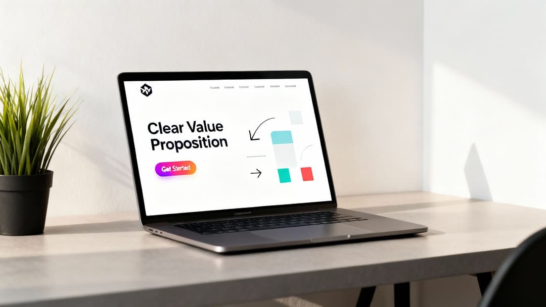
The Three Unskippable Components
No matter the industry or goal, every single banner ad that performs well has these three non-negotiable parts. If you miss even one, you're kneecapping your campaign's potential.
- Your Company Logo: It has to be there, and it has to be clear. This is all about building trust and brand recall. It doesn't need to be the main event, but it absolutely needs to be easy to spot.
- The Value Proposition: This is your core message—the part that tells the user, "Here's what's in it for you." You have to be concise. We're talking a snappy headline and maybe a short sentence to back it up.
- A Clear Call-to-Action (CTA): This is the punchline. It’s the action you want someone to take, usually packed into a button. Phrases like "Shop Now," "Learn More," or "Get Started Free" are perfect because they're direct and manage expectations.
Getting these fundamentals right is the most critical first step. Once you've got this foundation, you can start making smart choices about color, fonts, and images—choices that aren't just about aesthetics, but are strategically wired to get that click. Of course, none of this matters if you're talking to the wrong people. For a deeper dive, check out our guide on https://www.adstellar.ai/blog/how-to-identify-a-target-audience to really sharpen your strategy.
Nail Your Banner Ad Sizes and Specs
Getting your banner dimensions right is way more than just a technical checkbox. It's a strategic move that dictates who sees your ad and how often. If you pick a size that doesn't fit the common ad slots online, your beautiful banner might never get a chance to perform. Nailing this from the get-go is fundamental.
Banner ads have come a long way. The very first one popped up back in 1994 for AT&T—a simple 460x60 pixel banner with a curious message. That one experiment kicked off an entire industry, and over time, standards emerged to bring some order to the chaos. You can actually discover more about the evolution of digital banner ads and see just how much things have changed.
Today, big players like the Google Display Network have crunched the numbers and found that a handful of sizes consistently outperform the rest. Why? Because they have the most available ad inventory. Focusing your design efforts on these core dimensions is simply the smartest way to get your ads seen.
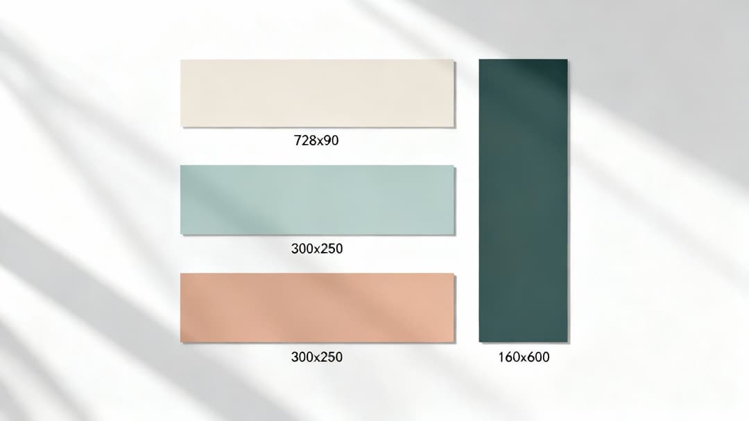
The Most Powerful Banner Ad Sizes
Sure, there are dozens of possible banner dimensions out there, but you don't need to design for all of them. A few key sizes dominate the web, and prioritizing them means your ads will be eligible for the vast majority of placements.
Here are the heavy hitters you absolutely need in your creative arsenal:
- 300x250 Medium Rectangle: This is the workhorse of display ads. It's incredibly versatile and fits neatly within article content or on sidebars, making it one of the most common and highest-inventory ad units you can buy.
- 728x90 Leaderboard: This long, horizontal banner usually sits right at the top of a webpage, "above the fold." Its prime real estate is perfect for grabbing immediate attention and boosting brand awareness.
- 336x280 Large Rectangle: A slightly beefier version of the Medium Rectangle, this size gives you a bit more canvas to work with. It's also incredibly popular and performs well when embedded in content.
- 160x600 Wide Skyscraper: You'll find this tall, skinny banner running down the sidebars of websites. It's great because it stays visible as users scroll, giving your message more screen time.
- 320x50 Mobile Leaderboard: With mobile traffic ruling the internet, this one is non-negotiable. It’s designed specifically to fit across the top or bottom of smartphone screens, catching users on the go.
My advice? Focus on the top 3-5 most popular sizes. It’s a much smarter strategy than spreading your creative team thin trying to design for every dimension under the sun. Concentrate your energy where it will have the biggest impact.
And while these sizes are crucial for web display, don't forget that social media is its own beast with unique specs. If you're running a cross-channel campaign, it's worth checking out the ideal sizes for Facebook ads to cover all your bases.
Top Performing Banner Ad Sizes and Their Use Cases
To make it even easier, here's a quick-reference table that breaks down the most valuable banner ad sizes and where they shine. Think of this as your cheat sheet for planning which assets to create for your next campaign.
| Ad Size (Name & Pixels) | Common Placements | Best For | Key Advantage |
|---|---|---|---|
| Medium Rectangle (300x250) | Embedded in content, sidebars | Versatile performance, direct response | Highest ad inventory available |
| Leaderboard (728x90) | Top of page, above main content | Brand awareness, announcements | High visibility upon page load |
| Large Rectangle (336x280) | Embedded in content, sidebars | More creative space, rich media | Offers slightly more impact than 300x250 |
| Wide Skyscraper (160x600) | Website sidebars | Storytelling, keeping brand visible | Stays on screen as users scroll down |
| Mobile Leaderboard (320x50) | Top or bottom of mobile screens | Reaching on-the-go users, mobile CTR | Essential for capturing mobile traffic |
This table covers the sizes that will give you the most reach and flexibility, ensuring your ads can appear on the widest possible range of websites and devices.
Understanding Technical File Formats and Limits
Okay, dimensions are locked in. Now let's talk about the technical details: file formats and size limits. This stuff matters. The file type you choose affects animation, image quality, and load speed—all of which influence the user experience.
Ad platforms are very strict about file size, usually capping banners at 150 KB. This is to make sure your ads don't slow down the websites they're on.
Here’s a simple breakdown of your options:
- JPG: The go-to for static ads with photos or complex images. It gives you great color and small file sizes, but it doesn't support transparency.
- PNG: Use this for static ads when you need a transparent background, like for a logo that needs to sit cleanly on any color. The trade-off can be a slightly larger file size.
- GIF: The classic choice for simple, looping animations. It's good for basic motion but is limited in color and can sometimes look a bit dated. Be careful, as file sizes can get big fast.
- HTML5: This is the modern standard for creating rich, interactive, and animated ads. It lets you build sophisticated experiences with video and user interaction, offering the most creative freedom.
Choosing the right format is a balancing act. For a simple promo with a powerful photo, a well-compressed JPG is your best bet. But if you want an animated ad that really pops, HTML5 is the way to go—just keep a close eye on that 150 KB limit. Sticking to these specs ensures your beautifully designed banner actually gets served, seen, and clicked without a hitch.
Crafting Visuals and Copy That Convert
In the split second a user glances at your banner, your creative has to do all the heavy lifting. This isn't just about making something that looks good; it's about blending striking visuals with words that demand action. A great banner ad communicates a clear, compelling message that stops the scroll and, most importantly, earns the click.
Honestly, this synergy between what people see and what they read is where most campaigns are won or lost. The imagery needs to grab attention, sure, but it also has to feel instantly recognizable as your brand. That’s how you build a real connection.
Selecting Visuals That Resonate
Think of your images and graphics as the initial hook. They need to be high-quality, on-brand, and hit the right emotional note. A grainy, off-brand photo will get your ad ignored faster than a page that refuses to load.
So, what does your audience actually respond to? If you're an e-commerce fashion brand, crisp product shots or lifestyle photos showing your apparel in action are a no-brainer. But for a B2B SaaS company, a clean illustration or a screenshot highlighting a killer feature is probably going to be more effective.
- Brand Consistency: Stick to your brand’s color palette, typography, and logo. This isn't just for looks; consistency builds trust and makes your ads instantly recognizable no matter where they pop up.
- Image Quality: Always, always use high-resolution images. A blurry or pixelated visual screams unprofessional and completely undermines your offer's credibility.
- Relevance: The visual has to connect directly to your product or the value you're promising. A random stock photo, no matter how beautiful, will just confuse people.
This isn't just anecdotal, either. An analysis of over 950,000 banners found that high-quality visuals are a massive driver of engagement. In fact, 67% of online shoppers call them "very important." It’s no wonder savvy marketers are embracing dynamic HTML5 formats that adapt to different devices, ensuring visuals are always sharp and interactive.
Writing Headlines That Immediately Communicate Value
You’ve got about three seconds to get your point across. Your headline is not the place for clever wordplay or vague brand statements. It needs to deliver the core benefit, and it needs to do it fast.
A strong headline cuts right to the user's silent question: "What's in it for me?" Focus on the outcome, not just the features. For instance, instead of "Our New Project Management Tool," try something like "Finish Projects 2x Faster." The second one speaks directly to a pain point and promises a real result.
When you're writing the copy, make sure it clearly communicates a powerful value proposition statement. This is your promise to the customer, and it's what grabs their attention from the get-go.
The best ad copy feels like a solution, not a sales pitch. It should be concise, benefit-driven, and so clear that a user understands the offer without a second thought.
To give your copy an extra punch, use numbers and power words. Phrases like "Save 50%," "Limited Time Offer," or "Get Your Free Trial" create a sense of urgency and clarity that pushes people to act. If you're feeling stuck, we've got a whole guide on writing good ad copy that converts.
Designing a Call-to-Action That Begs to Be Clicked
The Call-to-Action (CTA) is the final, crucial piece of the puzzle. This is where you turn a passive viewer into an active lead or customer. A weak, uninspired CTA can tank an otherwise perfect ad.
Your CTA should be the most visually prominent thing on the banner, almost always inside a button.
Anatomy of a High-Converting CTA
| Element | Best Practice | Why It Works |
|---|---|---|
| Color Contrast | Use a bright, contrasting color that stands out from the background. | Draws the eye and makes the button impossible to miss. |
| Action Words | Start with a strong verb like 'Get,' 'Shop,' 'Start,' or 'Join.' | Tells the user exactly what to do and what to expect. |
| Concise Text | Keep it to 2-4 words. Examples: "Shop Now," "Learn More," "Get Started." | Short, punchy text is easy to read and process instantly. |
| Clear Placement | Position the CTA at a logical end of the visual flow, usually bottom right. | Follows natural reading patterns and provides a clear next step. |
The design of your CTA button matters just as much as the words you put on it. It needs to look and feel clickable. Simple choices, like using a contrasting color that pops against the rest of the ad, can dramatically lift your click-through rate.
By thoughtfully balancing compelling visuals, benefit-driven copy, and an unmissable CTA, your banner ad transforms from a simple graphic into a powerful conversion machine. Every element has to work together, guiding the user on a seamless journey from first glance to final click.
Using Animation to Increase Engagement
Static banners are reliable, but let's be honest—a little motion can be the secret sauce that makes your banner ad impossible to ignore. When done right, animation can seriously boost engagement and click-through rates, turning a passive glance into an active click. It’s all about using motion with a purpose, not just for flashy effects.
The key is to think of animation as a tour guide for the viewer’s eye, not the main event. Simple, subtle movements can draw attention to the most important parts of your ad, like your value proposition or, most critically, your call-to-action button. When a user’s peripheral vision catches a slight fade-in or a gentle slide, it sparks a natural curiosity.
This is where HTML5 banners really shine. Unlike older GIF formats, which are often clunky and limited in color, HTML5 allows for smooth, sophisticated animations and interactive elements without bloating your file size.
Keep It Short and Purposeful
When it comes to animation in banner ads, less is absolutely more. The goal is to capture attention, not to overwhelm or annoy someone. A busy, chaotic animation will do more harm than good by distracting from your core message and potentially slowing down the page load time.
To keep your animations effective, stick to the 15-second rule. This is an industry best practice for a reason: any animation loop should last no longer than 15 seconds. After that, it should stop completely. Nobody wants a perpetually flashing ad distracting them while they're trying to read an article.
A great animated banner uses motion to tell a quick story. It introduces the brand, presents the offer, and highlights the call-to-action in a clear, logical sequence—all within a few seconds.
This forces you to be strategic. Instead of having elements constantly flying around, you can create a simple, elegant sequence. For example, your logo could fade in first, followed by the headline. Then, as the final beat, the CTA button can subtly pulse or slide into view. It creates a clean visual narrative that’s easy to follow.
Best Practices for Subtle Animation
You don't need complex, movie-level animation to be effective. In fact, the simplest movements are often the most powerful. They feel professional and guide the user without pulling focus from the message itself.
Here are a few simple but highly effective animation techniques to try:
- Fades and Dissolves: Gently fading elements in and out is a classic. It’s a soft, non-intrusive way to introduce new information, like transitioning between different product features or taglines.
- Simple Slides: Having your headline or key image slide in from the side can be very effective. This movement naturally directs the eye across the banner and creates a sense of dynamic entry.
- Subtle Scaling or Pulsing: Applying a very slight scaling effect or a gentle pulse to your CTA button makes it feel more interactive and clickable. This small touch can make a huge difference in whether a user notices and clicks it.
The most successful animated banners feel intentional. Every movement has a reason, whether it's to reveal information sequentially or to put a spotlight on the action you want the user to take.
The Power of HTML5 Banners
While GIFs were once the standard for animated ads, they come with some serious baggage. They’re stuck with a 256-color palette, which can make your branding look off, and they often result in massive, slow-loading files.
HTML5 is the modern solution. It's essentially a mini web page running inside an ad slot, built with standard web tech like HTML, CSS, and JavaScript. This opens up a world of possibilities for richer, more engaging ad experiences.
HTML5 vs. GIF: A Quick Comparison
| Feature | HTML5 Banners | GIF Banners |
|---|---|---|
| Animation Quality | Smooth, high-frame-rate animations | Often choppy and simplistic |
| File Size | Generally smaller and more efficient | Can get very large, very quickly |
| Color Palette | Full RGB color spectrum | Limited to 256 colors |
| Interactivity | Supports clickable elements, forms, videos | Not interactive—just a looping image |
By using HTML5, you can create ads that aren't just animated but are truly interactive. Imagine an ad where a user can swipe through a carousel of products or even play a simple mini-game. That level of engagement is simply not possible with a GIF, making HTML5 the clear winner for creating modern, high-performing banner ads.
How to Scale Banner Ad Production for Testing
Let's be honest: manually creating dozens of banner ad variations for proper A/B testing is a soul-crushing bottleneck. It's the kind of repetitive work that kills creative momentum and brings campaigns to a dead stop. For any team that's serious about getting real, data-driven results, that old manual way just won't cut it.
This is where automation and AI-powered platforms completely change the game. Instead of looking at each banner as its own little design project, you can build a system that spits out countless creative combinations in minutes. That kind of speed means you can go from a rough idea to a live, multi-variant test with unbelievable efficiency.
The real magic happens when you connect these tools directly to your ad accounts. An AI can dig into your historical performance data and figure out what images, headlines, and CTAs have actually worked with your audience in the past. It’s like having a data scientist and a production designer working in perfect sync.
From Manual Grind to Automated Machine
The old way? A designer manually resizes every single ad, a copywriter tweaks headlines one by one, and a media buyer uploads each file individually. It’s a slow, painful assembly line.
An automated workflow flips that entire process on its head. You just need to feed the system the core ingredients—your best images, logos, headlines, descriptions, and CTAs. The platform then takes over, assembling them into every possible combination across all the sizes you need.
This isn't just about moving faster; it's about blowing the doors off what you can test. You can finally get answers to questions you never had the bandwidth to ask before:
- Creative Angles: Does a lifestyle shot outperform a clean product photo?
- Copy Variations: Will a benefit-driven headline beat one that focuses on a pain point?
- Audience Matches: Which creative hits hardest with my different audience segments?
Suddenly, creative production isn't a roadblock anymore. It's your strategic advantage, giving you all the assets you need to find the winning ad combinations faster than your competition.
The process flow below breaks down a few core principles for making animated banners that work, whether you're making them by hand or automatically. Keep these rules in mind.
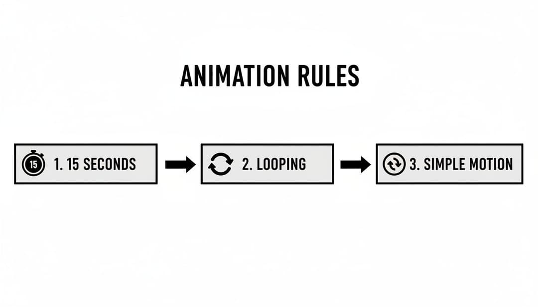
These simple rules—the 15-second limit, subtle looping, and simple motion—are key to grabbing attention without annoying the user.
Using AI for Smarter Creative Insights
Once your campaigns are out in the wild, the AI’s job isn’t done. It keeps pulling in new performance data, spotting which ad variations are actually moving the needle on your business goals. This completely eliminates the guesswork and the tedious manual data-crunching from the optimization process.
Instead of getting lost in spreadsheets, you get a clear, ranked list of your best-performing ads. The platform can tell you that a specific image, when paired with a certain headline, is delivering the highest Return On Ad Spend (ROAS) or the lowest Cost Per Acquisition (CPA).
This is a fundamental shift from manual analysis to AI-driven insights. You get to make optimization decisions based on real-time, objective data, not just a gut feeling or an incomplete report.
This kind of intelligent automation is at the heart of the most powerful advertising strategies today. To see how it all comes together, check out our guide on what is Dynamic Creative Optimization, which is all about automatically finding the absolute best-performing ad combinations for your campaigns.
Building a Repeatable System for Growth
The end goal here is to stop the creative chaos and build a repeatable, data-backed system that brings clarity to your campaigns. With an AI-powered platform like AdStellar AI, you create a powerful feedback loop where production, testing, and optimization constantly feed each other.
It boils down to a simple, powerful cycle:
- Generate: Instantly create hundreds of ad variations from your best assets.
- Launch: Push every variation live across multiple platforms with just one click.
- Analyze: Let the AI automatically track performance and rank your top creative combinations.
- Iterate: Use the winning elements to make your next batch of creative even stronger.
This workflow doesn't just save you a ton of hours. It compounds your learnings over time. Every campaign makes the next one smarter, helping you scale your advertising with confidence and efficiency. This is how modern growth teams stop just making ads and start building a true performance engine.
Answering Your Top Questions About Web Banner Ad Design
Even with a killer strategy, questions always come up when you’re deep in the design process. I’ve seen it time and again—the same challenges and uncertainties trip up even seasoned marketers. Getting clarity on these common hurdles can be the difference between a campaign that sings and one that sinks.
So, let's dive into some of the most frequent questions I get. Think of this as a quick-reference guide to sharpen your creative instincts and help you dodge those all-too-common pitfalls.
What’s the Real Secret to a Successful Banner Ad?
A banner ad that actually works is a masterclass in efficiency. It's not just about looking good; it's about a perfect fusion of three critical elements firing on all cylinders. When these pieces lock into place, your ad doesn't just get views—it gets clicks.
First, it has to scream its clear value proposition. The user needs to understand what’s in it for them in a fraction of a second. Next, it needs compelling, on-brand visuals that can literally stop someone mid-scroll and create an instant sense of trust. And finally, the most important part: a strong, unmissable call-to-action (CTA) that leaves zero doubt about what they should do next. Success is the sum of these parts, nothing less.
How Much Text Is Too Much on a Banner Ad?
When it comes to banner ad copy, my advice is always the same: less is more. Way more. You have to remember, people glance at banners, they don't read them. The entire point is to land your core message instantly and spark enough curiosity to earn that click.
Stick to a punchy, powerful headline that's just a handful of words. If you absolutely need more context, a tiny sub-line can work, but be ruthless about keeping it short. Overloading your design with text is the fastest way to get your ad completely ignored. Your landing page is where you do the heavy lifting and provide all the details.
A great banner ad gets its message across in under three seconds. If someone has to pause and actually read your ad, you’ve probably already lost them.
Should I Go With Animated or Static Banners?
Ah, the classic debate. The choice between animated and static really boils down to your campaign goals, your resources, and the story you're trying to tell. Neither is "better"—they just serve different functions.
- Static Banners: These are your trusty workhorses. They’re fast to create, supported everywhere, and fantastic for delivering one single, focused message without any distractions.
- Animated Banners (GIFs or HTML5): Motion is an incredible tool for grabbing attention. A well-done animation can guide the viewer's eye right where you want it and, in many cases, lead to higher click-through rates.
My practical advice? Test both. See what the data tells you. If a simple, subtle animation doesn’t blow your static version out of the water in terms of performance, the extra time and effort might not be worth it for that specific campaign. To get a better handle on setting up these kinds of tests, check out our guide on what is A/B testing in marketing for some practical tips.
What Are the Most Common Banner Design Mistakes?
So many banner ads fail for the exact same, preventable reasons. If you can learn to avoid these common traps, your creative will immediately be leagues ahead of the competition, giving your campaign a much stronger shot at success.
Here are the biggest mistakes I see designers make all the time:
- A Weak or Vague CTA: If people don’t know what you want them to do, guess what? They’ll do nothing. Your call-to-action has to be direct, clear, and visually impossible to miss.
- A Cluttered Mess: Too much text, too many photos, competing colors—it all just creates visual noise. A clean, simple layout always, always wins.
- Poor Readability: Using tiny fonts or colors with terrible contrast is a recipe for disaster, especially on small mobile screens. Your message has to be legible at a glance.
- Message Mismatch: The promise you make in your ad must line up perfectly with the landing page they click through to. Any disconnect shatters trust and sends your bounce rate through the roof.
Ready to stop the manual grind and scale your ad creative effortlessly? AdStellar AI is the AI-powered platform that lets you generate, launch, and test hundreds of ad variations in minutes. Turn your best assets into high-performing campaigns and let our AI insights show you what's working so you can double down on revenue. Learn more at AdStellar AI.