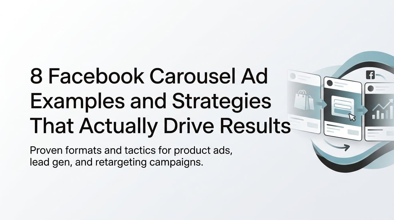
Facebook carousel ads give advertisers something most ad formats cannot: the ability to tell a story across multiple frames, showcase a product lineup, or walk a prospect through a decision in a single sponsored post. Each card in a carousel can carry its own image or video, headline, description, and destination URL, which means one ad unit can do the work of several static ads.
For performance marketers, that versatility is the real opportunity. But versatility without strategy produces cluttered, low-converting carousels that waste budget. The difference between a carousel that drives purchases and one that gets scrolled past usually comes down to how the cards are sequenced, what each card is designed to do, and whether the creative is compelling enough to make someone swipe.
This guide breaks down eight proven carousel ad strategies, including what each format looks like, why it works, and how to implement it inside your own campaigns. Whether you are running direct-to-consumer product ads, lead generation for a service business, or retargeting warm audiences, at least one of these approaches will fit your funnel.
1. The Product Lineup Carousel
The Challenge It Solves
When you have multiple products competing for the same audience, a single static ad forces you to choose one item and hope it matches what the viewer wants. That is a gamble. A product lineup carousel removes the guesswork by presenting several options simultaneously, each linked to its own product page, so the algorithm and the user can both find the best match.
The Strategy Explained
Lead with your bestseller or most visually compelling product on card one. This is your hook, and it needs to earn the swipe. Follow with complementary or related items across subsequent cards, keeping the visual style consistent so the carousel feels cohesive rather than cluttered.
Because each card links to its own product page, you are essentially running multiple product ads within a single ad unit. Meta's delivery system can also optimize card order automatically, surfacing the products most likely to convert for each individual viewer based on their behavior.
Implementation Steps
1. Identify your top three to six products by conversion rate or revenue, and select hero images at 1080 x 1080 pixels with clean, consistent backgrounds.
2. Write a unique headline for each card that leads with the product's primary benefit rather than just its name.
3. Set each card's destination URL to the specific product page, not the homepage, so users land exactly where the card promised.
4. Enable the "Automatically show the best performing cards first" option in Ads Manager to let Meta optimize card order over time.
Pro Tips
Keep pricing or a specific offer visible on the card itself rather than buried in the description. If you have seasonal or limited stock items, flag them with a short label in the creative. Shoppers who see scarcity signals are more likely to click through immediately rather than saving the ad for later.
2. The Before-and-After Story Arc
The Challenge It Solves
Abstract value propositions rarely convert. Telling someone your product "transforms their routine" means nothing without proof. The before-and-after carousel solves this by making transformation visual and sequential, walking the viewer through a relatable problem and delivering the resolution in a format that rewards swiping.
The Strategy Explained
Structure your cards as a three-act narrative. Card one presents the problem in terms the audience immediately recognizes. Middle cards show the process, the product in use, or the mechanism behind the change. The final card reveals the result and delivers the call to action.
This format works especially well for service businesses, fitness brands, skincare lines, and software products where the transformation is the core value proposition. The sequential structure gives users a reason to keep swiping because each card advances the story rather than repeating the same message.
Implementation Steps
1. Write the final card first. Define exactly what outcome you want the viewer to picture, then work backward to identify the problem and process cards that lead to it.
2. Use consistent subjects or environments across cards so the "before" and "after" are clearly connected to the same person, space, or product.
3. Keep card copy minimal. Let the visuals carry the narrative and use the headline field to add a single line of context per card.
4. Place your CTA on the final card only, after the payoff has been delivered.
Pro Tips
Avoid stock-photo transformations. Audiences have seen polished before-and-after imagery enough times to dismiss it instantly. UGC-style visuals or authentic product photography tend to perform better because they feel earned rather than staged. If you have real customer results, this is the format to showcase them.
3. The Step-by-Step Tutorial Carousel
The Challenge It Solves
Cold audiences do not trust brands they have never encountered. Pushing a hard sell to someone who has never heard of your product typically results in low click-through rates and wasted spend. The tutorial carousel earns attention by delivering genuine value before asking for anything in return.
The Strategy Explained
Number each card visibly, such as "Step 1," "Step 2," and so on, so viewers know they are progressing through a sequence. Each card should teach something useful and actionable. The CTA appears only on the final card, after the viewer has received the value you promised in the first card's hook.
This format builds trust with cold audiences and also works well as a retargeting creative for users who previously engaged with your content or visited your website. The educational framing positions your brand as a helpful resource rather than just another advertiser.
Implementation Steps
1. Choose a topic your target audience actively wants to learn. The tutorial should relate directly to the problem your product solves, but the content itself should be useful even without the product.
2. Limit each card to one step or one idea. If a step needs more than a single sentence to explain, it is too complex for a carousel card.
3. Design each card with a consistent visual template: step number in one corner, a clear headline, and a supporting image or icon.
4. Write the final card's CTA as a natural extension of the tutorial, such as "Ready to put this into practice?" followed by a link to a relevant landing page or free trial.
Pro Tips
The hook on card one determines whether anyone swipes to card two. Lead with the outcome the tutorial delivers, not the process. "How to cut your ad setup time in half" outperforms "A guide to ad campaign setup" because it leads with the benefit the viewer actually wants.
4. The Social Proof and Reviews Carousel
The Challenge It Solves
Mid-funnel audiences already know who you are. They have visited your website, browsed your products, and left without converting. The obstacle is rarely awareness; it is hesitation. Social proof carousels address that hesitation directly by showing real customers who made the same decision and came out satisfied.
The Strategy Explained
Dedicate each card to a customer quote, star rating, or UGC-style photo. Mix testimonial text with product imagery so each card provides both credibility and visual context. A card that shows a customer review alongside a photo of the product in use is more persuasive than either element alone.
This format is particularly effective in mid-funnel campaigns targeting users who have visited the website but not converted. Seeing multiple independent voices validate the purchase reduces the perceived risk of buying.
Implementation Steps
1. Collect your strongest testimonials, focusing on reviews that address specific objections: price, quality, ease of use, or results. Vague praise like "great product" is less effective than specific outcomes.
2. Design each card with the customer's quote as the visual headline, keeping it short enough to read in two seconds.
3. Include a star rating graphic or a recognizable review platform logo where permissions allow, as these add credibility signals that text alone cannot replicate.
4. End the carousel with a card that combines your strongest proof point with a clear, low-friction CTA such as a free trial, a guarantee, or a limited-time offer.
Pro Tips
If you have UGC video content from customers, consider using short video clips on individual carousel cards instead of static images. Video testimonials tend to feel more authentic and can stop the scroll more effectively than text-on-image designs. Tools like AdStellar can help you generate UGC-style avatar creatives if you are building this format from scratch.
5. The Feature Breakdown Carousel
The Challenge It Solves
Complex products with multiple capabilities are difficult to communicate in a single ad. Trying to fit every feature into one card results in cluttered creative that communicates nothing clearly. The feature breakdown carousel solves this by giving each capability its own dedicated card, matched to the specific buyer objection it resolves.
The Strategy Explained
Assign one product feature per card and pair it with the objection it addresses. If a prospect worries about setup complexity, one card handles that. If they question whether the product will work for their specific use case, another card answers it. This approach turns a product overview into a structured objection-handling sequence.
Use bold headlines, supporting icons, and minimal copy so each card communicates its point instantly. Sequence from the most universal benefit to the most differentiating capability, so you hook the broadest audience first and then reward those who keep swiping with the details that set you apart.
Implementation Steps
1. List your product's top five to seven features, then write the customer objection each one directly addresses. This pairing is the foundation of your card copy.
2. Design each card with a single icon or product visual, a bold headline that names the benefit, and one supporting sentence maximum.
3. Order cards from most universally appealing to most niche or differentiating, keeping in mind that not every viewer will swipe to the end.
4. Use the final card to summarize the full value proposition and present a clear CTA with a compelling reason to act now.
Pro Tips
Resist the temptation to use technical language on feature cards. Translate every feature into an outcome the buyer cares about. "Automated budget reallocation" becomes "Your budget moves to what's working, automatically." The outcome framing is always more persuasive than the feature description.
6. The Panoramic or Split-Image Carousel
The Challenge It Solves
Standard carousel ads look like a series of individual images. Most viewers can predict what they will see before they swipe. The panoramic carousel breaks that expectation by creating a single wide image that reveals itself progressively as the user swipes, turning the ad interaction into a visual experience rather than a passive scroll.
The Strategy Explained
Design a single wide image that spans across two to four carousel cards. When viewed in the feed, the first card is visible with the edge of the second card peeking in from the right, creating a natural visual cue to swipe. As users swipe left, the image continues to reveal itself, creating a scroll-stopping experience that static ads cannot replicate.
This format is best suited to brand awareness campaigns, product launches, and lifestyle imagery where visual impact is the primary goal. It is less effective for direct-response campaigns where each card needs to carry independent messaging.
Implementation Steps
1. Design your panoramic image at a total width that accounts for the number of cards you plan to use, keeping each card segment at 1080 x 1080 pixels.
2. Place the most visually compelling element near the center of the panoramic image so it is partially visible from card one and fully revealed on card two, rewarding the swipe.
3. Ensure the first card works as a standalone image in case some users do not swipe. It should communicate your brand and offer even without the full panoramic reveal.
4. Keep copy minimal across all cards. The visual is the message in this format; text should only add context, not compete with the imagery.
Pro Tips
Test the panoramic carousel on mobile before launching. The card edge preview that creates the "swipe to reveal" effect can look different across devices and placements. What looks seamless on one screen size may appear misaligned on another, so preview across multiple device sizes in Ads Manager before going live.
7. The Retargeting Sequence Carousel
The Challenge It Solves
Warm audiences who visited your website or added items to their cart already showed purchase intent. They left for a reason, and that reason is almost always one of three things: price hesitation, trust deficit, or lack of urgency. A generic retargeting ad that simply shows them the product again does not address any of those objections. The retargeting sequence carousel does.
The Strategy Explained
Build each card around a specific objection your warm audience is likely to have. One card addresses price by highlighting value, a guarantee, or a payment option. Another card builds trust with social proof or a credibility signal. The final card creates urgency with a time-limited offer, a low-stock notice, or a direct incentive to complete the purchase.
For e-commerce, dynamic product carousels can automatically populate cards with items a specific user viewed or added to cart, making the ad feel personally relevant rather than generic. This level of personalization is one of the most effective applications of the carousel format in performance marketing.
Implementation Steps
1. Segment your retargeting audiences by behavior: website visitors, product page viewers, and cart abandoners each deserve a slightly different card sequence because their level of intent differs.
2. Map the most likely objection for each audience segment and assign it to card one of their specific carousel sequence.
3. Set up a dynamic product catalog in Meta Commerce Manager if you are running e-commerce, so carousel cards automatically populate with the exact products each user interacted with.
4. Cap your frequency carefully. Retargeting carousels are effective, but overexposure to the same sequence creates ad fatigue. Rotate creative every two to three weeks for active retargeting audiences.
Pro Tips
Use AdStellar's Winners Hub to pull your top-performing creatives and headlines into retargeting sequences quickly. Rather than rebuilding from scratch each time, you can take proven elements from cold-audience campaigns and reconfigure them into objection-handling cards for warm audiences, saving significant production time.
8. The Comparison Carousel
The Challenge It Solves
Prospects who are evaluating their options are not just comparing you to competitors. They are often comparing your solution to doing nothing, using a manual workaround, or sticking with a generic alternative. The comparison carousel makes that contrast explicit and visual, helping undecided buyers see exactly what they gain by choosing your product over the status quo.
The Strategy Explained
Position your product against the old way of doing things or against generic alternatives, without naming specific competitors. Use cards to contrast pain points with your solution's outcomes. A split-screen visual design, with "before" on the left and "after" on the right within a single card, makes the comparison immediately scannable.
Structure the sequence so each card addresses a different dimension of the comparison: time saved, cost reduced, results improved, or complexity eliminated. Pair the sequence with a compelling final-card offer to convert viewers who have been persuaded by the contrast.
Implementation Steps
1. List the three to five most common frustrations your target audience has with their current approach. These become the "old way" side of each comparison card.
2. Design each card with a clear visual split: the pain point on one side and your solution's outcome on the other. Use color coding, such as red for the problem and green for the solution, to make the comparison instantly readable.
3. Write card headlines that name the contrast directly, for example: "Hours of manual work vs. automated in minutes."
4. Close with a final card that summarizes the overall shift and presents a low-friction entry point such as a free trial, a demo, or a limited introductory offer.
Pro Tips
The comparison carousel works particularly well when paired with the AdStellar AI Campaign Builder, which analyzes your past campaign data and surfaces the headlines and audiences most likely to resonate with buyers who are actively evaluating alternatives. Running this format with AI-optimized targeting ensures your comparison messaging reaches the people most likely to be in that decision-making mindset.
Your Implementation Roadmap
Eight strategies is a lot to absorb, so let's make this practical. The most effective approach is to match carousel format to funnel stage rather than running every format simultaneously.
For cold traffic, start with the product lineup or feature breakdown carousel. These formats introduce your product clearly, handle early objections, and work well when audiences have no prior familiarity with your brand.
For consideration-stage audiences who have engaged with your content or visited your site once, layer in the tutorial carousel and the social proof carousel. These formats build trust and reduce hesitation without applying the kind of sales pressure that pushes mid-funnel prospects away.
For warm audiences, deploy the retargeting sequence carousel. Match the objection-handling cards to the specific behavior each segment showed, and use dynamic product feeds where possible to make the experience feel personally relevant.
The comparison carousel and the panoramic format can work across multiple funnel stages depending on how they are targeted and what creative angle you use.
Once you identify a format that converts, the next challenge is scaling it without burning hours on manual creative production. AdStellar generates carousel-ready image and video ad creatives from a product URL, lets you mix multiple headlines and audiences in bulk, and launches every combination to Meta automatically. The AI Insights leaderboard then ranks each variation by ROAS, CPA, and CTR so you know exactly which cards and sequences are driving results, and the Winners Hub keeps your best performers ready to deploy in future campaigns.
If you are ready to move from carousel concept to live campaign faster than your current workflow allows, Start Free Trial With AdStellar and see how quickly you can build, launch, and scale carousel ads that actually drive results.