Your dashboard says ROAS is climbing. The line chart slopes upward, the latest reporting period looks stronger than the previous one, and someone is already asking whether to shift more budget into the campaign.
Then the delayed conversions arrive. A high-value audience has taken a larger share of spend. A partial day has been compared with complete days. The apparent improvement disappears.
This is the practical problem behind how to identify trends in data. The hard part isn't drawing a line. It's determining whether the pattern reflects meaningful directional change, seasonality, reporting noise, or a data-quality artifact. The reliable workflow starts with a precise question, tests the data from several angles, and treats visual evidence as an invitation to investigate rather than permission to act.
Why Most Perceived Trends Are Not Real Trends
A campaign dashboard shows rising spend, steadier conversions, and improving ROAS. The immediate story is attractive: creative fatigue has eased, the audience is becoming more efficient, or the campaign has found product-market fit. Before changing budget, test whether the movement survives different rollups, comparison windows, and missing-data assumptions.
A dashboard can report every value accurately and still support a false conclusion. Delayed conversions may make recent dates look weak, then strengthen older dates after attribution catches up. A shift in audience or placement mix can lift the blended metric while segment-level performance stays flat. A short seasonal spike can also resemble a new baseline.
Noise is random movement around a broader pattern. Seasonality repeats with a calendar or operating cycle. A trend is sustained directional movement that remains credible after those influences are considered. In campaign data, the categories can overlap, so classification depends on context and validation, not only on a fitted line.
Practical rule: Treat every visible slope as a hypothesis. Check whether it persists when you change the time window, aggregation level, segment mix, and treatment of incomplete records.
Trend analysis has a long history. Early civilizations recorded recurring agricultural yields and astronomical observations as far back as 3000 BCE to 500 CE. Formal time-series thinking developed in the 1800s through regression work associated with Francis Galton and Karl Pearson. By the early 1900s, Warren Persons had helped establish decomposition into trend, seasonal, cyclical, and irregular components, a framework still used in modern analytics (historical background on trend analysis).

The tools have changed, but the validation problem remains. Analysts must separate persistent movement from recurring structure, irregular variation, and reporting artifacts. Statistical significance can support the assessment, but it cannot repair an undefined question or incomplete data. Use this explanation of statistical significance in marketing analysis as a companion to data checks, not a replacement for them.
Define Your Goal and Prepare Data for Trend Analysis
A campaign dashboard can show rising revenue while profit falls, or improving ROAS while the account mix shifts toward a different audience. Before reading a slope, define what changed, for whom, across which comparable periods, and which decision the result must support. Trend identification is a validation problem, not a charting exercise.
Start by separating a gradual trend from a step-change. A gradual trend asks whether a metric moves steadily in one direction. A step-change asks whether its level shifted after a launch, budget change, tracking update, landing-page revision, or external event. The same dataset can support both questions, but each needs different diagnostics and comparison periods.
Turn the business question into a test
Write a question that could fail:
- Is cost per acquisition increasing across comparable weekly periods?
- Did conversion rate change after the new landing page went live?
- Does the improvement appear across audiences, or only in the blended account total?
- Has revenue quality changed, or are delayed conversions still entering the reporting window?
Choose one primary metric. ROAS, revenue, conversions, CPA, and click-through rate answer different questions, so movement in one does not establish movement in another. Record the denominator and attribution rule for campaign metrics. A rate can change because its numerator and denominator represent different populations, even when the underlying behavior has not shifted.
Make the time grain defensible
Daily data preserves detail, but it also exposes daypart effects, uneven traffic, and incomplete reporting periods. Weekly data often gives a clearer direction after short-term noise is combined, while hiding failures concentrated on particular days. Monthly data suits strategic review only when periods are complete and comparable.
Match the grain to the decision cycle. If budgets change daily, inspect daily behavior, then validate the decision against a steadier rollup. If the decision concerns a quarterly planning cycle, a daily view can create false urgency. Recalculate the result across more than one window before treating the direction as persistent.
Before selecting a statistical test, inspect how the dataset was assembled. A sound workflow defines the change type, checks assumptions through exploratory analysis, selects a suitable test and significance framework, evaluates trend indices, and interprets the result in context (guidance on robust trend identification).
Clean the records that can distort direction
Use a preparation checklist:
- Check duplicates: Confirm repeated event rows are not inflating conversions or revenue.
- Mark missing periods: A blank reporting period is not zero performance.
- Separate incomplete periods: Do not compare a partial current day with complete historical periods.
- Align attribution windows: Recent campaign results may still be accumulating.
- Review aggregation rules: Apply totals, averages, weighted rates, and blended ratios consistently.
- Flag tracking changes: A pixel, event, naming, or platform configuration change can create an artificial break.
For visitor-level context, this website visitor tracking overview helps clarify which events are captured and how they connect to campaign outcomes. Document exclusions and data gaps before testing. No statistical method can repair a metric whose definition changes halfway through the observation period.
Explore Data Visually Before You Test Anything
A dashboard can show growth while the underlying series is unstable. Before choosing a test, inspect whether the apparent direction survives different rollups, time windows, and missing-data conditions. Formal testing cannot correct a badly assembled view of the metric.
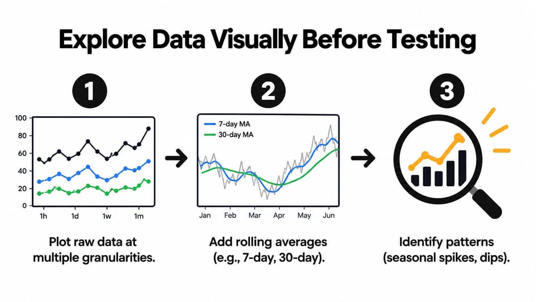
Start with the raw measure at more than one granularity. Plot daily performance to expose gaps, abrupt breaks, and day-of-week behavior. Then compare weekly or monthly rollups to see whether the direction remains after high-frequency movement is compressed. If the story changes between views, treat that disagreement as evidence to investigate, not as a charting nuisance.
Use multiple views of the same series
A line chart helps locate events and irregularities, but it cannot by itself distinguish persistent change from recurring movement. Add a rolling average to reduce short-term noise. Label the window clearly, because smoothing can hide a recent reversal or make a turning point appear later than it occurred.
For a paid campaign, inspect:
- Raw spend and conversion values.
- The calculated rate, such as CPA or ROAS.
- A rolling average that matches the reporting cadence.
- Segment lines by audience, creative, placement, or device.
- An annotation layer for budget, tracking, offer, and landing-page changes.
Test the conclusion at each level. A campaign may show rising blended ROAS because spend shifted toward an audience with a different order value. Segmenting the same metric may show that no individual audience improved. The aggregate movement is real, but the claim of broad efficiency improvement is not supported.
A useful dashboard layout can be found in these 7 dashboard examples for GTM teams, but presentation does not replace period-level checks.
Look for seasonality and incomplete periods
Decomposition views separate a longer directional component from recurring seasonal structure and irregular noise. The framework of trend, seasonal, cyclical, and irregular components helps identify what kind of movement you are observing without treating every rise as a trend.
Check the edges of rolling averages carefully. The latest period may contain fewer observations, and the current reporting window may still be receiving conversions. A clean rise at the end of a chart can result from incomplete data rather than genuine momentum.
Metabase's guidance on reading trends with the right time granularity makes the practical risk clear: incomplete periods and poorly chosen granularity can distort interpretation. Recalculate the view after excluding unfinished periods, then compare the result with the original chart.
The following video can provide a visual introduction to exploratory trend reading:
Hide the labels and ask what remains stable. If the direction appears only in one rollup, only after smoothing, or only in one segment, keep validating it before acting on the result.
Core Techniques to Detect and Measure Trends
A campaign dashboard can show a rising line while the underlying signal is unstable. The useful question is not which chart looks convincing. It is whether the apparent direction survives a different smoothing window, aggregation level, model, and treatment of incomplete observations. Each technique below answers a narrower question, so use its output as evidence to test rather than as a verdict.
Moving averages and smoothing
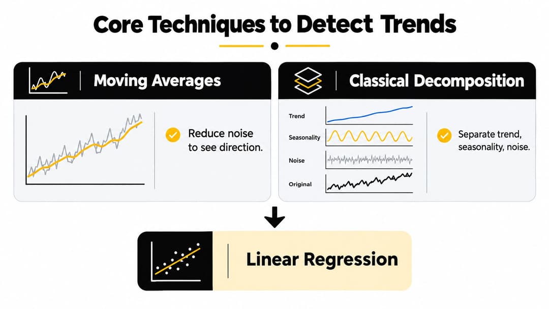
A moving average reduces short-term variation and makes direction easier to inspect. It suits operational monitoring when the raw series is jagged and the decision does not depend on the exact value in every period.
The trade-off is speed. A wide window creates a calmer line but can hide or delay a real change. A narrow window responds sooner while retaining more noise. Compare the smoothed series with the raw observations, record the window used, and repeat the view with a different reasonable window. If the direction disappears immediately, treat it as unconfirmed.
Classical decomposition
Decomposition separates a series into components such as trend, seasonality, cyclical movement, and irregular residuals. It helps when recurring behavior obscures the movement under review.
Its result depends on the assumed seasonal structure. Campaign frequency, spend allocation, and attribution behavior can change, so a pattern that once repeated may no longer fit. Inspect the residuals and the component logic. A clean trend component is not sufficient if the residuals remain structured or the seasonal assumption fails across segments.
Regression
Linear regression summarizes gradual movement with a fitted slope. It can estimate whether a metric tends to rise or fall over the selected interval and quantify the average rate of change under the model's assumptions.
A straight line poorly represents acceleration, saturation, reversals, or step changes. Nonlinear regression can describe curved movement, but its flexibility can also fit noise. Use the simplest model that answers the question, then compare its residual behavior with the raw series and alternative time windows. A slope that changes materially after one rollup or a small date adjustment needs further testing.
Change-point detection
Change-point methods look for abrupt shifts in a series' level or behavior. They fit situations where a tracking change, creative launch, pricing update, or budget intervention may have created a break.
Detection locates a possible break, not its cause. Match candidate points with campaign logs and business events, then check whether the shift appears in related segments and rollups. Treat the result as an investigation lead, not causal evidence.
| Method | Best For | Watch Out For |
|---|---|---|
| Moving averages | Making short-term direction easier to see | Smoothing can hide or delay a change |
| Classical decomposition | Separating trend from recurring seasonal structure | Results depend on suitable seasonal assumptions |
| Linear regression | Measuring gradual directional movement | Serial dependence, nonlinear behavior, and wrong trend specification can distort inference |
| Nonlinear regression | Modeling curved or saturating movement | Flexible models can follow noise |
| Change-point detection | Finding abrupt shifts in level or behavior | A break does not identify the cause |
A widely cited review of unit-root testing identifies wrong trend specification, nonlinearity, and heterogeneity as common failure modes. Time-series guidance also warns that ignoring serial dependence invalidates standard t-statistic inference because observations are related rather than independent (discussion of trend specification and serial dependence).
For intent-related segmentation, the LeadBeast intent signals guide provides useful context. Behavioral signals require interpretation alongside timing, segment definition, and business conditions, rather than automatic treatment as a stable category.
Before reporting uncertainty, review confidence interval testing. Check that the interval matches the metric, sampling process, and dependence structure. A precise-looking estimate from a poorly specified model remains weak evidence. The strongest trend is the one that stays directionally consistent after reasonable changes to windows, rollups, and missing-data handling.
Validate Interpret and Avoid Common Pitfalls
A visible slope is only a hypothesis. Validation asks whether the pattern survives reasonable changes to the analysis, including different time windows, rollups, and missing-data rules.
Start with the window test. Recalculate the metric across several start and end dates that fit the business context. If the trend appears only after an inconvenient period is removed, treat it as provisional. Persistence across comparable windows increases confidence, but it still does not establish causation.
Run the rollup test next. Compare the operational grain with a broader aggregation. Daily CPA may rise while weekly CPA stays stable because of daypart mix or random variation. If the weekly movement also appears across relevant audience and creative segments, the signal has more support. Compare blended ratios with correctly weighted segment calculations, since a simple average can misrepresent the underlying result.
Challenge the data before trusting the slope
Check these failure points directly:
- Incomplete periods: Exclude unfinished periods or label them clearly.
- Attribution lag: Revisit recent results after the expected conversion window has matured.
- Frequency changes: Record shifts in spend, delivery, traffic quality, or event volume.
- Missing data: Recalculate after reasonable treatments for gaps and compare the effect.
- Serial dependence: Do not use independent-observation inference for related time-series observations without accounting for that dependence.
- External events: Compare unusual movement with promotions, outages, platform changes, and tracking releases.
The data-generating process determines what a slope means. A model can produce a clean line while using the wrong structure, especially when a short sequence of related observations is treated as independent evidence. Review control group testing for marketing decisions when a budget decision requires evidence of incrementality rather than correlation.
A trend earns operational trust when it remains recognizable after you change the window, rollup, and assumptions.
Keep interpretation tied to the decision. A rising ROAS line does not, by itself, show that a campaign should receive more budget. Revenue may be delayed, the customer mix may have changed, or additional spend may perform differently from earlier spend. A holdout or controlled comparison is more appropriate when the question is causal.
Write the conclusion with calibrated language. State that the metric shows a persistent pattern under the tested conditions. Do not present one slope as proof of permanent improvement. The evidence may support scaling, continued monitoring, or better instrumentation. Name which outcome the analysis supports, and record the conditions that produced it.
Putting Trend Insights Into Action
Trend analysis earns its place when it improves the next decision. Treat the workflow as a validation loop, not a charting exercise:
- Define the decision: Name the metric, population, time grain, and type of change.
- Prepare the series: Resolve duplicates, missing periods, incomplete windows, and attribution timing.
- Inspect the shape: Compare raw values with smoothed views, segments, and broader rollups.
- Choose a method: Match smoothing, decomposition, regression, or change-point detection to the question.
- Test stability: Recheck different windows, aggregation levels, dependence, and business events.
- Choose an action: Scale, pause, investigate, or continue monitoring.
A trend should survive reasonable changes to the analysis. Recalculate it with shorter and longer windows, compare daily data with a broader rollup, and check whether missing periods or delayed conversions alter the pattern. If the direction disappears under one sensible setup, treat it as a hypothesis rather than an operating signal.
Document assumptions beside the chart. Record the data refresh time, attribution rule, excluded periods, selected rollup, and method rationale. This note keeps a provisional result from becoming an established fact during the next review.
A spreadsheet works for a lightweight review when its formulas and source data are visible. A recurring dashboard should expose incomplete periods and let analysts move from account totals to meaningful segments. For teams reviewing many Meta campaign combinations, AdStellar AI can analyze performance by creative, copy, audience, placement, and other groupings, then surface combinations for investigation. The analyst still needs to verify the underlying windows and definitions. For broader operating guidance, see data-driven marketing solutions that drive ROI. Use predictive performance modeling only after historical data and measurement rules have been checked.
Set the review cadence to match the decision. Fast campaign changes may require frequent monitoring, while strategic conclusions should wait for mature attribution and comparable periods. Act when the pattern remains stable across tested conditions, the data is complete, and the business context supports the interpretation. Otherwise, keep watching and state which evidence is missing.
AdStellar AI helps performance teams launch and analyze Meta campaigns, compare creatives, audiences, copy, and placements, and identify combinations for further investigation as new data arrives. Visit AdStellar AI to support a repeatable campaign analysis workflow, then scale only after the trend survives the relevant checks.