You launch a new Meta campaign. The ads get clicks. The comments look fine. CTR looks healthy enough that nobody panics on day one.
Then the numbers that matter stay flat. Leads are weak. Purchases don't come through. The sales team says the traffic isn't qualified. Finance asks why spend is rising faster than revenue.
That problem isn't about Canva skills or button colors. It's a design problem in the broader performance sense. The ad was designed to attract attention, but not designed to convert the right person with the right message in the right flow.
When people discuss designing Facebook ads, they stop at visuals. That's too shallow for how Meta works today. A converting ad is built from strategy first, then message, then creative production, then testing architecture, then iteration. If any layer is weak, the ad can still generate engagement while failing the business.
The Foundation of High-Converting Facebook Ads
Most underperforming Facebook ads fail in one of three places. The audience is wrong. The offer is weak. Or the click path creates friction after the ad does its job.

Audience message fit
A clean ad won't save a mismatched message. If you're showing a founder-focused pain point to first-time freelancers, the design can look polished and still miss.
Junior buyers get trapped here. They optimize for click appeal before they confirm buyer intent. A broad promise gets attention. A specific promise gets qualified action.
Use these checks before you brief a designer:
- Know who the ad is for: Define the buyer by problem awareness, not just age or interests.
- Match the pain point: Speak to the friction that person already feels, not the feature you want to promote.
- Keep one promise per ad: If the ad tries to sell speed, savings, simplicity, and premium quality at once, it says nothing clearly.
The offer has to carry the ad
If the product-market fit is soft or the offer is vague, design turns into decoration. A discount, demo, trial, lead magnet, or bundle should answer one question fast. Why should this person act now?
A lot of teams skip this. They ask for "better creatives" when what they really need is a stronger entry offer or better landing-page continuity.
Practical rule: If the offer can't be explained in one short sentence, the ad gets bloated trying to compensate.
For teams that need help aligning creative with media buying and account structure, good operational support matters too. A service partner like Facebook Ads services can be useful when the issue isn't just ad design, but campaign execution across the funnel.
The path to conversion must feel obvious
Meta can drive the click. The page still has to finish the job.
That means your ad headline, CTA, and landing-page opening need to feel like one continuous message. If the ad promises a clear outcome and the page opens with corporate fluff, conversion drops because trust breaks.
Read performance reports in this order:
- Start with the business metric: ROAS, CPL, CPA, or qualified pipeline.
- Check click quality: CTR can tell you if people care, but not whether they should have clicked.
- Review post-click behavior: If people bounce or abandon forms, the ad may be fine and the handoff may be the problem.
If you're tightening the full system, not just the ad itself, this breakdown of Meta campaign workflow is worth reading: https://www.adstellar.ai/blog/facebook-ads-optimisation
Designing Facebook ads well means thinking like a media buyer and a conversion strategist at the same time. The ad is not the endpoint. It's the first commitment in a chain.
Developing Your Core Creative Strategy
The strongest ads start long before anyone opens Photoshop, Figma, or a video editor. They start in customer language.
Many teams already have more angle data than they realize. It's buried in reviews, support tickets, sales call notes, post-purchase surveys, and competitor ads. If you don't mine those inputs first, you end up brainstorming from taste instead of evidence.
Mine your own customer language first
Start with what buyers already say when they describe the problem, the hesitation, and the outcome they wanted.
Look for recurring phrases in:
- Support tickets: These reveal friction, objections, and confusion in plain language.
- Reviews and testimonials: These contain benefit statements customers believe.
- Sales calls and chats: Objections here become your best hooks.
- Post-purchase surveys: These tell you why buyers acted, not why marketers assume they did.
When I build angle banks, I separate findings into three buckets. Pain, desire, and proof. Then I map each bucket into ad concepts.
A basic framework works well here:
| Input | What to look for | Possible ad angle |
|---|---|---|
| Pain | What frustrates them now | "Still dealing with..." |
| Desire | What result they want | "Get to..." |
| Proof | Why they trust a solution | "Used by people who..." |
Use competitor ads to find whitespace
The Meta Ads Library is useful, but not because competitors have magical hooks. It's useful because repetition exposes lazy positioning.
If five brands all run the same "save time" angle with the same polished founder video, that's a signal. You can test a different tone, a different persona, or a different format.
A practical workflow looks like this:
- Pull ads from at least a handful of direct competitors.
- Group them by promise, persona, format, and tone.
- Mark what nobody is saying.
- Write contrarian versions that still fit your offer.
Competitor research is less about copying winners and more about spotting where nobody is speaking clearly.
AI-assisted research can also help with speed. For example, angle extraction workflows built around Meta Ads Library analysis can surface missing tones and repeated patterns faster than doing it all manually. One useful reference on this kind of process is https://www.adstellar.ai/blog/facebook-ad-creatives
Turn raw research into testable angles
Don't brief "make me a better ad." Brief angle families.
A few reliable frameworks:
- Problem agitate solve: Best when the buyer already feels the pain.
- Before after bridge: Useful when the transformation is easy to visualize.
- Objection flip: Strong when purchase hesitation is your main bottleneck.
- Persona callout: Works when one segment feels ignored by generic ads.
That last one matters more than many teams think. An example from a 2026 case study found an underserved persona, described as "older guys," in post-purchase surveys and support tickets. Simple static ads built for that persona became three of the top four performing ads, which reinforced that persona relevance often matters more than production quality (YouTube case study).
That example is useful because it cuts against common creative vanity. You don't always need fancier motion graphics. Sometimes you need a message that finally makes the right buyer feel seen.
Build an angle board before you build creatives
I like to force angle clarity with a short matrix before production starts.
- Persona: Who exactly is this ad talking to?
- Pain point: What problem is being named?
- Offer connection: Why does your offer solve that problem now?
- Proof type: Testimonial, mechanism, demonstration, comparison, or simple claim.
- Format fit: Static, UGC-style video, founder video, testimonial clip, carousel, or story frame.
If your team can't fill that out cleanly, the ad isn't ready to design. The best creative teams don't begin with layouts. They begin with a position.
Crafting Compelling Visuals and Copy
Once the angle is clear, execution gets simpler. You're no longer decorating a vague message. You're packaging one idea so the right person notices it fast and understands it without work.
The mistake here is trying to make every ad look "premium." On Meta, clear beats polished. Relevance beats aesthetic perfection.
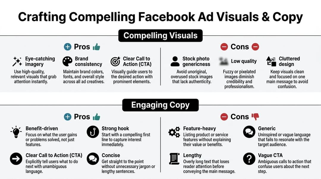
Make the visual carry one job
A strong ad visual should do one of a few things. Stop the scroll, demonstrate the product, frame the problem, or reinforce the persona.
What doesn't work well is clutter. Too many text blocks, too many benefit claims, too many visual focal points. If the eye doesn't know where to go first, the ad loses.
Use this checklist when reviewing creative:
- Single focal point: One face, one product shot, one pain visual, or one headline area.
- Strong hierarchy: The buyer should understand the ad in a glance.
- Mobile-first composition: If the ad only works on a desktop preview, it isn't ready.
- Clear CTA treatment: The action should feel obvious, even before the user reads the button.
Why video keeps winning attention
Meta rewards relevance signals. Click-through rate is one of the clearest early indicators. According to Sprout Social, Facebook ads average a 2.59% CTR for leads campaigns across industries, and video ads drive more clicks for 67.55% of advertisers compared to images. The same source notes that high CTR signals relevance to the algorithm, which can help lower costs and improve delivery in competitive markets (Sprout Social benchmark data).
That doesn't mean every ad should be a cinematic video. It means motion earns attention more efficiently, especially when the opening frames are direct.
For short-form ad video, the first few seconds do most of the work. Open with the problem, the transformation, or the strongest visual proof. Don't waste the opening on logo animation.
If your hook starts with branding instead of relevance, most users won't stay long enough to care who you are.
Use placements the way people consume them
Different placements reward different creative behavior. Feed can tolerate more context. Stories and Reels demand faster pattern interruption and cleaner framing.
Here is a practical working table for production planning.
| Placement | Recommended Resolution | Aspect Ratio | Video Length |
|---|---|---|---|
| Feed | Use platform-recommended high-resolution assets | Square or vertical-friendly | Short enough to deliver the hook quickly |
| Stories | Full-screen mobile-first asset | Vertical | Short, direct, fast opening |
| Reels | Full-screen mobile-first asset | Vertical | Short, native-feeling, hook-led |
That table is deliberately operational rather than numeric. Meta updates specs often enough that teams should always verify platform requirements before export, but the design principle stays the same. Build for mobile behavior first.
For more examples of mobile-first layouts and creative patterns, this resource is useful: https://www.adstellar.ai/blog/facebook-ad-designs
Copy that sounds like a person wrote it
Weak copy fails in one of two ways. It's too generic, or it's too feature-heavy.
Here are better patterns.
Weak headline "Advanced workflow solution for modern teams"
Better headline "Stop launching Meta ads one by one"
Weak primary text "Our platform helps businesses optimize advertising through automation and data-driven intelligence."
Better primary text "Building ad variations manually eats hours. Launch more tests with less setup and keep the winners."
A few copy rules I enforce hard:
- Lead with the pain or outcome: Don't start with the company.
- Use buyer language: Pull phrasing from reviews, tickets, and calls.
- Make the CTA specific: "Shop Now" or "Get Demo" is clearer than soft language.
- Cut filler: If a sentence doesn't sharpen urgency, trust, or clarity, remove it.
Good creative review is ruthless
Before an ad goes live, ask these questions:
- Can someone understand the promise without reading everything?
- Does the creative match the audience sophistication level?
- Is the ad selling one next step, not five?
- Would this still make sense with the sound off?
The teams that improve fastest don't wait for campaign data to tell them an ad is bloated. They catch that in review. Good creative work is editing as much as ideation.
Structuring Campaigns for Effective Testing
Bad campaign structure can ruin good creative. I see this constantly. A team does serious research, produces solid ads, and then launches them into a messy account where overlapping audiences, weak budgets, and mixed objectives muddy the data.
That isn't a creative problem. It's a testing problem.

Simplify the structure or pay for noise
A practical Meta account should separate prospecting from retargeting and keep ad sets distinct enough that you can learn something.
The reason is simple. Internal competition distorts delivery. According to The Ad Firm, overlapping audiences can drive up CPM by 20-40%. The same guidance recommends a simplified campaign structure with non-overlapping ad sets and a minimum daily budget of $50-$100 per ad set to help campaigns leave the learning phase, which requires roughly 50 optimization events per week (The Ad Firm on Facebook ad structure).
When junior buyers ask why their test results feel random, this is the answer. The architecture is noisy.
A clean testing model
I prefer a structure where each campaign has one job.
- Prospecting campaign: Cold audiences only. Test angle or creative without retargeting behavior contaminating the read.
- Retargeting campaign: Warm traffic, product viewers, lead form openers, or cart abandoners.
- Scaling campaign: Only proven combinations move here after they show stable performance.
Inside the testing campaign, keep variables under control.
| Level | What to test | What not to mix |
|---|---|---|
| Campaign | One clear objective | Multiple business goals |
| Ad set | Audience variable | Overlapping targeting pools |
| Ad | Creative, hook, CTA, format | Too many strategic changes at once |
That structure makes diagnosis easier. If performance changes, you know where to look.
CBO versus ABO in practice
This isn't a religious debate. It's a tool choice.
If you're trying to compare specific audiences with strict control, ad set budgeting can be useful. If you're testing multiple creative variations within a broader strategy, campaign-level budget allocation gives Meta more room to find efficient delivery.
The mistake is switching structures too often or forcing one model on every test. Pick the method that gives you the cleanest read on the variable you're testing.
The best structure is the one that preserves signal. If you can't explain what was tested, the result isn't trustworthy.
A good companion walkthrough for test planning and execution lives here: https://www.adstellar.ai/blog/test-for-ads
What a launch should look like
Before publishing, run this checklist:
- Confirm the campaign objective matches the business outcome.
- Check that audiences don't significantly overlap.
- Make sure the budget is high enough for learning.
- Verify tracking events and destination URLs.
- Label tests so reporting stays readable later.
A quick visual breakdown can help if you're training a team on setup discipline:
The account should feel boring in the best way. Clear naming. Clear separation. Clean tests. That's how you get data you can trust.
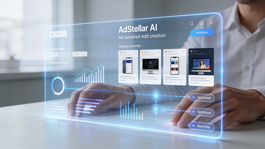
Automating Ad Creation and Testing with AdStellar AI
Manual testing breaks down fast once your account gets serious. One buyer can brainstorm angles, write copy, resize assets, build audience splits, upload variations, name everything, launch, and report on it. They can't do that at real volume for long without slowing down or cutting corners.
That's where automation becomes operational, not optional.
Where manual workflows start leaking time
The old workflow looks familiar. A strategist writes hooks in a doc. A designer makes variants. A media buyer uploads them manually. Reporting sits in a spreadsheet. Then someone tries to remember which combination won and why.
That process creates friction in four places:
- Creative throughput: Teams don't produce enough variants to test angles properly.
- Launch speed: Uploading combinations by hand slows learning cycles.
- Pattern recognition: Winners get noticed late because reporting is fragmented.
- Iteration discipline: Good concepts don't get expanded systematically.
Some teams use separate tools for copy generation, image production, and reporting. That can work. A broader overview of how AI affects modern creative workflows is covered in AI Powered Ad Creative, especially if you're comparing tool categories rather than looking for one fixed stack.
How AI enhances capabilities
One underused application of AI is competitor-gap analysis. A recurring question in designing Facebook ads is how to systematically identify unique angles from Meta Ads Library patterns instead of relying on instinct. A 2026 trend cited in an agent skills reference notes that AI-extracted intelligence from library data can help draft test variations by spotting gaps like formulaic competitor ads ripe for disruption, and that AdStellar’s AI Insights auto-ranks potential angles against ROAS from ingested performance data (competitive ads extractor reference).
That matters because "make more variations" isn't enough. You need better variation logic.
A practical AI-assisted workflow looks like this:
- Ingest account history so past winners and losers influence new tests.
- Generate combinations in bulk across copy, creative, and audience inputs.
- Launch variations quickly without rebuilding every asset manually.
- Rank outputs by goal such as ROAS, CPL, or CPA.
- Spin up follow-up tests from the winning angle instead of starting from zero again.
For teams that want this inside one platform, AdStellar AI does that through campaign launch, performance ingestion, and AI-based ranking of creatives and audiences. More on that workflow is outlined at https://www.adstellar.ai/features/ai-optimization
What automation should not do
AI shouldn't replace judgment. It should compress repetitive labor.
You still need a human to decide whether the offer is strong, whether a persona is strategically important, and whether a winning ad is durable or just catching a temporary pocket of demand. Automation helps when the strategy is already sound. It won't fix weak positioning.
The best use of AI in paid social is simple. Let people decide what deserves testing. Let systems handle the repetitive work required to test it at scale.
Measuring Iterating and Scaling Your Winners
A test isn't finished when Ads Manager shows a green number. It's finished when you've decided what to keep, what to cut, and what to build next from the result.
Often, teams waste the learning they just paid for. They identify a winner, leave it alone too long, and then panic once it fades. Strong operators treat winners as starting points, not finish lines.
Read the test in layers
The first job is to match metrics to the campaign goal. A lead gen account should care about lead quality and cost efficiency. An e-commerce account should care about revenue efficiency and margin reality. CTR matters, but only as part of that chain.
For creative testing specifically, the process needs enough volume to mean anything. According to Stape, statistically significant tests require 1,000-5,000 impressions per variant and strong A/B testing methodology can produce a 30-50% performance uplift. The same source recommends moving 80% of the budget to identified winners, refreshing losing creatives every 2-4 weeks, and notes that campaigns testing multiple variants can see 2-3x higher ROI than single-variant campaigns (Stape on Facebook ad optimization).
That guidance lines up with what experienced buyers already know. Most premature decisions come from underfed tests.
Kill, hold, or scale
I use a simple decision model after a clean test window:
- Kill it: The ad attracts low-quality clicks, weak post-click behavior, or clear underperformance against sister variants.
- Hold it: The ad shows promise but hasn't gathered enough clean signal.
- Scale it: The concept is stable enough to earn more budget and more derivative testing.
The critical detail is that scaling shouldn't mean "do nothing and increase spend." It should mean expanding the winning idea.
A winning ad is a winning angle in one expression. The next job is to find the other expressions.
Build iteration around concepts, not assets
If a testimonial-style video wins, don't just duplicate the same file. Test the same message with a new opening line, a different speaker, a shorter cut, or a stronger CTA. If a static persona ad wins, explore adjacent versions aimed at similar segments.
This keeps the account learning while reducing fatigue. It also gives you a steadier handoff into broader scale.
A reliable post-test loop looks like this:
| Outcome | Next move |
|---|---|
| Winning hook | Create multiple fresh executions of the same message |
| Winning persona | Expand with adjacent pain points or proof types |
| Winning format | Test the format across new offers or audiences |
| Losing concept | Archive the lesson so the team doesn't retest it blindly |
That loop is where disciplined teams separate from reactive ones. They don't just report outcomes. They convert outcomes into the next test plan.
Frequently Asked Questions About Designing Facebook Ads
How do you fight ad fatigue without constantly inventing brand-new concepts
Don't treat fatigue as a signal that every message is dead. Usually one layer is tired, not the whole concept.
Refresh the execution before replacing the strategy. Change the opening hook, visual framing, spokesperson, CTA phrasing, or proof format. Keep the underlying angle if it's still tied to a real buyer problem.
A good fatigue response sequence looks like this:
- Refresh the hook: New first line, same promise.
- Swap the format: Turn a static winner into a short video or carousel.
- Change the proof: Replace a claim-led ad with demonstration or testimonial-led creative.
How do you balance brand guidelines with direct response performance
Treat brand guidelines as constraints, not shackles. You need recognizable colors, tone, and identity. You don't need every ad to look like a homepage banner.
Performance creative needs harder contrast, clearer hierarchy, and more direct copy than brand teams initially prefer. The compromise is to protect core brand elements while letting ad-specific layouts and hooks do their job.
If the ad is on-brand but nobody understands the offer, the brand hasn't been protected. It's been hidden.
What should you do when ads are getting approved inconsistently
Start by reducing ambiguity. Sensitive claims, exaggerated outcomes, and vague before-and-after framing create trouble.
Review the ad through three lenses:
- Claim language: Remove anything that sounds absolute or unverifiable.
- Visual implication: Make sure imagery doesn't imply a prohibited promise.
- Landing-page alignment: The destination should match the ad's framing and disclosures.
When approvals are inconsistent, document what changed between approved and rejected variants. Over time, that becomes your internal policy guide, which is more useful than guessing from memory.
Should you design separate ads for cold and warm audiences
Yes, if the buying journey is meaningfully different.
Cold audiences need context, problem recognition, and trust-building. Warm audiences need objection handling, urgency, or product-specific proof. Using one generic creative set for both weakens both stages.
The best accounts keep the strategic core consistent but adjust how much explanation each audience needs.
If you want to replace manual ad setup with a faster testing workflow, AdStellar AI is built to help teams generate variations, launch campaigns in bulk, and learn from historical Meta performance so scaling decisions rely less on guesswork.