You’re probably here because a cover photo looked right in Figma, Canva, or Adobe Express, then broke the moment it went live on Facebook. The headline got clipped on mobile. The logo slipped under the profile picture. The image looked soft on one device and cramped on another.
That’s not a small cosmetic issue. For a performance team, the cover photo is part of the first impression users get after clicking an ad, searching your brand, or landing on your page from a referral. If that top banner looks careless, the whole account feels less trustworthy. If it looks clean and intentional, it supports every other asset around it.
The dimensions of facebook cover photo matter because Facebook doesn’t show one static canvas. It renders the same image differently across desktop and mobile, and that creates real trade-offs. The job isn’t to make a beautiful banner in isolation. The job is to create one asset that survives cropping, compression, overlapping UI, and brand review without needing three rounds of rework.
Why Your Facebook Cover Photo Still Matters in 2026
A paid social team launches a campaign, the ads are tight, the landing page converts, and the Facebook Page still undercuts the whole experience because the cover looks cropped, dated, or off-brand on mobile.
That happens more often than it should. The cover photo sits in the highest-visibility position on the page, so users read it as a signal. If the banner looks current and aligned with the campaign they just clicked, the page feels maintained. If it looks generic or broken, confidence drops before they scroll.
Facebook introduced the cover photo on March 30, 2012 with the Timeline layout, and that change turned the top of the profile into a large-format brand surface. The role of that asset has stayed the same even as the platform changed around it. It still has to carry brand recognition, message clarity, and visual consistency across devices.
For performance marketers, the cover photo is not a standalone design task. It is part of the conversion path. A user may click an ad, search your brand, or check your page before following, messaging, or trusting the offer. In each case, the header either supports the click or creates doubt.
The practical trade-off is simple. Creative teams want room for headlines, logos, offers, and product visuals. Facebook gives you one canvas that gets cropped differently on desktop and mobile, with interface elements layered on top. That means cover photo specs affect more than appearance. They affect approval cycles, rework, and how consistently a campaign shows up across every brand touchpoint.
Use the same discipline here that you use for ad placements. Build for the platform’s actual display behavior, not the mockup. If you need a broader placement-by-placement reference beyond covers, keep this Facebook image size guide for marketers in your workflow.
In practice, three outcomes matter:
- Poorly planned covers create hesitation. Users question whether the page is active, credible, or connected to the ad they just saw.
- Well-structured covers keep brand continuity intact. The page header should feel like the same campaign, not a separate asset built by another team.
- Incorrect specs create preventable production work. The usual fixes happen after upload, when text gets clipped, focal points shift, or legal and brand reviewers ask for a rebuild.
A cover photo rarely drives results on its own, but it can weaken the page experience enough to hurt the traffic your campaigns already paid for.
Facebook Cover Photo Dimensions Quick Reference
If you need the numbers first, use this table and design around it. For a broader creative workflow across placements, keep this companion reference for the best image size for Facebook handy.
Facebook Cover Photo Dimensions Cheat Sheet 2026
| Placement | Recommended Upload Size (pixels) | Desktop Display Size | Mobile Display Size |
|---|---|---|---|
| Personal Profile | 820 x 360 | 820 x 312 | 640 x 360 |
| Business Page | 820 x 360 | 820 x 312 | 640 x 360 |
| Group | Qualitatively, groups use a different cover format and should be designed separately | Varies by interface | Varies by interface |
| Event | 1920 x 1080 | Varies by interface | Varies by interface |
Two quick notes matter here. Pages and profiles share the same practical cover workflow, so a single template can be standardized. Events are different, and groups should not be treated like page covers just because they all sit at the top of a Facebook surface.
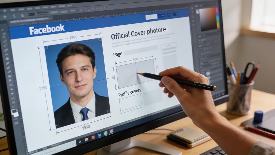
The Official Dimensions for Page and Profile Covers
For Page and Profile covers, the working file you should design for is 820 x 360 pixels. That’s the best upload size to cover how Facebook renders the asset across devices. On desktop, Facebook displays it at 820 x 312 pixels. On mobile, it shows 640 x 360 pixels. Canva’s 2026 sizing reference also notes that smartphones account for over 98% of global Facebook traffic in key markets, which is why mobile behavior should drive the layout, not just the desktop preview in your design file. You can review that sizing breakdown in Canva’s Facebook cover photo dimensions guide.
Why upload size and display size don’t match
This is the part new team members usually trip over. The upload file is a master canvas. Facebook then crops and fits that canvas depending on where the user sees it.
Desktop trims vertical space. Mobile trims width. If you design only for one of those views, the other one will punish you.
What works in production
A cover built at 820 x 360 gives you enough height to survive mobile’s taller presentation without inventing awkward background fills later. It also prevents the common “desktop-perfect, mobile-broken” problem that happens when teams design only to older guidance and never preview the mobile crop.
Practical rule: Build one master file for the platform’s real behavior, not for the prettiest artboard in your design tool.
When I review covers for launch readiness, I don’t ask whether the full image looks balanced edge to edge. I ask whether the message still holds if Facebook removes part of the width on mobile and part of the height on desktop. That’s the standard that prevents creative redo work.
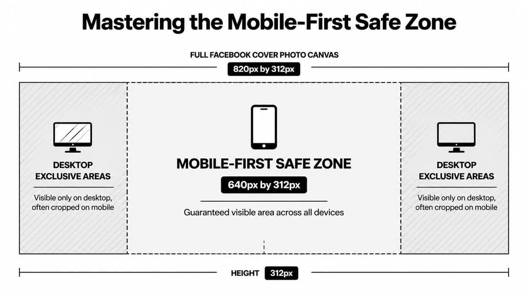
Mastering the Mobile-First Safe Zone
The most useful concept in the dimensions of facebook cover photo discussion isn’t the outer canvas. It’s the safe zone.
Facebook may accept a larger image area, but the part you can count on across views is the central 640 x 312 pixels. Snappa’s guide notes that best practice is to keep text, logos, and CTAs inside that 640 x 312 safe zone so they maintain 100% visibility, and to use PNG for graphics with transparency or fine text when edge clarity matters. Their walkthrough is worth bookmarking in this Facebook cover photo safe zone guide.
How cropping actually affects your layout
Think of the safe zone like broadcast safe area rules on TV. You can decorate outside it, but you shouldn’t place anything essential there.
Mobile can crop up to 90 pixels from each side, which means edge-aligned text, offer tags, and logos are the first things to disappear. That’s why background texture can live near the edges, but campaign language can’t.
Non-negotiable placement rules
Use these rules when handing off to design or reviewing exports:
- Keep the message centered. Headlines, value props, logos, and faces belong inside the safe zone.
- Let the sides do atmospheric work. Use them for color, pattern, secondary imagery, or visual extension.
- Avoid edge CTAs. If a call to action matters, it has to sit in the center field, not near the outer margins.
- Design for mobile first. If the cover works on a phone, desktop usually holds up. The reverse isn’t reliable.
If your team also works on other banner-heavy platforms, MakerSilo's banner size guide is a useful comparison because it shows the same core principle. Wide banners often look simple until mobile crops start deciding what survives.
For teams that regularly adapt creative across placements, the same discipline shows up in mobile banner ad design. The lesson is consistent. The visible center matters more than the full canvas.
A quick visual walkthrough helps if you’re onboarding a junior designer or media buyer:
What doesn’t work
Three layouts fail again and again:
- Left-anchored logos that sit too close to the profile picture area.
- Wide sentences stretched across the banner like a website hero.
- Busy collages with several focal points competing for the same safe area.
A strong cover is usually simpler than stakeholders first request. One message. One visual center. One brand cue that stays intact after Facebook does its cropping.
Designing Around Profile Pictures and Buttons
Even if you respect the safe zone, the cover still isn’t a clean canvas. Facebook places interface elements on top of it, and the biggest offender is the profile picture.
Adobe Express notes that profile picture interference requires about a 14% left margin, which is roughly 115 pixels on an 820-pixel-wide cover. It also notes a 170-pixel-diameter circular crop and that the mobile viewport can shift placement up to x=90px, which is why left-side branding often gets obscured in live view. That design constraint is explained clearly in Adobe’s Facebook cover sizing reference.

The assumption that breaks covers
Teams often assume, “If it’s inside the safe zone, it’s safe.” Not always.
The profile image overlaps the lower-left portion of the banner, and interface buttons can change the visual balance around the right side depending on the page state. That means a logo placed low and left can still get crowded or partially hidden even if the mobile crop doesn’t remove it.
Better layout choices
A few placements consistently survive better:
- Put the main headline in the center.
- Place the logo above center or center-right, as long as it doesn’t drift too close to the edge.
- Keep small text out of the lower-left area.
- Treat the far left as a buffer, not premium messaging space.
The best Facebook covers aren’t just centered for cropping. They’re composed around Facebook’s own interface.
Choosing the Right File Format and Resolution
Once the layout is correct, export settings decide whether the cover feels polished or cheap.
Facebook’s long-standing recommendation is to upload a file at 851 x 315 pixels for fast loading, ideally in JPG format and under 100 KB. At the same time, practical design guidance for modern displays favors building the master image taller, then exporting with care so Facebook’s compression doesn’t ruin text and edges. That trade-off shows up often in real production.
JPG versus PNG
Use JPG when the cover is photo-heavy and you need a smaller file for quicker loading. This works well for brand photography, lifestyle imagery, and soft gradients.
Use PNG when the cover includes logos, interface-style graphics, or small text that needs crisp edges. PNG generally survives compression better for sharp design elements.
Standard resolution versus 2x export
A 2x export, such as 1640 x 720 pixels, can help preserve sharpness on high-DPI screens before Facebook scales the file down. That’s useful when your cover includes clean typography or fine graphic detail.
Use it selectively. If the design is simple and mostly photographic, the extra resolution may not change much after compression. If the cover includes tight letterforms or precise brand marks, the higher-resolution source can hold up better.
A practical workflow is:
- Design on the correct cover canvas.
- Export a standard version and a 2x version.
- Upload the stronger one after checking how Facebook compresses each.
- Keep the file as lean as possible without damaging visible quality.
Strategic Best Practices for Cover Photo Content
A visitor lands on your Page after clicking an ad, a tagged post, or a branded search result. The cover photo is one of the first signals they use to decide whether the Page matches the promise that brought them there. If the creative feels off-brand, outdated, or overloaded, that doubt shows up before they read a word of body copy.

A strong cover photo does three jobs at once. It confirms brand consistency, gives the visitor quick context, and supports the action you want next. For a SaaS page, that might mean reinforcing the category and product value. For ecommerce, it may mean aligning the cover with a current promotion or seasonal push. For local businesses, it often works best as a trust signal with clean visuals, recognizable branding, and a current offer.
What the banner should do
Good cover creative is focused. Use it to support one clear objective:
- Match active campaigns. Keep the same visual system, offer language, or campaign theme your paid and organic traffic already saw.
- Clarify positioning. Show what the brand does and who it serves without turning the cover into a paragraph.
- Reinforce credibility. Use current, polished creative that makes the Page feel maintained by a real team.
- Support timely promotions. Highlight launches, events, seasonal offers, or community initiatives if they are still current.
Performance marketers usually make the right trade-off with the cover photo. The cover is not the place to explain everything. It should reduce hesitation and make the next click feel logical.
What usually underperforms
Weak covers tend to fail for the same reasons:
- Generic stock imagery with little connection to the brand
- Long text blocks that try to do the website header’s job
- Expired campaign creative that conflicts with current ads or offers
- Visuals pulled from unclear sources
If your team sources visuals externally, it’s worth checking how to avoid image legal problems before publishing a banner that sits in a highly visible brand position.
The same discipline carries over to web banner ad design best practices. Strong creative stays narrow on purpose. One message, one visual hierarchy, one reason to keep engaging.
A practical test I use is simple: if a first-time visitor sees the cover for two seconds, can they tell they are in the right place and what the brand is about. If not, the design needs a tighter message or a cleaner visual structure.
How to Upload and Reposition Your Cover Photo
A technically correct file can still fail if the final crop is off. Facebook’s reposition tool is simple, but teams skip it too often.
Use this sequence:
- Go to your Page and hover over the cover area.
- Choose the option to edit or upload a new cover photo.
- Select the finished JPG or PNG file.
- Use Facebook’s drag-to-reposition control to adjust the visible crop.
- Save, then check the page on desktop and mobile before calling it done.
What to look for before you approve it
Don’t just ask whether the image uploaded correctly. Check whether the focal point still lands where you intended, whether the headline feels centered, and whether any important detail now sits too close to Facebook’s interface.
If you manage updates through Meta tools regularly, this workflow pairs well with a practical understanding of Meta Business Suite, especially when multiple people touch the same page assets.
A final preview pass catches most avoidable mistakes.
Troubleshooting Common Cover Photo Problems
Most cover issues fall into three buckets. If you know the cause, the fix is straightforward.
Blurry or pixelated image
Cause: The source file was too small, over-compressed, or exported in the wrong format for the design style.
Solution: Re-export from the original design file at the proper cover dimensions. If the artwork includes text or logos, try PNG instead of JPG. If it still looks soft, test a higher-resolution source export and compare how Facebook compresses each version.
Text gets cut off
Cause: The design ignored the central safe area, or key content sat too close to the outer edges.
Solution: Move all critical text, logos, and campaign messaging into the center field. Treat the sides as decorative space only. Then re-upload and preview on a phone before approval.
Image looks stretched or distorted
Cause: The file was built in the wrong aspect ratio, then forced into Facebook’s cover container.
Solution: Rebuild the asset on the correct canvas instead of resizing an unrelated banner to fit. Don’t repurpose an event image, website hero, or ad creative without redesigning the composition for Facebook’s cover behavior.
Most cover photo problems are not Facebook bugs. They start in the source file.
A good review habit is to inspect the design at three stages: in the design tool, in Facebook’s upload preview, and on a live mobile device. That catches layout, compression, and overlap problems separately.
Cover Dimensions for Facebook Groups and Events
Page covers are only one part of the ecosystem. If you want brand consistency across Facebook, build separate templates for Groups and Events rather than forcing one banner into every surface.
For Events, the commonly used cover size is 1920 x 1080 pixels. That format behaves differently from page covers, so don’t assume the same composition rules apply. If your team publishes event banners often, this guide on how to avoid awkward Facebook event cover cropping is a useful practical reference.
For campaign planning across launch assets, Facebook event dimensions is the better internal workflow companion. It helps keep event creative aligned with the rest of your Meta assets without forcing page-cover logic where it doesn’t belong.
Your team can design a Facebook cover photo manually every time, or you can systematize the work around repeatable creative rules. AdStellar AI helps performance teams launch, test, and scale Meta creative faster, so brand consistency doesn’t break every time a new campaign goes live.