You launch a new Meta campaign. The copy is tight. The offer is clear. The product photo looks expensive. Then the ad stalls.
CTR stays soft, CPC climbs, and the post-click numbers never recover. Frequently, the hook, the audience, or the algorithm are blamed first. Often the actual problem is simpler. The layout of advertisement is doing a poor job of directing attention.
That matters more than many marketers want to admit. A strong ad isn’t just made of good parts. It’s made of parts arranged in the right order, with the right emphasis, for the way people scan a feed. If the eye lands on the wrong element first, the message breaks before the offer even has a chance.
Why Your Perfect Ad Creative Is Still Failing
A common failure pattern looks like this. The designer builds a polished asset. The media buyer approves it because every individual ingredient seems right. There’s a nice product shot, a benefit-led headline, some supporting copy, and a CTA. But when the ad goes live, it feels strangely hard to process.
The problem isn’t usually quality. It’s composition. On Meta, people don’t study an ad. They decide in a split second whether the layout gives them a reason to stop scrolling.

Good ingredients can still create a weak ad
I’ve seen ads fail for layout reasons that had nothing to do with the offer itself:
- The headline was too low: users saw the image first but didn’t get the point fast enough.
- The CTA blended in: it existed, but it didn’t feel like the next logical action.
- The visual fought the copy: the eye bounced around instead of following a clear path.
- Branding dominated the frame: the ad looked polished, but it felt more like a poster than a conversion asset.
That last point matters. Brand-heavy creative can look great in a review deck and still underperform in-market.
A layout should reduce decision friction, not add it.
Layout has always separated amateur ads from effective ones
This isn’t new. Advertising became more strategic as layout evolved from basic text blocks into deliberate visual composition. During that shift, U.S. ad volume grew from about $200 million in 1880 to nearly $3 billion by 1920, a 1,400% increase, as the industry moved from simple text ads toward more advanced layout and design practice, according to History Matters on the evolution of advertising.
That same principle still applies on Meta. A layout isn’t decoration. It’s the structure that tells the user what to notice, what to believe, and what to do next.
If your ad has strong parts and weak results, don’t ask only whether the copy is good. Ask whether the layout makes the copy easy to win with.
The Anatomy of a High-Converting Ad Layout
A converting ad behaves like a system. Each element has a job. If one part is overemphasized or misplaced, the whole unit loses force.
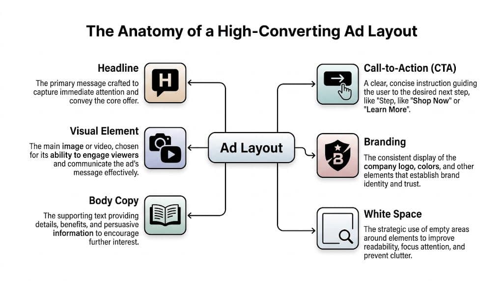
The visual sets the stop
The image or video frame earns the first fraction of attention. On Meta, that means it must communicate before anyone reads. A visual should do one of three things immediately: show the product, show the outcome, or show the tension that the product resolves.
When teams miss here, they often choose visuals that are attractive but vague. Pretty scenery, generic lifestyle scenes, or overly abstract graphics may look premium, but they don’t create a fast reason to care.
If your campaigns lean heavily on motion, this video marketing success guide is a useful reference for thinking about how visual storytelling changes performance once movement enters the layout.
The headline gives the frame meaning
A headline translates attention into understanding. It answers the user’s first silent question: “Why should I keep looking?”
Eye-tracking research cited by iPromote shows that layouts following an F-pattern, with key visuals and headlines in the top-left area, can generate up to 25% higher click-through rates, and contrasting CTA colors like orange or green can increase clicks by 32%, according to iPromote’s guide to ad layout performance.
That’s why headline placement matters as much as headline writing. A strong line buried in the wrong place is still weak creative.
Body copy qualifies the click
Body copy doesn’t need to explain everything. It needs to do enough to move the right person one step closer. On Meta, short supporting lines usually work better than dense blocks because they preserve momentum.
Use body copy to handle one of these jobs:
- Clarify the offer: what exactly the person gets
- Add a practical benefit: speed, ease, convenience, confidence
- Filter intent: who the offer is for, or who it isn’t for
For more examples of how copy and layout need to work together as one unit, this breakdown of designing an ad is a useful companion.
The CTA finishes the argument
The CTA should feel inevitable. If the visual hooks and the headline frames the promise, the CTA is the next obvious step.
A CTA fails when it’s visually timid, semantically vague, or placed where the eye doesn’t naturally land. Good CTA treatment is less about making the button loud and more about making the action unmissable.
Practical rule: If the CTA disappeared from the ad, the user should still know what action you want. The button then confirms the decision instead of carrying the whole burden.
Branding builds trust without hijacking the ad
Branding matters, but it shouldn’t become the focal point unless brand recognition is the strategy. In most direct response campaigns, the logo should support credibility, not dominate the frame. The same goes for brand colors. Use them to create consistency, not to overwhelm hierarchy.
And don’t forget white space. White space is what keeps every other component from competing at full volume. In high-performing layouts, that breathing room often does more work than another line of copy.
Core Design Principles for Structuring Your Ad
Most bad layouts don’t fail because they break a rule from a design textbook. They fail because they make the eye work too hard.
A useful way to think about structure is to treat the ad like a road map. You’re deciding where attention enters, where it pauses, and where it exits. If the route is messy, the user leaves before reaching the CTA.
Build hierarchy before you decorate
Start with order, not style. Decide which element should be seen first, second, and third. In most Meta ads, that sequence is visual, headline, CTA, then supporting detail.
That sequence changes by offer. A discount-driven ad may need the offer visible almost immediately. A B2B lead gen ad may need the pain point to carry more weight. But the principle stays the same. Every layout needs a dominant element and a controlled path.
A few practical checks help here:
- Lead with one focal point: if two elements scream for attention, neither wins.
- Use size intentionally: bigger means more important. Don’t enlarge elements just because there’s room.
- Create contrast: contrast isn’t only color. It’s also scale, spacing, shape, and density.
Design for scanning behavior
People don’t read feed ads the way they read landing pages. They scan. That’s why strong social layouts tend to reward quick left-to-right and top-to-bottom processing.
For banner-style thinking and placement logic that carries over well into social creative systems, this advertising banner design resource is worth reviewing.
A few layout habits consistently help:
| Principle | What it means in practice | What usually goes wrong |
|---|---|---|
| Clear entry point | The eye knows where to start immediately | Busy backgrounds hide the key message |
| Short path to value | Benefit appears early in the scan | Users have to decode the ad first |
| Visible action cue | CTA stands apart from surrounding elements | Button color and shape fade into the composition |
Use white space as a performance tool
Marketers often treat empty space as wasted space. In conversion creative, it’s usually the opposite. White space isolates the important thing. It also makes cheap-looking ads feel more controlled.
This matters most when teams add “just one more message.” A price callout, badge, feature list, testimonial snippet, and urgency label can all be individually defensible. Together, they often kill clarity.
The strongest layout of advertisement usually says less, but says it in the right order.
Balance symmetry with motion
Perfectly centered layouts can feel stable, but they can also feel static. Slight asymmetry often creates a stronger sense of movement in-feed, especially when a subject’s gaze, product angle, or text alignment pushes attention toward the CTA.
That doesn’t mean every ad should look edgy or off-balance. It means the layout should feel directed. The user should sense where to go next without consciously thinking about it.
Color plays a supporting role here. A CTA should contrast with the rest of the frame, but don’t force a color that clashes with the brand so hard that the ad feels stitched together. The best-performing layouts often feel simple, but they’ve made dozens of small hierarchy decisions correctly.
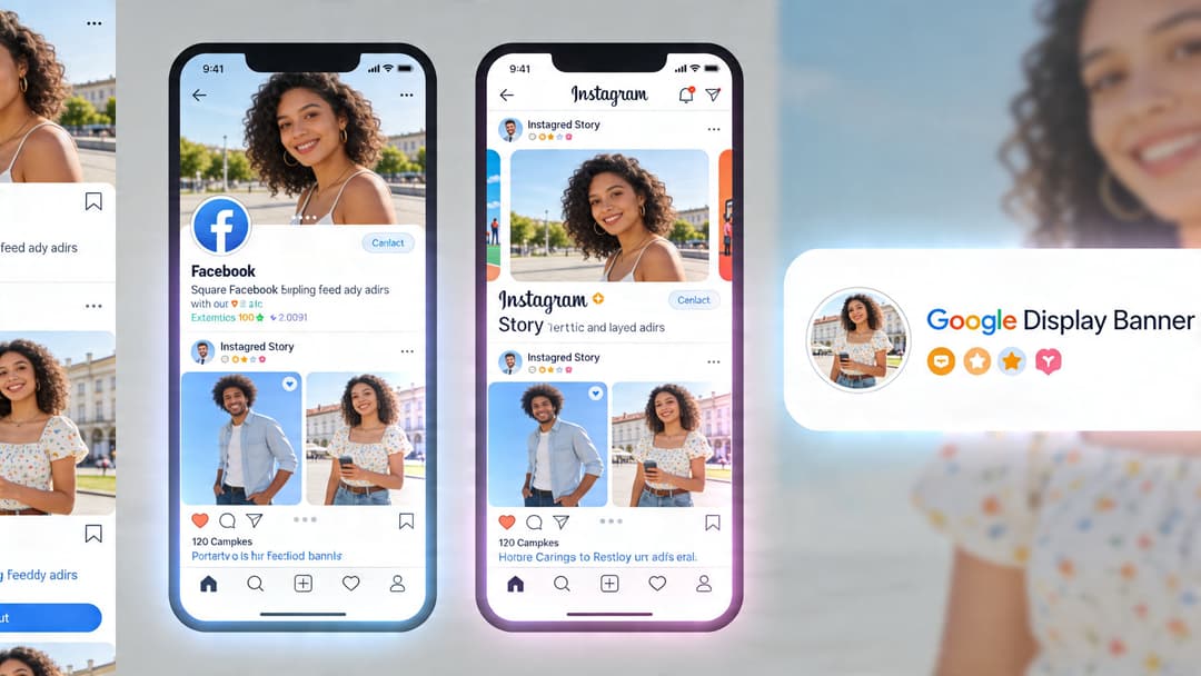
Adapting Your Layout for Different Ad Platforms
One of the fastest ways to waste spend is to treat placement adaptation like resizing. It isn’t. A square feed ad, a vertical Story ad, and a display banner each ask the user to process the message in a different viewing context.
Meta feed versus Stories
In a feed placement, users usually encounter the creative surrounded by other posts, comments, and distractions. The layout has to win fast and stay readable at small sizes. That usually means fewer elements, stronger contrast, and cleaner text placement.
Stories and Reels are different. They fill the screen, which gives you more room but also raises the standard. A weak full-screen layout feels even weaker because the user can dismiss it instantly. Vertical formats need larger visual anchors, cleaner text zones, and tighter sequencing.
A practical approach involves considering:
- Feed ads: compact hierarchy, fast comprehension, visual-first stop
- Story and Reel ads: immersive framing, stronger vertical stacking, clearer safe zones
- Desktop placements: more room, but often lower tolerance for clutter because side-by-side page elements compete for attention
If you’re building specifically for vertical placements, this Instagram Stories format guide helps map creative decisions to the format instead of retrofitting square assets later.
Display standards still matter
Even if your main focus is Meta, display logic is useful because it forces discipline around constraints. The IAB standard sizes 300×250, 728×90, and 160×600 remain important because they improve cross-publisher compatibility, and standard sizes like 300×250 and 728×90 can reduce load errors by up to 40%. Strategic ad placement just after the initial content can boost viewability by 20-30%, according to Playwire’s ad layout optimization analysis.
That’s relevant for social teams because platform constraints should shape the system you build. If your creative process only works when a designer manually redoes every layout, it won’t scale.
Here’s a simple comparison:
| Placement type | Layout priority | Common mistake |
|---|---|---|
| Meta square feed | One strong focal point with short text support | Shrinking a complex desktop concept |
| Meta vertical Story/Reel | Large visual anchor and strong top-to-bottom flow | Reusing square creative with cramped text |
| Display banner | Extreme clarity within fixed dimensions | Trying to cram a full social ad into banner space |
After the format strategy is clear, it helps to watch how creative pacing changes in motion placements:
Build modularly, not one-off
The scalable approach is to create a layout system with reusable rules. Keep the core message, visual logic, CTA treatment, and brand cues consistent. Then adapt composition by placement.
That’s different from cloning one asset into every ratio. Native-looking creative usually outperforms resized creative because it feels designed for the environment rather than forced into it.
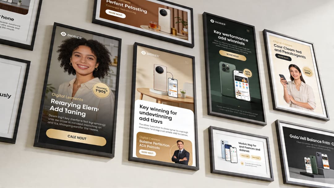
Real-World Examples of Winning Ad Layouts
Theory gets clearer when you look at actual ad types. The layouts below aren’t “templates” in the rigid sense. They’re repeatable structures that fit different business models.
DTC product ad
A skincare brand runs a prospecting ad in Meta feed. The winning layout usually starts with the product large in frame, not tiny in a lifestyle scene. The headline sits high and makes one promise. The CTA is visible without fighting the product shot.
What often improves this type of creative is angle choice. An upward camera angle can make the product feel more luxurious and powerful, while a downward angle can make it feel more portable or user-controlled, as discussed in Kolenda’s review of vertical angles in advertising.
That sounds subtle, but subtle framing choices change perception fast in-feed.
Why it works
- Product visibility is immediate
- The promise is simple enough to process quickly
- The CTA closes the gap between interest and action
What usually breaks it
- Too many ingredient callouts on the image
- Tiny packaging floating in a busy lifestyle background
- Beauty-first composition with no conversion path
B2B SaaS lead gen ad
A B2B SaaS layout works differently. The product UI can help, but the user usually needs a business outcome before caring about the software itself.
A strong SaaS lead-gen layout often puts the pain point or result at the top, uses a cropped UI panel as proof, and keeps the CTA direct. Instead of “Learn More” carrying the ad, the layout frames a concrete reason to click. Think pipeline visibility, lead routing clarity, or reporting speed.
For additional visual references on platform-native concepts, this set of Facebook ad design examples is useful.
Don’t let screenshots dominate unless the UI itself is the hook. Most of the time, the business outcome should lead and the interface should support.
Mobile app install ad
App install layouts win when they show the in-app experience clearly and remove ambiguity. If the user can’t tell what the app does in a glance, the ad is already behind.
A practical app layout usually includes:
- A bold app-use visual that shows the product in context
- A short outcome-led line that explains why the app matters
- A clear install action that feels native to the platform
The mistake here is over-branding. App teams often load the frame with logos, badges, and text overlays. That can make the creative look official, but it also makes it harder to understand.
Across all three examples, the pattern is consistent. Winning layouts don’t try to communicate everything. They choose a path, guide the eye, and make the click feel low-friction.
How to A/B Test Your Way to the Perfect Layout
There isn’t a perfect layout waiting to be discovered once. There’s a testing system that keeps finding better versions.
That distinction matters because “best practices” are only a starting point. A layout that works for a DTC supplement brand may fail for a B2B workflow tool, even if both follow the same design rules. Audience familiarity, offer type, and feed context all change how people respond.
Test structure before micro-details
Teams often test too small, too early. They swap a button color or rewrite a headline while keeping the overall composition untouched. That can help, but it won’t rescue a layout that’s inherently weak.
Start with larger layout questions:
- Primary focal point: product-first versus person-first
- Text position: top-led message versus center overlay
- CTA treatment: integrated into the composition versus isolated
- Information density: stripped-back variant versus proof-heavy variant
After a structural winner appears, then test micro-optimizations inside that framework.
Privacy changes have made this more important. With reduced signal quality, viewability has dropped 15% year-over-year in major markets as of 2026, and layouts that avoid top and bottom placements where users scroll past can increase exposure by up to 50%, according to Freestar’s discussion of ad layout and viewability.
When exposure quality gets less predictable, layout becomes one of the few levers you still control directly.
Keep the test clean
A clean layout test changes one variable cluster at a time. If you alter the offer, audience, and composition all at once, you won’t know what caused the result.
A practical rhythm looks like this:
| Test stage | What to vary | What to hold steady |
|---|---|---|
| Round 1 | Overall composition | Offer, audience, copy angle |
| Round 2 | Headline placement or visual crop | Winning structure from round 1 |
| Round 3 | CTA treatment, badges, proof elements | Same message and layout family |
If you want a good framework for experiment hygiene, this guide to A/B testing best practices is a solid reference.
For teams managing larger creative matrices, this overview of what A/B testing means in marketing workflows is also useful. One platform in that workflow category is AdStellar AI, which assembles multiple creative, copy, and audience combinations for Meta and ranks performance against goals like ROAS, CPL, or CPA.
The goal isn’t to prove your favorite layout right. It’s to make the account smarter after every test.
Optimize for learning, not only for winners
Some tests won’t produce a huge immediate gain. They still matter if they reveal what your audience ignores, what they respond to first, and how much information they’ll tolerate before bouncing.
That’s how you build a scalable creative system. Not by searching for one magic ad, but by turning layout decisions into repeatable learnings.
An Actionable Checklist for Building and Evaluating Ad Layouts
Before any new ad goes live, run it through a short review. This catches most expensive layout mistakes early.
Pre-launch layout checklist
- Start with the goal: Is this layout built for clicks, leads, purchases, or installs? A lead-gen ad and a catalog-style product ad shouldn’t structure attention the same way.
- Identify the focal point: Can you name the first thing the user will notice in one second? If not, the layout is too crowded.
- Check message order: Does the eye move naturally from visual to promise to action?
- Review headline placement: Is the main value proposition easy to spot at a glance?
- Trim unnecessary elements: Remove anything that doesn’t help comprehension or trust.
- Inspect CTA visibility: Does the action stand out clearly from the rest of the frame?
- Protect readability: Is text easy to parse on mobile without zooming or squinting?
- Adapt to placement: Does this creative feel native to feed, Story, Reel, or display, or does it look resized?
- Balance branding: Is the brand present enough to create trust without overpowering the ad?
- Prepare test variants: Are you launching at least a few meaningful layout variations instead of a single “approved” concept?
Final review questions
Use these as a last pass before launch:
- What does this ad want me to notice first?
- What makes the next step obvious?
- What can be removed without hurting conversion intent?
- Would this still make sense to a cold audience seeing it for the first time?
A good layout of advertisement doesn’t need to look complicated. It needs to feel easy to process and easy to act on.
If your team is producing lots of Meta creative and wants a faster way to generate, launch, and evaluate layout variations, AdStellar AI is built for that workflow. It helps teams assemble multiple ad combinations, push them live, and use performance data to identify which creative structures deserve more spend.