You're probably looking at a feed full of competent ads that all blur together. Same cropped product shot. Same soft-gradient background. Same “Shop now” button trying to carry the whole campaign. That's usually the moment marketers start asking for “more creative,” when what they need is stronger pattern interruption.
That's where creative print ads still have a lot to teach. Print had to solve stopping power before scroll behavior existed. A magazine ad got one static frame, no motion, no retargeting, no autoplay, and still had to make someone pause. The best art directors learned to win with shape, silence, surprise, physical interaction, and ruthless clarity.
That old-school discipline matters now because digital buyers don't reward decoration. They reward ads that get noticed, understood, and acted on. Print has also kept more performance value than many digital-first teams assume. One industry roundup reports an average 9% response rate for print advertising versus about 1% for email, paid search, and social media, while also citing 82% of consumers trusting print ads most when making purchase decisions and a 112% return on investment in the same roundup, all of which helps explain why the format still matters for action-focused campaigns in major markets (print advertising response and trust figures).
The useful move isn't to romanticize magazines. It's to reverse-engineer what made classic creative print ads work, then rebuild those ideas as variables you can test on Meta, TikTok, display, landing pages, and direct mail. Treat each print concept like a creative system, not a one-off art piece. That's how you turn inspiration into iterations that can scale.
1. Die-Cut and Shaped Print Ads
A rectangular ad has to work harder because it looks like every other ad. Die-cut print gets an unfair advantage by changing the object itself. A bottle-shaped insert for Coca-Cola, a shoe-shaped piece for Nike, or a record-inspired promo for Spotify doesn't just communicate the product. It becomes a physical shorthand for the brand.
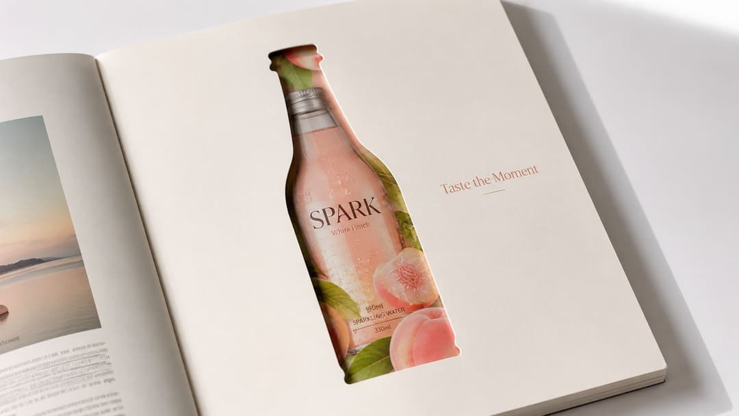
The strategic principle is simple. Form can carry the message before copy does. In digital, that translates well to cropped frames, shaped masks, silhouette-led layouts, and unconventional aspect-ratio compositions that break the feed's visual rhythm.
What to borrow for digital
If you're adapting this idea for Meta, don't just make the ad “look print.” Build tests around containment and silhouette.
- Shape as the hook: Use the product outline as the first visual read. Think bottle silhouette, sneaker sole, lipstick bullet, or jar profile.
- Frame-breaking layout: Let the product push outside the safe grid so the composition feels less template-driven.
- Message-match shape: If the shape doesn't reinforce the benefit, it becomes craft for craft's sake.
A shaped print ad works when the shape makes the promise faster. Heinz can get away with a tomato-bottle visual because the product truth and visual metaphor are tightly aligned. A random custom cut for a SaaS brochure usually doesn't earn the production cost.
Practical rule: If you can remove the special shape and the idea still reads exactly the same, the shape is ornamental.
For digital teams, this is one of the easiest print principles to test. Run a clean baseline static, then create a silhouette-led variant, a frame-break variant, and a shaped-background variant. You're not testing “creativity” in the abstract. You're testing whether altered visual form improves stop power without hurting comprehension.
2. Augmented Reality Print Ads
AR print is one of the few formats that bridges print credibility and digital interaction. A lookbook that reveals a 3D model, a beauty ad that triggers a virtual try-on, or a brochure that opens an immersive product demo turns a static page into a measurable touchpoint.
A luxury brochure with a scan prompt makes that bridge obvious.
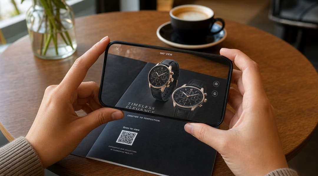
The reason this matters now is measurement. Print performance often has to be reconstructed from downstream actions, not click logs. Teams can instrument campaigns with unique URLs, vanity phone numbers, and offer codes to attribute performance by publication, placement, or segment (print attribution methods for offline campaigns). AR gives you another bridge variable: scan behavior.
What makes AR worth it
AR fails when it's just a novelty layer on top of a weak message. It works when the scan completes the pitch.
IKEA-style visualization is useful because it answers a buying question. L'Oréal-style try-on concepts work because they reduce uncertainty. Pepsi-style celebrity or entertainment overlays can work too, but they're usually stronger for awareness than direct response unless the interaction leads somewhere concrete.
For digital translation, think less about “building AR” and more about designing scan-to-experience pathways:
- Clear trigger: The print asset needs an obvious reason to scan.
- Fast payoff: The post-scan experience should answer curiosity immediately.
- Measurable next step: Product page visit, add-to-cart, lead form, store locator, or booking flow.
If you already run rich media advertising formats, AR print should feel familiar. The principle is the same. Use interactivity to deepen intent, not to show that the brand owns a flashy tool.
Later-stage teams can also repurpose the same concept into paid social. The print ad becomes the teaser. The mobile experience becomes the conversion layer. That makes the print piece part of the funnel instead of a standalone stunt.
A short demo often sells the idea better than a description.
3. Minimalist and Negative Space Print Ads
Minimalism is often misunderstood as a luxury aesthetic. It's really a decision to remove anything that competes with the core idea. Apple did this for years with product-led layouts. High-end watch and fashion brands still use huge fields of white space because emptiness can signal confidence when the brand and message are strong enough.
There's also a memory reason to study it. A controlled three-study experiment in the Journal of Marketing found that print ads produced stronger encoding and engagement than digital ads during exposure, with greater activation in the hippocampus and parahippocampal regions for print; one week later overall recognition was similar, but participants remembered the context of print ads better (Journal of Marketing study on print and digital ad encoding). That matters because minimalist print often leans heavily on context and disciplined visual focus.
Where minimalist ads go wrong
Most brands don't fail at minimalism because they used too little. They fail because they removed the wrong thing. They strip away explanation before the audience understands the premise, or they rely on brand equity they haven't earned.
For digital adaptation, minimalism is best treated as a set of layout hypotheses, not an identity statement. Test:
- Visual-to-copy ratio: Product-dominant versus headline-dominant.
- Headline position: Top, center, or low-anchor.
- Contrast strategy: Clean white field versus bold single-color block.
The craft side matters too. If your team wants to sharpen static ad composition, studying ad layout fundamentals is more useful than copying luxury campaigns blindly.
Less only works when the remaining element carries enough meaning.
On Meta, minimalist concepts often win when the product has strong visual recognition, the offer is easy to parse, or the audience already has category awareness. They usually struggle when the product needs education, the claim is unfamiliar, or the brand is still unknown. In those cases, clarity beats elegance.
4. Multi-Sensory Print Ads
Print can do something digital still can't replicate directly. Scent strips, textured varnishes, embossed surfaces, thermochromic inks, and tactile inserts create a physical memory trace that screens can only suggest. Fragrance brands have used this forever, but the idea extends far beyond perfume.
Axe or Febreze-style scent inserts are obvious examples. So are restaurant mailers that reveal an image with heat, packaging inserts with textured finishes for skincare, or premium automotive brochures with materials that mimic leather or brushed metal. These aren't just premium flourishes. They help the product claim feel physically plausible.
The real trade-off
Sensory effects make a stronger first impression, but they also create more ways to annoy people. An overwhelming scent can backfire. A rough texture can feel gimmicky. A thermal reveal that doesn't work instantly turns delight into frustration.
Use sensory design only when the sense itself supports the offer. If the product promise is freshness, softness, warmth, craftsmanship, or material quality, multi-sensory print can reinforce it. If you're advertising HR software, adding scent won't rescue the brief.
For digital marketers, the useful translation is indirect. You can't ship scent through a feed ad, but you can borrow the same mechanism:
- Suggest touch through macro detail: Fabrics, finishes, texture closeups.
- Suggest transformation through reveal: Before-and-after sliders, peel animations, heat-map style transitions.
- Suggest immersion through sound-led UGC: Product use, ambient texture, ASMR-style interaction.
The print lesson is that sensation can be the message. In paid social, that usually means showing texture, friction, compression, liquid movement, or physical result, not just the pack shot.
5. Data Visualization and Infographic Print Ads
Not every print ad needs to be a visual joke. Some of the best B2B and thought-leadership ads win because they teach. A sharp infographic spread in a business magazine can do two jobs at once: communicate expertise and pre-frame the reader for a deeper conversion path.
That approach matters because the print market hasn't disappeared. One market forecast puts the global print advertising market at $46.23 billion, with newspaper advertising estimated as the largest segment at $33.35 billion, while another source projects U.S. print advertising expenditure at $8.0 billion in 2026 (print advertising market size and expenditure projections). In other words, serious brands still buy print space. Many of them use it to carry denser, authority-building messages that would get ignored in a display banner.
What strong infographic ads do
They don't dump charts onto a page. They stage information so one insight pulls the reader into the next one. That's why HubSpot, Tableau, Salesforce, Adobe, and consulting brands often use editorial-style data stories rather than classic ad layouts when speaking to professional audiences.
For digital translation, this is a sequencing problem. Don't ask one static asset to carry every proof point. Break the concept into a creative family:
- Hook frame: One counterintuitive chart or sharp statement.
- Proof frame: A second asset with a visual explanation.
- Conversion frame: Lead magnet, webinar, report download, or demo CTA.
When you analyze which parts of a dense creative do the heavy lifting, winning ad element analysis becomes more useful than broad aesthetic debate. Sometimes the chart is the hook. Sometimes the headline is. Sometimes the strongest performer is the stripped-down version that keeps only one data story.
For print, keep the hierarchy clean and the citation visible. For digital, distribute the density across multiple assets and retarget based on who engaged with which argument.
6. Gatefold and Dimensional Pop-Up Print Ads
A gatefold or pop-up ad buys something that flat media rarely gets. Dwell time with intent. When someone unfolds a Dior insert, opens a dimensional travel brochure, or interacts with a pop-up car reveal in a premium mailer, they aren't glancing. They're participating.
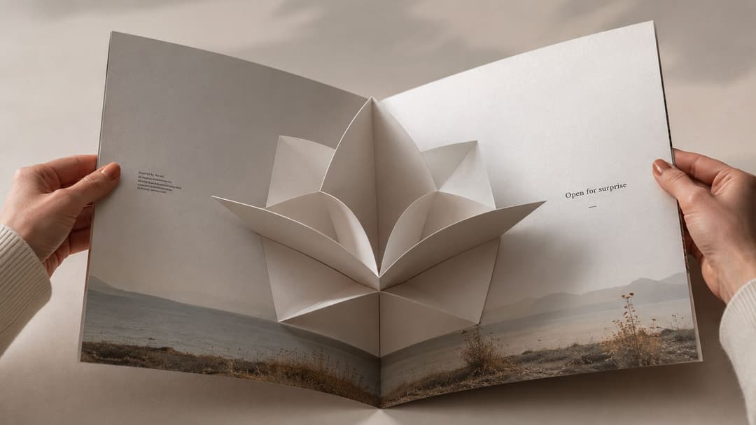
That's why these executions often work best in luxury, hospitality, publishing, auto, and event marketing. The mechanism itself communicates value. A resort brochure that opens into a layered scene says “escape” before the reader hits the body copy.
How to adapt the dimensional idea
The mistake is treating dimensionality as the whole concept. The fold should reveal meaning, not just more surface area.
A good gatefold creates sequence. The closed state creates curiosity. The open state resolves it. That maps neatly onto digital:
- Teaser to reveal carousels
- Tap-to-expand product demos
- Landing pages with staged scroll reveals
- Short-form videos where the product opens, unfolds, or transforms
If the second state doesn't increase understanding, the fold is just theater.
For performance work, the digital version of a pop-up ad is often a progression-based asset set. Use one ad to create incomplete information. Use the next to reveal the mechanism, proof, or offer. This works especially well for products with hidden features, expandable functionality, or layered benefits.
Dimensional print also gives creative teams excellent production material. Film the interaction. Use the hand movement, the unfolding moment, and the reveal sequence as content for paid social. The physical piece can become the raw asset library for multiple video variations.
7. Hyper-Personalized Print Ads
Variable data printing changed direct mail from broad targeting to individual relevance. A piece that includes a customer's name, local store, product recommendation, unique code, or past purchase category doesn't feel like mass media. It feels like a deliberate prompt.
That's why this format is still useful for retention, win-back, high-value offers, and account-based outreach. A streaming brand can personalize creative by genre interest. A bank can adjust messaging by customer segment. A B2B team can customize a leave-behind with the prospect's company name, industry pain point, and a customized landing page.
Personalization that helps versus personalization that creeps
Use the data point that makes the message more useful. Don't stack every available field into the creative just because you can.
Good print personalization usually follows one of three patterns:
- Identity personalization: Name, city, company, role.
- Behavior personalization: Past category interest, recent lapse, account status.
- Offer personalization: Unique code, custom landing page, segment-specific incentive.
Print is especially strong when paired with trackable response paths. Unique URLs and codes matter here, and so does thoughtful packaging. Something as simple as a custom label or American-made custom decals can help turn a personalized piece into something recipients keep instead of toss.
For digital teams, this principle is already familiar. Dynamic product ads, localized hooks, and segmented headlines all come from the same logic. The useful extension is creative modularity. Build components that can swap by audience without rebuilding the whole ad.
If you're already experimenting with personalised engagement banners, print-style variable data thinking can sharpen your segmentation discipline. The lesson from direct mail isn't “personalize everything.” It's “personalize the one thing that changes action.”
8. Interactive and Puzzle-Based Print Ads
Some ads shouldn't be understood instantly. That sounds heretical in performance circles, but puzzle mechanics can work when the reward is built into the solve. Hidden-object ads, guess-the-song prompts, visual riddles, and scavenger-style print inserts increase dwell time because the audience has to complete the experience.
Lego-like visual inference, Spotify-style lyric or track prompts, and search-based catalog concepts all use the same engine. They make the reader participate in meaning. That participation creates a small internal payoff, and that payoff transfers to the brand.
Where this format fits
Puzzle-driven creative isn't for every category. If you sell an urgent need or a low-consideration impulse product, friction can kill response. But for entertainment, culture, education, nonprofit awareness, travel, and certain premium retail categories, interaction can be the point.
Current guidance on print creative often highlights storytelling, white space, interactivity, QR codes, and strong CTAs, but it rarely answers the practical performance question of how to prove a print ad worked beyond vanity metrics (gap in measuring modern print ad effectiveness). Interactive print makes that gap more obvious, which is why the digital handoff matters so much.
Use puzzle mechanics only if the solve leads somewhere measurable:
- QR reveal to a landing page
- Answer submission for offer access
- Scan for the full collection
- Access content after completion
In digital, this becomes quiz ads, swipe-to-reveal cards, comments-based prompts, or short-form videos with delayed payoff. The strongest versions don't ask users to work hard for nothing. They make the act of solving feel like proof that the brand understands its audience.
9. Provocative and Controversy-Driven Print Ads
Provocation can work, but most brands overestimate their right to use it. Bold political or cultural positioning, confrontational headlines, and issue-based creative can cut through instantly. They can also misfire if the brand hasn't earned the stance, or if the campaign asks audiences to applaud rhetoric with no operational follow-through.
Nike, Gillette, Benetton, PETA, and Patagonia all sit somewhere on this spectrum. The common factor isn't shock for its own sake. It's a willingness to choose a side visibly, then accept that some response will be negative.
The test before you launch
Ask a blunt question. If this ad gets criticized tomorrow, what real-world action makes the criticism survivable?
That's the line most brands miss. A provocative print ad without organizational alignment becomes a social media crisis disguised as creative bravery. A controversial ad backed by policy, product, donations, sourcing choices, or long-term positioning can become a credible brand statement.
For performance marketers, this concept is best tested in controlled layers. Start with message-edge variation, not maximum outrage. A sharper claim, a more direct challenge, a stronger point of view. Then monitor not just click behavior, but qualitative response, comment themes, and downstream conversion quality.
Creative boldness in social needs design discipline too. The message has to read instantly, which is why teams working on sharper point-of-view campaigns should spend time on Facebook ad design decisions, not just copy tone.
Strong provocation narrows the audience on purpose. Weak provocation alienates people by accident.
If you need broad efficiency, this probably isn't your default format. If you need cultural distinction and brand meaning, it can be.
10. Newsprint and Native Advertorial Print Ads
Native print works because it borrows editorial attention patterns. A page designed like a thought-leadership article, industry analysis, or executive commentary invites a different reading mode than a standard display ad. The audience leans in because the content promises value before it asks for action.
This is especially relevant for B2B, healthcare, finance, enterprise software, and professional services. A conventional ad often can't carry enough nuance. An advertorial can. That's why firms like McKinsey and BCG, publication-sponsored content programs, and business media inserts still use editorial framing when the sale depends on credibility.
Why native works when banners don't
People don't reject ads only because they're ads. They reject thin messages. Native print succeeds when it gives the reader a legitimate reason to continue, whether that's an insight, a framework, a benchmark, or a viewpoint that helps them do their job.
There's also a modern direct-response angle here. Existing advice on print often stresses simplicity, legibility, concise copy, and QR codes, but it doesn't fully resolve the trade-off between originality and response efficiency for performance-led teams adapting print ideas to digital-first behavior (gap in modern direct-response guidance for print-style ads). Advertorial thinking helps because it starts with utility, not decoration.
For digital translation, borrow the editorial shell without faking journalism:
- Use article-style headlines with a real point
- Lead with information, not self-praise
- Preserve clear sponsored labeling
- Offer a next step that matches the depth of the content
Native-style ads often outperform standard creative when the buyer needs education before action. They usually underperform when the category is simple and the offer is already obvious. If your product needs trust, context, and explanation, this format earns its keep.
10 Creative Print Ad Types Compared
| Ad Type | Implementation Complexity | Resource Requirements | Expected Outcomes | Ideal Use Cases | Key Advantages |
|---|---|---|---|---|---|
| Die-Cut and Shaped Print Ads | Medium, custom tooling and layout | Higher production cost, premium placements, longer lead times | Higher engagement, longer dwell time, strong brand recall | Premium product launches, differentiated branding, creative A/B tests | Distinct tactile form, standout visibility, shape as testable variable |
| Augmented Reality (AR) Print Ads | High, development, integration, QA | AR/app development, analytics, ongoing content updates | Trackable digital engagement, first‑party data, richer interactions | Catalogs, product try‑ons, campaigns needing attribution | Measurable interactions, scalable digital experiences, rich analytics |
| Minimalist / Negative Space Print Ads | Low–Medium, disciplined design | Low production cost (premium stock optional) | Clear messaging, fast comprehension, improved readability | Premium branding, simple product promotion, high‑volume placements | Cost‑efficient, highly testable, stands out in clutter |
| Multi‑Sensory Print Ads (Scent, Texture, Temperature) | Very High, specialized techniques and QA | Specialized printing partners, higher costs, limited shelf‑life | Exceptional engagement and emotional recall, PR lift | Fragrance, food & beverage, luxury experiences, high‑value placements | Deep sensory memory, high shareability, justifies premium positioning |
| Data Visualization & Infographic Print Ads | Medium, data storytelling + design | Data sources/analysts, strong design, periodic updates | Increased credibility, longer engagement, lead generation | B2B thought leadership, research campaigns, SaaS brand authority | Positions brand as authority, testable narratives, informative value |
| Gatefold & Dimensional / Pop‑Up Print Ads | Very High, structural engineering and testing | Complex assembly, specialized partners, long lead times | Exceptional dwell time, memorable experience, organic sharing | Luxury campaigns, product launches, hand‑delivered collateral | Immersive tactile interaction, unboxing appeal, high recall |
| Hyper‑Personalized Print Ads (Variable Data Printing) | Medium–High, data integration & templating | Clean customer database, VDP systems, tracking infrastructure | Higher response rates, improved ROI, precise attribution | Direct mail, retention, high‑LTV customer outreach | One‑to‑one relevance at scale, measurable personalization lift |
| Interactive / Puzzle‑Based Print Ads | Medium, game design and UX | Quality design, QR/landing integration, incentive mechanics | High engagement/time‑on‑ad, social sharing potential, measurable actions | Engagement campaigns, gamified lead gen, awareness drives | Active participation, measurable engagement signals, viral potential |
| Provocative / Controversy‑Driven Print Ads | Medium, strategic risk management | Creative strategy, stakeholder alignment, PR readiness | Strong earned media and attention; polarizing brand effects | Brand positioning, awareness for values‑driven brands | High organic reach, strong differentiation, memorable positioning |
| Newsprint & Native / Advertorial Print Ads | Low–Medium, editorial caliber content | High‑quality journalism/writing, editorial design, labeling compliance | Higher trust and read‑through, effective lead generation in B2B | Thought leadership, B2B campaigns, content marketing | Editorial credibility, improved read‑through, subtle persuasion |
From Print Inspiration to Campaign Execution
The useful lesson from creative print ads isn't nostalgia. It's discipline. Print forced creatives to make one frame do more work. No endless edits after launch. No motion to rescue a weak idea. No lazy assumption that targeting would carry the ad. The strongest concepts had to stop attention, communicate quickly, and leave a durable impression.
That's exactly why these ideas still matter for paid social. Die-cuts teach you to test form, not just message. Minimalist ads teach you to remove visual noise until the core proposition becomes obvious. Multi-sensory executions remind you that people respond to felt experience, even when you have to simulate that experience through video, texture, and close-up detail. Interactive and puzzle-based ads show when friction increases engagement and when it kills response. Native and data-led layouts prove that some audiences want substance, not just sparkle.
The big shift is measurement. Creative teams used to study print mainly for art direction. In 2026, the smarter move is to study print for variable design. Every classic concept can become a test matrix for digital: silhouette versus standard crop, reveal versus direct demo, editorial framing versus sales framing, personalized headline versus generic headline, sparse layout versus dense proof layout. That turns “make it more creative” into something media buyers and designers can act on.
Print also fits better into modern funnels than many teams admit. QR codes, unique URLs, offer codes, custom landing pages, and downstream attribution make print more measurable than the old reputation suggests. That matters if you're combining direct mail, event collateral, retail handouts, or publication placements with paid social follow-up. It also matters if you want to connect tactile brand moments with digital conversion paths, which is part of why experience-led campaigns and how to boost ROI with immersive events now sit much closer to performance strategy than they used to.
A platform like AdStellar AI can help on the digital side of that translation. If your team wants to turn one print-inspired concept into many static variations, segmented messages, and testable layouts for Meta, a system that generates, launches, and compares those combinations can reduce manual production work. That doesn't replace strategy. It makes strategy easier to operationalize.
The best way to use print inspiration is simple. Don't copy old ads. Extract the mechanism. Ask what created the stop, the smile, the memory, or the response. Then rebuild that mechanism into formats your team can test, measure, and scale.
If you want to turn print-inspired concepts into live Meta experiments faster, AdStellar AI is built for that workflow. It helps teams generate creative variations, launch campaigns in bulk, and analyze which layouts, messages, and audience combinations are driving results.