From Ad Creative Chaos to Campaign Clarity
You've got a product that should sell. The audience definition looks solid. The landing page is acceptable. Yet performance stalls because the campaign itself is fragmented. One static ad for prospecting, one rushed video for retargeting, one carousel someone on the team built in Canva at midnight, and no clear logic connecting any of it.
That's the trap. Teams aren't typically short on ideas. They're short on systems. They launch one-off creatives, react to yesterday's results, and spend too much time inside Ads Manager trying to reverse-engineer why one ad held attention while the next one died on arrival. The result is familiar: flat CTR, unstable CPA, creative fatigue, and a lot of internal debate with very little learning.
A good campaign ad example should do more than look polished. It should reveal the structure behind performance. That means matching format to funnel stage, message to audience intent, and testing plan to the KPI that matters for the objective. That's the difference between creative production and campaign architecture.
This list focuses on that architecture. You'll get eight campaign ad example breakdowns with practical guidance on messaging, KPIs to watch, tests worth running, and tactical notes for recreating and scaling each format, including ways teams can operationalize variation using tools like AdStellar AI. If you also work with retail or apparel accounts, this complete guide to AI for fashion businesses is a useful companion.
1. Single Image Ads

Single image ads still carry more accounts than many realize. They're fast to produce, easy to refresh, and brutally honest. If the offer is weak or the hook is generic, static ads expose that immediately.
For DTC brands, this format works best when the image does one job well. Product clarity, use-case context, or aspiration. Warby Parker-style product focus, Dollar Shave Club-style benefit framing, and Glossier-style brand aesthetic all fit here, but they don't belong in the same ad. Pick one visual job and let the copy do the rest.
How to build one that can actually scale
A strong single image campaign ad example has a disciplined structure. One primary visual, one obvious promise, one friction-reducing line in the body copy, and one CTA that matches intent. Don't ask static creative to tell your entire brand story. Ask it to earn the click.
Use visual consistency across variants so the account learns from message changes, not random design shifts. If you're rotating many concepts, keep typography, framing, and brand cues stable. This also makes versioning cleaner when your team expands into multiple audience segments.
- Primary KPI: Track CTR for hook strength, CPC for cost efficiency, and downstream conversion rate for message quality.
- Best A/B test: Compare lifestyle imagery against product-only imagery with identical copy.
- Useful variant set: Test one pain-led headline, one benefit-led headline, and one offer-led headline against the same image.
Practical rule: If a static ad needs three design tricks to explain itself, the angle isn't ready.
Creative fatigue hits this format fast, so refreshing the visual system matters. That doesn't always mean a full redesign. Often it's enough to swap crop style, background treatment, or headline framing while preserving the same core promise.
Teams producing static variations at scale should also get dimensions right from the start. Compression and awkward crops wreck good ads. This guide to Facebook ad image sizing is worth keeping in your workflow.
2. Carousel Ads

Carousel ads are where a lot of accounts either get smarter or get messy. The format can tell a story, break down objections, sequence product benefits, or merchandize multiple SKUs. It can also become a dumping ground for every asset in the folder.
Airbnb-style destination progression, Shopify-style feature sequencing, and Slack-style use-case storytelling all work because the card order has intent. The first card earns the swipe. The middle cards build relevance. The final card closes with action.
The sequencing logic most teams miss
The best carousel campaign ad example doesn't treat each card as a mini billboard. It treats the full unit like a landing page in swipe form. Card one should establish the core promise. Cards two through four should answer “why this” and “why now.” The final card should reduce the next-step ambiguity.
This is a strong format for mid-funnel education and retargeting because you can stack proof, features, and category framing without forcing the user onto your site before they understand the offer. It's also useful when one audience has multiple entry points into the product.
One practical example: a SaaS team can open with the problem statement, follow with workflow screenshots, then show customer proof, then end with the demo CTA. A retail brand can open with hero product imagery, follow with feature close-ups, then social proof, then the collection push.
- Primary KPI: Watch CTR, outbound click quality, and card-level drop-off patterns.
- Best A/B test: Compare product-first card order against problem-first card order.
- Scaling move: Build versions by segment, not just by design. Agencies often get better learning from persona-specific sequencing than from color changes.
If you're producing carousels in volume, the fastest wins usually come from changing the first card and the final card before rewriting the entire sequence. For creative operations, this Instagram carousel post guide is a practical reference for building variants efficiently.
Most carousel underperformance starts with a weak first card, not a weak offer.
3. Video Ads
Video is still the fastest way to compress product education, emotion, and proof into one ad unit. It also punishes lazy execution harder than static. If the opening seconds don't establish relevance, the rest of the edit won't matter.
A useful real-world lesson comes from a storytelling video campaign case reported by industry case-study coverage. One example reached more than 5 million people, delivered a 33% higher video-view rate, and recorded $0.02 per video view plus $0.59 per video completion, while also lowering CPM versus direct-response campaigns. That's the key trade-off many performance teams ignore. Storytelling isn't automatically less efficient than hard-sell creative if the narrative is tightly built.
What separates winning video from expensive noise
Good video ads front-load the payoff. Don't save the product for the reveal. Show the use case early, establish the category quickly, and make the first frames understandable with sound off. Hard captions, visual hierarchy, and motion pacing matter more than cinematic polish.
Campaigns in the vein of Grammarly, Native, and Allbirds often work well. The strongest versions are usually simple. Problem. Demonstration. Result. CTA. Fancy transitions don't rescue a vague value proposition.
For performance marketers, the KPI stack should reflect the campaign objective. If the goal is awareness, track hold rate, view rate, and completion behavior. If the goal is conversion, pair those with CTR and post-click performance so you don't overvalue cheap views from weak buyers.
- Primary KPI: Video-view rate for hook strength, completion behavior for message retention, and CTR for click intent.
- Best A/B test: Test the first hook line while keeping the body of the video unchanged.
- Creative rebuild idea: Cut one concept into short, medium, and longer edits, then compare whether brevity or explanation better fits the audience.
When teams want to scale video testing, scripting variation matters as much as visual variation. This automated video ad creation workflow is useful when you need many combinations of hooks, scripts, visuals, and voiceovers without rebuilding every ad manually.
4. Lead Gen Form Ads
Lead gen form ads are boring in the best possible way. They remove one of the biggest leaks in the funnel: the extra click to a landing page that loads slowly, asks for too much, or loses intent before the form appears.
This format is especially useful for B2B SaaS, financial services, consultations, event registration, and any sale where the first conversion is not the final purchase. The ad has one job. Make the exchange feel worth it and friction-light.
Why form ads fail even when CPL looks good
Plenty of teams celebrate low CPL and then complain that sales says the leads are junk. Usually the issue isn't the format. It's the promise. If the ad offers something broad and low-commitment, the form fills fast but intent stays weak.
That's why message specificity matters more than form convenience. Use a headline tied to an actual outcome. Match the creative to the buyer's stage. Then keep the form short enough that people complete it, but not so vague that everyone qualifies.
A strong campaign ad example here often uses one visual tied to the offer, one line of value clarity, and one short descriptor of what happens after submission. “Book a demo” and “Get the worksheet” are not the same lead. Don't build them with the same creative logic.
- Primary KPI: Track CPL, lead quality by CRM stage, and speed to first follow-up.
- Best A/B test: Compare a short educational offer against a direct consultation offer.
- Operational note: Make sure lead routing is immediate. Delayed follow-up can ruin a strong campaign.
For creative support, bottom-funnel proof works well in this format. Marketing guidance from ActiveCampaign highlights case studies as bottom-funnel ad assets because they reduce objection friction, especially for decision-stage audiences.
If your team is building these inside Meta, this Facebook lead generation guide helps with setup and scaling considerations.
The fastest lead form isn't always the best lead source. Tight offers beat broad freebies.
5. Collection Ads
Collection ads are one of the cleanest bridges between prospecting and shopping intent on mobile. They let you pair a lead visual or short video with a row of products that users can browse without immediately feeling pushed into a hard-sell landing page experience.
Nike-style seasonal merchandising, Warby Parker frame exploration, and Fashion Nova-style product discovery all fit naturally here. The format works when the hero asset creates desire and the tiles convert that desire into navigable options.
Where collection ads outperform plain product pushes
Use collection ads when the buyer needs a small amount of guided browsing before choosing. They're ideal for apparel, beauty, accessories, home goods, and any catalog where one hero message can support multiple relevant SKUs.
What doesn't work is treating the lower product tiles like a random feed dump. Merchandising logic matters. Lead with products that best match the audience intent behind the ad. A gifting angle should not open into the same tile order as a new arrivals angle.
For ecommerce teams, this format often performs well when the hero creative sells the category and the product set handles depth. A skincare brand might open with a routine-focused visual, then show cleanser, serum, and moisturizer combinations. A jewelry brand can open with styling imagery, then show rings, hoops, and layered necklaces.
- Primary KPI: Track CTR, product tile engagement, and purchase path quality after the click.
- Best A/B test: Compare lifestyle hero creative against product-close-up hero creative with the same product set.
- Scaling move: Duplicate by merchandising logic. Bestsellers, bundles, seasonal edits, and category-specific collections should each stand on their own.
This format becomes more valuable when your catalog is clean, your product names are readable, and your merchandising team is aligned with paid social. If product feed quality is weak, collection ads expose it immediately.
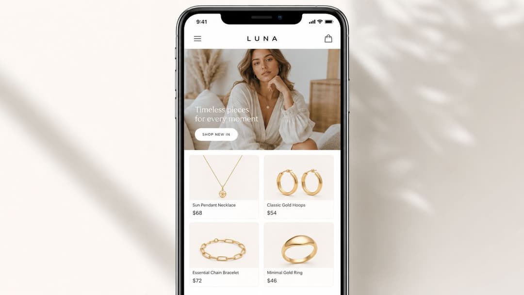
6. Instant Experience Full-Screen Mobile Ads
Some offers need more than a click and less than a full site visit. That's where Instant Experience earns its place. It opens in-app, loads quickly, and gives you a controlled mobile canvas for message sequencing.
This is a strong choice for launches, education-heavy products, and campaigns where the user needs to understand the brand before they're ready to leave the platform. Beauty, consumer tech, premium DTC, and local retail campaigns can all use it well.
Here's a platform example of the format in action:
What makes Instant Experience worth the extra build time
The format gives you pacing control. You can open with a high-impact image or short video, follow with benefit blocks, insert product galleries, and place the CTA after the user has built context. That's useful when your landing page is cluttered or when mobile site speed isn't good enough to support paid traffic.
It's also one of the better places to test inclusive and context-aware creative thoughtfully. General guidance on inclusive marketing often stays abstract, but the critical work is in choosing message elements, visuals, proof points, accessibility details, and image descriptions that feel credible for the audience rather than tokenized. This is especially important for underserved segments, as discussed in this inclusive marketing conversation on accessible and authentic creative.
- Primary KPI: Track click-through into the experience, engagement depth, and downstream conversion behavior.
- Best A/B test: Keep the body structure stable and test different opening hero frames.
- Practical build note: Don't over-design it. A short, focused experience almost always beats a bloated mini-site.
If your product needs explanation, use the screen space to remove one objection at a time.
7. Reels Ads
Reels ads demand a different mindset from standard video. The audience isn't waiting for your pitch. They're swiping through entertainment. If the ad looks like an ad too early, you've already lost.
That's why the best Reels campaign ad example usually feels native first and branded second. Glossier-style behind-the-scenes content, creator-led demos, trend-adjacent edits, and fast visual cuts all work when they preserve clarity. Native doesn't mean vague. It means familiar enough to earn attention.
The tension between trend fit and performance control
A lot of teams either overproduce Reels or chase trends with no strategic filter. Both approaches break. Overproduced ads feel stiff. Trend-chasing without message discipline creates views without business value.
The strongest Reels executions hold three things together at once: a sharp first-second hook, a visible product or use case early, and a CTA that doesn't feel bolted on. Organic-looking footage helps, but only if the message is still legible to a cold audience.
This format is often excellent for top-of-funnel and creative testing. It also becomes a strong retargeting format when you cut creator testimonials, use-case demos, or objection-handling clips into short native edits.
A useful strategic lens comes from recent industry guidance on ad angles. The issue isn't just finding a catchy hook. It's matching problem framing, objection handling, social proof, and specificity to your objective and funnel stage, especially when broad targeting depends on the creative signal to do the heavy lifting, as discussed in this guide to ad angles and creative signal strength.
- Primary KPI: Watch thumb-stop behavior, CTR, and assisted conversion patterns.
- Best A/B test: Test the opening visual pattern before changing the whole script.
- Scaling move: Rebuild winning organic Reels into paid variants with alternate hooks, captions, and CTAs.
8. Dynamic Product Ads DPA and Catalog Ads
Dynamic product ads are where relevance usually beats cleverness. If someone viewed a product, added to cart, or browsed a related category, the fastest path to performance is often a clean reminder with the right item, not a fresh brand concept.
That's why this format remains a staple for ecommerce and large-catalog advertisers. It automates product matching while still leaving room for strategy in audience segmentation, offer framing, and creative overlays.
The real lever is segmentation, not just automation
Many advertisers launch one broad DPA setup and call it done. That leaves money on the table. Cart abandoners, category viewers, and past purchasers should not receive the same message. Their intent is different, so the ad logic should be different too.
A useful data-driven example comes from GreenPal. The company used publicly available demographic data to identify homeowners in East Nashville as more price-sensitive than other local groups, then targeted those zip codes with ads positioning the service as the “cheapest lawn care solution in Nashville,” which reportedly drove more than a 200% lift in click-through rate and a 30% lift in on-page conversion rates. That lesson transfers directly to catalog strategy. Segmentation changes outcomes when the message reflects local or behavioral context rather than broad reach.
For retail accounts, that can mean one DPA stream for discount-sensitive audiences, one for premium repeat buyers, and one for category-specific browsers. The catalog serves the product. Your strategy serves the message.
- Primary KPI: Track return-to-site efficiency, purchase rate by audience segment, and product-level performance concentration.
- Best A/B test: Compare plain product feed creative against product feed plus offer or urgency overlays.
- Operational note: Clean product titles, accurate availability, and audience exclusion logic matter more here than flashy design.
If you're building or restructuring this format, this guide to dynamic display ads and catalog workflows is a useful operational reference.
8-Format Campaign Ad Comparison
| Ad Format | Implementation complexity | Resource requirements | Expected outcomes | Ideal use cases | Key advantages |
|---|---|---|---|---|---|
| Single Image Ads | Very low, quick setup and deployment | Minimal: one high-quality image, basic copy | Broad reach, consistent performance; easy to test but risk creative fatigue | Performance testing, large-scale e-commerce, high-volume campaigns | Low cost, fastest turnaround, simple A/B testing |
| Carousel Ads | Moderate, manage 2–10 cards and sequencing | Multiple images/copy/CTAs, design time per card | Higher engagement and richer insights; boosts interaction vs static | Multi-product showcases, sequential storytelling, DTC & SaaS feature tours | Storytelling across cards, card-level analytics, higher engagement |
| Video Ads | High, production and editing required | Video production, editing, captions, multiple lengths | Highest engagement and conversion rates; strong storytelling potential | Product demos, brand stories, conversion-focused creatives | Top engagement/conversion, repurposable across platforms |
| Lead Gen Form Ads | Moderate, form setup and CRM integration | Form design, CRM/webhooks, data/consent handling | Increased lead volume with lower friction; higher CPL but better lead quality | B2B SaaS, financial services, high-consideration purchase funnels | In-platform capture, pre-filled fields, faster sales follow-up |
| Collection Ads | High, catalog and in-app checkout setup | Product catalog, synced inventory, lifestyle assets | Very high mobile conversion rates; reduced checkout friction | E-commerce & DTC with product catalogs, seasonal launches | Shoppable in-app experience, synced inventory, strong mobile ROAS |
| Instant Experience (Full‑Screen) | High, custom design/development needed | Multimedia assets, interactive design, analytics tracking | Very high engagement and dwell time; better storytelling, slower immediate ROI | Premium brands, high-consideration purchases, immersive campaigns | Fast-loading immersive experiences, rich interaction tracking |
| Reels Ads | High, short-form, trend-driven production | Vertical video, audio selection, rapid creative iterations | Very high reach and engagement; viral potential but rising CPMs | Gen Z-targeted DTC, entertainment, awareness and virality campaigns | Algorithmic boost, sound-on engagement, trend amplification |
| Dynamic Product Ads / Catalog Ads | Moderate–High, feed, pixel and tracking setup | Clean product catalog, server/pixel tracking, product images | Excellent ROAS for e-commerce; personalized remarketing drives conversions | Retailers with many SKUs, cart abandonment and remarketing | Automated personalization at scale, high ROAS, minimal manual creative |
Your Blueprint for High-Performing Ad Campaigns
The biggest mistake I see in campaign planning isn't weak creative. It's format mismatch. Teams use static ads to explain complex products, use long video for low-intent audiences, use lead forms for offers that don't justify a submission, and use catalog ads without segment logic. Then they blame the platform.
The better approach is simpler. Match each format to the job it does best. Single image ads are often your sharpest message test. Carousels help sequence proof. Video compresses education and emotion. Lead gen forms remove friction. Collection ads support guided shopping. Instant Experience gives mobile storytelling room to breathe. Reels win attention when they feel native. Dynamic product ads bring relevance back into the funnel.
There's also a broader campaign lesson in one of the most iconic examples in marketing history. Nike's “Just Do It,” launched in 1988, became more than a single ad. It evolved into durable campaign architecture that could stretch across audiences, media, and product lines while staying anchored to one core promise. That's still the standard. Strong campaigns aren't isolated assets. They're systems built around a message that can sustain variation.
For performance marketers and agencies, that means your KPI plan should sit next to your creative plan from day one. Before launch, decide what each format is supposed to prove. Hook strength. Swipe depth. Form completion quality. Product relevance. Completion behavior. Purchase intent. If the KPI doesn't match the format's role in the funnel, the optimization loop gets noisy fast.
Testing is what turns all of this from theory into an operating model. The most useful tests aren't random. They isolate one variable at a time. Hook. First frame. Card order. Offer framing. Social proof style. Segment-specific message. Once you identify a winner, scale by controlled variation instead of rebuilding from scratch.
That's where a workflow platform can help. If your team is manually assembling every creative and ad set one by one, learning stays slow. A platform like AdStellar AI can fit naturally into this process when you need to generate many combinations of creatives, copy, and audience structures, launch them efficiently, and identify which patterns deserve more spend.
If you take one action after reading this, make it practical. Pick one format that matches your current bottleneck. Build three to five disciplined variations. Track the right KPI. Then scale only what proves its role in the funnel. If you also manage marketplace or beauty accounts, these Amazon advertising examples for beauty brands can help you extend the same campaign thinking beyond paid social.
If your team needs to produce and test campaign variations faster, AdStellar AI is built for that workflow. It helps marketers generate creative, copy, and audience combinations in bulk, launch them into Meta more efficiently, and use performance signals to identify which campaign ad examples are worth scaling.