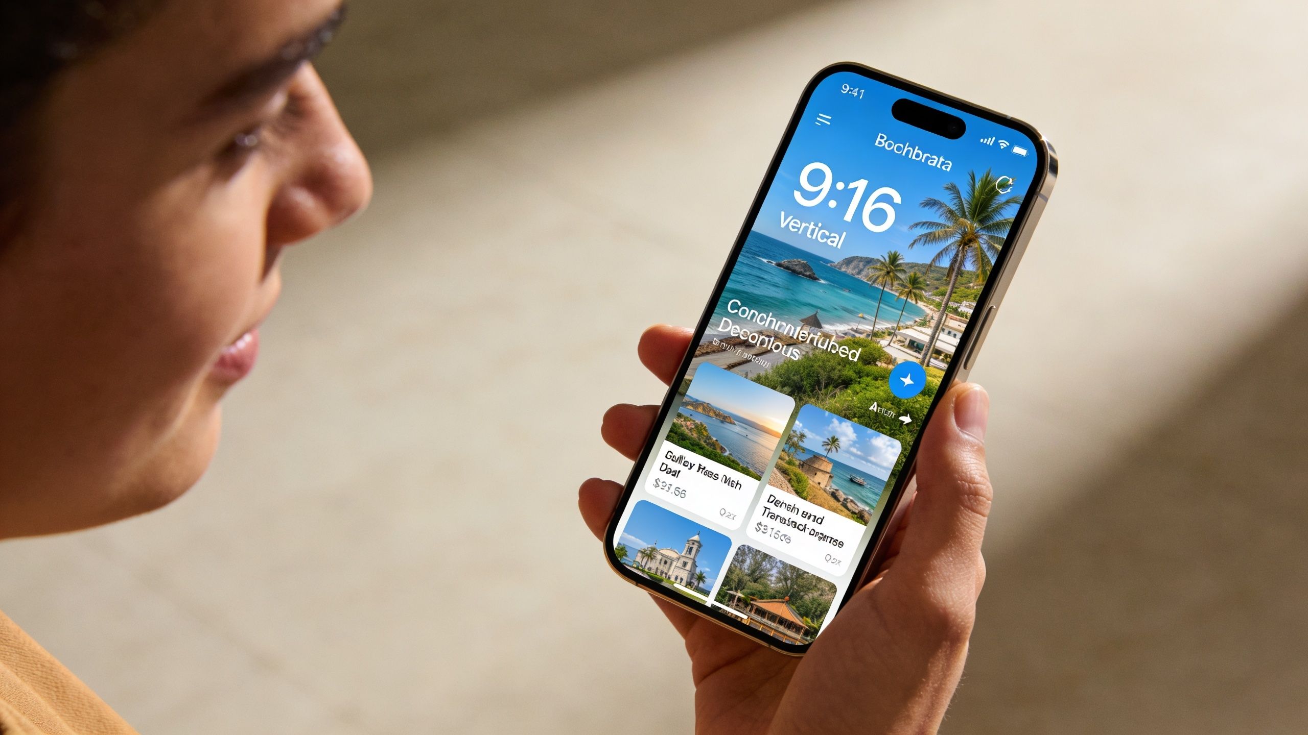
For most feed campaigns, use 1:1 at 1080×1080 or 4:5 at 1080×1350, and if you want the highest-quality version for feed placements, upload 1440×1440 or 1440×1800. If you're building one flexible standard for the widest range of Facebook feed inventory, start with square. If you're optimizing for mobile feed performance, 4:5 is usually the stronger choice.
A lot of marketers land on this question after a familiar failure. The campaign is live, targeting is clean, budget is fine, copy is acceptable, but performance drags. Or worse, the ad gets cropped awkwardly, looks soft in placement previews, or underdelivers because the creative doesn't fit the surface where Meta wants to show it.
That's why image size for facebook ad work isn't a design detail. It's a buying lever. The right dimensions help the creative occupy more usable space, render cleanly, avoid avoidable delivery issues, and support lower-friction scaling across placements. The wrong dimensions create waste before the algorithm even has a fair chance to judge your offer.
Why Your Facebook Ad Image Size Is Costing You Money
The expensive part isn't just rejection. It's silent underperformance.
A Facebook image ad can technically run while still being poorly matched to the placement where Meta serves it. That mismatch shows up as awkward crops, compressed visuals, tiny product details, or text pushed into areas that users skip past. Media buyers often diagnose those as weak creative, weak audience, or offer fatigue when the first issue is simpler. The asset wasn't built for the job.
Each placement has a different job
Feed ads need to stop a scroll. Marketplace ads need to look like credible product inventory. Stories need to feel native to a full-screen mobile environment. Right column placements survive on simplicity because the visible area is small. One image ratio won't do all of that equally well.
That matters if you care about efficient acquisition. Teams that focus on client acquisition using Facebook ads usually learn fast that a clean funnel starts with a clean impression. If the visual looks cramped or distorted, the rest of the system has to work harder.
Practical rule: If the image looks like it was resized after the fact instead of composed for the placement, expect weaker click quality.
Image specs also affect operating efficiency. When your team is launching multiple variants, inconsistent dimensions create review friction, render unpredictably across placements, and make it harder to compare results accurately. Cost control starts earlier than bidding strategy. It starts with asset discipline.
For anyone modeling media efficiency, the downstream effect becomes obvious once spend scales. That's why creative QA belongs in the same conversation as auction economics and Facebook ads cost benchmarks. A cheap CPM doesn't help if the asset wastes the impression.
Compliance is optimization, not admin
Marketers often treat specs like platform bureaucracy. That's backwards.
Good sizing improves how the ad appears, how often key visual elements stay visible, and how reliably you can expand into more placements without rebuilding every asset from scratch. For large accounts, that's not cosmetic. That's throughput.
Facebook Ad Image Quick Reference Chart 2026
If you need the short version, bookmark this chart and build from it. For a broader multi-platform reference, this social media image sizes guide 2025 is also useful when your creative team is designing across channels, and AdStellar's own Meta ad sizes reference is a practical companion for Meta-specific workflows.
Facebook Ad Image Specifications by Placement 2026
| Placement | Aspect Ratio | Recommended Resolution (Pixels) | Min Resolution (Pixels) |
|---|---|---|---|
| Feed | 1:1 | 1440 × 1440 | 600 × 600 |
| Feed | 4:5 | 1440 × 1800 | 600 × 750 |
| Marketplace | 1:1 | 1080 × 1080 | 1080 × 1080 |
| Stories | 9:16 | 1440 × 2560 | 500px width |
| Carousel | 1:1 | 1080 × 1080 | 1080 × 1080 |
| Right Column | 1:1 | 1080 × 1080 | 254 × 133 |
| Audience Network | 1.91:1 | 1200 × 628 | Not specified in verified data |
A few practical notes matter more than the raw pixels:
- Feed default: Build 1:1 if you want broad compatibility.
- Mobile feed priority: Build 4:5 if feed performance is the main goal.
- Stories: Design vertically from the start. Don't just stretch a feed asset.
- Carousel: Keep every card visually consistent.
- Right column: Use simple, high-contrast visuals because the display space is constrained.
Core Technical Requirements for All Ad Images
Bad image prep wastes budget before bidding even matters. If the file is too heavy, too soft, or built with text crammed into the canvas, Meta has less room to distribute the ad efficiently and users have less reason to stop scrolling.

File type and file weight
Meta image ads should be uploaded as JPG or PNG, with a 30MB maximum file size.
That spec sounds simple, but the performance trade-off is real. Oversized exports often get compressed harder by the platform, which can soften product detail, skin tones, interface elements, and fine typography. Very small or aggressively compressed files create the same problem from the other direction. The ad loads, but the creative looks cheap.
Use JPG for photography-heavy creative where file efficiency matters. Use PNG for graphics, app screenshots, logos, pricing tiles, or any asset with sharp edges that need to hold up on mobile.
A practical workflow is to export cleanly before upload instead of letting Meta do all the compression work for you. That gives you more control over how the image appears in-feed, in Stories, or in Marketplace. If your team is also building commerce creative, this matters even more when adapting assets for Facebook Marketplace ad setup workflows.
Text inside the image
Text in the image still needs restraint.
Meta no longer enforces the old text rule the way many advertisers remember it, but image-heavy text treatment can still hurt results for two simple reasons. First, cluttered creative is harder to process in a fast mobile feed. Second, if the ad unit already includes primary text, headline, description, CTA, and overlays in some placements, the image does not need to carry all of that work.
Keep image text limited to what must be understood at a glance, such as a short offer label or a product category cue. Put the fuller message in the ad copy fields where Meta expects it.
In practice, image text works best when it answers one question fast. What is this?
Resolution and ratio tolerance
Minor aspect ratio variance is allowed, but close enough is not the same as well composed.
An asset can technically pass review and still perform poorly if the focal point sits near the edge, if the crop trims packaging, or if a headline block gets pushed into a UI-safe area. That is why high-resolution master files matter. They give your team room to adapt placements without rebuilding from scratch or sacrificing sharpness.
Use this baseline:
- Start with a larger source file so exports stay crisp after resizing
- Protect the focal point by keeping products, faces, and key visual cues away from the outer edges
- Preview every placement before launch because crop issues are cheaper to fix in setup than after spend starts
- Check mobile first since that is where poor framing usually shows up fastest
Universal creative QA checklist
| Check | What to confirm |
|---|---|
| File format | JPG or PNG |
| File size | Below 30MB |
| Text load | Limited text inside the image, with copy handled in ad fields |
| Resolution | Clear, high-resolution export that meets placement minimums |
| Ratio | Matches the intended placement closely enough to avoid awkward crops |
| Readability | Product, face, logo, or hook is still clear on a small mobile screen |
This is basic creative hygiene, but it affects real business metrics. Clean files reduce preventable quality loss. Better framing improves thumb-stop rate. Stronger readability usually lowers wasted impressions, which gives the algorithm a better chance to find cheaper clicks and more efficient conversions.
Feed and Marketplace Ad Sizes for Maximum Engagement
Feed is where most creative wins or loses quickly. Marketplace is different in intent, but the sizing discipline overlaps. In both placements, screen real estate affects performance more than many teams admit.
Square versus vertical in feed
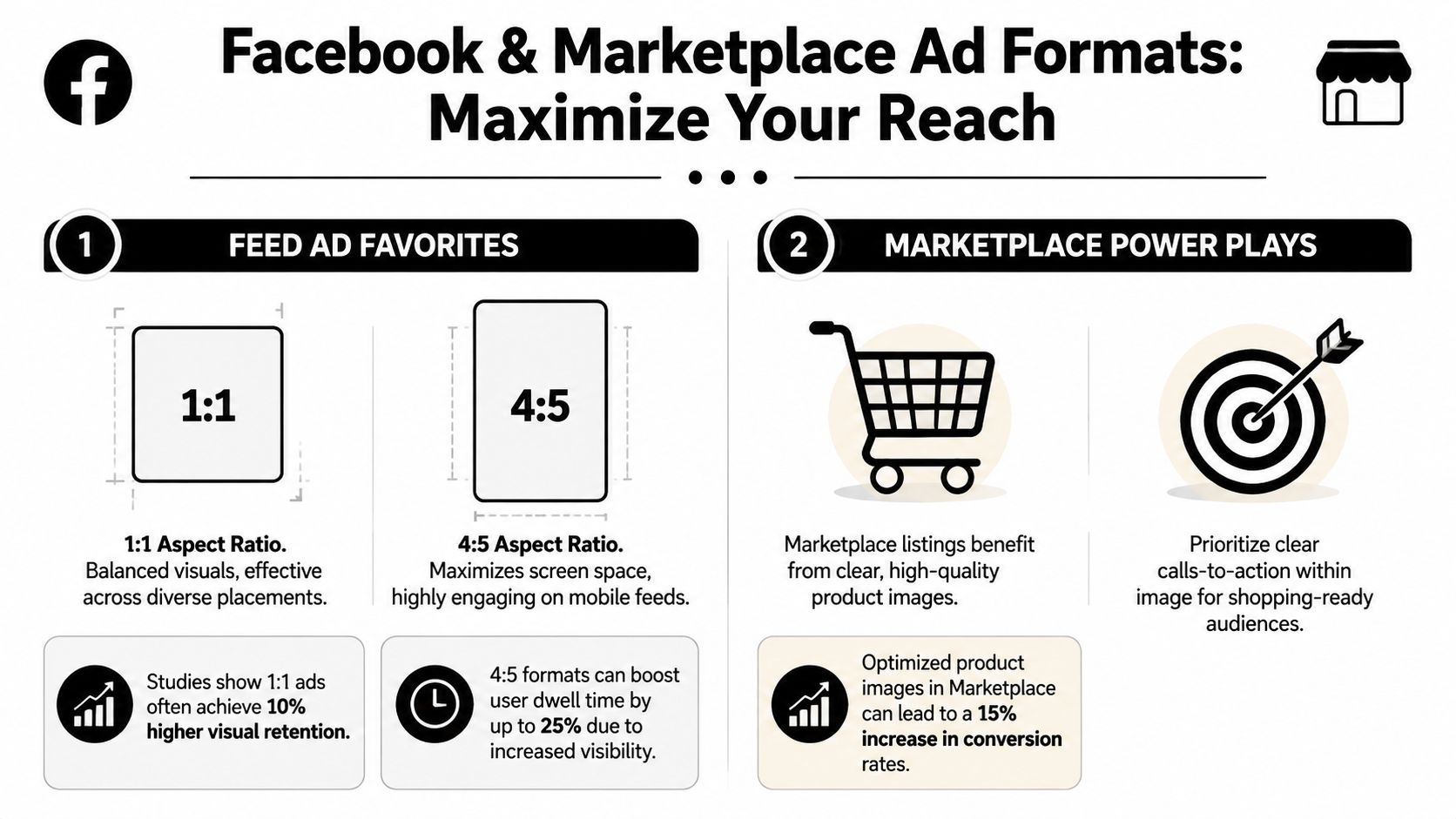
The practical decision for feed comes down to 1:1 versus 4:5.
According to Hootsuite's summary of Meta-focused sizing data, 1:1 images achieve 1.5x higher CTR in feeds compared to outdated 1.91:1 images, while 4:5 ads deliver 20% lower CPC and 18% higher conversion rates in e-commerce (Hootsuite Facebook ad sizes).
That lines up with what experienced buyers see in account after account. A horizontal orientation is usually the weakest compromise in a mobile-first feed. It takes up less vertical space, gets visually crowded faster, and often forces either tiny products or oversized text.
When 1 to 1 still wins
Square still matters because it's flexible.
If you need one image that can travel across multiple feed-heavy placements without rebuilding every asset, 1080×1080 is the safest operational standard. It works well for broad testing, prospecting campaigns with many variants, and accounts where speed matters more than hyper-custom placement production.
Square also helps when your creative concept is centrally composed:
- Single product on plain background
- Founder or spokesperson portrait
- Graphic-led message with centered hierarchy
- UGC still frame with one dominant subject
When 4 to 5 is worth the extra work
If your account lives on mobile feed volume, 4:5 usually deserves dedicated production.
A 1080×1350 image uses more of the phone screen. That larger visual footprint gives your product or offer more room before the user scrolls past. It's especially useful for DTC product ads, before-and-after creative, apparel, home goods, food, and any visual where context around the subject improves click intent.
If the goal is efficient feed traffic, don't ask a landscape image to do a vertical job.
The trade-off is operational. A true 4:5 asset often needs recomposed layouts, not simple resizing. Headroom changes. Negative space changes. Text overlays that looked balanced in square can become awkward in vertical.
Marketplace needs clarity first
Marketplace users are already in a shopping mindset, so the image has a slightly different job. It doesn't just need to interrupt. It needs to look credible next to listings.
Use 1080×1080 for Marketplace image ads and make the product instantly readable. If the item blends into the background or the crop hides important context, the ad starts to look less like inventory and more like a generic social post. That's a bad fit for the environment.
For teams building shopping campaigns there, this guide to setting up Facebook Marketplace ads is worth reviewing because placement logic matters as much as raw sizing.
A few Marketplace-specific creative rules hold up well:
- Lead with the product: Don't let props dominate the frame.
- Use cleaner backgrounds: Clutter weakens trust.
- Show scale fast: If product size matters, make that obvious visually.
- Avoid excessive overlay text: Shopping placements benefit from straightforward imagery.
Stories and Reels Ad Sizes for Immersive Verticals
Stories and Reels don't reward lazy resizing. They punish it.
The working format here is 9:16, with 1440×2560 as the high-quality standard and a minimum width of 500 pixels for Stories. These placements are full-screen, mobile-native, and fast. That changes the design job completely. You're not trying to fit a feed ad into a taller box. You're trying to make the ad feel like it belongs there.
Design around the safe zone
The most common mistake isn't wrong dimensions. It's placing logos, offers, or calls to action too close to the top or bottom where interface elements compete for attention.
Keep the visual focal point in the middle area. If you're using text, keep it high enough to avoid lower UI clutter and low enough to avoid top overlays. In practical terms, center-weighted composition is safer than edge-heavy composition.
Good Stories and Reels creative usually has these traits:
- One visual idea: Too many competing elements get skipped.
- Fast comprehension: Users should know what they're seeing immediately.
- Large, simple hierarchy: Small details disappear on handheld screens.
- Native framing: It should look like vertical content, not adapted desktop creative.
Build for sound-off attention
Even if your campaign includes motion assets elsewhere, the visual logic still matters for static or poster-style frames used in these placements. Product, benefit, and action need to be understandable without audio support.
A useful walkthrough on vertical composition lives in these Instagram Story specs, especially if your team is aligning Facebook and Instagram placement assets together.
This video is a good companion when you're reviewing how vertical ad formats appear in practice:
Don't recycle feed creative blindly
A feed winner can fail in Stories for reasons that have nothing to do with the offer. If the original image relies on horizontal context, fine print, or side-by-side product detail, it often collapses in vertical full-screen.
The better workflow is recomposition. Keep the same concept, not the same crop.
Specs for Carousel Collection and Instant Experience Ads
These formats don't ask one image to do all the work. They ask a sequence of images to work together.
Carousel is a storyboard, not a gallery dump
For Carousel ads, each image card should be 1080×1080 at 1:1. Consistency matters more here than in almost any other image format. If one card feels tighter, darker, busier, or cropped differently from the rest, the sequence loses momentum.
Carousel works best when each card has a role. That role can be product progression, feature breakdown, objection handling, or visual storytelling. What doesn't work is loading multiple unrelated assets into one unit and hoping the swipe mechanic creates interest.
A good carousel sequence often follows a clear order:
- Hook card with the strongest visual or outcome
- Proof or product detail that answers the first question
- Variation or use case that broadens relevance
- Offer or CTA card that closes the sequence
Meta also allows up to 10 cards, but more isn't automatically better. Use as many as the concept needs, no more.
Collection acts like a storefront preview
Collection ads use a cover image or video with supporting product assets underneath. The visual job is different from standard feed. The cover has to open the door, while the product set validates the click.
For ecommerce, that means the cover should establish category, mood, or use case quickly. Then the supporting items do the catalog work. If the cover looks disconnected from the products underneath, click quality drops because the ad feels stitched together.
Instant Experience needs compositional discipline
Instant Experience is where many teams overdesign. They treat the opening asset like a landing page hero and forget that the tap happens on a phone.
The asset strategy should stay simple:
- Lead image: Clear, high-resolution, easy to understand immediately
- Supporting visuals: Maintain one visual system across the experience
- Product imagery: Prioritize readability over decorative layout
- Transitions: Keep the journey visually coherent from ad to expanded canvas
For teams using carousel-led storytelling, this overview of what a carousel post means in practice is a helpful framing reference because the same sequencing principles carry over into paid units.
A multi-asset ad only works when each frame strengthens the next one. One weak card can drag the whole unit down.
How to Avoid Costly Image Optimization Mistakes
Most wasted spend from creative sizing isn't dramatic. It leaks.

The ad launches. Delivery starts. Nothing looks obviously broken. But the account pays for preventable inefficiency because assets are mismatched, undersized, or inconsistent. AdStellar AI is one option teams use to generate bulk creative sets in placement-specific aspect ratios so launches stay standardized across many variants, but the core discipline matters no matter what tool you use.
According to AdStellar's image sizing guidance, mismatched image sizes can inflate campaign costs by 20-35% by disrupting Facebook's algorithm learning phase. The same guidance recommends 1080×1080 for 1:1 and 1080×1350 for 4:5 as the baseline quality standard, and notes that images below the 600px minimum width appear noticeably smaller and degrade performance (AdStellar image size guide).
The mistakes that hurt most
Some errors are easy to spot. Others reside unnoticed within average-looking campaigns.
Auto-cropping a wide image into mobile placements This is one of the fastest ways to weaken a good concept. Products get chopped, faces lose framing, and offers shift into awkward corners.
Uploading low-resolution files
Even when the ad gets approved, soft imagery lowers trust. Small products look cheaper. Fine details vanish. Premium brands feel generic.Mixing inconsistent dimensions across test variants
Then you're not only testing concept or copy. You're accidentally testing rendering quality too.Stuffing too much text into the visual
The image becomes a flyer instead of an ad. Users skip it faster and Meta may reduce delivery.
A better pre-launch workflow
Use a simple production checklist before any campaign goes live.
| Risk area | Better move |
|---|---|
| Feed creative built only in landscape | Produce square and vertical versions intentionally |
| Product image exported too small | Re-export from the source file at proper resolution |
| Same concept used across all placements | Recompose by placement instead of relying on crop behavior |
| Visual overloaded with offer copy | Move most message detail into primary text and headline |
| Bulk upload from mixed designers or tools | Standardize templates and export settings before launch |
Cheap shortcuts become expensive media
A lot of beginner ecommerce creative falls into the same traps. Too much promotional text, weak composition, cluttered product framing, and dimensions that weren't planned before design started. For a practical look at cleaner visual execution, these ad image techniques for eCom beginners are useful because they focus on what users notice first.
The easiest way to waste paid social budget is to treat creative production and media buying as separate systems.
The teams that scale cleanly don't do that. They use repeatable templates, placement-aware exports, and QA that happens before launch day, not after spend exposes the problem.
The Strategic Evolution of Facebook Ad Image Sizes
A lot of wasted Meta spend starts with an old creative habit. The team designs one horizontal master image, resizes it for every placement, and assumes the platform will handle the rest. It usually does not. The result is weaker composition, lower click-through rate, and higher costs in the placements that now carry the most inventory.
Facebook ad image sizes changed because attention changed. Early ad formats were built for desktop feeds and wider layouts. As Facebook usage shifted to mobile, image standards followed. Square became more practical across placements, then vertical formats gained importance as feed behavior and full-screen consumption increased. The historical pattern documented in PostPlanner's Facebook dimensions history matches what media buyers have seen in account performance for years. Taller creative tends to earn more visual real estate on mobile, which often improves thumb-stop rate and gives the algorithm stronger engagement signals to work with.
That shift matters because image size is not just a spec issue. It changes how much of the screen your ad controls, how clearly the product is framed, and whether key visual elements survive placement adaptation.
The practical takeaway is straightforward:
- Wider formats come from a desktop-first era
- Square formats work well when you need broad placement coverage
- Vertical formats fit mobile scrolling behavior better
- Full-screen vertical formats suit immersive placements like Stories and Reels
For current campaigns, the production logic should start with placement behavior, not design convenience. If the placement is mobile-first, build for mobile-first viewing. If the placement fills the screen, compose for that screen. This reduces crop problems, protects the focal point, and gives each placement a better chance to convert at an efficient CPC.
I have seen the same offer hold steady on audience and bid strategy, then improve once the creative was rebuilt in the right aspect ratio instead of being auto-adapted from horizontal layouts. The gain usually does not come from compliance alone. It comes from better framing, stronger product visibility, and more native-feeling creative in the placements where Meta is trying to spend.
So the best image size for facebook ad campaigns is not one fixed dimension. It is the format that matches the placement's job, preserves clarity on the device where the ad is viewed, and removes avoidable friction from delivery and engagement.
If your team is producing lots of Meta creative and wants a faster way to keep image sizes consistent across placements, AdStellar AI is built for that workflow. It helps teams generate and launch multiple ad variations in the right formats so testing speed does not come at the expense of creative compliance.