Getting the specs right for your LinkedIn single image ads is the first, most crucial step. If you take away just one thing, remember this: 1200 x 627 pixels is your go-to size for maximum compatibility. It’s the standard 1.91:1 aspect ratio that plays nicely everywhere.
Of course, LinkedIn also supports square (1:1) and vertical (4:5) formats, which are great for optimizing mobile placements. Just be sure your final creative is a JPG or PNG and stays under the 5 MB file size limit. Nail these basics, and you're already halfway to a smooth campaign launch.
Your Quick Reference Guide to LinkedIn Ad Specs
I get it—sometimes you just need the numbers, fast. This section is your cheat sheet, built for busy marketers who need the essential LinkedIn single image ad specs for 2026 without any fluff. Think of it as your go-to reference for all the critical dimensions, file types, and size limits.
Here’s a quick visual summary of the technical requirements you’ll need to keep in mind.
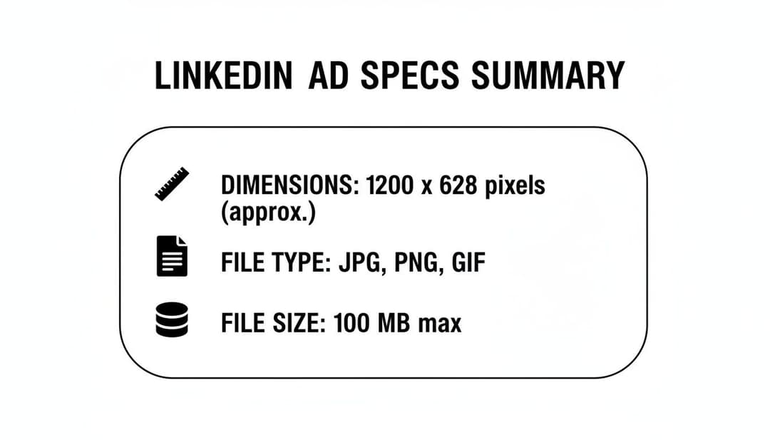
The main idea here is that LinkedIn wants your images to look sharp but load quickly, which is why they cap files at a pretty generous 5 MB. The table below breaks down every spec you need for a technically perfect ad. It's also interesting to see how these requirements stack up against other platforms; you can check out our guide on Meta ad specs for a direct comparison.
LinkedIn Single Image Ad Specs At a Glance (2026)
This table gives you a complete rundown of the core technical specs for LinkedIn single image ads, covering everything from dimensions and aspect ratios to file types and size limits.
| Specification | Requirement | Best Practice Tip |
|---|---|---|
| Dimensions | Minimum: 640 x 360 px | Use 1200 x 627 px for the best and most consistent results across both desktop and mobile feeds. |
| Aspect Ratio | 1.91:1, 1:1, or 4:5 | A 1:1 ratio (1200 x 1200 px) is fantastic for maximizing screen real estate on mobile devices. |
| File Type | JPG, PNG | Stick with PNG for logos or any graphics with transparency. For all other photos, JPG is your best bet. |
| File Size | Maximum 5 MB | I always recommend compressing images to stay below 3 MB. You'll get faster load times with no noticeable quality loss. |
Bookmark this table. It's the perfect quick-check resource to have open when you're in LinkedIn Campaign Manager and uploading your creatives. Getting these details right from the start saves a ton of headaches later.
Optimizing Image Dimensions and Aspect Ratios
While LinkedIn technically accepts a wide variety of image sizes, getting your single image ad to truly perform comes down to a strategic choice. The shape of your image—its aspect ratio—has a huge impact on how much screen real estate it commands, especially on mobile. Get this right, and you’ll stop the scroll. Get it wrong, and you’ll get lost in the feed.
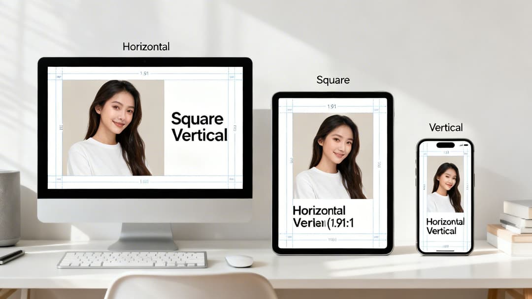
Think of the three main ratios as different tools for different jobs. Each one serves a specific purpose in the highly competitive environment of the LinkedIn feed, and understanding them is key to making your visuals work harder for you.
Choosing the Right Aspect Ratio
Your choice here should really be driven by your campaign goals and where your audience spends their time. And let's be clear: that’s overwhelmingly on mobile. With over 60% of LinkedIn engagement now happening on mobile devices, formats that look great on a smaller screen are almost always going to give you better results.
Here’s a breakdown of your options:
Horizontal (1.91:1): This is the old-school, classic choice. A 1200 x 627 pixel image is your safest bet for rendering properly on both desktop and mobile. The downside? It takes up the least amount of vertical space on a phone, making it incredibly easy for users to scroll right past it.
Square (1:1): This is what we recommend for most campaigns. A 1200 x 1200 pixel image is a powerhouse, grabbing significantly more screen real estate on both mobile and desktop. That extra presence helps you capture attention and literally pushes other content out of view.
Vertical (4:5 or 2:3): Meet the mobile-first champion. An image sized at 720 x 900 pixels (4:5 ratio) is tailor-made to dominate the screen on mobile devices. Just be aware that it won't show up in desktop feeds at all. If you know your audience is on the go, this format is brilliant for stopping them in their tracks.
Pro-Tip: LinkedIn does technically support a tall 1:1.91 vertical ratio (like 628 x 1200 px), but it often gets slapped with ugly automatic borders. For a clean, full-bleed look on mobile, stick to a 4:5 or 2:3 ratio.
By picking the right ratio for your LinkedIn single image ad specs, you’re giving your creative its best shot at doing its job. This principle holds true across most platforms; you can see how it compares in our guide on Meta ad sizes.
Mastering Your Ad Copy and Character Limits
A great image will stop the scroll, but it's your words that will get the click. Your ad copy is where you make your case and turn a passing glance into a genuine lead. The challenge? You have to do it with very little space.
Sticking to LinkedIn’s character limits isn't just about following the rules—it's about making sure your message actually gets seen. Go over the limit, and your carefully crafted pitch gets unceremoniously cut off, especially on mobile.
Ad Copy Character Limits
Think of each text field as a different tool for the job. Your main goal is to land your message clearly and quickly before it gets truncated by the dreaded "...see more." This is mission-critical on mobile, where screen real estate is tight and users are scrolling fast.
Here’s the breakdown of the official character limits for single image ads:
Introductory Text: You get up to 600 characters, but let's be realistic. LinkedIn itself recommends keeping it under 150 characters to avoid getting cut off on most devices. Always put your most important info right at the very beginning.
Headline: The official limit is 200 characters, but the sweet spot is actually under 70 characters. We've seen it time and again in tests: a short, punchy, benefit-driven headline will always outperform a long one that nobody finishes reading.
Description (Optional): While you have up to 300 characters here, this text hardly ever shows up. It only appears on a few desktop placements in the LinkedIn Audience Network, so don't bank on it for conveying anything important.
Key Insight: Less is almost always more. In our own A/B tests, headlines under 70 characters and intro copy under 150 characters consistently deliver higher click-through rates. Why? Because the viewer gets the full message instantly.
Writing powerful copy within these tight constraints is a real skill. For a deeper dive into what makes ad text actually convert, check out our guide on how to write good ad copy that captures attention. Remember, your words and your visual need to work together to create a single, compelling reason for someone to click.
Navigating File Formats and Size Requirements
Getting your ad’s file format and size right is one of those small details that can have a huge impact. Mess this up, and you’re looking at a rejected ad or, almost worse, a creative that loads so slowly your audience just scrolls right past it. Thankfully, LinkedIn keeps things straightforward for single image ads, accepting only JPG and PNG files.
It's worth noting that while you can technically upload a GIF, LinkedIn will just display it as a static image. If you’re aiming for animation, you'll need to switch over to the video ad format. Knowing this simple distinction can save you a ton of headaches and prevent campaign delays.
Choosing Between JPG and PNG
So, should you go with a JPG or a PNG? This isn't just a technical choice; it's a creative one. Each format is built for a different purpose, and picking the right one makes your ad look its best.
JPG (Joint Photographic Experts Group): This is your go-to for any ad featuring photography. JPGs are brilliant at compressing complex images with lots of colors and details, meaning you get a high-quality photo without a monstrous file size. They are perfect for showing off product shots or authentic, people-focused visuals.
PNG (Portable Network Graphics): Reach for a PNG when your ad creative involves logos, text overlays, or any sharp-edged graphic that needs a transparent background. PNGs keep these elements looking crisp and professional, avoiding the fuzzy artifacts you can sometimes get with JPGs.
Pro-Tip: Always compress your images before you upload them. While LinkedIn’s hard limit is 5 MB, a good rule of thumb is to aim for under 3 MB. This ensures your ad loads almost instantly, especially on mobile, without any noticeable loss in quality.
Compressing Images Without Losing Quality
That 5 MB file size limit is a hard and fast rule, but you don't need to sacrifice your image quality to meet it. There are plenty of fantastic, free online tools that can shrink your file size down while keeping your creative looking sharp. Taking a minute to do this is a simple but critical step for optimizing your ad’s performance and the user's experience.
This kind of technical discipline is vital no matter where you're advertising. If you’re running campaigns on Meta’s platforms, too, check out our guide on the best image size for Facebook to see how the specs stack up.
Creative Best Practices for High-Performing Ads
Knowing the right LinkedIn ad specs is just step one. To actually see results, your creative needs to do more than just meet the requirements—it has to be compelling enough to stop a busy professional mid-scroll. This is where design that captures attention and communicates your value in a split second comes into play.
Forget about just grabbing the first stock photo you find. The ads that consistently perform well use a smart mix of clear visuals, deliberate composition, and a message that connects directly with a specific audience. Your goal is to make your ad an unmissable, valuable part of the feed, not just another piece of sponsored noise.
Design Your Ad to Stand Out
In a professional feed crowded with content, visual contrast is your best asset. We consistently see ads with bright, bold colors and a single, clear focal point outperform the rest. Ditch the cluttered backgrounds and overly complex scenes. A clean aesthetic that pulls the eye straight to your product or key message is what you're after.
Authenticity is another huge factor. LinkedIn users are savvy; they can spot a generic, staged stock photo from a mile away and will scroll right past it. They respond much better to images that feature real people in relatable, professional settings. Choose visuals that feel genuine and mirror your target audience. You can even use an AI mascot generator to create a unique brand character, giving your static ads a memorable and distinctive edge.
Prioritize a Mobile-First Approach
With over 60% of LinkedIn traffic now coming from mobile devices, designing for the small screen isn't just a good idea—it's mandatory. This means your creative must be effective when viewed on the go, which boils down to a few core practices.
- Minimal Text on Images: LinkedIn doesn't have a hard rule like Facebook's old 20% text policy, but our data shows that ads with less on-image text simply perform better. Keep your visuals clean and let your headline and intro text do the heavy lifting.
- A Clear Focal Point: Your image needs a single, unambiguous subject. It has to be instantly recognizable, even when viewed on a small phone screen.
- Embrace Square and Vertical: As we've covered, the 1:1 and 4:5 aspect ratios are your best friends on mobile. They take up significantly more screen real estate, making your ad much harder to ignore.
Data consistently shows single-image ads on LinkedIn outperform other formats in click-through rate (CTR), achieving a benchmark of 0.44%–0.65%. This makes them a go-to choice for performance marketers, with top-quartile performers hitting a 0.59% CTR or higher by using high-contrast visuals and punchy copy. Find out more about how these LinkedIn benchmarks can guide your strategy.
At the end of the day, the best creatives come from a combination of solid design principles and relentless testing. For more ideas on what's working right now, check out our breakdown of successful creative ad campaigns.
Your Pre-Launch Campaign Checklist
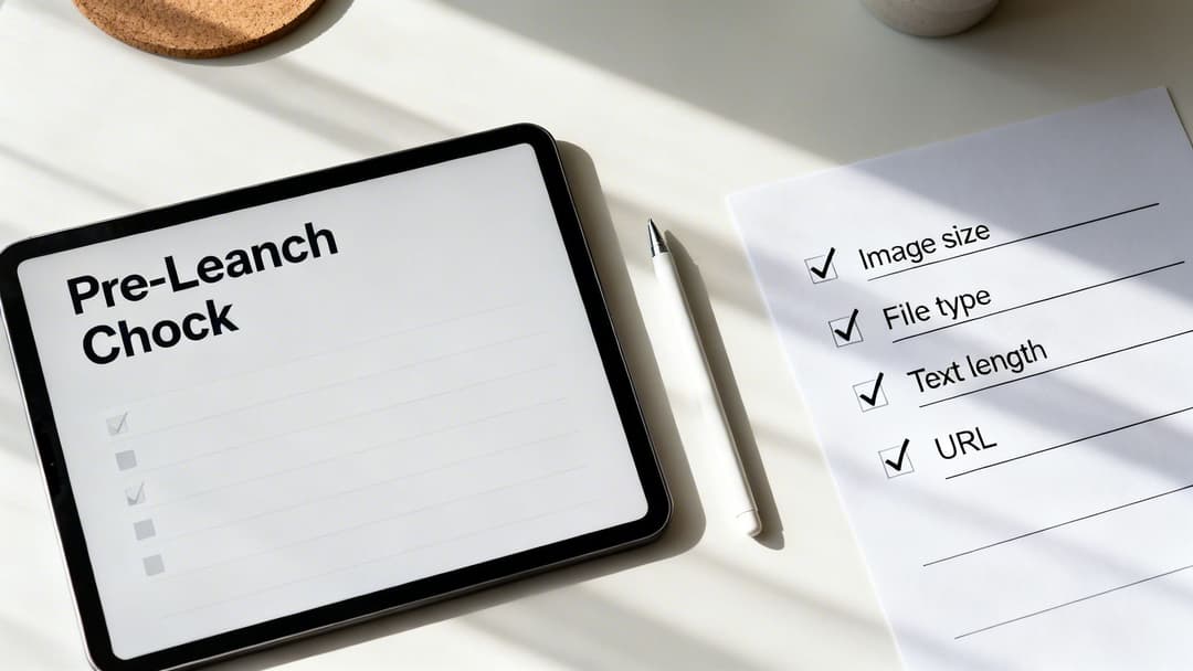
Before you push that "launch" button, take a moment to run through this final list. Think of it as your pre-flight inspection—a quick but critical step that catches the common mistakes that can get an ad rejected or hurt its performance.
Getting these details right ensures a smooth takeoff for your campaign. We've gathered all the key specs here so you can double-check everything in one place.
Final Ad Review
Go through each point here to make sure every piece of your creative and copy is good to go.
Image Dimensions & Ratio: Is your image at least 1200px on its longest side? For the best look, stick to either a square 1200x1200px (1:1) or a horizontal 1200x627px (1.91:1) format.
File Format & Size: Is your ad creative a JPG or PNG? And crucially, is the file size under the 5 MB limit?
Text Lengths: Check your character counts. For maximum impact and to avoid awkward truncation, keep your headline under 70 characters and your main text under 150 characters.
Destination URL: The simplest but most common mistake. Does the link actually work? Give it a click and make sure it lands on the correct page without any errors.
Answering Your Lingering LinkedIn Ad Spec Questions
Even when you’ve double-checked every spec, a few tricky questions always seem to surface right before you hit "launch." You're not alone. Let's walk through some of the most common hangups marketers run into with LinkedIn single image ads.
Think of this as your go-to troubleshooting guide. We’ll clear up the confusion so you can get your campaigns live and performing, without any last-minute surprises.
What's the "Best" Image Size for Mobile vs. Desktop?
This is the million-dollar question, and the answer really depends on your goal. The safest, most versatile choice is a horizontal image at 1200 x 627 pixels. This 1.91:1 aspect ratio is the workhorse of LinkedIn ads—it’s guaranteed to look good on both desktop and mobile feeds without any awkward cropping.
However, if you're taking a mobile-first approach (and you probably should be), a square 1200 x 1200 pixel (1:1) image is your best bet. It takes up significantly more screen real estate on a phone, making your ad much harder to scroll past. That extra visibility can be the difference between a glance and a click.
Why Did My Single Image Ad Get Rejected?
An ad rejection is frustrating, but it’s almost always due to one of a handful of simple technical slip-ups. Before you go down a rabbit hole, check for these common culprits:
- File Size Overload: Your image file is bigger than the 5 MB limit.
- Wrong File Type: You uploaded something other than a JPG or PNG.
- Broken Destination: The link in your ad leads to a 404 page or is otherwise non-functional.
- Policy Violation: Your ad copy or image goes against LinkedIn's official advertising policies, like making misleading claims or promoting prohibited content.
A quick review of these four points and a look at the official ad policies usually solves the mystery and gets you back on track.
Can I Use an Animated GIF in a Single Image Ad?
The short answer is no. While LinkedIn's ad platform won't stop you from uploading a GIF file in a single image campaign, it won't animate. LinkedIn will simply grab the very first frame and display it as a static picture.
If you have a great animation you want to use, you’ll need to build your campaign using the Video Ad format instead. That's the only way to bring motion into the feed.
How Much Text Should I Put on My Ad Image?
Less is always more. While LinkedIn doesn't have a rigid "20% text" rule like other platforms once did, best practices (and performance data) firmly point toward keeping your image as clean as possible. An image cluttered with text just doesn't perform as well.
Let your creative do the visual work. Your message belongs in the dedicated headline and introductory text fields. This approach not only makes your ad look more professional but also ensures your full message is accessible and isn't cut off on smaller mobile screens.
Ready to stop guessing and start scaling? AdStellar AI helps you generate hundreds of ad variations in minutes, test them at scale, and use AI-powered insights to double down on what works. Launch winning Meta campaigns 10x faster at https://www.adstellar.ai.