You've got a campaign objective, a folder full of creative assets, and a deadline that isn't moving. The problem is deciding whether the campaign needs a static image, a short video, a swipeable product story, an immersive storefront, a lead form, a catalog ad, or a conversation in Messenger.
The strongest choice depends on the action you want, the audience's familiarity with your brand, the creative resources available, and what happens after the click. A polished format can still fail if it sends a cold prospect to a complicated destination, while a simple image can work well when the offer is clear and the audience already knows the product.
This guide breaks down 10 Meta Ads formats by the job they perform, not just by where they appear. You'll see when each format makes sense, what to build, what tends to create friction, and how to combine formats instead of treating them as mutually exclusive. Meta's ecosystem now spans image, video, carousel, collection, Stories, Messenger, Marketplace, Audience Network, and other placements, so format selection is also a delivery decision. Meta's advertising documentation remains the best place to confirm current eligibility and placement requirements before launch.
1. Image Ads
Image ads are the fastest route from an idea to a live test. One visual, primary text, a headline, and a call to action can communicate a product benefit, offer, event, or proof point without asking the audience to wait for a video to load or swipe through a sequence.
That simplicity makes image ads useful across the funnel. A retailer can show a new product in a clean lifestyle setting. A SaaS team can turn a product screenshot into a feature-led ad. A service business can use a recognisable face, a clear problem, and a direct booking prompt.
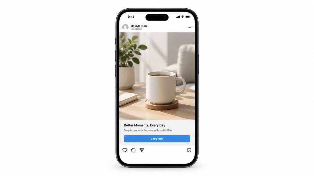
The format works best when the visual does one job immediately. Show the product, make the contrast obvious, or create a strong emotional cue. Don't turn the image into a brochure. Put the explanation in the primary text and use the visual to earn the next second of attention.
Use image ads for efficient testing
Image ads are particularly valuable when you need to test offers, angles, audiences, and messages before investing in more elaborate production. Create variations around one controlled idea, such as product photography versus lifestyle photography, or benefit-led copy versus problem-led copy.
A practical testing set might include:
- Product angle: Show the item clearly and let the headline explain the main benefit.
- Human angle: Use a person interacting with the product to make the use case easier to understand.
- Proof angle: Present a review theme, result, or distinctive product detail without overcrowding the visual.
- Offer angle: Lead with the promotion when price or urgency is the main reason to act.
The limitation is obvious. A single frame can't demonstrate a complicated workflow or answer several objections at once. If the product needs movement, comparison, or explanation, use the image as a baseline and develop video or carousel variations from the winning concept.
2. Video Ads
Video earns its place when motion explains the value faster than a still image can. A skincare brand can show application, a software company can reveal a workflow, and a subscription business can demonstrate the experience before asking for a signup.
The production doesn't need to look like television. Feed video often benefits from a direct opening, visible product use, captions, and a human delivery style. A creator explaining one feature can outperform a polished brand film when the audience needs clarity more than spectacle.
Practical rule: Treat the opening frame as the ad, not as an introduction to the ad.
Build several openings around the same core video. One might begin with the problem, another with the finished result, and another with a product close-up. Keep the central proof consistent so you can learn whether the hook, offer, or audience is responsible for the response.
Build for silent, mobile viewing
Use large visual cues and place essential context on screen. Captions help people follow the message when sound isn't available, while a clear thumbnail gives the viewer a reason to start. Don't hide the product reveal until the final moment. Show enough in the opening to establish relevance, then use the rest of the video to demonstrate the benefit.
Video also creates more production risk. A weak first scene, slow edit, or unclear call to action can waste more effort than a weak image variation. Start with short, focused concepts, then expand the winners into demonstrations, testimonials, tutorials, or comparison videos. For a practical production workflow, see how to create video ads.
3. Carousel Ads
Carousel ads are built for consideration. They let a prospect move through several products, benefits, use cases, or stages of an argument inside one ad. Meta says a carousel can showcase up to ten images or videos, with each card able to use its own link, as documented in the Meta Business Help Center.
That makes the format useful for a fashion retailer showing several outfits, a software company presenting a workflow, or a property business showing different rooms in one listing. It also gives an ecommerce team more room to answer the question, “Why this product?” without forcing the audience to visit multiple pages first.
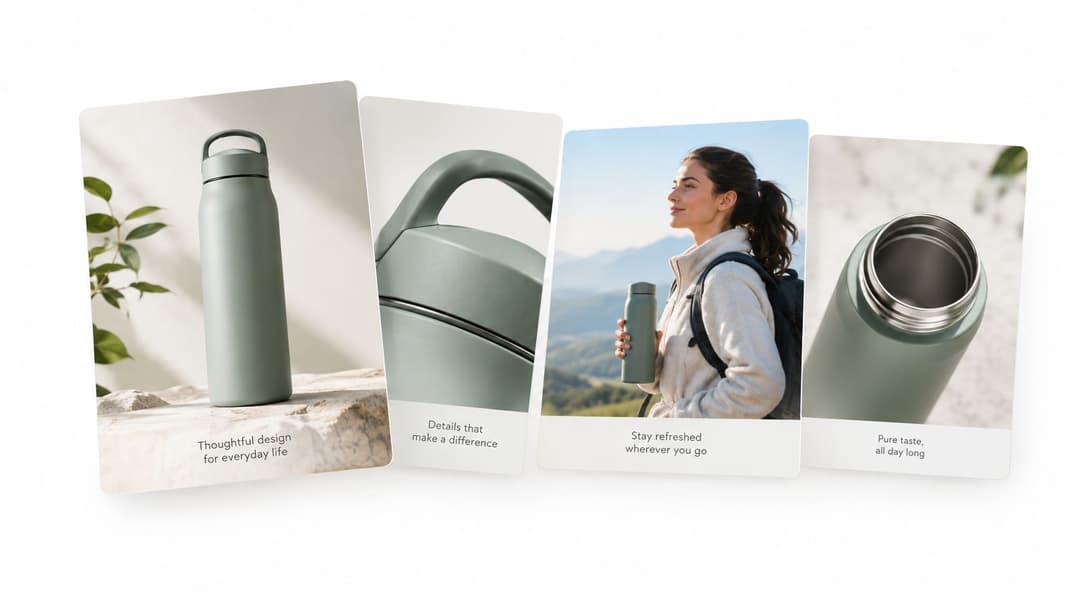
The first card carries disproportionate responsibility. Lead with the strongest hook, best product image, or clearest promise. If the opening card looks generic, many people won't discover the stronger cards that follow.
Give every card a role
A useful sequence might move from hook to benefit to proof to action. For a meal-planning app, the cards could show the time-saving promise, a sample plan, the shopping-list feature, and the signup invitation. For a product range, each card can represent a different use case rather than repeating the same product shot.
Carousel ads become weaker when every card contains dense copy or when the sequence has no logic. Avoid using ten cards because the format allows it. Two or three strong cards can create a clearer argument than a long catalogue.
Test card order, opening visual, and destination logic separately. If every card links to a different product, make sure each landing page matches the card promise. More ideas for structuring the unit appear in these carousel ad best practices.
4. Collection and Instant Experience Ads
Collection and Instant Experience formats serve a browsing job. They keep the user inside Meta while combining a prominent visual with a richer product or brand journey. A collection can introduce a product range, while an Instant Experience can combine images, video, galleries, product details, and lead capture in a full-screen environment.
For a homeware retailer, the opening creative might show a styled room and lead into products organised by room or design. A B2B company could use an immersive sequence to explain a platform before presenting a form. The destination matters as much as the ad. If the in-app experience feels like a compressed catalogue with no clear path, the extra production won't solve the problem.
Meta's format system has evolved from simple image units into a broader ecosystem that includes immersive and shoppable experiences. The Meta Ads Guide and format documentation should be checked before launch because format availability and objective eligibility can change.
Reduce browsing friction
Use a strong cover asset and make the first visible products relevant to the promise in that asset. A cover showing a travel bag should lead to the bags, accessories, or travel bundles implied by the creative, not an unrelated catalogue section.
An Instant Experience also needs a tight narrative. Start with the most persuasive visual, answer the primary buying question, and give the user a clear next action. Don't force people through a long brand story before showing the product or form.
Some current coverage notes that Collection may appear through format display settings rather than the main setup flow, while Flexible Ads have been absorbed into broader Advantage+ creative and campaign experiences. That makes the format less about manually selecting an isolated unit and more about deciding whether an in-app shopping journey adds value. For implementation context, review this guide to Meta Collection Ads.
5. Stories Ads
Stories ads are designed for interruption inside a vertical, full-screen sequence. They work when the message benefits from immediacy, visual movement, or a clear “act now” reason. A limited promotion, product launch, appointment opening, or event reminder can fit naturally into this environment.
The creative should feel native to Stories without pretending to be organic content. A fashion brand might use a sequence of outfit frames. A gaming advertiser might open with a fast gameplay moment. A local service business could use a short testimonial followed by a booking prompt.
Stories reward clarity because the viewer is already tapping through content. Put the central idea on screen quickly, keep the composition simple, and reserve space for interface elements. A horizontal asset cropped into a vertical frame often loses the product, face, or text that made the original creative work.
Build a sequence, not a poster
One Story frame can work for a direct offer, but sequential frames can create a more persuasive path:
- Frame one: Establish the problem, product, or announcement.
- Frame two: Show the benefit, proof, or product in use.
- Frame three: Present the next step with a direct call to action.
Use movement early, but don't mistake motion for meaning. Stickers, bold overlays, and urgency can help the format feel at home, yet excessive decoration competes with the offer. For a clear comparison of the organic experiences surrounding the placements, read Reel vs Story on Instagram.
Stories aren't the default choice for every campaign. They can be a poor fit when the offer needs a long explanation or when the team only has a horizontal asset that can't be adapted properly. In those cases, use Stories as one placement-specific version of a broader idea, not as the entire creative strategy.
6. Reels Ads
Reels ads perform an attention and discovery job. They appear in a short-form video environment where polished advertising competes with creators, tutorials, humour, commentary, and entertainment. The strongest Reels creative usually feels like a useful or enjoyable piece of content first, with the commercial message integrated into the experience.
A beauty company might demonstrate a transformation. A SaaS brand could explain one practical shortcut. A consumer product advertiser might use a creator-style unboxing that makes the product tangible within the opening moments. The concept should be understandable even when the viewer doesn't know the brand.
Independent benchmark coverage reports that short-form video around 15 seconds reached a 2.31% CTR and 3.6x ROAS in one 2026 dataset, while longer 30 to 60 second video recorded a 1.89% CTR and 3.8x ROAS. These results come from a specific benchmark, not a universal rule, so use them as a prompt to test length against your own buying cycle, offer, and audience. The data is reported in this 2026 Meta ads creative benchmark.
The winning Reel doesn't need to look expensive. It needs to make the viewer understand why they should keep watching.
Make the concept native
Open with a visible action, surprising statement, product result, or recognisable problem. Add captions for dialogue and keep important text away from interface areas. Creator-style footage, customer demonstrations, and direct-to-camera explanations can give the ad a more natural rhythm than a conventional commercial.
Reels also demand creative renewal. A concept that works repeatedly can become familiar, especially when the opening and visual treatment never change. Create several hooks from one core idea, then vary the speaker, setting, product angle, or sound while preserving the message you want to learn about.
For practical creative direction, use these Instagram Reels ad creative tips. Reels may be excellent for reach and attention, but they're not automatically ideal for high-consideration conversion. If the next step requires detailed comparison, pair the Reel with a carousel, product page, lead form, or message flow.
7. Lead Form Ads
Lead form ads remove the external landing-page step. The prospect taps the ad, reviews a form within Meta, and submits contact information or answers qualifying questions. This makes the format useful for demo requests, quote enquiries, education leads, consultations, and other actions where the business needs permission to follow up.
The format's advantage is speed. A person interested in an insurance quote doesn't need to wait for a new page to load. A potential software buyer can request a demo without navigating a website. That convenience only helps if the follow-up is equally disciplined.
Lower friction without lowering quality
Ask only for information the sales or service team will use. A short form can capture name, contact detail, and one qualifying question. A long form may produce more context but can also discourage completion, so test the trade-off rather than assuming more data is better.
Your thank-you screen should explain what happens next. If a representative will call, say so. If the user should book a meeting, provide that action immediately. Connect submissions to the CRM and create a response process before spending heavily. A lead that sits untouched loses value quickly, even if the ad itself performed well.
Good use cases include:
- B2B demonstrations: Ask for work email and company context, then route the lead to the right salesperson.
- Local services: Offer an estimate or consultation with a simple service-specific form.
- Education: Capture programme interest and preferred contact method.
- Recruitment: Ask for role or experience information before the next screening step.
The form is not a substitute for qualification strategy. Use it when the audience can reasonably express intent in a few fields. For setup guidance, see how to set up Facebook ads for lead generation.
8. Slideshow Ads
Slideshow ads turn still images into a lightweight motion sequence. They sit between an image ad and a full video production workflow, which makes them useful when a team has strong photography but limited footage, editing capacity, or bandwidth.
A travel advertiser can move through destination images. A vehicle dealer can show exterior, interior, and feature details. A property company can turn listing photography into a short visual tour. The format gives the audience a sense of progression without requiring filmed action.
Meta documents slideshow ads as a format that can use a minimum of three and up to ten images or videos, making it suitable for structured visual sequences without a full production process. The Meta Business Help Center provides the relevant format guidance.
Use progression to create meaning
Don't treat the slideshow as a random gallery. Start with the strongest image, move into a close-up or use case, then end with a benefit and call to action. Keep colour treatment and visual quality consistent so the sequence feels intentional.
The format loses impact when transitions distract from the story or when every frame carries a new message. Use simple movement and give each image enough time to register. Test the sequence without relying on audio first, then add music only when it reinforces the mood.
Slideshow ads are also a practical fallback when a campaign needs motion versions for many products or offers. They won't demonstrate physical movement as convincingly as real video, and they can't deliver the same creator presence as a Reel. Their value is efficient adaptation, not imitation of a high-production film.
9. Dynamic Ads
Dynamic ads perform a personalisation and catalogue job. They draw from a product catalogue and use behavioural signals to show relevant items to people who have viewed products, added items to a cart, or interacted with a shop. For ecommerce teams, the format can keep product discovery connected to changing inventory and pricing.
A fashion retailer might remind a shopper about a viewed jacket. A homeware store could show complementary products after a purchase. A merchant with a broad catalogue can use product data to create more relevant combinations than a single manually built ad would support.
The system is only as good as the catalogue and tracking foundation. Missing images, outdated prices, incorrect availability, or weak product titles can turn personalisation into confusion. Verify the feed before judging the creative.
Segment the commercial context
Treat different audience temperatures differently. Someone who abandoned a cart may need reassurance, delivery information, or a relevant incentive. Someone who only browsed may need product education or category inspiration. A prospecting audience may need a broader catalogue story rather than a reminder about an item they never saw.
Monitor performance at product and audience level, not only at campaign level. A catalogue can contain products with very different margins, demand, availability, and conversion paths. Exclude items that create poor customer experiences or fail to support the campaign's economics.
Collection and dynamic ads can overlap, but they solve different problems. Collection creates a designed browsing experience around a hero asset. Dynamic ads automate product relevance at scale. In a system increasingly shaped by Advantage+ automation, the important question is whether your feed, event tracking, and product strategy are strong enough for automation to make useful choices. Current discussion of these shifts appears in Meta ad formats and creative.
10. Ads in Social Messaging
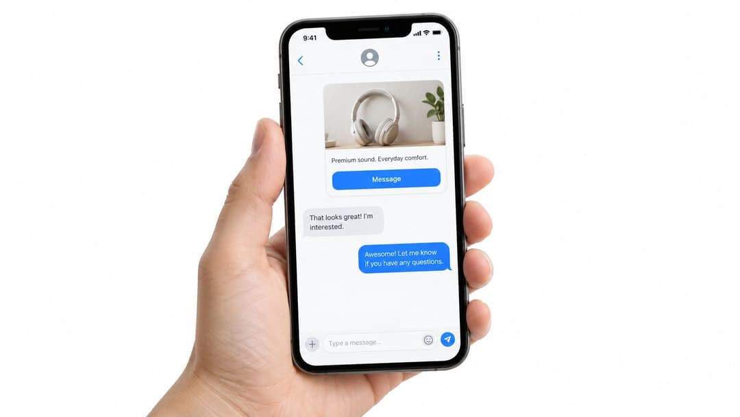
Messaging ads perform a conversation and qualification job. Instead of sending someone to a product page or form, the ad opens a dialogue in Messenger or another supported messaging environment. That can be a better destination when the buyer has questions, needs recommendations, or expects a human response before acting.
A travel company can use messaging to discuss dates and preferences. An automotive dealer can qualify a vehicle enquiry. A service provider can answer availability questions and book an appointment. Ecommerce brands can use a message flow to help shoppers choose between products when a catalogue page alone creates uncertainty.
The trade-off is operational. A message CTA creates an expectation of responsiveness. If the business has no prepared replies, routing, qualification logic, or human coverage, the campaign can generate conversations without creating useful sales opportunities.
Design the conversation before the ad
Start with the first three questions a prospect is likely to ask. Create response templates for price, availability, delivery, eligibility, or booking details. Use automation for predictable information, but give the user a clear path to a person when the question needs judgement.
Warm audiences are often a sensible starting point because they already recognise the brand and have a reason to continue the interaction. Cold audiences may need more context before a message feels natural. Keep the ad copy brief and make the CTA specific, such as getting a quote, booking a consultation, or asking about availability.
Measure conversation quality, not just message volume. Track qualified conversations, booked appointments, completed quotes, and revenue where possible. A large number of low-intent chats can hide weak targeting or an unclear promise.
Top 10 Meta Ad Formats, Side-by-Side Comparison
| Format | Implementation complexity | Resource requirements | Expected outcomes | Ideal use cases | Key advantages |
|---|---|---|---|---|---|
| Image Ads | Low | Minimal, single high-quality image + copy | Good awareness and low-cost conversions (CTR ~1–3%) | Audience testing, seasonal promos, single-product offers | Fast to produce, low cost, broad placements, high approval rate |
| Video Ads | Medium–High | High, video production, editing, multiple aspect ratios | High engagement, strong recall and conversions (completion/CTR 2–8%) | Storytelling, product demos, brand campaigns, ROAS-focused ads | Best for storytelling and engagement; favored by algorithm |
| Carousel Ads | Medium | Moderate–High, 2–10 images/videos per ad | Higher conversions than single images; multi-item exploration (CTR ~2–4%) | Product catalogs, multi-benefit stories, before/after sequences | Showcase many products/angles; progressive storytelling; strong conversion |
| Collection & Instant Experience Ads | High | High, catalog integration, design, product data | Very high mobile conversions and fast browsing-to-purchase (collection CTR 3–6%) | Mobile storefronts, impulse purchases, product discovery, mobile lead gen | Immersive, low-friction experience; fast load and strong mobile conversion |
| Stories Ads | Medium | Moderate, vertical 9:16 creative, quick edits | Very high viewability and completion; good for urgency (CTR ~2–4%) | Time-limited offers, launches, youth-focused campaigns | Full-screen attention, native feel, premium placement |
| Reels Ads | Medium–High | High, short-form vertical video, trends/creator integrations | Highest reach and engagement potential (engagement ~3–8%) | Viral campaigns, reach maximization, Gen Z and creator-led content | Algorithmic reach, organic distribution potential, high engagement |
| Lead Form Ads | Low–Medium | Low–Moderate, form setup, CRM/webhook integration | Very high lead conversion vs. redirects (60–80% higher conversion) | B2B lead gen, demos, appointment scheduling, service inquiries | Low friction capture with pre-filled fields; direct CRM delivery |
| Slideshow Ads | Low–Medium | Low, 3–10 images + transitions, optional audio | Video-like engagement with small file size (CTR ~1.5–3.5%) | Emerging markets, low-bandwidth users, rapid creative iteration | Lightweight, fast to produce, reuses image inventory |
| Dynamic Ads (Product Ads) | Medium–High | Moderate, product catalog, pixel/feed setup | Very high ROAS for retargeting (typical 50–150% ROAS) | E‑commerce retargeting, cart recovery, cross-sell at scale | Personalized at scale, automated product selection, strong ROAS |
| Ads in Social Messaging | Medium | Moderate, messaging setup, chatbot or human responders | Very high open rates and conversational conversions (80%+ opens) | Customer service, appointment booking, high-intent conversational sales | Direct one-to-one conversation, high intent, less saturated inventory |
Build a Format Mix That Matches the Funnel
Format selection becomes easier when you name the job before choosing the asset. Image ads give you a fast baseline for testing offers, audiences, and visual angles. Video ads explain movement, product use, and emotional context. Reels compete for attention with native short-form ideas, while Stories create a focused environment for launches, urgency, and quick actions.
Carousel ads support multi-angle consideration. Use them when a prospect needs to compare products, understand several benefits, or move through a logical argument. Collection and Instant Experience ads make sense when mobile browsing is part of the conversion path and a richer in-app destination can reduce friction. They can be especially useful for retail, product discovery, and visual storytelling.
Lead form ads are the practical choice when the desired outcome is contact capture and the user doesn't need a long explanation before submitting. Slideshow ads create lightweight motion from existing imagery. Dynamic ads are the catalogue engine for relevant product reminders, cross-selling, and scalable product personalisation. Messaging ads fit offers that depend on questions, recommendations, qualification, or appointment setting.
Performance data can help refine the mix, but it shouldn't replace the initial business decision. One 2026 benchmark covering 1,247 accounts reported average results of 1.74% CTR, 2.8% conversion rate, 3.3x ROAS, and a $15.80 CPM for image ads, while carousel ads reached 3.7x ROAS and collection ads reached 4.2x ROAS with a 2.47% CTR. Those figures describe that dataset, not a guaranteed outcome for your account, and they should encourage controlled testing rather than format selection by benchmark alone. Review the full Meta ads benchmark dataset alongside your own conversion data.
Before launch, document five decisions:
- Campaign goal: Define whether you need attention, traffic, leads, sales, product discovery, or conversations.
- Audience temperature: Separate cold prospects, engaged visitors, product viewers, cart abandoners, and existing customers where the strategy requires it.
- Asset constraints: Note what you can produce consistently, including still images, creator footage, product photography, catalog data, and landing-page content.
- Destination experience: Confirm whether the click leads to a website, catalogue, Instant Experience, form, app, or conversation.
- Success metric: Choose the metric that reflects the business outcome, such as ROAS, CPA, CPL, qualified conversations, booked appointments, or revenue.
A format mix doesn't need to contain every option. Start with one clear hypothesis and a manageable set of assets. For example, a product launch might pair image ads for fast offer testing, Reels for demonstration, carousel for feature consideration, and a collection experience for browsing. A B2B campaign might combine video for explanation, image ads for message testing, and lead forms for capture.
The most useful testing system changes one meaningful variable at a time. Compare hooks, offers, visual structures, card sequences, destinations, and audiences with enough discipline to understand what changed. Motion's dataset of 578,750 creatives across 6,015 advertiser accounts and $1.29 billion in Meta spend found that only a small share of creative archetypes consistently outperformed, with formats such as Offer-First Banner, Demo, Testimonial, Unboxing, and Before & After appearing among the stronger hit-rate patterns. The practical lesson is to test distinct creative structures, not endless cosmetic variations, as described in Motion's Meta creative benchmark coverage.
AdStellar AI can support that process by creating combinations of Meta creative, copy, and audiences, connecting performance data through Meta Ads Manager, and helping teams identify which combinations align with goals such as ROAS, CPL, or CPA. Use the platform to make iteration repeatable, not to outsource the campaign hypothesis. Human judgement still determines the offer, audience, promise, and destination that the system should test.
Choose formats by the action they make easier. Launch the first round, inspect the quality of the response, and let those results guide the next creative round. The best Meta Ads format isn't the one that looks most impressive in the library. It's the one that gives the right audience a clear reason and a simple path to take the action your campaign needs.
AdStellar AI helps teams create and test large combinations of Meta ad creatives, copy, and audiences from one workflow. Connect your Meta Ads Manager data, identify promising combinations against your key goals, and use the results to plan the next round by visiting AdStellar AI.