You've got the campaign ready, the media budget approved, and the creative team has sent over a polished cut. Then someone notices the video is horizontal, the caption runs long, and the logo sits under TikTok's interface. That's the kind of mistake that burns a launch day before the ad even gets a fair shot.
TikTok ad specifications aren't just a checklist for upload. They shape how the ad is watched, how long people stay with it, and whether the creative feels native or like a repurposed clip from another channel. TikTok's full-screen mobile format centers 9:16 vertical video at 1080 × 1920 px, supports files up to 500 MB, and allows videos up to 10 minutes, although 15 to 30 seconds is the strongest range for completion and watch-through TikTok ad specs reference. That technical baseline matters because TikTok's auction is mature enough that budget floors and format discipline affect performance together, not separately, with benchmark CPMs averaging $9.16, many campaigns landing in the $3.21 to $10.00 range, and a commonly cited $50+ daily minimum spend to exit learning efficiently TikTok ad statistics reference.
A lot of teams discover this the hard way after a few rejected uploads, a few underperforming tests, and a few creative edits that would've been unnecessary with the right spec sheet in hand. If you're comparing formats across channels, it's also useful to see how TikTok's layout discipline differs from display placements like the ones in this Google Display Ads spec guide, because the creative logic is completely different. For broader context on why the platform's ad environment became so central to paid social, the Rise Of Tik Tok article is a useful read.
Introduction to TikTok Ad Specifications
A launch can look ready in the editor and still fail in-feed. The usual problem is not the offer or the media buy, it is a mismatch between the asset and TikTok's native environment, which is built around a full-screen vertical viewing experience and UI overlays that crowd the edges of the frame. When the creative fights the interface, it reads as foreign to the platform.
That is why the spec sheet matters before anyone starts polishing hooks or trimming copy. TikTok's layout rewards a first frame that earns attention fast, a center-weighted composition, and safe zones that protect the message from UI overlap. Keep critical text out of the top 10%, right 10%, and bottom 20% of the frame, or expect approval delays, awkward crops, and edits that should have been avoidable.
Why the spec sheet changes performance
The spec sheet affects more than review status. A vertical ad that fills the phone feels immediate, while a cropped or letterboxed asset adds friction before the message lands. TikTok also rewards short, clean, sound-aware creative, which is why 15 to 30 seconds keeps showing up as the most practical duration range for performance work.
Practical rule: If you would not be comfortable reading the ad's key message with the UI sitting on top of part of the frame, the layout is not ready.
Spec work should happen before script polish. Get the framing, text placement, and export settings right first, then tune the hook, offer, and visual rhythm. The difference usually shows up in the first export, and it saves far more time than fixing a creative after it has already been reviewed.
For teams used to adapting one asset across channels, TikTok also has a different relationship to layout discipline than display placements like the ones in this Google Display Ads spec guide. If the frame is not built for the feed, the message has to work harder than it should.
Budget context matters too
TikTok's economics sit inside the same planning problem. With average CPM around $9.16, many campaigns sitting in the $3.21 to $10.00 range, and a $50+ daily spend floor often cited as the level needed to exit learning efficiently, the platform rewards advertisers who can generate enough volume for useful data. That means a spec mistake wastes creative time and media spend at the same time.
The broader ad environment has helped make the platform central to paid social, and the Rise Of Tik Tok piece is a useful reference for that context.
Treat TikTok ad specs as part of campaign planning, not a final preflight task. When the format and budget line up, the creative gets a fair test. When they do not, even good ideas stall before they prove anything.
Overview of TikTok Ad Formats
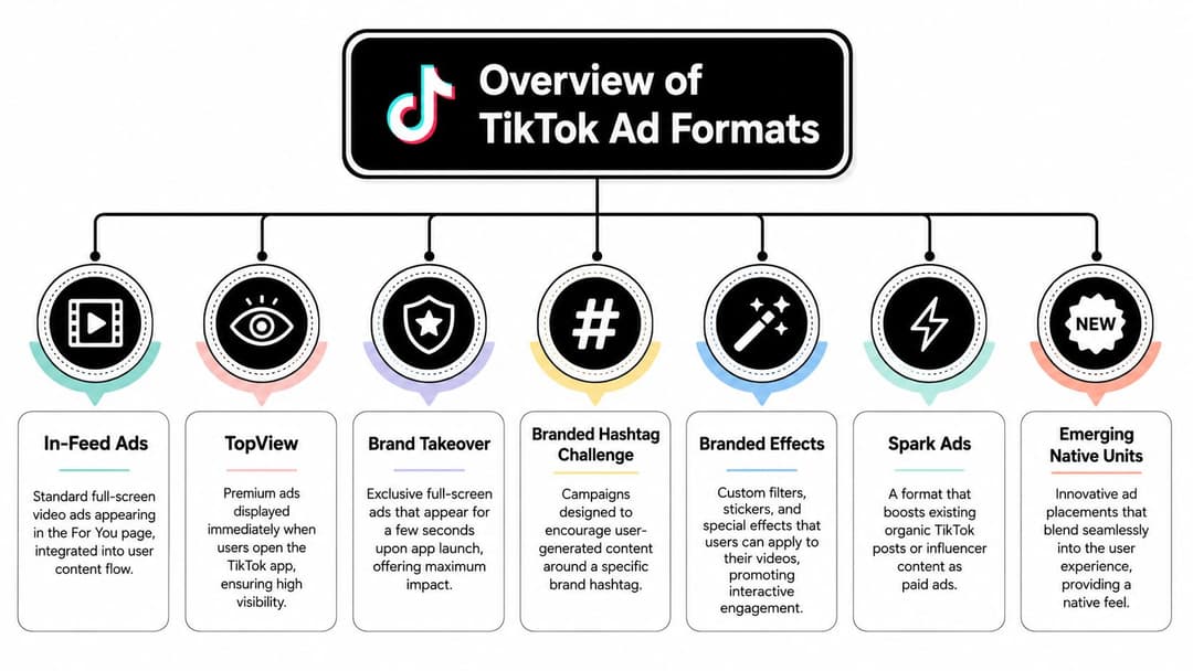
TikTok's format ecosystem breaks into two broad groups, reach-driven placements and interaction-driven placements. In-Feed Ads, TopView, Brand Takeover, Branded Hashtag Challenges, Branded Effects, Spark Ads, and newer native units all look similar at a glance because they live inside a mobile-first app, but they serve very different jobs. Choosing the wrong one is a planning mistake, not a creative one.
The core formats and what they do
In-Feed Ads are the default workhorse. They appear inside the For You feed, blend into the scroll, and are the easiest place to test hooks, offers, and edit styles at scale. If your goal is direct response or iterative testing, this is usually where the budget should start.
TopView and Brand Takeover occupy the highest-visibility moments. They're built for launches, big announcements, and short bursts of attention when a brand needs immediate prominence. The difference is that TopView gives the message a longer runway, while Brand Takeover compresses the idea into a much tighter opening beat.
Branded Hashtag Challenges and Branded Effects are participation formats. They're designed to invite users into the campaign, either by creating content around a hashtag or by using a custom filter or effect. Those are especially useful when the goal is cultural spread rather than simple click-through.
Spark Ads sit in a different lane. They amplify existing posts, usually organic brand content or creator content, and preserve the feel of the original post. That makes them valuable when authenticity matters more than a polished brand-film feel.
How to think about fit
A lot of media plans fail because they treat all TikTok placements as if they were interchangeable. They're not. In-Feed Ads are the closest thing TikTok has to a flexible testing layer, TopView and Brand Takeover are attention spikes, Branded Hashtag and Branded Effects are engagement engines, and Spark Ads are the bridge between social proof and paid scale.
For a useful comparison point, think of the way UGC advertising changes how people read a message. TikTok rewards creative that feels borrowed from the platform's own language, not imposed on it. That's why Spark Ads often feel more natural, and why interactive formats tend to outperform purely static ideas in culture-led campaigns.
A good TikTok format choice starts with one question, do you want attention, participation, or conversion?
Once that's clear, the spec details become easier to apply because the creative job is already defined.
In-Feed Ads Specifications
In-Feed Ads carry a large share of TikTok spend because they blend into the feed while still giving advertisers enough control to test hooks, offers, and edits in a structured way. The standard format is 9:16 vertical, 1080 × 1920 px, with videos that can run up to 10 minutes, although 15 to 30 seconds is usually the more practical range for performance work. That gives you enough time to make the point without losing the native feel that keeps the placement effective.
File, frame, and duration rules
The export setup is simple enough, but the details matter. Use vertical video, keep the file size under 500 MB, and match the frame size to TikTok's mobile-first layout. Longer videos are allowed, but longer cuts only help when the opening is strong enough to hold attention.
The frame deserves as much attention as the file. TikTok advises keeping critical text away from the top 10%, right 10%, and bottom 20% of the frame so buttons, captions, and interface elements do not cover the message. If the headline sits in those areas, the UI will do part of the job your creative should be doing.
What to do in production
Start with the first frame, not the first second. The opening visual should make the offer, product, or action clear right away, since the feed gives very little time before a viewer decides whether to keep watching. Strong In-Feed edits usually keep movement in the shot, keep the product or person easy to read, and keep on-screen text short enough to scan quickly.
Practical rule: Build the safe zone into your design template before you script the video.
That habit cuts down on avoidable revisions. It also keeps teams from placing logos, URLs, or callouts where TikTok's controls will block them. If subtitles or motion graphics are part of the cut, check them in a phone-sized preview instead of relying on a desktop timeline.
A simple internal checklist works well here:
- Format first: Confirm 9:16 and 1080 × 1920 px before editing begins.
- Length second: Cut the creative to the shortest version that still presents the offer clearly.
- Text third: Keep critical words centered and away from overlay zones.
- Export last: Preserve quality while staying under 500 MB.
That order usually leads to cleaner uploads and fewer review issues. It also makes performance testing easier because every version starts from the same spec baseline.
TopView and Brand Takeover Specs
A user opens the app and sees your ad before they see anything else. That makes TopView and Brand Takeover the most demanding placements in the mix, because there is no scroll behavior to buy you extra time. The creative has to feel immediate, look finished, and make the point without hesitation. Both formats use the same 9:16 vertical frame at 1080 × 1920 px.
Side-by-side placement differences
TopView gives you more room to work. It supports video up to 60 seconds, which makes it suitable for a product reveal, a launch message, or a fuller branded story. The opening still has to do the heavy lifting, because attention is highest at the start and drops fast if the message takes too long to form.
Brand Takeover is much tighter. It runs only 3 to 5 seconds, and it can use either video or a static image, with the static image capped at 50 KB. That short window changes the job of the creative. There is no room for setup, so the idea has to be obvious on contact. If the message needs explanation, it is too complex for this placement.
Creative constraints that matter
Sound should be part of the hook, not an afterthought. These placements open on a full screen, so the audio has to match the pace and clarity of the visual instead of trailing behind it. The first frame should stay clean, centered, and clearly branded.
Text placement needs the same discipline. The opening state leaves very little tolerance for clutter, and the return transition can crowd the lower frame. Keep logos, product names, and taglines in the middle of the composition instead of pushing them toward the edges where interface elements can interfere.
Treat the first three seconds as a complete ad inside the ad. If the brand name, product, and value proposition all appear there, the rest of the spot can expand the story. If they do not, the format loses momentum before the viewer has a reason to stay with it.
Do not try to make TopView feel subtle. It works best when the opening is clear, simple, and tightly controlled.
Brand Takeover usually performs better with an even simpler layout. Use large type, one product, one promise, one action. Any extra detail starts competing with the format's short window instead of supporting it.
Branded Hashtag and Branded Effect Specs
A Branded Hashtag Challenge or a Branded Effect changes the job of the creative. The goal is no longer only to get a view, it is to get someone to do something with the ad, post with it, or repeat it. That puts more weight on clarity, low friction, and quick recognition than on dense messaging.
Branded Hashtag Challenge assets
Challenge support assets need to be light and easy to read. The intro video still follows standard TikTok video rules, so 9:16 vertical is the right frame, and the video can run up to 60 seconds TikTok ad specs reference. In practice, shorter usually works better because the viewer has to understand the action fast, not study the brand story.
The challenge itself needs a hook that is simple to repeat. Keep the description concise and make the participation step obvious from the start. If someone has to work out the instructions before joining, the format starts losing people. A clean challenge concept often performs more like a UGC prompt than a polished brand film, which is why a UGC advertising framework is a useful reference point for teams shaping the prompt.
Branded Effects asset basics
Branded Effects rely on small support assets that still have to be readable at a glance. The effect icon is limited to 150 × 130 px, the promotion banner can go up to 300 × 130 px, and the effect name is capped at 30 characters, with shorter names usually easier to spot in the effects tray. Those limits may look minor, but they affect whether people notice the effect and understand what it does.
Participation formats reward restraint. A filter that makes the face harder to read, a challenge that needs too many steps, or a banner with too much copy all raise friction. The smoother the first interaction feels, the more likely people are to try it.
A few practical choices help here.
- Keep names short: Short effect and challenge names are easier to recognize and repeat.
- Use one action: The strongest challenges ask users to do one simple thing.
- Design for imitation: If the format is too complex to copy in one take, it is too complex.
- Protect clarity: Do not let overlays, stickers, or graphics crowd the main action.
Teams that build around creator participation should also keep the asset logic aligned with broader short-form video requirements, and the social video specs reference is a useful companion for that. The same rule applies across both formats, make the asset readable, lightweight, and easy to use.
Challenge and effect formats work when the user understands them immediately. If the value of participating is not obvious on first glance, the campaign has too much friction.
Spark Ads and Other Formats
Spark Ads are the cleanest bridge between organic proof and paid distribution. They boost an existing post rather than replacing it, which means the ad inherits the feel of the original content instead of looking like a separate brand asset. That makes them especially useful when a creator post, founder video, or organic brand clip is already getting traction.
How Spark Ads are structured
The key operational difference is that Spark Ads promote an existing post, so the creative source stays linked to the original TikTok content. That means you're working from the post that already exists rather than uploading a fresh version into a separate ad slot. It also means the original context matters, because the caption, engagement signals, and account identity all shape how the ad feels to the viewer.
For teams using creator content, this format is often the most practical way to keep the ad looking authentic while still controlling spend. It's also a good fit for brands that want to scale proof without over-polishing the clip. If the raw post feels credible, Spark Ads can preserve that advantage.
Niche formats and when they matter
TikTok also supports specialized placements such as Dynamic Showcase Ads and Lead Generation units, which serve different funnels and product types. Those formats are more operationally specific than In-Feed, so the main question is whether your campaign needs catalog-driven display, lead capture, or a broader awareness path.
In creative workflows, automation can help here. One option is creating video ads with AI when you need multiple variants for testing, especially if the goal is to generate different hooks, benefit orders, or visual treatments quickly. For marketers handling scale, that kind of workflow reduces the manual work of variant production without changing the underlying spec rules.
A practical rule keeps this format family manageable:
Use Spark when the content already feels credible, use niche formats when the campaign objective needs a special interaction layer, and don't force either one into a standard video brief.
The best decisions here are made by matching the format to the job, not by chasing novelty. If the campaign doesn't need the extra interaction, standard In-Feed is usually simpler to operate and easier to measure.
Technical Requirements and Placement Notes
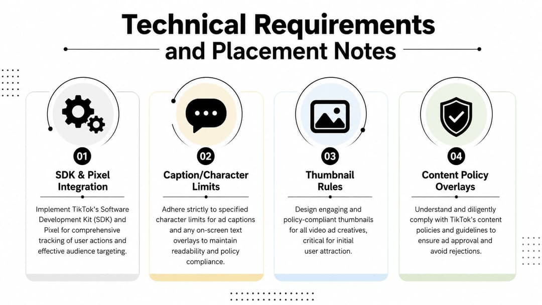
A TikTok ad can look ready in review and still fail in delivery if the file, text layout, or tracking setup misses the platform's rules. That is the part teams often rush, then spend time fixing after launch. For brands running across multiple platforms, the safest check is to compare the creative setup with Instagram ad specifications, because each platform hides different constraints behind a similar upload flow.
The other layer people miss is placement logic. A file that passes upload is not automatically safe once TikTok overlays the caption, CTA, and action icons on the frame. That is why the creative has to be planned for the phone screen, not just for the edit suite.
Tracking and measurement setup
Set up the Pixel or SDK before the creative is locked. If the event path is weak, the reporting trail becomes hard to trust, and campaign decisions get messy fast. A polished ad is still only as useful as the measurement behind it.
The clean workflow is simple. Validate the event path, confirm the creative, then launch. That order protects spend and makes the first test reads easier to interpret. It also avoids the common mistake of sending traffic before the landing page or conversion event is properly wired.
Copy, thumbnails, and overlays
TikTok copy limits vary by placement, so short, direct writing is the safer choice. The best captions usually put the main value in the first sentence, then use the rest of the space for support. Thumbnails should be readable at a glance, because the first visual impression still matters even when the ad auto-plays.
The bigger mistake is assuming a creative that works elsewhere will translate here without changes. TikTok's UI covers the bottom of the frame, clusters action buttons on one side, and pulls attention toward the center. Safe-zone discipline keeps the message visible where users see it.
Practical rule: If the ad depends on tiny text, edge-placed logos, or dense overlays, redesign it for mobile before you export it.
Reviewing placement conflicts
Most placement conflicts show up as soon as someone watches the ad on a phone. The problem is that many teams review on a desktop timeline, where the caption bar, CTA, and action icons are not in view. That gap is where the mismatch starts.
A reliable review pass should answer three questions before upload:
- Can the message be understood with sound off? If not, the visual language is too weak.
- Does the CTA sit in a clear area? If it competes with UI, move it.
- Are the brand elements visible in the center frame? If they drift to the edges, they will get obscured.
That kind of check keeps review loops short. It also prevents the common situation where the creative team thinks the ad looked fine in the edit suite, but the phone experience tells a different story.
For teams that maintain cross-channel assets, a separate social video specs reference helps when you need to compare TikTok framing with other platform requirements without rebuilding the asset from scratch.
Creative Optimization Tips and Templates
The best TikTok ads usually aren't the most elaborate ones. They're the ones that get to the point quickly, show something visually clear, and make the next action obvious. Specs keep the ad runnable, but creative choices decide whether people keep watching.
The first three seconds matter most
Start with motion, a person, or a product in use. TikTok is a fast-scroll environment, so the opening beat has to earn attention before the rest of the edit can do any work. A slow logo reveal or a generic establishing shot usually wastes the highest-value moment.
For In-Feed Ads, the hook should be visible before the viewer has time to wonder what the ad is about. For TopView, the opening frame has to do even more work because the placement commands attention at app launch. For Spark Ads, the hook still matters, but the tone should feel like a post someone would already stop for organically.
Template ideas by format
Here's a practical way to think about production:
- In-Feed template: Hook, problem, product, proof, CTA. Keep each beat short and centered.
- TopView template: Brand cue, visual impact, one message, one action. No filler.
- Spark Ad template: Organic-looking opening, creator-led explanation, simple CTA. Preserve the post feel.
- Branded Challenge template: Show the action, show the outcome, invite participation. The behavior should be obvious.
- Shopping format template: Product first, benefit second, offer third. The viewer should know what's being sold immediately.
A good script prompt is often more useful than a polished storyboard. For example, “Show the product solving the pain point in the first shot” gives the editor a clearer task than “Make it engaging.” If you're building variations at scale, AdStellar AI can be used as one workflow option for generating multiple creative versions and then refining the hook, benefit order, and visual style before launch.
Sound, text, and pacing
Sound should support the motion, not fight it. TikTok is a sound-aware platform, but that doesn't mean every ad needs heavy audio design. A clean voiceover, a strong music cue, or a simple sync between cuts and movement is usually enough. Overdesigned sound can make the ad feel busier than it needs to be.
Use on-screen text sparingly and place it where it won't get buried by the interface. If the message can be reduced to one clear sentence, the viewer is more likely to absorb it quickly. If it needs a paragraph, it probably belongs on a landing page instead.
For a broader creative benchmark, the Facebook ad creative best practices guide is useful as a contrast, because TikTok usually rewards a looser, more native, and faster-moving style than traditional feed creative.
Keep the ad visually simple enough that the offer is readable in a single pass.
That rule saves edits, shortens production cycles, and usually improves the quality of the test.
Quick Reference Cheat Sheet
Use this as a briefing sheet before export or upload. It keeps the most important TikTok ad specifications in one place so creative, media, and production teams can check the same baseline before launch.
| Format | Dimensions (px) | Aspect Ratio | File Type | Max File Size | Max Duration | Caption Limit | Thumbnail Rules |
|---|---|---|---|---|---|---|---|
| In-Feed Ads | 1080 × 1920 | 9:16 | MP4, MOV | 500 MB | Up to 10 minutes | 100 characters | Keep key text out of the top 10%, right 10%, and bottom 20% |
| TopView | 1080 × 1920 | 9:16 | MP4, MOV | 500 MB | Up to 60 seconds | Use short, direct copy | Keep critical elements centered and away from interface overlays |
| Brand Takeover | 1080 × 1920 | 9:16 | Video or static image | 500 MB for video, 50 KB for static image | 3 to 5 seconds | Very short message only | Clean, simple first frame, no clutter |
| Branded Hashtag Challenge | 540 × 960 minimum | 9:16 | MP4, MOV | 500 MB | Up to 60 seconds | Keep instructions concise | Use a clear banner and easy-to-read challenge cue |
| Branded Effects | Effect assets vary by build | N/A | JPG, PNG, effect files | Under 1 MB for core support assets | N/A | Effect name up to 30 characters | Icon and banner need to stay legible at small size |
| Spark Ads | Matches original post | Usually 9:16 | Existing TikTok post | Original post limits | Original post limits | Original caption applies | Use the original post as-is |
| Video Shopping Ads | 1080 × 1920 | 9:16 | MP4, MOV | 500 MB | Same as In-Feed | Short, product-first copy | Product should be visible early |
The easiest way to use this table is to assign one person to verify the spec, one person to verify the copy, and one person to verify the frame. That division catches the majority of launch mistakes before they reach review.
If you're building a repeatable workflow, keep a shared checklist for export settings, safe zones, and caption length, then reuse it on every new variant. That habit turns TikTok ad specs from a last-minute panic into a normal production step.
If you're ready to turn these TikTok ad specifications into launchable creative, review your next ad batch against the cheat sheet, rebuild any asset that violates safe zones, and then use AdStellar AI to generate and organize faster creative variations for testing.